30+ CSS Hero Sections: Free Code Snippets & Examples
CSS hero sections establish the critical first-impression threshold for landing pages, framing the visual storytelling hierarchy above the fold to capture immediate user focus. By orchestrating bold typography, split grids, and immersive background assets natively, these layouts define the aesthetic tone of a web platform while preserving vital loading metrics.
- True full-screen boundaries are calibrated natively using modern viewport units like dvh and dvw, resolving height shifts caused by dynamic mobile browser navigation bars.
- To optimize LCP (Largest Contentful Paint) metrics, background media is structured with explicit fetch priorities and inline critical CSS, ensuring assets render instantly.
- Interactive mouse-tracking glares and parallax depths are calculated on GPU compositor layers, entirely bypassing main-thread layout thrashing during scroll transitions.
Explore these high-performance above-the-fold frameworks to master the integration of fluid, typography-driven hero dividers and modern landing structures.
Table of Contents:
Examples

Vibrant OKLCH Conic Hero
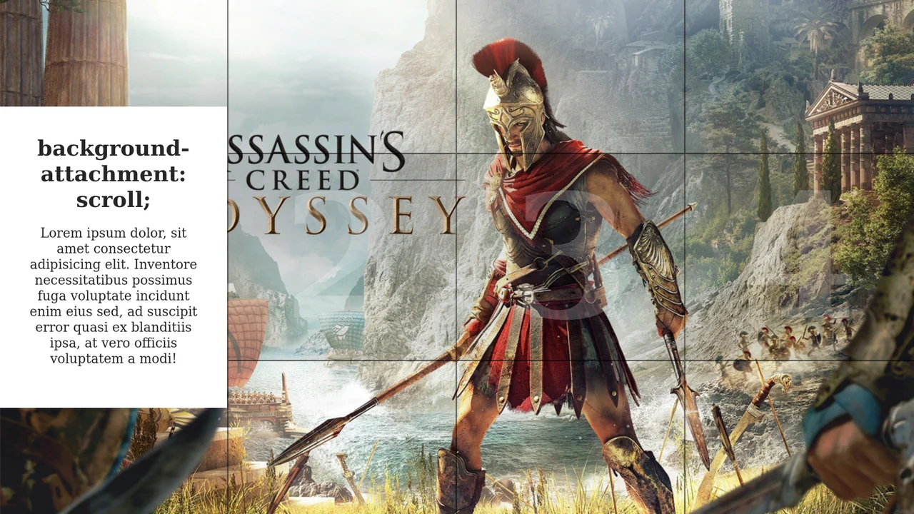
For too long, the web has been trapped in the dull, muddy spectrum of sRGB. We accept “gray dead zones” in our gradients as a fact of life. No more. This hero section embraces the OKLCH color space to deliver vibrance that matches the human eye’s perception. It is not just a background; it is a radiant, high-definition light source that bathes your typography in pure energy. (Requires: open-props)
 Chrome 111+
 Edge 111+
 Firefox 113+
 Safari 15.4+
See the Pen Vibrant OKLCH Conic Hero.

Hero in Monochrome (Open Props OKLCH)
A responsive hero component design system leveraging CSS cascade layers and Open Props.
See the Pen Hero in Monochrome (Open Props OKLCH).
Hero Section Article Gallery Hover
This demo showcases a dynamic split-screen layout where hovering over a column triggers a full background image reveal and slides in a content box. The interactive effect is efficiently managed by toggling an .active class with a simple jQuery mouseover event, while all animations are handled purely by CSS transitions.
See the Pen Hero Section Article Gallery Hover.
AI Hero Chat Using the Popover API
An up-to-date Hero Section featuring an interactive chat implemented via the new Popover API. It showcases clean style organization using CSS @layer and leverages Open Props for modern variables and design.
See the Pen AI Hero Chat Using the Popover API.

Headings/Hero Image Typography Playground
A demonstration of multiple typographic styles implemented using SCSS to manage extensive font settings, weights, and heading adornments. The content is presented over various backgrounds, including gradients and images, allowing for thorough inspection of readability and aesthetic consistency across diverse styles.
See the Pen Headings/Hero Image Typography Playground.
Hero Image Reveal
Striking hero image and heading reveal animation, controlled by CSS Custom Properties for timings and a custom easing function, delivering a smooth and precise UX.
See the Pen Hero Image Reveal.

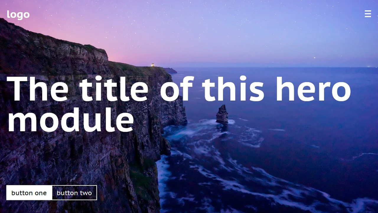
Travel Site Hero
Landing page with variable font and CSS variables. Layout built with grids, navigation adapts for mobile. Focus on smooth transitions and accessibility: respects reduced-motion preferences.
See the Pen Travel Site Hero.
Hero Appearance - CSS Only
Hero section with clip-path reveal animation. Background image scales, text and logo fade in with delay. SCSS variable controls color overlay. Grid stacks layers on top of each other.
See the Pen Hero Appearance - CSS Only.
Hero Image Staggered Hover Zoom Effect - CSS Only
Mosaic zoom effect: multiple empty divs inside header scale the background image on hover via background-size, simulating a zoom-in illusion. Title underline animates on header hover. CSS variables control zoom intensity and color tint.
See the Pen Hero Image Staggered Hover Zoom Effect - CSS Only.
Home Hero Animation
Complex SVG infographic with cascading appearance animation. CSS variable --time sets base duration, classes with Greek letters control delays and initial offsets for each element. Multiple groups and transforms create layered data visualization.
See the Pen Home Hero Animation.

Balanced Hero Headline Component
Section with background image and gradient overlay for text readability. Heading uses clamp() for responsive sizing and text-wrap: balance for even line distribution. Styled via CSS layers for clean code organization.
See the Pen Balanced Hero Headline Component.
Blend-Mode Sticky Nav & Hero
Interactive navigation with hamburger-to-cross animation via frame-by-frame SVG path updates. Custom cursor with blur effect follows mouse movements. Sliding menu, video background and colored sections form a dynamic landing structure.
See the Pen Blend-Mode Sticky Nav & Hero.

Responsive Hero Section with Navigation Menu
Responsive navigation menu with hamburger-to-cross animation on open. JavaScript toggles classes for show/hide, overlay, and header style change on scroll. CSS variables and media queries ensure responsiveness and dark theme.
See the Pen Responsive Hero Section with Navigation Menu.

A User-Friendly Hero Section with Open Props
Two-column landing header with CSS Grid. Left column contains heading, description and buttons, right column — image. Styled via Open Props: variables for colors, shadows, sizes and spacing. Minimal custom CSS, only basic layout and overrides.
See the Pen A User-Friendly Hero Section with Open Props.
Rays Background
Houdini @property and the :has() selector power this high-contrast theme-switching hero. Den achieves visual depth through backdrop-filter and mix-blend-mode: difference. Animated backgrounds rely on shifting repeating-linear-gradient patterns. The scaling title leverages background-clip: text and data attributes. A masterclass in modern CSS layering and state.
See the Pen Rays Background.

Responsive Hero with Dark Mode
A responsive landing page featuring persistent dark mode and a mobile burger menu. Built with HSL variables and clamp() for fluid typography. JavaScript manages state via localStorage and handles window resize events. It uses a semantic Flexbox and Grid architecture for a clean, accessible interface.
See the Pen Responsive Hero with Dark Mode.
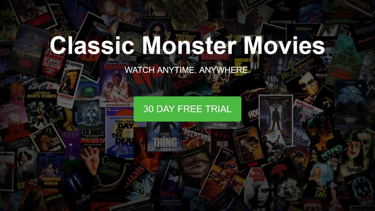
ACME Classic Monster Movie Showcase
A cinematic hero component using a full-height ::after overlay and inset box-shadow for vignette depth. Flexbox handles centering. Media queries scale typography and reposition the logo for mobile. Built with CSS Custom Properties for consistent colors across rounded and extra-large button variants.
See the Pen ACME Classic Monster Movie Showcase.

Be a Hero
Full-viewport hero component with a responsive background cover. It uses absolute positioning and translate for off-center alignment, shifting to a centered, high-contrast container on smaller viewports via media queries. Minimalist markup combined with system-ui typography and a single CSS transition for layout fluidity.
See the Pen Be a Hero.

Stylish Hero Section with Snowfall Effect
An atmospheric hero section featuring an interactive snowfall on a <canvas>. It combines a masked backdrop with a pulsing CSS-animated call-to-action. The snow logic uses OOJS to simulate gravity and friction, reacting to pointer movement via a throttled mousemove force field. Includes a fixed header and responsive clamp layout.
See the Pen Stylish Hero Section with Snowfall Effect.

Hero Experiment
A full-screen hero using layered pseudo-elements. The background sits in ::before with sepia and grayscale filters, while ::after adds a gradient overlay. Text is perfectly centered via transform. Includes box-decoration-break: clone for clean padding on wrapped text lines. Simple, effective, no JS.
See the Pen Hero Experiment.
Animated Hero Background
A generative hero layout utilizing JS-driven particle emission. Each bubble container is assigned a random rotate value, while CSS keyframes handle the outward translateX drift. It relies on viewport units (vmin, vmax) for device-agnostic scaling and a central Flexbox container for text alignment and circular branding.
See the Pen Animated Hero Background.

Animated Hero Image with CSS Clipping
A multi-layered hero section using fixed-attachment backgrounds and floating cloud overlays. It leverages clip: rect() for container masking and CSS keyframes for slow-drift animations. Typography combines high-contrast serif pairings with viewport units for responsive scaling, creating a cinematic, depth-driven storytelling experience.
See the Pen Animated Hero Image with CSS Clipping.
Parallax Background Hero
Animated pure CSS parallax hero using multiple background layers. Each layer is absolute-positioned and runs a synchronized @keyframes loop to shift background-position at varying speeds, creating depth. Includes cyclists moving at distinct rates. A dark-themed flexbox navigation and clean SVG content sections complete the responsive landing page.
See the Pen Parallax Background Hero.

CSS Star Animation for Hero
A high-contrast space-themed hero using clip-path to create a bold diagonal boundary. The starfield effect is achieved through massive box-shadow stacks on three distinct layers, moving at different speeds via @keyframes to simulate parallax depth. A linear gradient overlay provides a sleek, modern background for the animated celestial scene.
See the Pen CSS Star Animation for Hero.
Hero Module with Flexbox and the 'vh' Unit
A vertical-flex hero module spanning the full viewport height. It employs space-between to anchor the navigation, title, and call-to-action buttons. Typography uses viewport height units (vh) for fluid responsiveness, while the background image is centered with cover scaling. Simple, clean, and perfectly suited for high-impact landing pages.
See the Pen Hero Module with Flexbox and the 'vh' Unit.

Stripe Hero
A CSS-only recreation of the Stripe hero background. It uses a single container with skewY(-12deg) and multiple absolutely positioned span elements. Dynamic colors are handled via a complex linear-gradient and specific nth-child overrides. Media queries adjust the geometry to keep the diagonal flow fluid across breakpoints.
See the Pen Stripe Hero.
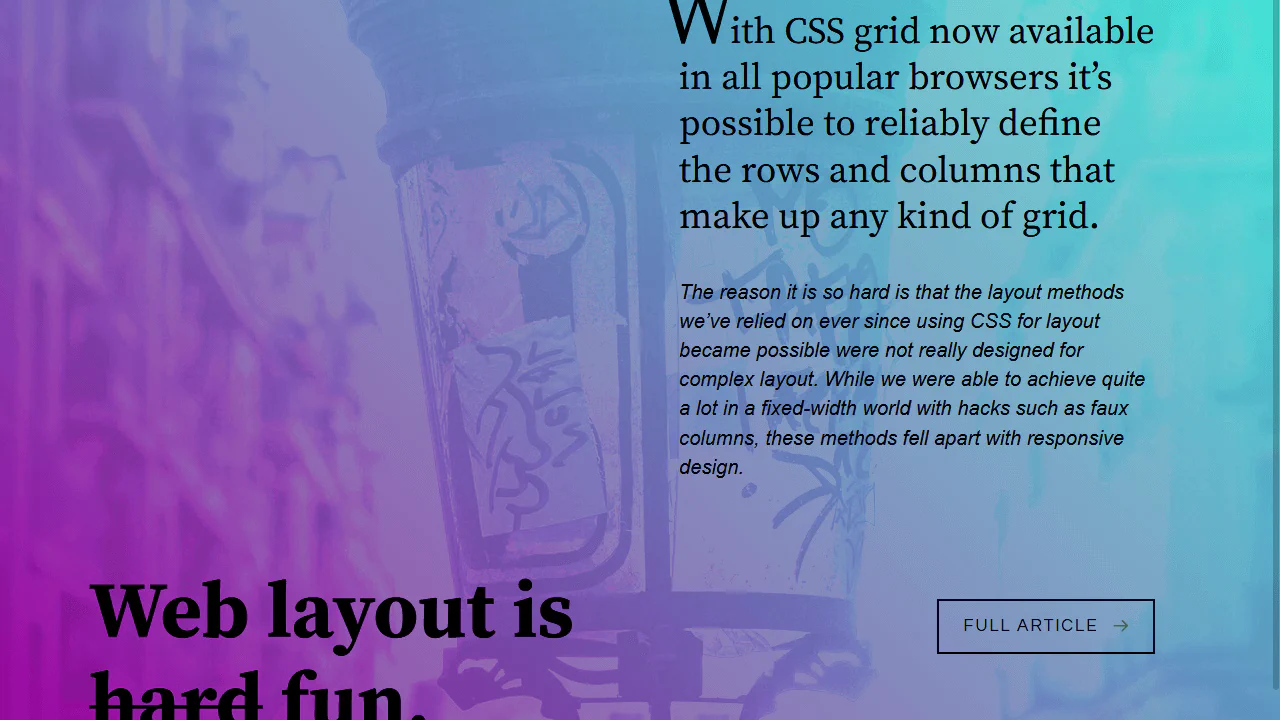
Hero Article
An advanced CSS Grid-based hero section featuring a full-bleed mix-blend-mode background. It uses a complex 12-column layout to anchor typography and links across breakpoints. Includes a feature-rich tooltip system driven by data-attributes and pseudo-elements, alongside a fallback mechanism using @supports for modern grid layouts.
See the Pen Hero Article.
Hero Waves
A minimalist hero layout featuring a dynamic wave animation. It uses a clever border-radius trick on oversized, rotating pseudo-elements (::before and ::after) to simulate fluid water motion at the bottom. Flexbox handles centering the typography, and CSS variables manage the accent color for easy theme adjustments.
See the Pen Hero Waves.
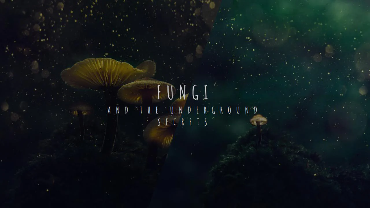
Dual Picture Hero
A split-screen hero section using clip-path to create a sharp diagonal intersection between two distinct background images. It relies on absolute-positioned layers with linear-gradient overlays to ensure high text legibility. The bold typography features the Amatic SC font with wide letter-spacing, delivering a rustic and organic visual impact.
See the Pen Dual Picture Hero.
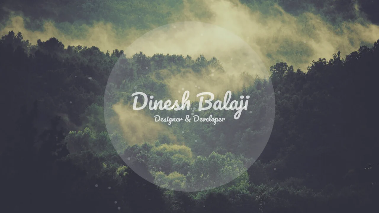
Hero - 3 Designs
A collection of three distinct hero section styles: Classy, Fun, and Inspiring. The layout uses semantic fieldset and legend hacks for framed typography, alongside oversized circular containers for bubble-masked imagery. It features a diverse palette of Google Fonts and CSS filters, with media queries handling mobile-first content stacking.
See the Pen Hero - 3 Designs.