20+ CSS Hexagons: Free Code Snippets & Examples
Hexagons pack more information per square pixel than rectangles — their six-sided geometry creates natural honeycomb patterns that maximize surface area in tight grid layouts. CSS hexagons deliver this spatial efficiency through native clipping, keeping the DOM lean and the rendering fast.
- Each hexagon uses
clip-path: polygon()with six vertex coordinates calculated from the container dimensions, creating precise hexagonal boundaries that clip the content without affecting the underlying layout box. - The honeycomb grid uses CSS Grid with
auto-filland precise column widths, where hexagons offset by half-width on alternating rows create the signature interlocking pattern without JavaScript positioning. - Semantic HTML with proper heading hierarchy inside each hexagon ensures screen readers interpret the content regardless of the visual clipping, while
:focus-visibleprovides clear keyboard navigation boundaries.
Browse the collection to find a hexagon layout that fits your data density — from full honeycomb grids for image galleries to scattered hexagon badges for feature highlights.
Table of Contents:
Examples

Pure CSS Responsive Hexagon Grid
This is a Pure CSS Responsive Hexagon Grid. It replaces complex SVG or Javascript-driven honeycomb layouts with a purely mathematical CSS approach. Its function is to automatically tile and nest geometric shapes in a tight honeycomb pattern that recalculates rows and offsets on the fly as the parent container resizes.
 Chrome 119+
 Edge 119+
See the Pen Pure CSS Responsive Hexagon Grid.
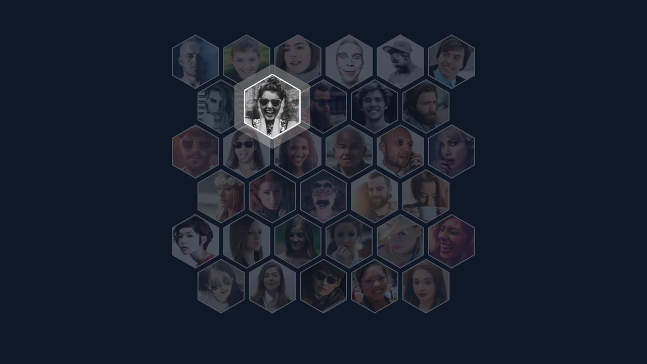
Corner-shape Hexagon Avatars
This demo creates a responsive hexagonal grid using CSS Grid and the powerful, lesser-known corner-shape: bevel property. It uses negative margin-block for smooth overlaps, and a unique linear() easing function for a bouncy, fluid hover animation.
See the Pen Corner-shape Hexagon Avatars.

Flying Through Hexagons
A large-scale 3D scene where Sass procedurally generates both the trajectory of 72 rings using trigonometry, and the @keyframes for its “fly-through” mode via a Sass map. Animation is switched without JS using the “checkbox hack”, and the entire composition is built upon perspective and transform-style: preserve-3d.
See the Pen Flying Through Hexagons.
Pure CSS Responsive Hex Grid
An adaptive hexagonal grid without media queries, built on Container Queries, where the column count and the position of each element are calculated in CSS via complex calc() functions. The code demonstrates progressive enhancement - with a fallback to @property and a tan(atan2()) math trick to emulate division in older browsers.
See the Pen Pure CSS Responsive Hex Grid.
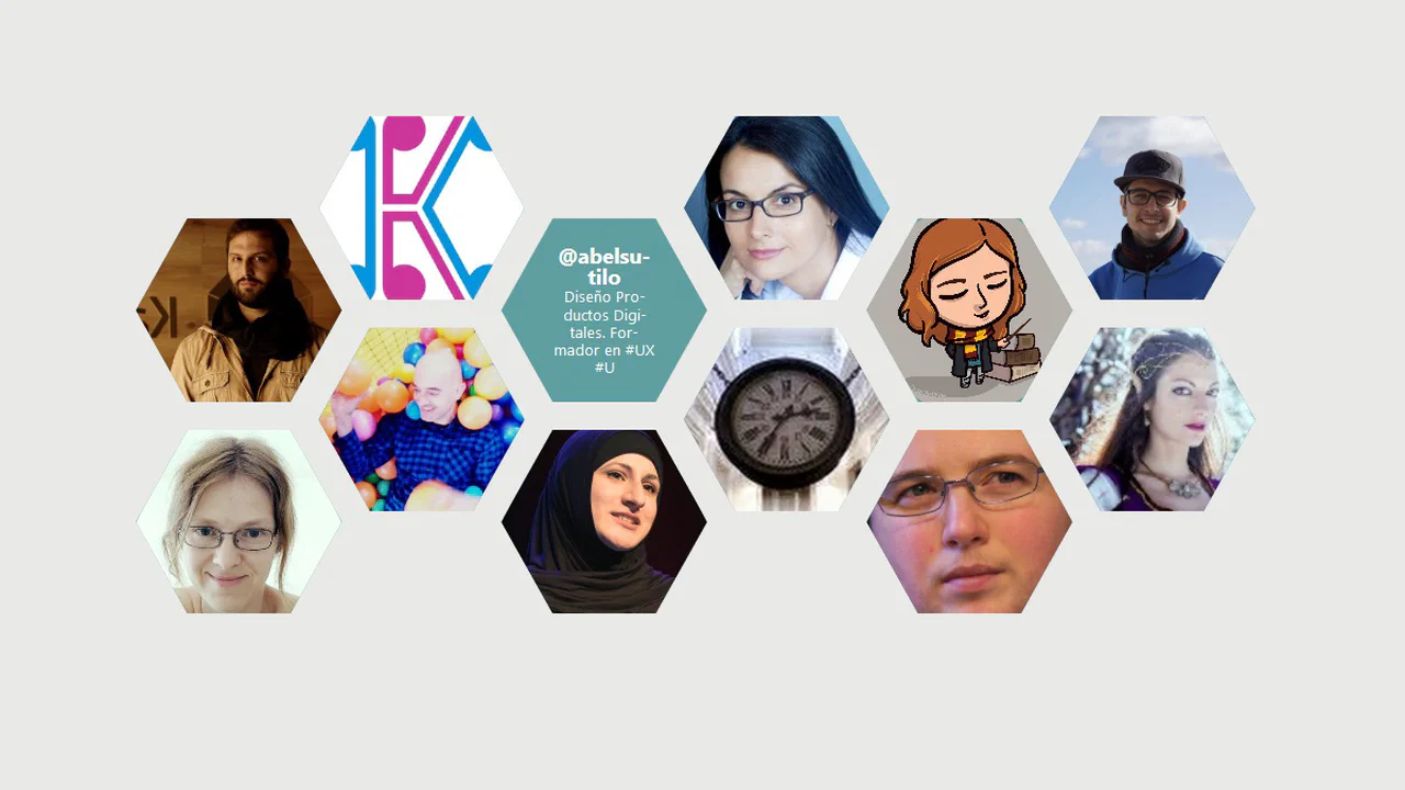
Auto Hexagonal CSS Grid Layout
Responsive hexagon grid with CSS Grid. Column count (--Nhexa) changes via media queries, hexagons shifted via nth-child(2n). clip-path creates shape, shape-outside wraps text inside, image rotates on hover.
See the Pen Auto Hexagonal CSS Grid Layout.

Hexagon Grid with Hover
Hexagonal cards with 3D flip on hover. hex-size mixins control dimensions for different screens, shape created via nested .-clip with rotations. Front and back sides (.-front/.-back) animate via transform: rotateY(180deg).
See the Pen Hexagon Grid with Hover.
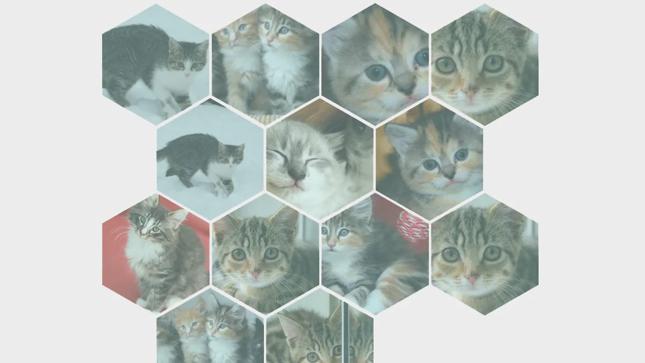
Responsive Hexagonal Grid
Hexagon grid via three nested rotate transforms. Each .hexagon rotated 120°, inner layers compensate rotation to preserve image. box-shadow on hover removes colored overlay. Row positioning via margin-left and margin-top with media queries.
See the Pen Responsive Hexagonal Grid.
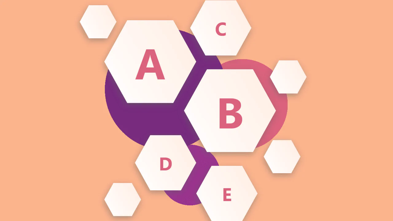
ABCDE
Hexagon composition with clip-path and custom sizes (-big, -normal, -small). Page background built from three radial gradients simulating blurred circles. Absolute positioning with media query adaptation.
See the Pen ABCDE.

Hexagonal Responsive Grid
Responsive hexagon grid via rotate and skew combination. Shape created through nested transforms (hexIn → hexLink), image cropped with clip-path. Even rows shifted via margin-left based on media queries.
See the Pen Hexagonal Responsive Grid.
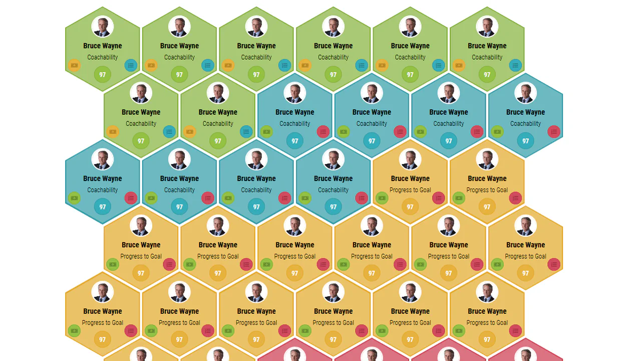
Responsive Hexagon Grid
Hexagon cards created via border on :before and :after pseudo-elements. Outer hexagon contains inner one with padding, color coding via modifiers (.hexagon-green, .hexagon-blue, etc.). Grid adapts to different widths by shifting even rows with margin-left.
See the Pen Responsive Hexagon Grid.
Creative Hexagon with Hover Effect
Infinite hexagon grid with color animation via hue-rotate. Each hexagon cropped with clip-path, turns green on hover. Even rows shifted via margin-left: 1px to create honeycomb pattern.
See the Pen Creative Hexagon with Hover Effect.
Hexa Team
Hexagon composition with portraits and labels controlled via :target. Clicking photo element (link with href="#m1") activates layer with enlarged portrait and sliding text. Background hexagon pattern unifies visuals.
See the Pen Hexa Team.
Hive Photo Gallery Grid
Responsive hexagon grid with CSS Grid and dynamic columns. Even rows shifted via grid-column-start, images scale and change brightness on hover via CSS variable. Pug generates rows with alternating column count.
See the Pen Hive Photo Gallery Grid.
Another Hexagon Grid
Gallery of seven hexagons arranged in a flower pattern via translate transforms. Each image positioned relative to center using CSS variables --_x and --_y. On hover, scales up (scale) and removes grayscale filter.
See the Pen Another Hexagon Grid.

Hexagonal Button
An interactive pure CSS wireframe button. It constructs the hexagon shape by rotating three nested div elements, each drawing a top/bottom border line. Hovering scales up the concentric nested frames while dynamically expanding the inner border thickness from 1px to 15px to create a bold, highlighted visual bloom.
See the Pen Hexagonal Button.
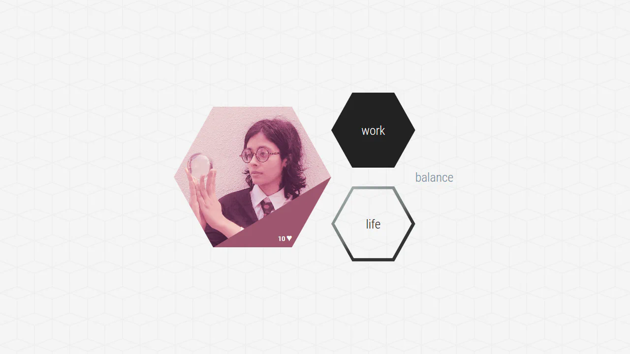
Hexagon Shapes
An interactive set of hexagonal product cards utilizing SVG clip-path masks. The custom coordinate polygons crop the base elements and nested elements into perfect hexagons. On hover, a triangular pseudo-element overlay on the main card shrinks its height to zero, producing a clean corner-peeling animation that reveals hidden metadata.
See the Pen Hexagon Shapes.
Rotating Hexagon Loader
A minimalist, pure CSS liquid loader styled with custom clip paths. The container and outer borders are cropped into aligned hexagons using the clip-path polygon property. Inside, the .content div represents a rotating fluid baseline, spinning infinitely via @keyframes contentAnimation to simulate a liquid-filled container.
See the Pen Rotating Hexagon Loader.

Animated Hexagons
An interactive 3D loading spinner designed entirely with pure CSS. The viewport utilizes perspective: 390px to project depth, while the parent container has preserve-3d. The pseudo-elements :before and :after use clip-path to form hollow hexagonal rings that spin dynamically in opposite directions.
See the Pen Animated Hexagons.

Hexagon
A minimal, pure CSS hexagon shape featuring a subtle hover animation. The base element is structured as a vertical rounded rectangle. Stacking two pseudo-elements, :before and :after, and rotating them by 60deg and -60deg respectively, forms the interlocking hexagonal geometry. Hovering smoothly rotates the entire shape by 30deg.
See the Pen Hexagon.

Hexagonal Cycle
A complex, geometric isometric animation on pure CSS. The layout coordinates a 3D preserve-3d cube alongside a flat hexagon built with rotated pseudo-elements. The flat hexagon tumbles step-by-step along the cube’s outer edges via a highly detailed @keyframes hexa timeline, while the cube rotates synchronously to reset the loop.
See the Pen Hexagonal Cycle.
Butterfly Hexagon
A stylish set of pure CSS social badges that morph from hexagons to circles on hover. Each hexagon is constructed by stacking a vertical rectangle with rotated :before and :after layers. On hover, applying a border-radius: 50px transition across all three layers smoothly morphs the sharp hexagon into a rounded circle.
See the Pen Butterfly Hexagon.
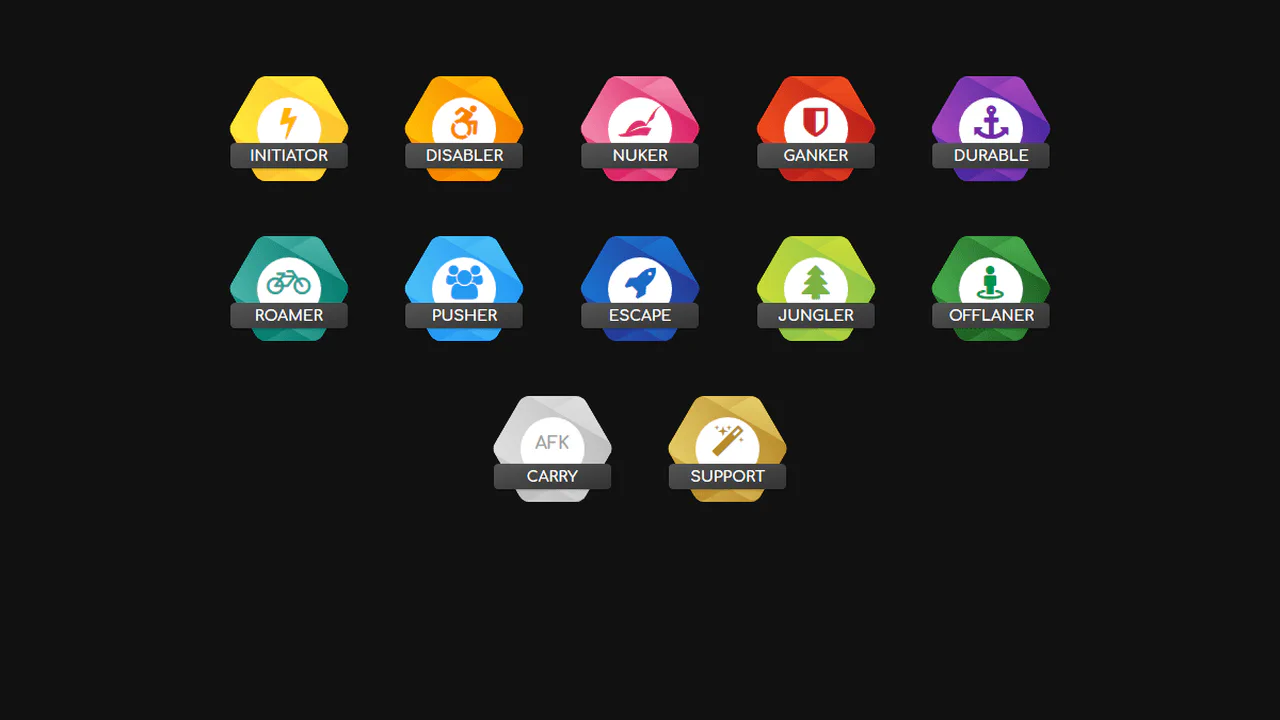
Hexagon Badges
A colorful set of pure CSS gaming role badges styled with gradient themes. To assemble the rounded hexagon shape, each badge combines a vertical rectangle with rotated :before and :after pseudo-elements. The layouts are completed by an absolute-centered white circle with an icon and a dark, styled text ribbon.
See the Pen Hexagon Badges.
Neon Hexagon
A complex 3D neon carousel built entirely with pure CSS. Utilizing preserve-3d and a 750px perspective, the container rotates on multiple axes. Six vertical pillars, designed with clip-path masks, host animated flowing light beams, while three colorful neon rings rotate and climb around them in a staggered, looping sequence.
See the Pen Neon Hexagon.
Rounded Hexagon Images
A masterclass in CSS masking by Temani Afif. It styles single img elements into hexagons using a complex combination of conic-gradient, radial-gradient, and linear-gradient masks. By registering a custom --radius property with @property, hovering triggers a smooth transition that morphs the hexagon into a circle or a sharp-edged shape.
See the Pen Rounded Hexagon Images.