100+ CSS Hover Effects: Free Examples & Code Snippets (Page 2)
Examples

Invert Radius Shape with Cool Hover Effect
A sophisticated hover effect utilizing CSS Houdini to animate a complex image mask.
See the Pen Invert Radius Shape with Cool Hover Effect.

Image Peeling Hover Effect
Hovering over the grid triggers a light flare sweep, transforming the images from a distorted, stretched state into their sharp, original form, creating a futuristic transition effect.
See the Pen Image Peeling Hover Effect.

Mac Dock Magnify Effect with :has
A Dock menu where the scaling effect on hover is implemented entirely in CSS using :hover and :has() selectors - this allows scaling not only the active element but also its neighbors.
See the Pen Mac Dock Magnify Effect with :has.
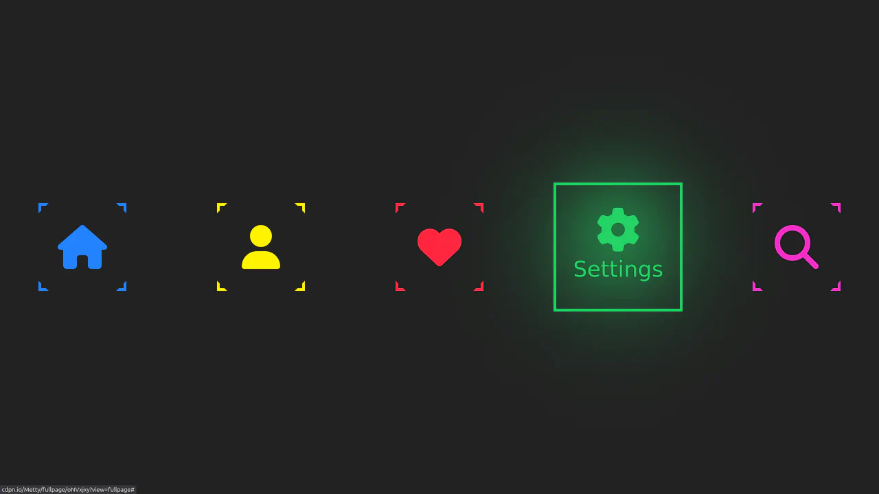
Neon Icon Hover Effect
A navigation menu with a neon glow and a complex hover effect. Icons and text use the CSS drop-shadow filter to create a glow effect, while the element’s color is controlled via an inline CSS variable --clr.
See the Pen Neon Icon Hover Effect.

Cosmic Neon Text Effect
A spectacular, interactive heading design: on hover, the text stroke disappears, giving way to a powerful, multi-colored neon glow. It’s a perfect demonstration of pure CSS capabilities for creating complex typography and “wow” effects.
See the Pen Cosmic Neon Text Effect.

CSS-Only Image Tilt Towards Cursor
A 3D image tilt effect that mimics cursor movement, achieved purely with CSS by combining multiple invisible overlay zones, the general sibling combinator, and the transform: rotate3d() function with perspective on the parent container.
See the Pen CSS-Only Image Tilt Towards Cursor.
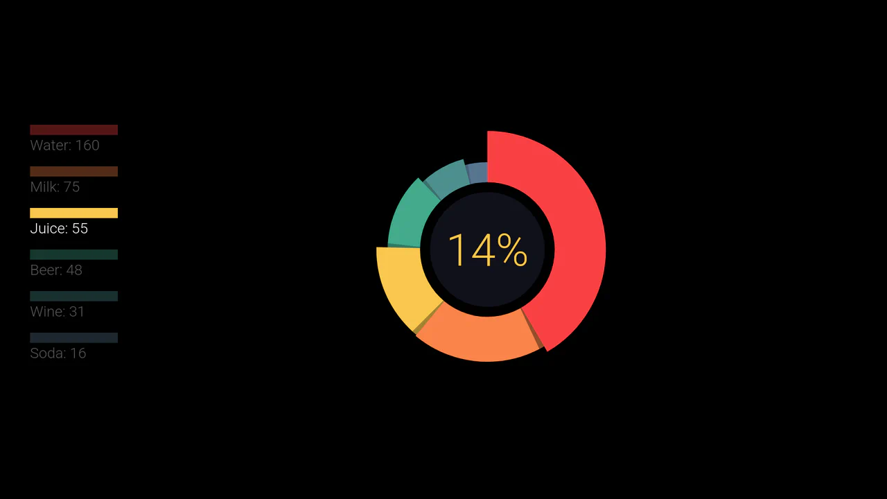
Animated Pie Chart (V2)
A demo showcasing an adaptive, unique “ring” pie chart design using SVG circles, where each segment is animated and colored from a predefined JavaScript array.
See the Pen Animated Pie Chart (V2).
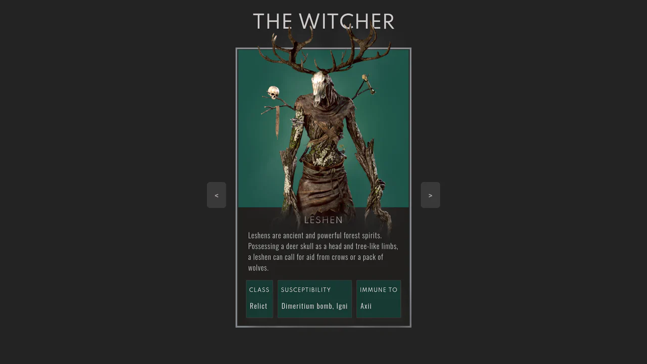
The Witcher Monster Cards Slider
Showcases a stylish, interactive monster card slider, utilizing pure HTML and CSS for complex design, custom typography, and subtle image animations with a zoom/lift effect on hover.
See the Pen The Witcher Monster Cards Slider.
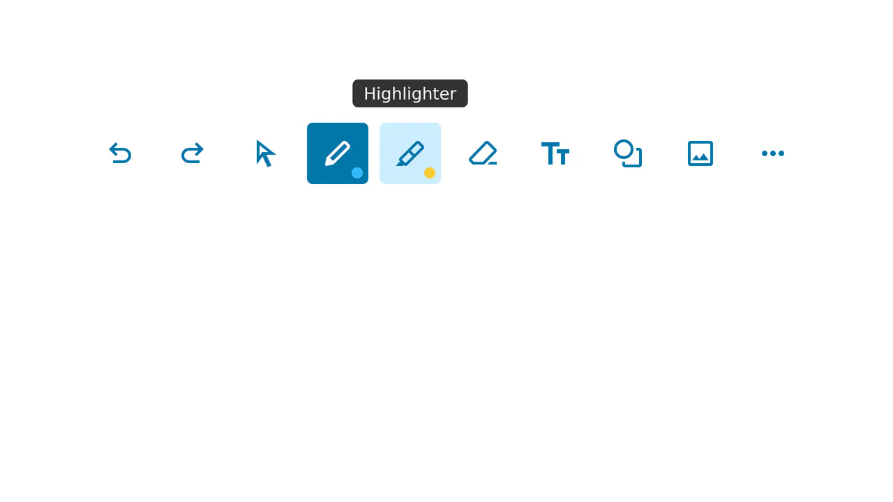
Note-Taking Toolbar with Dynamic Tooltip
This is a sleek, reusable Note-Taking Toolbar component, utilizing pure CSS for :hover and :active effects (including the dynamic tooltip), and basic JavaScript to manage a single selected state without external libraries.
See the Pen Note-Taking Toolbar with Dynamic Tooltip.
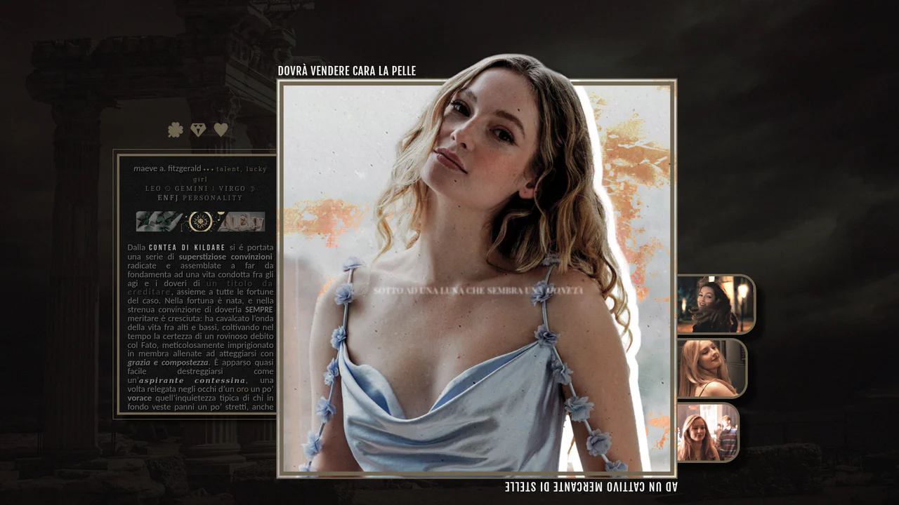
CSS-Only Character Profile Card with Tabs
A stylish custom layout (character profile card) built entirely on CSS positioning and content switching using HTML radio inputs without JavaScript, effectively creating pure CSS tabs.
See the Pen CSS-Only Character Profile Card with Tabs.
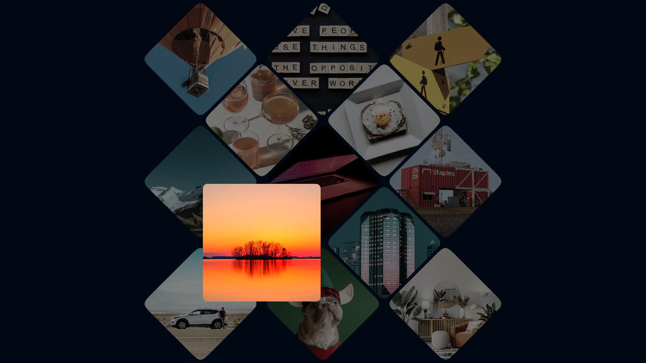
Photo Gallery Grid Animation with CSS Clip-Path
A showcase of the creative application of clip-path to create an “unfolding” image effect on hover, where the interaction not only changes the shape but also uses z-index to elevate the element and overlap neighboring tiles.
See the Pen Photo Gallery Grid Animation with CSS Clip-Path.
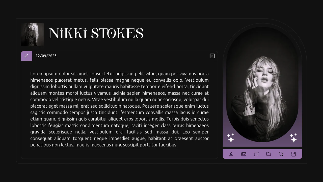
Just Bored Vol. 3 - Creative Post UI
A visually complex component focusing on non-standard geometry (border-radius: 0 150px 0 10px) and an impressive avatar hover effect (gradient shift, filter: brightness(), and information blur/fade-out) implemented purely with CSS.
See the Pen Just Bored Vol. 3 - Creative Post UI.

CSS Staircase Hover Effect Using :has()
This “staircase” hover effect is a prime example of the power of the new CSS :has() selector. It enables elements to react to the state of their siblings, creating a complex and elegant animation without JavaScript.
See the Pen CSS Staircase Hover Effect Using :has().

Image Orbit Animation with CSS
This carousel effect demonstrates a modern approach to CSS animations, using the offset-path property for circular motion. The complex scaling and highlighting effects on hover are achieved purely with CSS transitions and the :has() selector, eliminating the need for JavaScript.
See the Pen Image Orbit Animation with CSS.
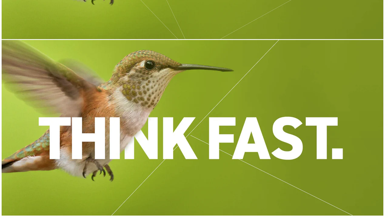
Image Polygon Overlay
A technically advanced effect where SVG paths are used to create an animated grid over an image. The demo showcases how CSS transitions can be applied to SVG attributes, which is a modern and performant way to create complex visual effects.
See the Pen Image Polygon Overlay.

Apple Liquid Glass Effect
This demo creates a stunning “liquid glass” effect by layering a CSS backdrop-filter with a complex SVG filter. The realistic distortion and specular highlights are achieved using feTurbulence and feSpecularLighting, all without a single line of JavaScript.
See the Pen Apple Liquid Glass Effect.
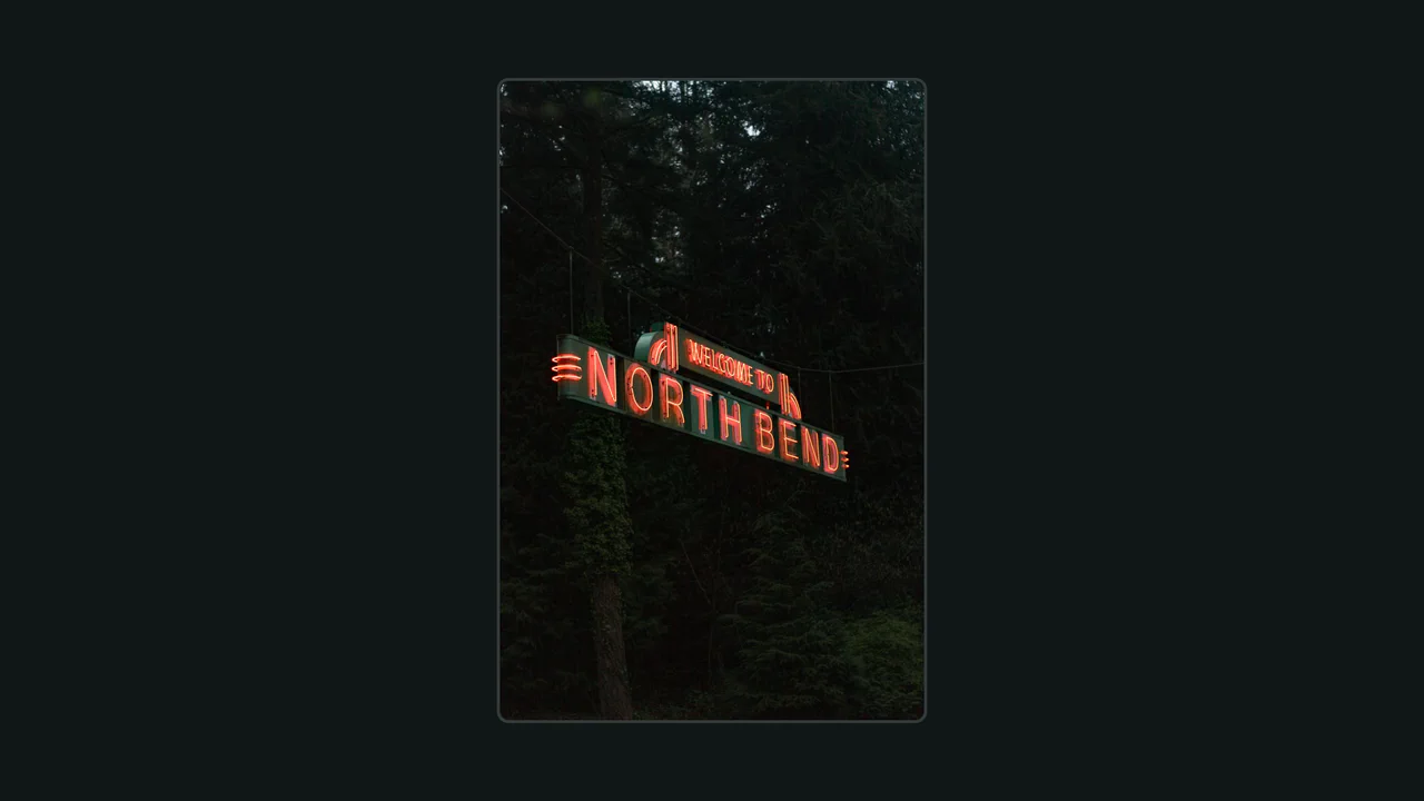
CSS Turbulent Hover Effect
Check out this interactive card that uses an animated SVG filter to create a unique “glitch” or “noise” effect on hover. The effect is triggered purely by CSS :hover and SVG’s declarative animation, combining feTurbulence with an animated feDisplacementMap for a seamless distortion.
See the Pen CSS Turbulent Hover Effect.

Splitting.js Image Hover Effect
This demo shows how modern CSS can power rich interactions. It combines Splitting.js and advanced CSS Grid with dynamic custom properties to create a complex, performant, and responsive image hover effect.
See the Pen Splitting.js Image Hover Effect.
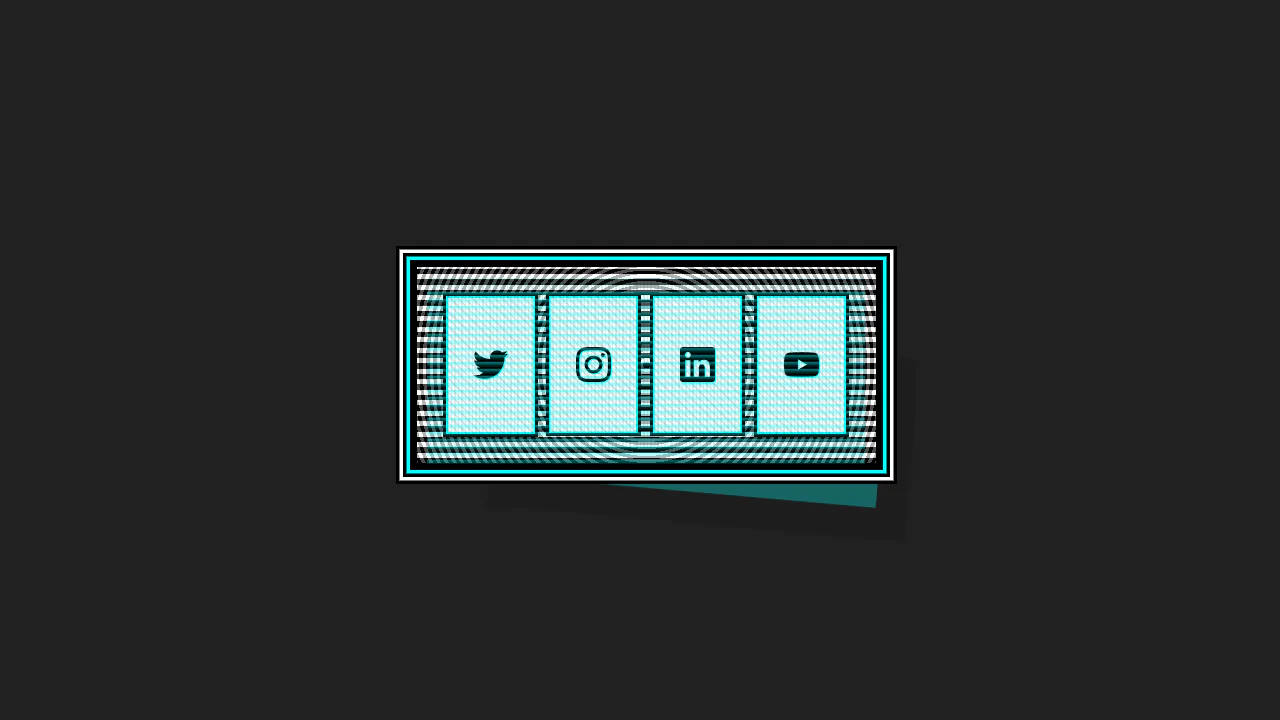

This Cyberpunk-inspired card features a complex box-shadow offset and text-shadow for the core CRT aesthetic, paired with a dynamic :hover state that uses transform to instantly swap the terminal view for a social icon grid.
Skateboard Product Grid
This demo showcases a responsive grid built on modern CSS technologies: CSS Grid for layout, Custom Properties for centralized theme management, and Fluid Typography using clamp() for ’elastic’ font sizes. The key feature is a complex animation system, including a staggered appearance of cards and advanced :hover effects using animated SVG.
See the Pen Skateboard Product Grid.
The Intention of :hover
This component builds an interactive hover-intent demonstrator by linking GUI configuration nodes to dynamic CSS transform-origin alignments and a View Transitions bloom animation. The logic drives a responsive text-inverting ::after pseudo-element with mix-blend-mode: difference that scales on hover, optionally injecting a brief intentional delay to optimize cursor path traversal. Because the transition states and the circular theme clipping rely on hardware-accelerated transforms and clip-paths, the interface retains fluid composited performance while offering high-fidelity, educational user feedback.
See the Pen The Intention of :hover.
Fanned Cards with Hover Effect
This component implements an interactive playing card fan simulator by combining CSS grid column resizing with index-based custom properties. The structural logic collapses container nodes via zero-width columns, while fanning out pseudo-elements radially using bottom-anchored rotations and a CSS auto-increment counter to generate card values. On hover, the grid columns expand to separate the cards, while targeting a card resets its angle and translates it upward. This interaction is highly performant since the primary hover dynamics rely on GPU-accelerated transforms, delivering tactile and physically natural feedback.
See the Pen Fanned Cards with Hover Effect.
Gummy Buttons
A “gummy” button animation in pure CSS, where the effect is achieved by simultaneously animating transform: scale() and border-radius. Separate @keyframes are used for the :hover and :active states, creating a unique tactile response.
See the Pen Gummy Buttons.
Button
The main button has a semi-transparent background, the ::before pseudo-element contains the animated gradient, and ::after has a solid dark background that “cuts out” the inner part, leaving only the border visible.
See the Pen Button.
Vinyl Albums
This component builds an interactive, skeuomorphic vinyl record album cover using modular CSS gradients and lightweight JavaScript to synchronize sleeve and record label artwork. The structural logic leverages repeating-radial-gradient for physical vinyl grooves and dual conic-gradient layers to simulate realistic ambient light reflections, executing a sliding rotation transition on hover. Because the kinetic sliding and spinning animations rely entirely on GPU-composited transform properties, the interface maintains exceptional framerates while providing a highly tactile, physical user experience.
See the Pen Vinyl Albums.
Rainbow Stacked Accordion Animation
Multiple box-shadow layers with negative spread create the illusion of stacked paper. On hover, the card shifts diagonally while shadows collapse to zero offset — the layers appear to align. CSS custom properties keep the color scheme maintainable.
See the Pen Rainbow Stacked Accordion Animation.
The badge uses background: rgba() and backdrop-filter: blur(10px) to create a translucent, frosted look. A double layer with ::before adds depth and enhances the blur effect.
An interactive hover animation that separates elements in 3D space. On container hover, one element animates with transform: rotateX(70deg), while another gets a grow animation, creating an effect of depth and dynamism.
CSS Only Cool Hover Effect
This component implements an interactive marquee-style border directly on raster images by shifting oversized gradient textures mapped via local custom properties. Structurally, the CSS calculates padding offsets directly on the img element to house the background, drawing four separate repeating linear-gradient segments as a unified, non-wrapping frame. On hover, transitioning a shared positional variable (--_p) shifts the oversized gradient coordinates to produce a synchronized crawling border animation while smoothly removing a grayscale filter. Because these interactions avoid layout-disrupting property mutations, the browser renders the marquee effect and filter transition with optimal GPU compositing efficiency.
See the Pen CSS Only Cool Hover Effect.
Clock Wipe Transition
This component implements a cinematic “clock wipe” scene transition by leveraging CSS Houdini to register and animate a typed custom angle property within a multi-layer mask. Structurally, the interaction overlay uses dual conic-gradient masks on the primary transitioning layer — one executing a soft-edged rotating clip and the other securing a seamless start-point overlap — alongside an analytical split-frame visualizer. Because the transition is powered by Houdini variable interpolation on the compositor thread, it eliminates layout paint cycles and JavaScript overhead, delivering fluid, hardware-accelerated cinematic feedback.
See the Pen Clock Wipe Transition.