4 CSS hue-rotate() Examples
The hue-rotate() function enables dynamic color manipulation without modifying source assets. This updated collection of CSS hue-rotate() examples provides a direct path to implement rainbow cycles, theme toggles, and reactive UI states. Using these snippets ensures consistent brand application across various elements by shifting the color wheel degrees natively in the browser. Logic replaces static files.
The logic relies on the CSS filter property. By offloading color calculations to the GPU through hardware acceleration, the code achieves fluid 60fps performance. This method preserves layout stability since visual filters occur during the paint stage without affecting the HTML document flow. From simple icons to complex backgrounds, these free snippets keep the DOM lightweight and optimized for modern rendering engines.
Every demo in this collection is fully responsive and cross-browser compatible. Users can instantly download the source code or fork a specific logic pattern on CodePen. These design assets are ready for production, providing a transparent and efficient way to handle color-shifting interactions on all modern devices where the technology serves the content directly.
Examples
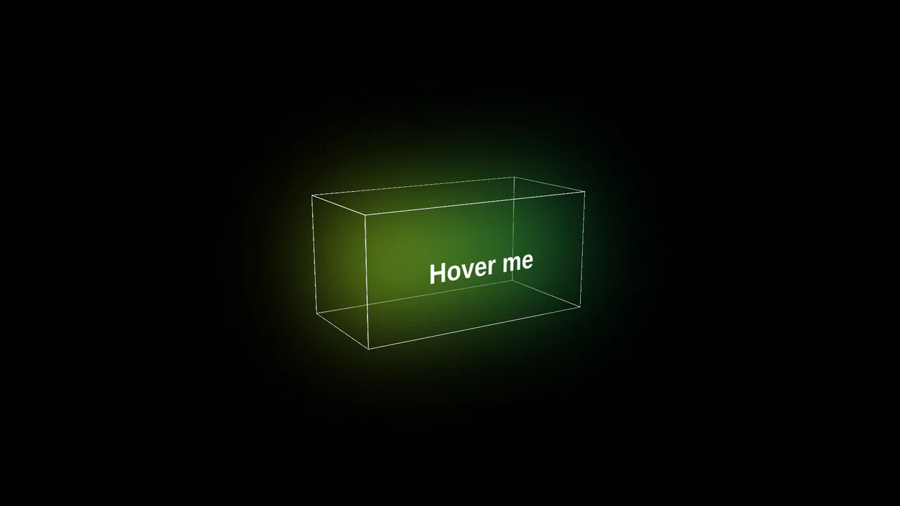
3D Glowing Button with CSS
A futuristic 3D button constructed from CSS-transformed planes to form a cube. JavaScript tracks mouse movement to apply dynamic rotateX/Y transforms for a tilt effect, while CSS keyframes animate a neon gradient glow and blur that activates on hover.
See the Pen 3D Glowing Button with CSS.
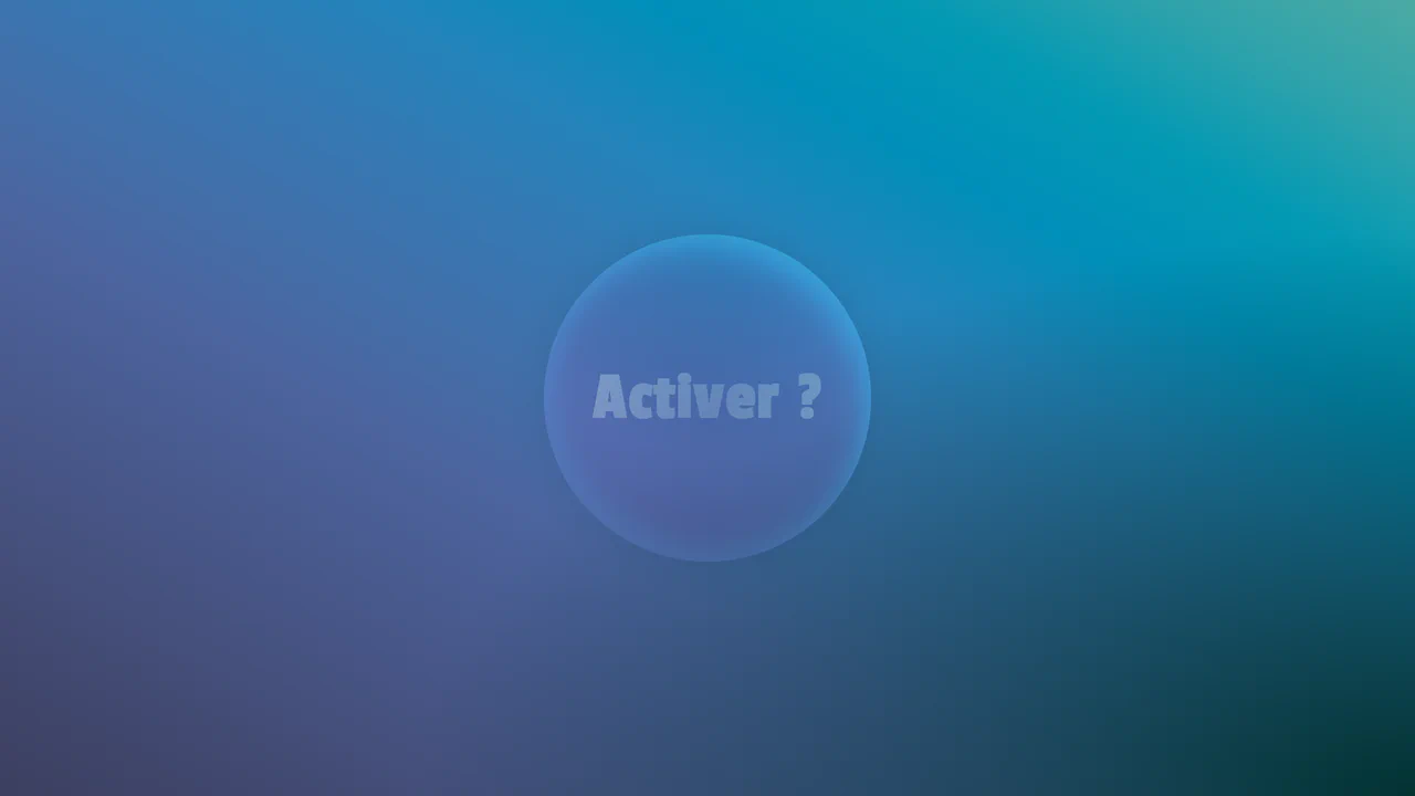
Organic Button
A mesmerizing, organic UI element that feels alive and constantly shifting, engaging the user in a visual experiment.
See the Pen Organic Button.

Change Bass Color with Hue
A simple example of media control - a click event in vanilla JS is used both to control the HTML5 Audio API and to dynamically change the hue-rotate CSS filter.
See the Pen Change Bass Color with Hue.
Animated Squiggly Border Glow Cards
A card with a neon border effect where two CSS animations are synchronized - stroke-dashoffset for the SVG frame and hue-rotate for the drop-shadow glow. Each card gets a unique theme via :nth-child and the --cardAccent CSS variable, while multi-layering with z-index positions the glow underneath the main content.
See the Pen Animated Squiggly Border Glow Cards.