50+ CSS Icons and Icon Sets
The Pure CSS Icon Examples collection showcases how symbol systems function through CSS geometry. Shapes built from borders and gradients eliminate SVG dependencies — reducing file size and enabling instant theme switching between concept and deployment.
Icons use border techniques to construct geometric shapes: circles via border-radius: 50%, triangles through border color manipulation, and complex symbols via clip-path polygons. Pseudo-elements (::before, ::after) layer multiple shapes without markup overhead; transform rotates and scales components. CSS Custom Properties control icon size, stroke width, and color, enabling single-source theming across entire sets. Animation adds rotation, pulse, and fill effects; animation-delay staggers multi-element sequences. Conic-gradient and linear-gradient create fills and patterns; mask-image applies texture overlays.
Responsive design scales icons fluidly via calc() and em units, maintaining proportions at any size. Accessibility is native: semantic HTML ensures screen readers announce icon purpose. The collection includes free CodePen demos, downloadable code, and updated examples. Each snippet prioritizes Core Web Vitals — zero layout shift through fixed dimensions, hardware-accelerated transforms via will-change: transform, minimal repaints using contain: paint.
Every example works in modern browsers (Chrome, Firefox, Safari, Edge). Download, customize, deploy.
Examples
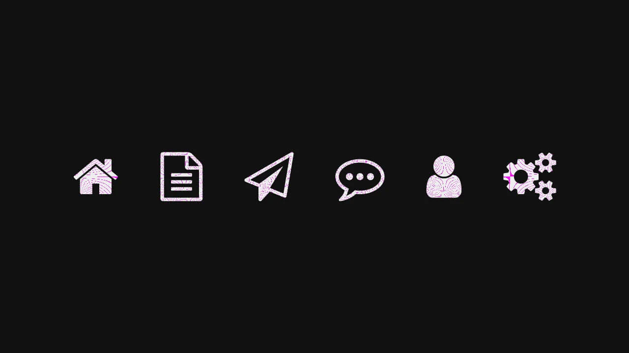
Micro-Animated SVG Icon Bar
Static icons are dead pixels; they occupy space but offer no soul. We believe that every interaction — no matter how small — is an opportunity to delight. This navigation bar transforms the mundane act of switching tabs into a tactile event. By embedding the animation logic directly into the SVG structure, we create a system that feels organic, responsive, and deeply crafted. It is not just about showing the user where they are; it is about rewarding them for arriving there.
 Chrome 60+
 Edge 79+
 Firefox 60+
 Safari 11+
See the Pen Micro-Animated SVG Icon Bar.

Skeuomorphic Retro Power Buttons
Skeuomorphic design meets modern web animation in these Windows XP-inspired power buttons. This component utilizes detailed CSS shadows to create a tactile 3D effect, paired with SVG path manipulation for playful micro-interactions upon interaction.
Chrome 80+
Edge 80+
Firefox 75+
Safari 13.1+
See the Pen Skeuomorphic Retro Power Buttons.
Arrow Animations (CSS-Only Icon)
This highly reusable CSS-only icon features complex bidirectional animation and a ripple effect, achieved by leveraging CSS Custom Properties for state and using a minimal JavaScript cloning trick to instantly restart the animation on click.
See the Pen Arrow Animations (CSS-Only Icon).
Scroll Down Icon Animation
Intuitive visual cues prompting the user to take action (scroll), executed in a minimalist style.
See the Pen Scroll Down Icon Animation.
A trash bin icon built with CSS – each part is absolutely positioned and transforms on hover. The lid opens, the bin tilts, and a crumpled piece of paper slides out.
A 3×3 grid of emojis, each with a blurred duplicate behind — creating a soft glow effect. The markup is generated with a simple loop; the styling uses absolute positioning and CSS filters. No interaction, purely decorative.
A pure‑CSS plant icon – the base is a CSS triangle, the leaves are built from rotated shapes with inset shadows. The backdrop‑filter adds a subtle glassmorphism effect.
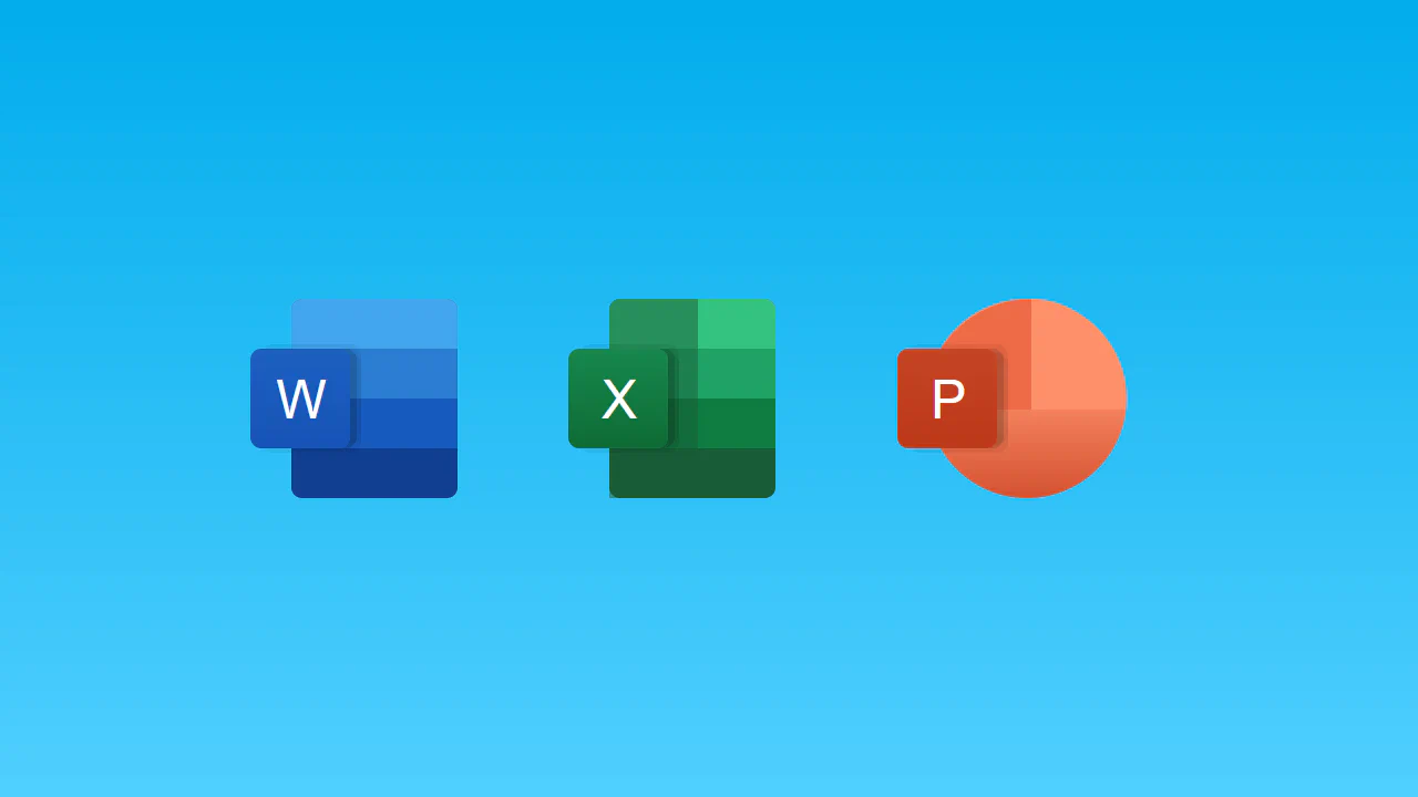
Three app icons built with nested absolutely positioned divs. Word and Excel share a similar stacked‑layer structure, while PowerPoint is a circle with separate top halves. SCSS variables keep colors consistent, but the layout is rigid — everything is manually positioned.
This is a large CSS icon system built with SCSS. It uses nested selectors, extends, and mixins to create dozens of detailed interface components (browsers, devices, gears, etc.) with synchronized animations. The markup is generated with Pug loops, keeping the HTML DRY, but the CSS is heavily nested and tightly coupled to the HTML structure.
Four Font Awesome icons are styled with multiple layered box‑shadows and text‑shadows to create a glowing, 3D appearance. A continuous hue‑rotate animation cycles each icon through the full color spectrum, with staggered delays for a sequential effect. The design is purely visual; no JavaScript or interactivity is involved.
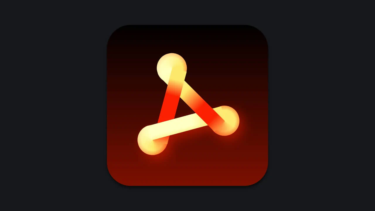
A pure‑CSS stylized letter “A” built from multiple absolutely positioned <div> elements. Complex gradients, transforms, and clip‑paths create a three‑dimensional, neon‑like appearance.
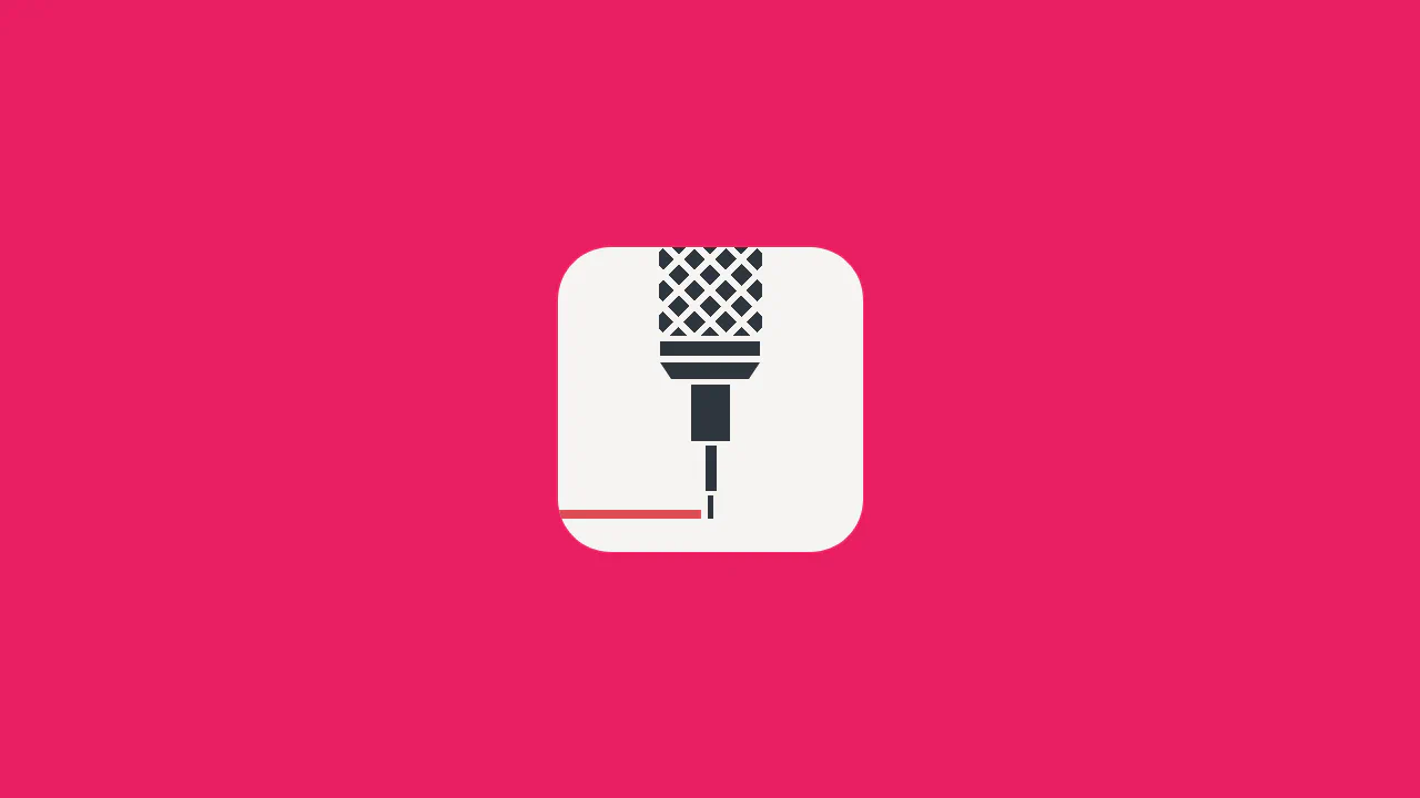
A single‑element printer icon built with pseudo‑elements and nested divs. The paper sheet animates continuously with a subtle 3D rotation; the animation pauses on hover.