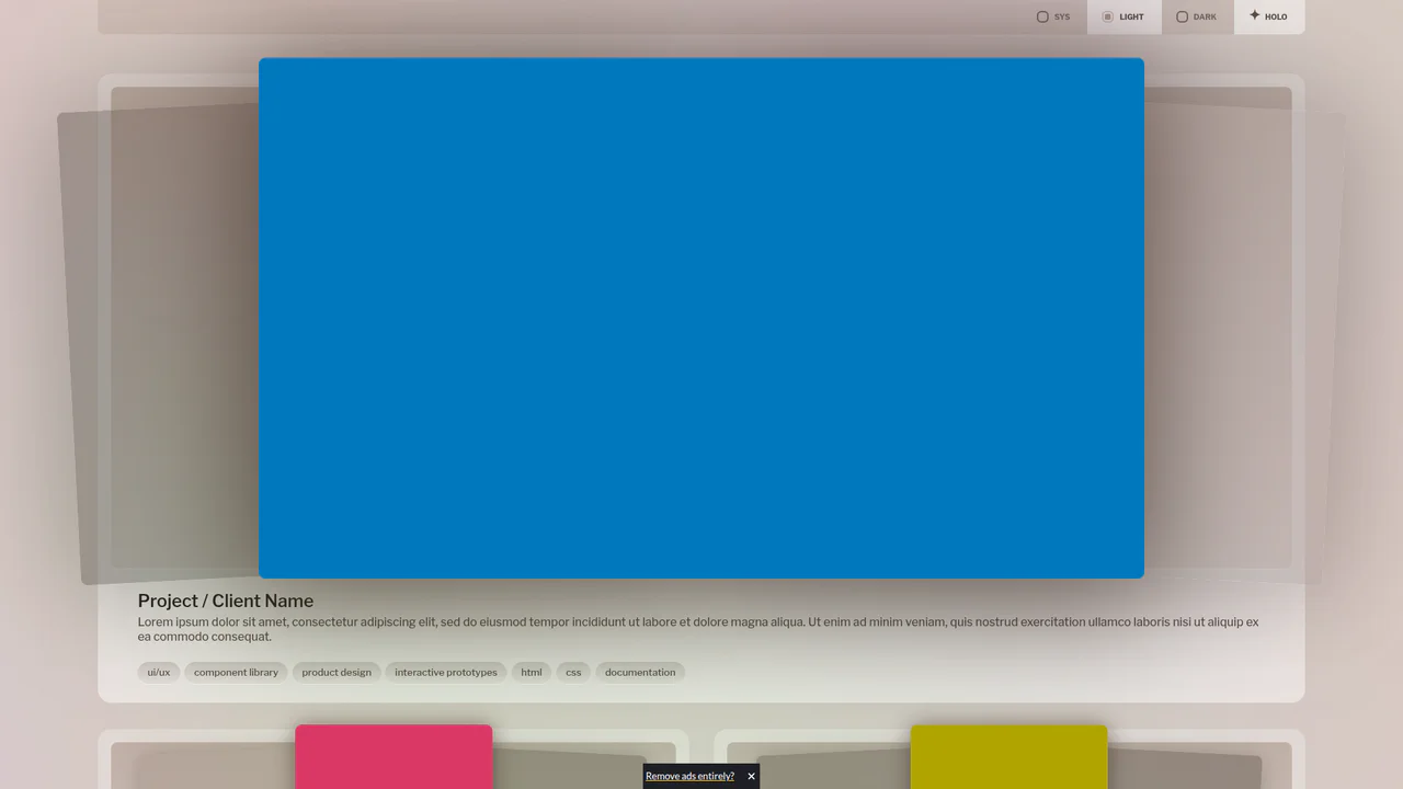
<header class="settings">
  <fieldset id="color-scheme">
    <label for="system" tabindex="0">
      <input id="system" type="radio" name="theme" value="system" checked="checked"/>				<span>Sys</span>
    </label>
    <label for="light" tabindex="0">
      <input id="light" type="radio" name="theme" value="light"/>				<span>Light</span>
    </label>
    <label for="dark" tabindex="0">
      <input id="dark" type="radio" name="theme" value="dark"/>				<span>Dark</span>
    </label>
    <label for="holo" tabindex="0">
      <input id="holo" type="checkbox" name="theme" value="holo" checked="checked"/>				<span>Holo</span>
    </label>
  </fieldset>
</header>
<div class="project-container">
  <div class="project project--3 full">
    <div class="preview-container">
      <picture tabindex="0">
        <div class="bg red" alt="fakeCap"></div>
      </picture>
      <picture tabindex="0">
        <div class="bg blue" alt="fakeCap"></div>
      </picture>
      <picture tabindex="0">
        <div class="bg green" alt="fakeCap"></div>
      </picture>
    </div>
    <div class="content-container">
      <hgroup>
        <h1>Project / Client Name</h1>
        <p>Lorem ipsum dolor sit amet, consectetur adipiscing elit, sed do eiusmod tempor incididunt ut labore et dolore magna aliqua. Ut enim ad minim veniam, quis nostrud exercitation ullamco laboris nisi ut aliquip ex ea commodo consequat.</p>
      </hgroup>
      <ul class="tag-container">
        <li class="tag design">ui/ux</li>
        <li class="tag design">component library</li>
        <li class="tag design">product design</li>
        <li class="tag dev">interactive prototypes</li>
        <li class="tag dev">html</li>
        <li class="tag dev">css</li>
        <li class="tag dev">documentation</li>
      </ul>
    </div>
  </div>
  <div class="project project--1">
    <div class="preview-container">
      <picture tabindex="0">
        <div class="bg green" alt="fakeCap"></div>
      </picture>
      <picture tabindex="0">
        <div class="bg red" alt="fakeCap"></div>
      </picture>
      <picture tabindex="0">
        <div class="bg blue" alt="fakeCap"></div>
      </picture>
    </div>
    <div class="content-container">
      <hgroup>
        <h1>Project / Client Name</h1>
        <p>Lorem ipsum dolor sit amet, consectetur adipiscing elit, sed do eiusmod tempor incididunt ut labore et dolore magna aliqua. Ut enim ad minim veniam, quis nostrud exercitation ullamco laboris nisi ut aliquip ex ea commodo consequat.</p>
      </hgroup>
      <ul class="tag-container">
        <li class="tag design">ui/ux</li>
        <li class="tag design">component library</li>
        <li class="tag design">a11y auditing</li>
        <li class="tag design">wcag conformance</li>
        <li class="tag dev">interactive prototyping</li>
        <li class="tag dev">html</li>
        <li class="tag dev">css</li>
        <li class="tag dev">documentation</li>
      </ul>
    </div>
  </div>
  <div class="project project--2">
    <div class="preview-container">
      <picture tabindex="0">
        <div class="bg blue" alt="fakeCap"></div>
      </picture>
      <picture tabindex="0">
        <div class="bg green" alt="fakeCap"></div>
      </picture>
      <picture tabindex="0">
        <div class="bg red" alt="fakeCap"></div>
      </picture>
    </div>
    <div class="content-container">
      <hgroup>
        <h1>Project / Client Name</h1>
        <p>Lorem ipsum dolor sit amet, consectetur adipiscing elit, sed do eiusmod tempor incididunt ut labore et dolore magna aliqua. Ut enim ad minim veniam, quis nostrud exercitation ullamco laboris nisi ut aliquip ex ea commodo consequat.</p>
      </hgroup>
      <ul class="tag-container">
        <li class="tag design">ui/ux</li>
        <li class="tag design">component library</li>
        <li class="tag design">wcag conformance</li>
        <li class="tag dev">interactive prototyping</li>
        <li class="tag dev">html</li>
        <li class="tag dev">css</li>
        <li class="tag dev">documentation</li>
      </ul>
    </div>
  </div>
</div>
@property --1-holo-pos {
  syntax: "<percentage>+";
  inherits: true;
  initial-value: 100% 0%;
}

@property --2-holo-pos {
  syntax: "<percentage>+";
  inherits: true;
  initial-value: 0% 100%;
}

:root {
	--scheme-light: light;
	--scheme-dark: dark;
	--color-scheme: var(--scheme-light) var(--scheme-dark);
	color-scheme: var(--color-scheme);

	--primary--h: 25;
	--primary--s: 30%;
	--primary--l: 50%;

	--primary-000: var(--primary--h) var(--primary--s) 2.5%;
	--primary-005: var(--primary--h) var(--primary--s) 6%;
	--primary-010: var(--primary--h) var(--primary--s) 12%;
	--primary-020: var(--primary--h) var(--primary--s) 20%;
	--primary-030: var(--primary--h) var(--primary--s) 30%;
	--primary-040: var(--primary--h) var(--primary--s) 40%;
	--primary-050: var(--primary--h) var(--primary--s) 50%;
	--primary-060: var(--primary--h) var(--primary--s) 60%;
	--primary-080: var(--primary--h) var(--primary--s) 80%;
	--primary-070: var(--primary--h) var(--primary--s) 70%;
	--primary-090: var(--primary--h) var(--primary--s) 90%;

	--secondary--h: 206;
	--secondary--s: 12%;
	--secondary--l: 50%;

	--secondary-000: var(--secondary--h) var(--secondary--s) 2.5%;
	--secondary-005: var(--secondary--h) var(--secondary--s) 6%;
	--secondary-010: var(--secondary--h) var(--secondary--s) 12%;
	--secondary-020: var(--secondary--h) var(--secondary--s) 20%;
	--secondary-030: var(--secondary--h) var(--secondary--s) 30%;
	--secondary-040: var(--secondary--h) var(--secondary--s) 40%;
	--secondary-050: var(--secondary--h) var(--secondary--s) 50%;
	--secondary-060: var(--secondary--h) var(--secondary--s) 60%;
	--secondary-080: var(--secondary--h) var(--secondary--s) 80%;
	--secondary-070: var(--secondary--h) var(--secondary--s) 70%;
	--secondary-090: var(--secondary--h) var(--secondary--s) 90%;

	--bg: light-dark( hsl(var(--primary-080)), hsl(var(--secondary-010)) );

	--spacer-x: 1.75dvw;
	--spacer-y: 18px;

	--spacer: min(var(--spacer-x), var(--spacer-y));

	--radius-min: 3cqi;
	--radius-001: min(var(--radius-min), 18px);
	--radius-002: calc( var(--radius-001) / 2 );
}

.project-container {
	--col-w--min: calc(max(390px, 50cqw) - var(--spacer-x));

	container: project-container / inline-size;
	display: grid;
	grid-template-columns:
		repeat(
			auto-fit,
			minmax( min( var(--col-w--min), 100% ), 1fr )
		)
	;
	gap: calc(var(--spacer-y) * 2) var(--spacer-x);
	margin: 0 auto;
}

.project {
	--preview-x: var(--x-init);

	background:
		linear-gradient(
			light-dark( hsl(var(--primary-090) / .5), hsl(var(--secondary-020) / 1) ),
			light-dark( hsl(var(--primary-090) / 1), hsl(var(--secondary-040) / 1) )
		)
	;
	border-radius: var(--radius-001);

	container: project / inline-size;

	display: grid;
	grid-template-rows: auto 1fr;
	align-content: start;
	min-height: 50cqh;

	&:not(.full) {
		--x-init: 6cqw;
		--x-hover: -1cqw;

		.preview-container {
			picture {
				aspect-ratio: 9/16;
				height: 100cqh;

				&:nth-of-type(2) {
					height: 110cqh;
				}
			}
		}
	}

	&.full {
		--x-init: 2cqw;
		--x-hover: -4cqw;
		grid-column: 1 / -1;

		.preview-container {
			picture {
				aspect-ratio: 16/9;
				height: 100cqh;

				&:nth-of-type(2) {
					height: 110cqh;
					width: 75%;
					position: absolute;
				}
			}
		}
	}
}

.preview-container {
	border-radius: var(--radius-002);

	container: preview-container / size;

	display: flex;
	align-items: center;
	justify-content: center;

	margin: var(--spacer) var(--spacer) 0 var(--spacer);
	padding: calc(var(--spacer) / 3);

	min-height: 150px;
	height: 60cqw;
	max-height: 60dvh;

	transition-property: height;
	transition-duration: .3s;
	transition-timing-function: ease-out;

	will-change: height;

	position: relative;

	&:before {
		background: linear-gradient(
			light-dark( hsl(var(--primary-070)), hsl(var(--secondary-010) / .75) ),
			light-dark( hsl(var(--primary-080) / .5), hsl(var(--secondary-020) / .35) )
		);

		border-bottom:
			1px
			solid
			light-dark(
				hsl(var(--primary--h) var(--primary--s) 95% / 1),
				hsl(var(--secondary-060) / .45)
			)
		;
		border-radius: inherit;
		opacity: 1;

		content: "";
		inset: 0;
		position: absolute;
	}

	picture {
		--height-init: 100cqh;
		--height: var(--height-init);
		--shadow-blur: 4cqw;
		--shadow-spread: 0;
		--shadow-y: .25cqh;
		--translateY: 1.25cqh;

		border-radius: var(--radius-002);
		box-shadow:
			0
			var(--shadow-y)
			var(--shadow-blur)
			var(--shadow-spread)

			if(
				style(--color-scheme: var(--scheme-light)): hsl( var(--primary-020) / var(--shadow-opacity, 60%) );
				not style(--color-scheme: var(--scheme-light)): hsl( var(--secondary-010) / var(--shadow-opacity, 75%) );
			)
		;

		container: picture / size;
		display: grid;
		place-content: start;
		min-height: 0;

		overflow: hidden;

		translate: var(--translateX, 0) var(--translateY);

		transition-property: box-shadow, filter, opacity, rotate, translate, width;
		transition-duration: .3s;
		transition-timing-function: ease-in-out;

		position: relative;

		/* stack <picture> contents */
		* { grid-area: 1 / 1;	}

		img {
			border-radius: inherit;
			pointer-events: none;
			user-select: none;
			width: 100cqw;

			&.fill {
				all: initial;
				object-fit: cover;
			}
		}

		.project:has(:hover, :focus) & {
			--preview-x: var(--x-hover);

			--shadow-blur: 25cqh;
			--shadow-spread: 3cqh;
			--shadow-opacity: if(
					style(--color-scheme: var(--scheme-light)): 70%;
					not style(--color-scheme: var(--scheme-light)): 100%;
				)
			;
			filter: unset;
			mix-blend-mode: unset;
		}

		/* inactive state */
		.preview-container:has(:hover) &:not(:hover),
		&:first-of-type,
		&:last-of-type {
			mix-blend-mode: luminosity;
			filter:
				grayscale(100%)
				if(
					style(--color-scheme: var(--scheme-light)): opacity(50%);
					not style(--color-scheme: var(--scheme-light)): brightness(60%) opacity(80%);
				)
			;

			&:focus,
			&:hover {
				filter: unset;
				mix-blend-mode: unset;
				opacity: 1;
				rotate: 0deg;
				z-index: 600;
			}
		}

		&:nth-of-type(1) {
			--translateX: var(--preview-x);
			rotate: if(
				media(width > 750px): -3deg;
				media(width > 480px): -2deg;
				else: 0deg
			);
		}

		&:nth-of-type(2) {
			--translateY: -1.25cqh;
			scale: 1;
			z-index: 500;

			&:hover {
				--translateY: -2cqh;
			}
		}

		&:nth-of-type(3) {
			--translateX: calc(var(--preview-x) * -1);
			rotate: if(
				media(width > 750px): 3deg;
				media(width > 480px): 2deg;
				else: 0deg
			);
		}

		&:focus {
			outline: 6px solid #ffc32c;
			outline-offset: 3px;
		}

		&.scrollable {
			cursor: ns-resize;
			overflow-y: auto;
			scrollbar-width: none;
		}

		&:focus,
		&:hover {
			--shadow-blur: 15cqh;
			--shadow-spread: 1cqh;
			--shadow-opacity: 50%;
			--shadow-y: 3cqh;
			--translateY: 0;
			mix-blend-mode: initial;
		}
	}
}

@media (orientation: portrait) {
	.preview-container {
		max-height: 360px;
	}
}

@media (max-width: 880px) {
	.preview-container {
		max-height: 720px;
	}
}

.content-container {
	display: grid;
	gap: 1lh;
	color: light-dark( hsl(var(--primary-030)), hsl(var(--secondary-080) / 1) );
	padding: 3ex min(6%, calc(var(--spacer) * 3));

	hgroup {
		display: grid;
		gap: .5ex;
		margin-block: .5ex;

		h1 {
			color: light-dark( hsl(var(--primary-010)), hsl(var(--secondary--h) var(--secondary--s) 95% / 1) );
			font-size: clamp(1.1rem, 5cqw, 1.5rem);
			font-weight: 550;
		}

		p {
			font-size: clamp(0.85rem, 5cqw, 1rem);
			font-weight: 460;
			line-height: 2.4ex;
		}
	}
}

.tag-container {
	display: flex;
	flex-wrap: wrap;
	gap: .5ch;
	list-style: none;

	li.tag {
		border-radius: 60px;
		background: linear-gradient(
			light-dark( hsl(var(--primary-030) / .2), hsl(var(--secondary-020) / .81) ),
			light-dark( hsl(var(--primary-040) / .05), hsl(var(--secondary-020) / .36) )
		);

		border-bottom:
			1px
			solid
			light-dark(
				hsl(var(--primary--h) var(--primary--s) 95% / 1),
				hsl(var(--secondary-060) / .65)
			)
		;

		display: flex;
		align-items: center;
		text-box: trim-both ex alphabetic;
		font-size: 84%;
		font-weight: 500;
		height: 29px;
		padding-inline: 1.45ch;
		padding-bottom: .18ex;
		user-select: none;
		white-space: nowrap;
		overflow-x: hidden;
		text-overflow: ellipsis;
	}
}

/* Demo Resets */
* { font-family: inherit; margin: 0; padding: 0; }

html {
	background: var(--bg);
	height: 100%;
	transition: all .45s ease-out;

	&:has(#color-scheme input[value="dark"]:checked) {
		--color-scheme: var(--scheme-dark);
	}

	&:has(#color-scheme input[value="light"]:checked) {
		--color-scheme: var(--scheme-light);
	}

	&:has(#color-scheme input[value="holo"]:checked) {
		body {
			&:before {
				background:
					radial-gradient(
						circle at var(--1-holo-pos) in hsl longer hue,
						oklch(100% 0 80 / .75),
						oklch(90% 0.1 300 / .75)
					),
					radial-gradient(
						circle at var(--2-holo-pos) in hsl longer hue,
						oklch(90% 0.1 70 / .75),
						oklch(90% 0.1 370 / .75)
					),
					radial-gradient(
						rgba(168, 169, 174),
						rgba(165, 174, 216)
					)
				;
				background-blend-mode: plus-lighter, plus-darker, overlay;
				animation-name: holo-anim;
				animation-duration: 3s;
				animation-iteration-count: infinite;
				animation-timing-function: ease-in-out;
				animation-direction: alternate;
				mix-blend-mode: color;
				opacity: .5;
				user-select: none;
				pointer-events: none;
				position: absolute;
				inset: 0;
				content: "";
				z-index: 10;
			}
		}
	}
}

body {
	container: body / inline-size;
	font-family: "Libre Franklin";
	padding: 0 calc(var(--spacer-x) * 4) calc(var(--spacer-y) * 4);
	overflow-x: hidden;
	position: relative;
}

@keyframes holo-anim {
	to {
		--1-holo-pos: -50% 30%;
		--2-holo-pos: 60% 150%;
	}
}

header.settings {
	--header-border--w: 1px;
	border-radius: var(--radius-002);
	corner-shape: square square round round;
	overflow: clip;
	display: grid;
	justify-content: end;
	margin-bottom: calc(var(--spacer-y) * 3);
	background: light-dark(
		hsl(var(--primary-070) / .5),
		hsl(var(--secondary-005) / .5)
	);
	color: light-dark(
		hsl(var(--primary-090)),
		hsl(var(--secondary-010))
	);

	fieldset {
		border: 0;
		margin: 0;
		padding: 0;
	}

	label {
		cursor: pointer;
		display: flex;
		align-items: center;
		font-weight: 720;
		user-select: none;
	}
}

fieldset[id="color-scheme"] {
	display: flex;
	flex-wrap: wrap;

	label {
		--gap: 1.25ch;
		color: light-dark(
			hsl(var(--primary-030) / 0.75),
			hsl(var(--secondary-060) / 0.75)
		);
		flex: 1;
		font-size: 1.25ex;
		margin: 0;
		padding: 3ex 1.5rem;
		text-transform: uppercase;

		input {
			color: inherit;
			appearance: none;
			border-radius: 2px;
			outline: 2px solid currentColor;
			outline-offset: 2px;
			height: 0.5rem;
			width: 0.5rem;
			transition-property: outline, background;
			transition-duration: .15s;
			transition-timing-function: ease-out;

			&:checked {
				background: light-dark(
					hsl(var(--primary-060)),
					hsl(var(--secondary-010))
				);
				outline-color: light-dark(
					hsl(var(--primary-060) / .5),
					hsl(var(--secondary-010) / .5)
				);
			}
		}

		span {
			margin-left: 0.75rem;
		}

		&:hover {
			background: light-dark(
				hsl(var(--primary-090)),
				hsl(var(--secondary-010))
			);
			color: light-dark(
				hsl(var(--primary-040)),
				hsl(var(--secondary-090))
			);

			input {
				outline-color: currentColor;
				&:checked {
					background: currentColor;
				}
			}
		}

		&:has(input:checked) {
			background: light-dark(
				hsl(var(--primary-090)),
				hsl(var(--secondary-050))
			);
			color: light-dark(
				hsl(var(--primary-030)),
				hsl(var(--secondary-010))
			);
		}

		&[for="holo"] {
			--icon-unchecked: "✧";
			--icon-checked: "✦";
			--icon-opacity: .5;
			position: relative;

			input {
				outline: 0;
				border: 0;
				width: 0;
			}

			span {
				margin-left: 1.15rem;
				&:before {
					content: var(--icon, var(--icon-unchecked));
					font-size: 1.2rem;
					opacity: var(--icon-opacity);
					position: absolute;
					left: 1.5ch;
					top: .75ex;
				}
			}

			&:has(:checked) {
				--icon: var(--icon-checked);
				--icon-opacity: 100%;
				input { background: none; }
			}
		}
	}
}

.bg {
	height: 100cqh;
	width: 100cqw;
}

.red { background: oklch(60% 50% 10deg); }
.blue { background: oklch(50% 60% 220deg); }
.green { background: oklch(70% 70% 110deg); }

@font-face {
	font-family: "Libre Franklin";
	src: url("https://assets.codepen.io/2392/LibreFranklin.ttf");
	font-style: normal;
	font-weight: 100 900;
}
 Chrome
 Edge
Edge