130+ CSS Illustrations
The Pure CSS Illustration Examples collection showcases how visual artwork functions through CSS geometry and animation. Illustrations built from shapes, gradients, and motion eliminate image dependencies — enabling scalable vector-like artwork with instant color theming and interactive animation capabilities.
Illustrations use radial-gradient and conic-gradient to construct organic forms and natural textures; clip-path polygons define character silhouettes and landscape features. Pseudo-elements layer multiple shapes for depth — shadows, highlights, and environmental details. Transform: rotate(), skew(), and scale() position elements in 3D space with perspective for dimensional effects. Animation drives movement—character walks, objects float, environments shift. CSS Custom Properties store color palettes, enabling instant theme switching across entire compositions. Filter effects (blur, brightness, saturate) add atmospheric depth and lighting.
Responsive design scales illustrations fluidly via em units and aspect-ratio containers, maintaining artistic proportions from mobile to desktop. Accessibility is native: semantic HTML ensures screen readers describe illustrated content. The collection includes free CodePen demos, downloadable code, and updated examples. Each snippet prioritizes Core Web Vitals — zero layout shift through fixed aspect ratios, hardware-accelerated transforms via will-change: transform, minimal repaints using contain: paint.
Every example works in modern browsers (Chrome, Firefox, Safari, Edge). Download, customize, deploy.
Examples
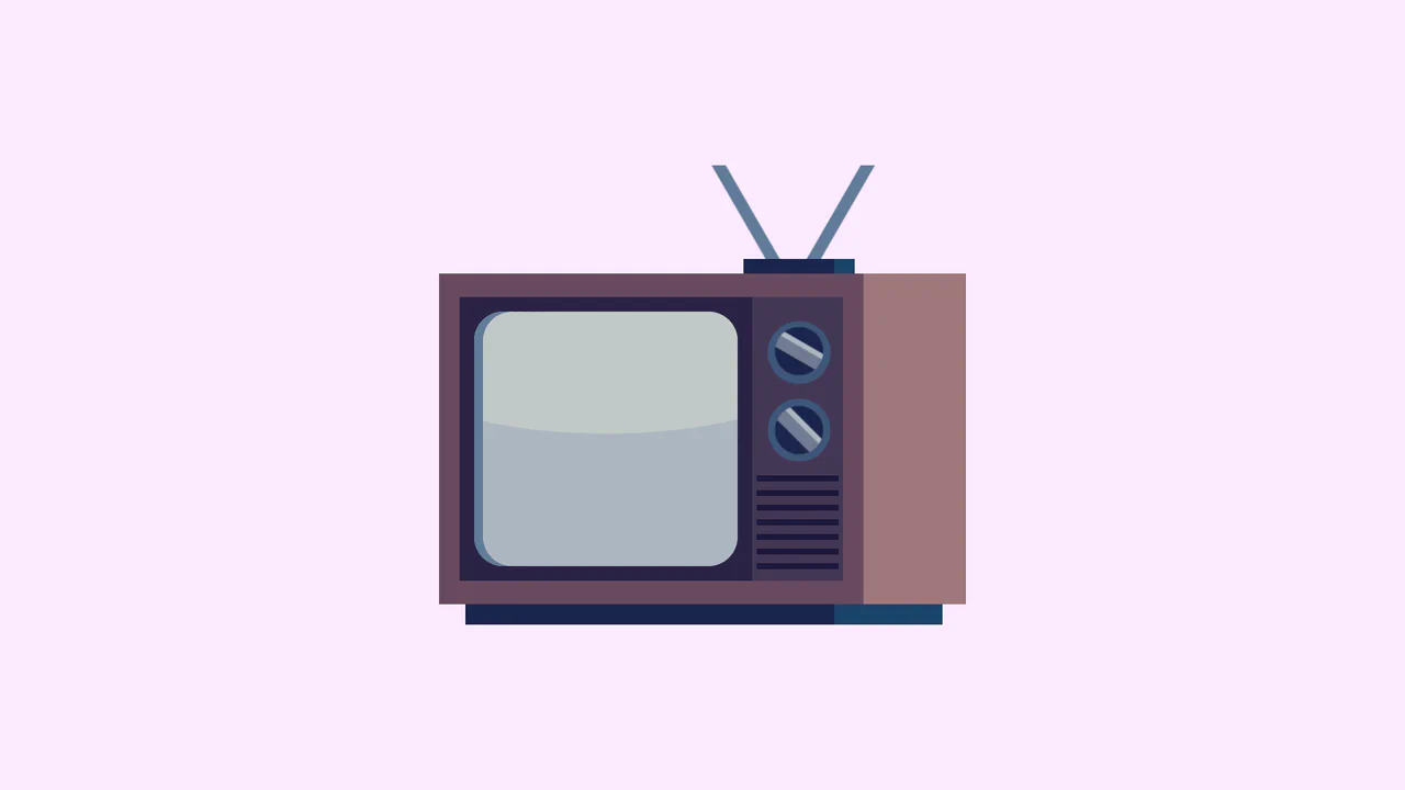
Single Div Vintage TV CSS Illustration
Single Div Vintage TV CSS Illustration is a masterclass in CSS gradient art. Using only one div and its ::before/::after pseudo-elements, it renders a retro television set. The body, screen, antenna, and speaker grill are meticulously drawn using layered linear-gradient, radial-gradient, and repeating-linear-gradient. The mask-image property is cleverly used to carve out the control knobs. A brilliant example of pushing CSS drawing to its limits.
 Chrome 53+
 Edge 79+
 Firefox 53+
 Safari 15.4+
See the Pen Single Div Vintage TV CSS Illustration.
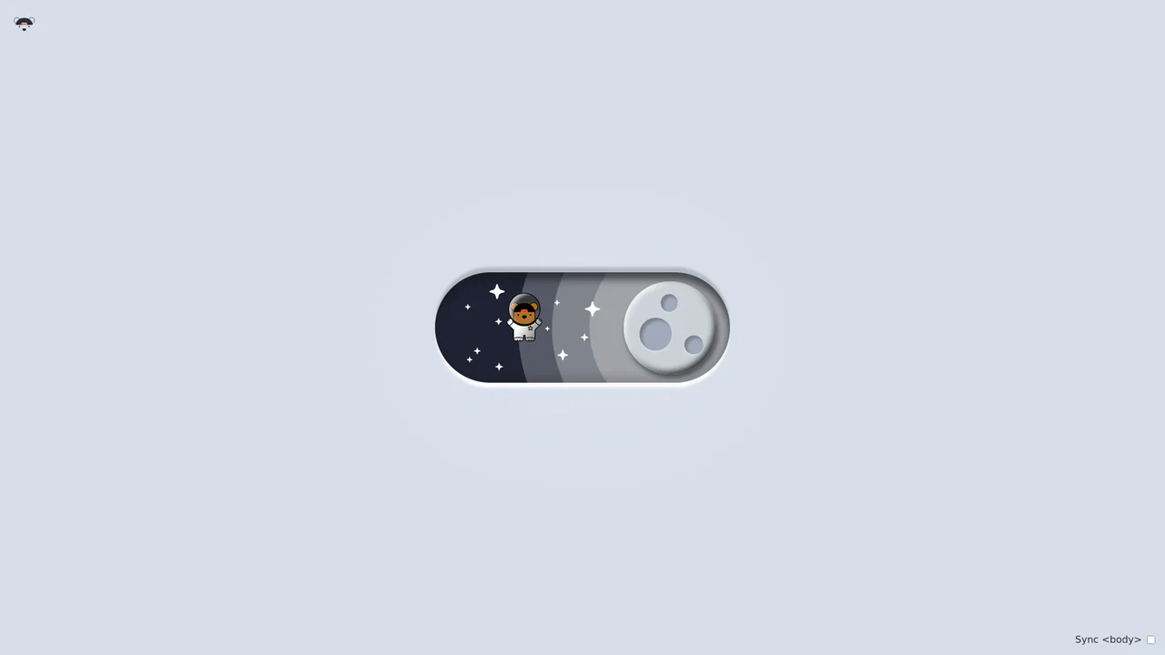
Bouncy Bear Theme Toggle Switch
Bouncy Bear Theme Toggle Switch relies on a clean, accessible HTML <button> to toggle an aria-pressed state, initiating a complex visual narrative that shifts between an aviator bear in light mode and an astronaut bear in dark mode. The animation utilizes modern CSS layout techniques including container-type queries, separate translate declarations, and a heavy-backwards cubic-bezier(.4,-0.3,.6,1.3) curve to achieve physical bounce. While structurally robust, the sheer volume of concurrently transitioning inline SVG paths and scaling stars can generate intensive layout recalculation spikes unless elements are actively isolated via hardware-promoted layers.
Chrome 105+
Edge 105+
Firefox 110+
Safari 16+
See the Pen Bouncy Bear Theme Toggle Switch.

Haunted Grandfather Clock
This is a Haunted CSS Grandfather Clock. It renders a highly detailed, thematic timepiece using only CSS shapes, set against an animated spooky background. Its function is to provide an immersive, real-time clock interface, replacing flat digital readouts with rich, analog spatial design.
Chrome 55+
Edge 79+
Firefox 54+
Safari 10+
See the Pen Haunted Grandfather Clock.
CSS Pixel Art Animation
This is a Pure CSS Pixel Art Animation. It renders a multi-frame character sequence (Guybrush Threepwood) using a single HTML <div>. Its function is to demonstrate extreme CSS capability and provide lightweight, scalable retro graphics without requiring external raster images or canvas rendering.
Chrome 26+
Edge 12+
Firefox 19+
Safari 6+
See the Pen CSS Pixel Art Animation.

Hover-Reactive Parrot Character
This is a Pure CSS Hover-Reactive Parrot Character. It replaces static image files with a resolution-independent, mathematically constructed drawing using only HTML div elements and CSS styling. Its function is twofold: to demonstrate advanced CSS geometry and to provide a delightful micro-interaction where hovering over the character triggers a frantic, animated “talking” state complete with comic-style curse words.
Chrome 88+
Edge 88+
Firefox 84+
Safari 14+
See the Pen Hover-Reactive Parrot Character.

Cute Animal Illustration
This is a Pure CSS Cute Animal Illustration. It replaces static image files (PNG/SVG) with a mathematical, resolution-independent drawing constructed entirely from DOM nodes. Its function is to showcase advanced CSS geometry and rendering capabilities, creating a highly scalable and lightweight visual asset without external HTTP requests.
Chrome 88+
Edge 88+
Firefox 84+
Safari 14+
See the Pen Cute Animal Illustration.

Pure CSS Retro Arcade Machine
This is a Pure CSS Retro Arcade Machine. It constructs a highly detailed, nostalgic gaming cabinet entirely out of HTML nodes and CSS styling. Its function is to showcase the power of CSS as an illustrative medium, replacing static raster images or SVGs with resolution-independent, scalable code.
Chrome 69+
Edge 79+
Firefox 83+
Safari 12.1+
See the Pen Pure CSS Retro Arcade Machine.

Skeuomorphic Chess Pawn
This is a Skeuomorphic CSS Chess Pawn. It replaces static raster images with a resolution-independent, pure code illustration. Its function is to demonstrate high-fidelity rendering capabilities within the DOM, utilizing native styling properties to fake three-dimensional geometry, light, and mass.
Chrome 26+
Edge 12+
Firefox 16+
Safari 7+
See the Pen Skeuomorphic Chess Pawn.

Pure CSS Animated Scorbunny
This Pure CSS Animated Scorbunny showcases the power of CSS as an illustration tool. Without a single SVG or image file, it constructs a recognizable character using nested divs, gradients, and advanced border-radius manipulation. The character feels alive thanks to continuous idle animations (blinking eyes, wiggling ears) and a joyful reaction when the user hovers over it.
Chrome 60+
Edge 79+
Firefox 55+
Safari 11+
See the Pen Pure CSS Animated Scorbunny.
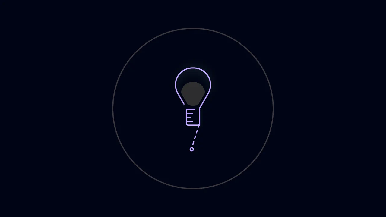
Interactive CSS Light Bulb Toggle
This Interactive CSS Light Bulb Toggle transforms a standard theme switch into a playful interaction. It creates a convincing illusion of a physical pull-cord using standard click events. Rather than using a complex physics engine, it relies on precise timing between mouse/touch events and CSS transforms to mimic the tension and release of a rope when the user clicks the button.
Chrome 80+
Edge 80+
Safari 13+
Firefox 70+
See the Pen Interactive CSS Light Bulb Toggle.

Blooming Night Garden Animation
This Blooming Night Garden Animation is a delightful example of “CSS Art,” where HTML elements are shaped into complex illustrations using code. It features a complete scene with a textured night sky, procedurally blooming flowers, swaying grass, and a particle system of floating hearts, all brought to life through choreographed CSS keyframes.
Chrome 100+
Edge 100+
Safari 14+
Firefox 90+
See the Pen Blooming Night Garden Animation.

Watermelon Themed Analog Clock
This Watermelon CSS Analog Clock transforms a standard timekeeping UI into a playful, summery vector illustration. By leveraging SCSS pre-processing for generative design and CSS Gradients for complex shapes, it reduces HTML markup while maintaining a vibrant, flat-design aesthetic.
Chrome 60+
Edge 79+
Firefox 55+
Safari 11+
See the Pen Watermelon Themed Analog Clock.
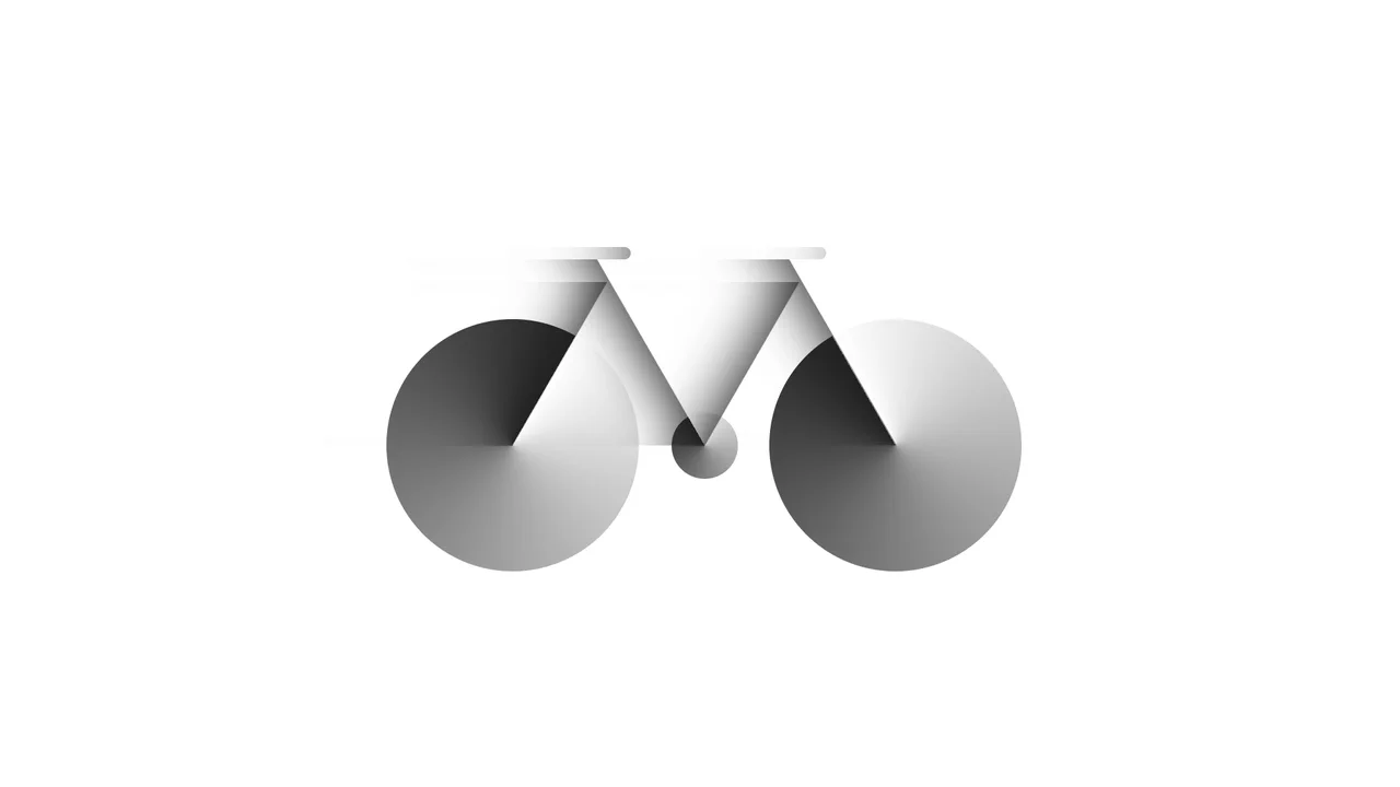
Bicycle
A pure CSS bicycle illustration constructed from geometric primitives using absolute positioning and vmin units for responsiveness. conic-gradient simulates wheel spokes, transform: skewX shapes the frame, and inset box-shadow adds depth, while pseudo-elements efficiently duplicate components like wheels.
See the Pen Bicycle.
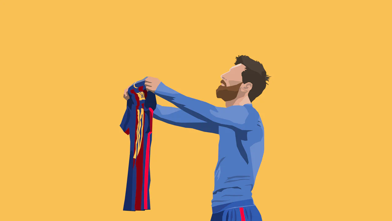
CSS Messi
A highly detailed, scalable vector-style portrait of an athlete created entirely with CSS clip-path polygons, layering shapes, shadows, and highlights without any image files or SVG tags.
See the Pen CSS Messi.

Dipper Pines from Gravity Falls
A pure CSS character illustration of Dipper Pines, constructed from geometric primitives using absolute positioning and vmin units for responsiveness. The design leverages border-radius, transform, clip-path masking, and pseudo-elements to shape detailed features like the signature pine tree hat and hair, all styled with CSS variables and a custom web font.
See the Pen Dipper Pines from Gravity Falls.
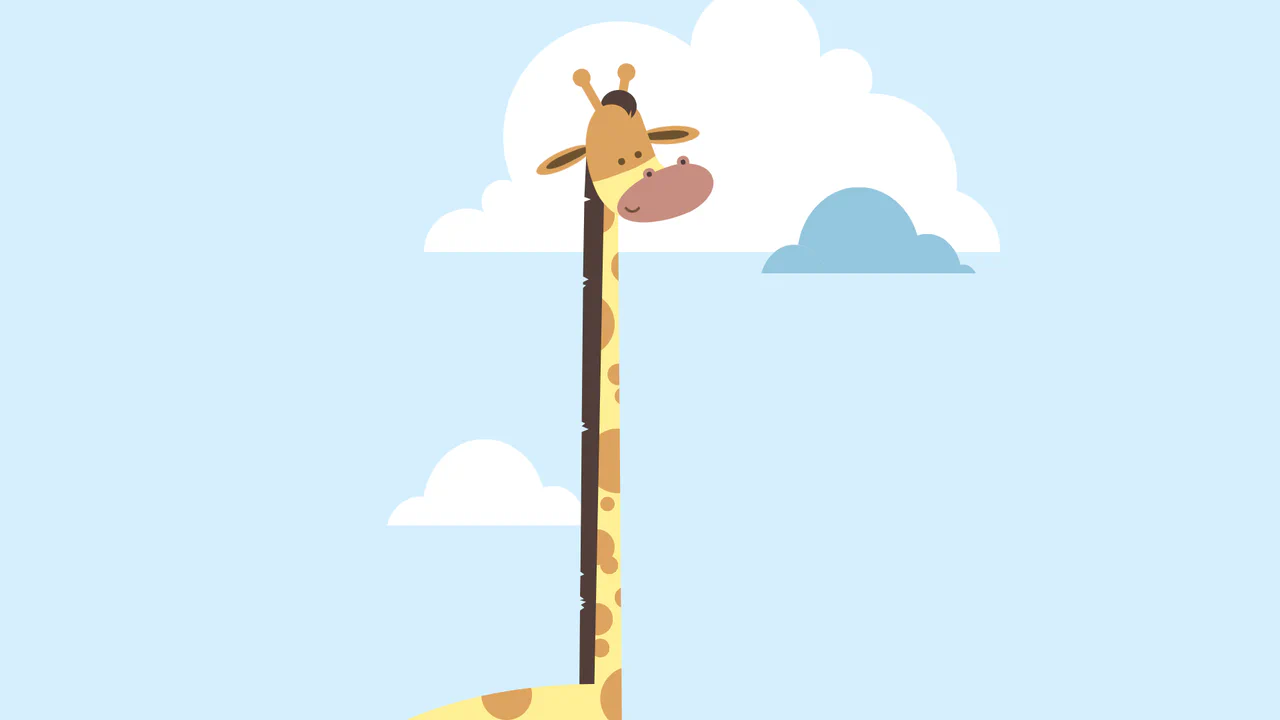
Giraffe
A pure CSS cartoon illustration of a giraffe constructed from geometric primitives using absolute positioning. It leverages box-shadow for efficient pattern repetition (spots, clouds), clip-path for complex shapes like the mane, and CSS variables for a consistent pastel color palette.
See the Pen Giraffe.

Interactive 3D Parallax Landscape
This volumetric 2.5D landscape utilizes spatial depth and layered parallax to create a tactile, multi-planar environment. While CSS preserve-3d handles the heavy lifting of perspective rendering, JavaScript orchestrates the state by mapping input to parametric rotation. By delegating logic to a hidden hit-area grid and leveraging GPU-accelerated transforms, the component ensures performance-optimized motion. This physical feedback minimizes cognitive load through intuitive spatial orientation for an immersive feel.
See the Pen Interactive 3D Parallax Landscape.
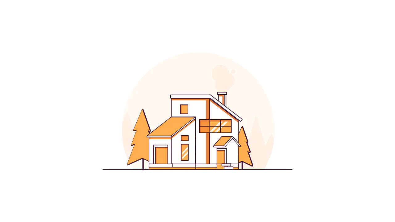
Line House
A pure CSS illustration of a house constructed from geometric primitives using clip-path for complex shapes and transform for perspective. It features a warm color palette managed via CSS variables, extensive drop-shadow usage for foliage density, and linear-gradient for detailed window reflections.
See the Pen Line House.

Profile CSS Drawing
A stylish, detailed vector-style portrait with depth and shadows, fully implemented using pure CSS gradients and clipping paths.
See the Pen Profile CSS Drawing.

Warrior
A pure CSS illustration of a knight constructed from geometric primitives. It employs repeating-linear-gradient for shield textures, clip-path for armor shaping, and extensive box-shadow duplication to render limbs and details efficiently, creating a stark, high-contrast monochrome aesthetic.
See the Pen Warrior.

Psyworm: CSS Motion-Path Animation Experiment
A mesmerizing, slightly eerie animation of a “living hole” with teeth, demonstrating the power of modern CSS for creating complex procedural graphics.
See the Pen Psyworm: CSS Motion-Path Animation Experiment.
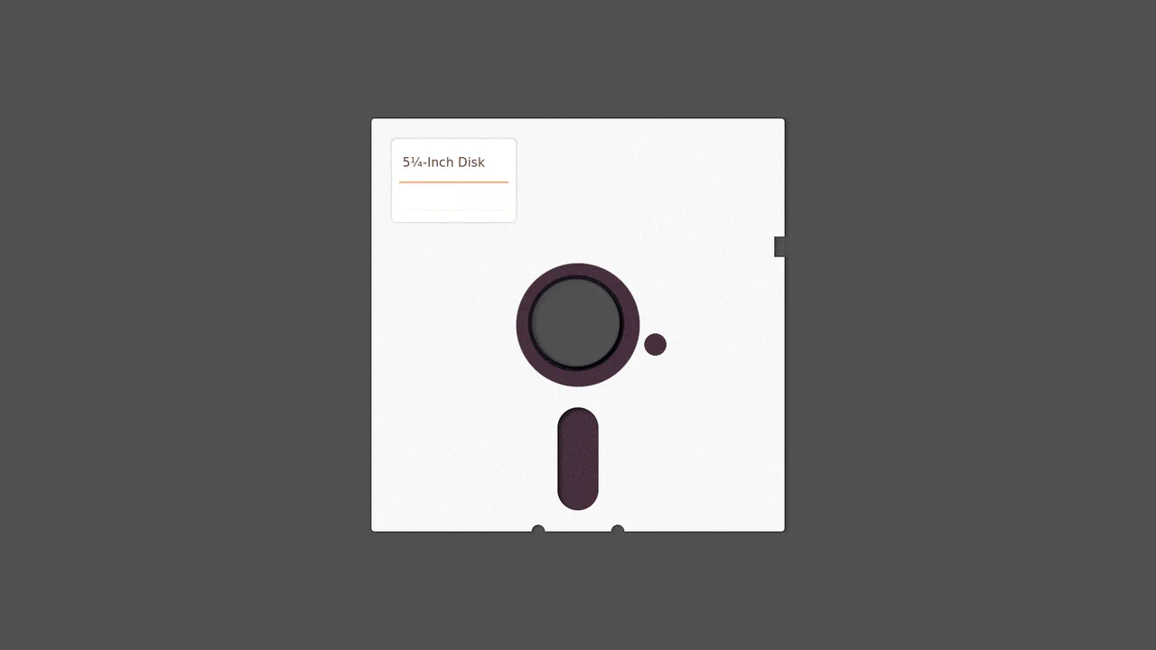
5¼-Inch Floppy Disk
A purely CSS-generated skeuomorphic representation of a vintage 5.25-inch floppy disk.
See the Pen 5¼-Inch Floppy Disk.
CSS Cat Illustration with Tracking Eyes
An illustration of a cat created entirely in CSS, featuring interactive eyes that follow the cursor. JavaScript uses Math.atan2 to calculate the gaze angle, while all of the cat’s details - from the body to the whiskers - are implemented using pseudo-elements, box-shadow, and gradients.
See the Pen CSS Cat Illustration with Tracking Eyes.
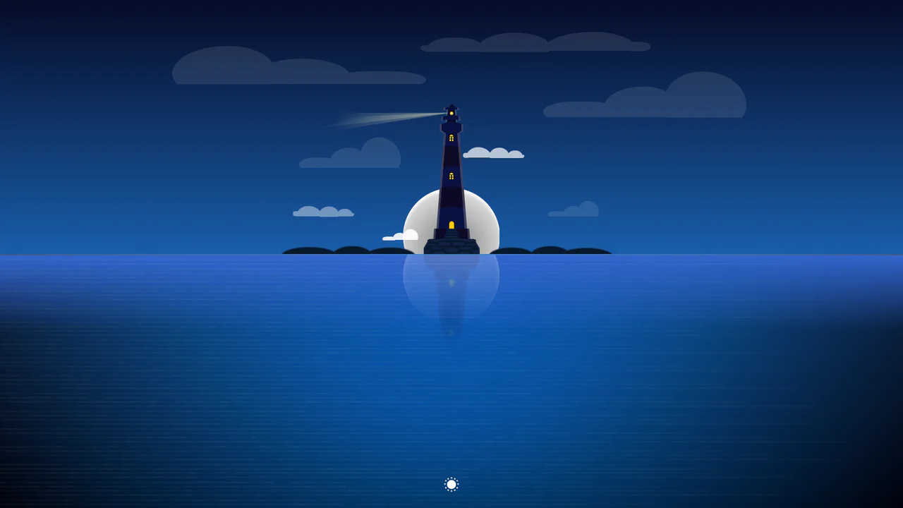
CSS Day/Night Lighthouse Illustration
A purely CSS rendering of a complex lighthouse scene at sunset/night. The “checkbox hack” is used to toggle between day and night modes. All graphics - from the lighthouse itself to the sea, clouds, and stars - are created exclusively using CSS gradients and box-shadow.
See the Pen CSS Day/Night Lighthouse Illustration.

Single Div CSS Computer
A demonstration of pixel art creation using only CSS gradients and box-shadow animation, without a single image file or extra HTML elements.
See the Pen Single Div CSS Computer.

BMO CSS Illustration with nth-child
An example of creating CSS art using pseudo-elements and nth-of-type, enhanced with a JS easter egg - a mouseover spam detector to call the Vibration API.
See the Pen BMO CSS Illustration with nth-child.

Realistic MPK Mini MIDI Controller in Pure CSS
Pure CSS skeuomorphism in action - a complete replica of a MIDI controller where every knob, pad, and key is drawn by layering dozens of gradients and shadows.
See the Pen Realistic MPK Mini MIDI Controller in Pure CSS.

Lighthouse Single-Div CSS Illustration
The entire scene is constructed from a combination of gradients (linear-gradient/radial-gradient) and precise element positioning using background-position.
See the Pen Lighthouse Single-Div CSS Illustration.
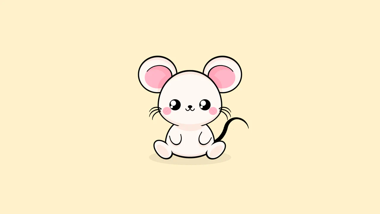
CSS Art: Mouse Illustration
A technically impressive work demonstrating how to use CSS variables and complex combinations of border-radius and box-shadow to build intricate, multi-layered shapes. It is a great example of using modern CSS capabilities for creative illustration.
See the Pen CSS Art: Mouse Illustration.
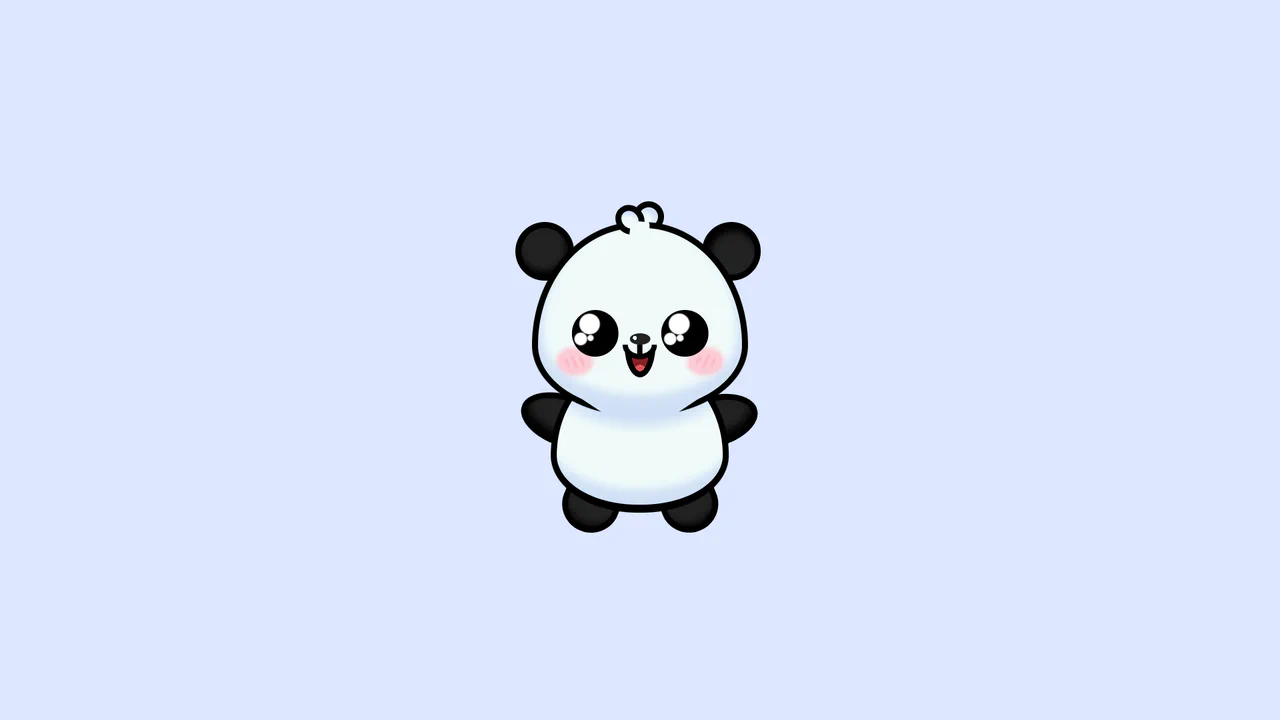
CSS Art Panda
An elegant example of semantic markup, where every element is styled and animated using CSS. The technical foundation includes clip-path, CSS custom properties, and animated pseudo-elements for each visual layer.
See the Pen CSS Art Panda.