20+ CSS Image Grids
Grid layouts define modern image presentation. Building them without CSS Grid or Flexbox forces unnecessary complexity. This collection eliminates that friction.
The Pure CSS Image Grids showcase demonstrates layout techniques using native CSS Grid with grid-template-columns, gap, and auto-fit for fluid responsiveness. Flexbox solutions handle simpler two-dimensional arrangements with alignment precision. Masonry-style layouts use column-count and break-inside for multi-column flows. Each approach is semantic HTML — no wrapper divs beyond necessity.
Responsive behavior adapts automatically through media queries and minmax() functions, eliminating manual breakpoints. Cross-browser support covers modern browsers with tested fallbacks. Accessibility is preserved: images retain alt attributes, focus states remain visible, and screen readers navigate structure correctly.
Examples
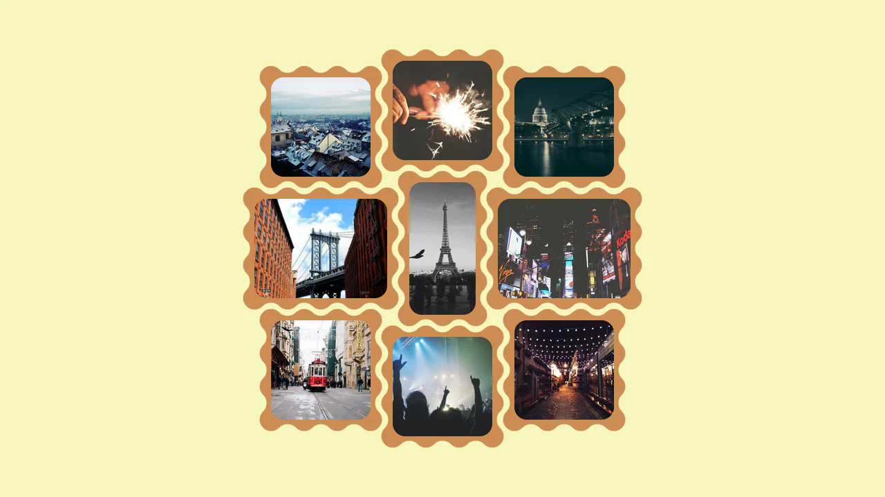
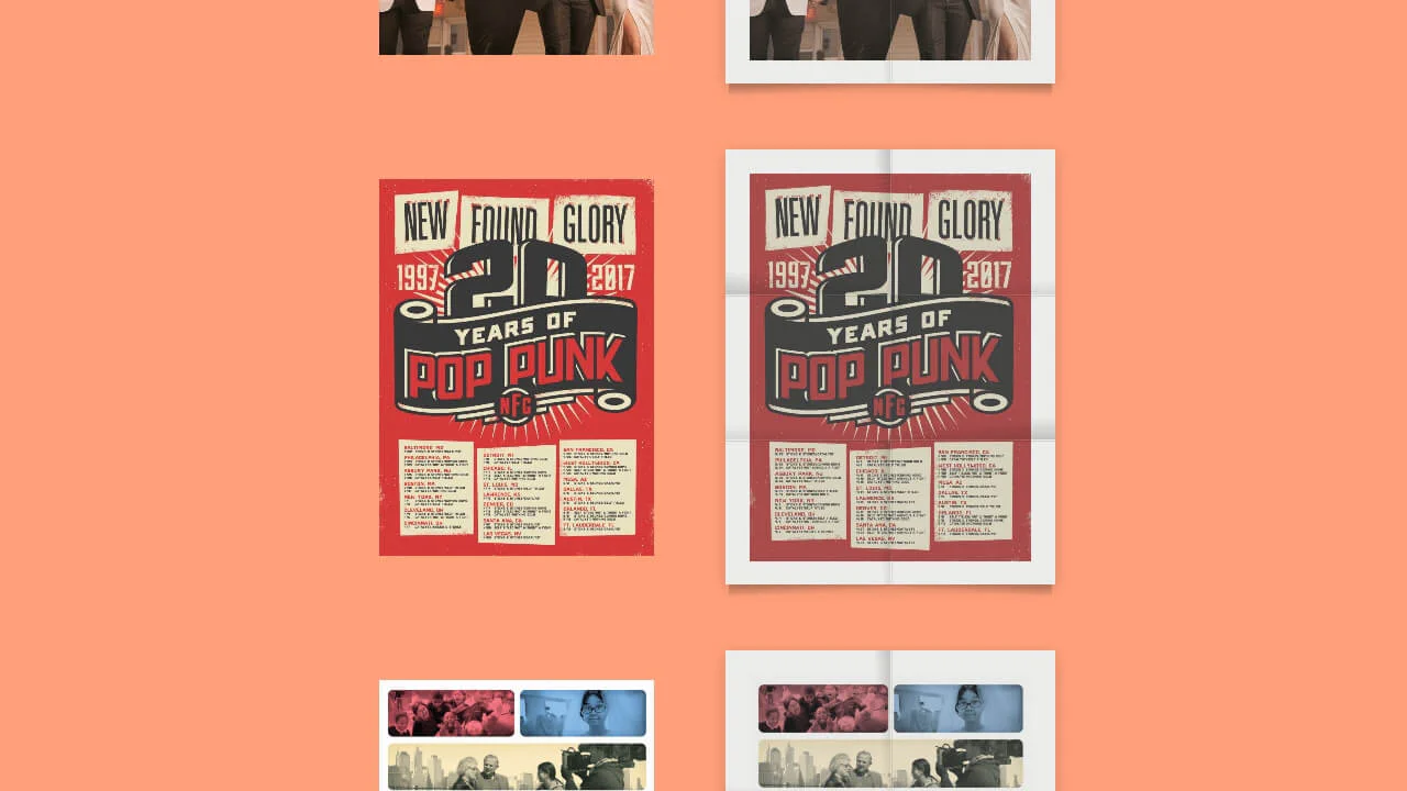
Interlocking Wavy Image Grid
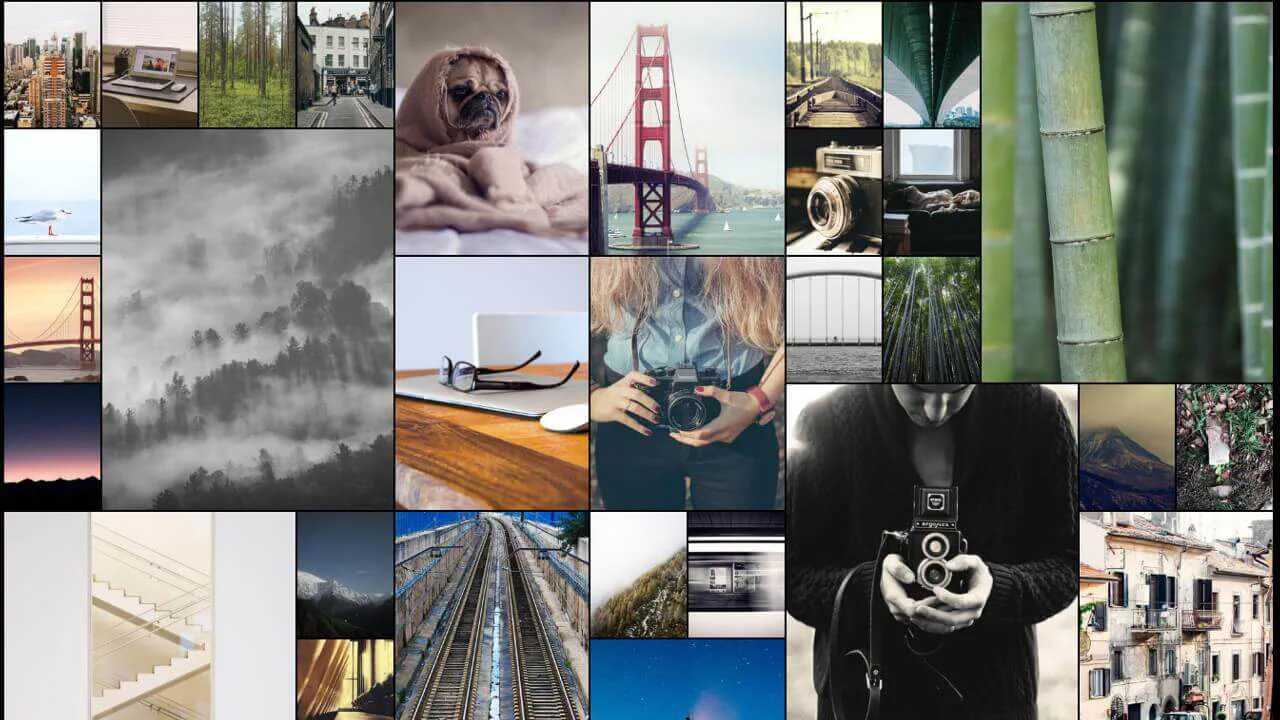
This is an Interlocking Wavy Image Grid. It applies procedural scalloped edges to raster images and shifts them into a tight, puzzle-like masonry formation. Its function is to break rigid, rectangular bounds in visual galleries, converting standard blocks into an organic, cohesive texture.
 Chrome 111+
 Edge 111+
 Firefox 112+
 Safari 15.4+
See the Pen Interlocking Wavy Image Grid.

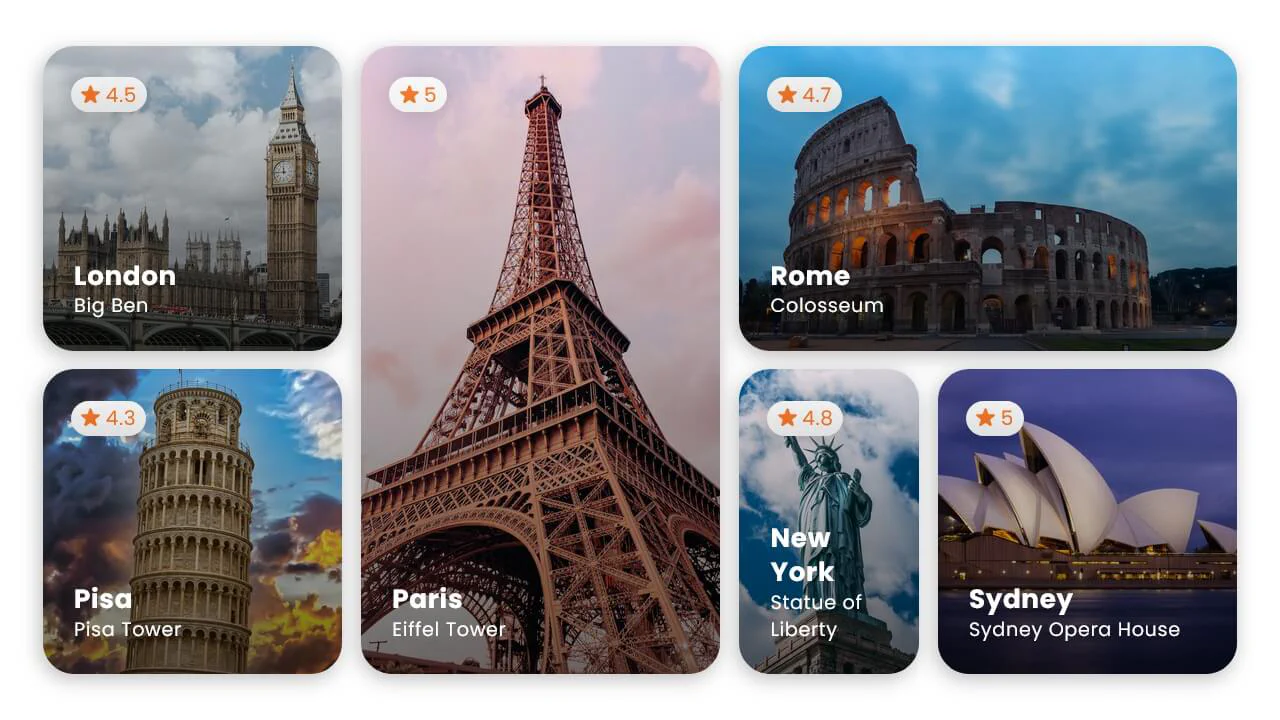
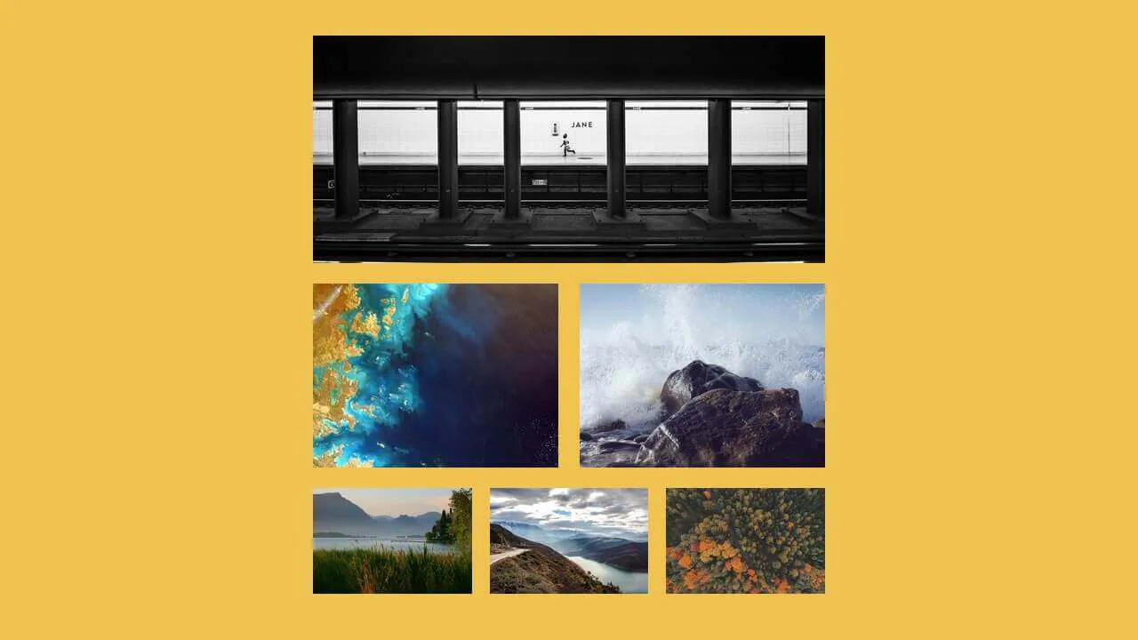
Responsive Fluid Photo Gallery Grid
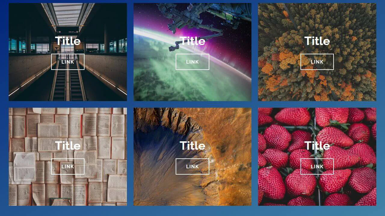
This is a Responsive Fluid Photo Gallery Grid. It organizes varied aspect-ratio images into justified rows without cropping essential content. Its primary function is to optimize visual space, ensuring edge-to-edge alignment while deferring offscreen asset loading for strict performance control. (Requires: lazysizes, object-fit-images)
Chrome 80+
Edge 80+
Firefox 75+
Safari 13+
See the Pen Responsive Fluid Photo Gallery Grid.

CSS :has() Character Select Screen
This is a CSS :has() Character Select Screen. It replicates the classic user interface of a fighting game’s selection menu, using modern CSS to handle all state logic. Its function is to demonstrate how the :has() pseudo-class can completely replace JavaScript for managing visibility in a selection-based UI, triggering changes in the main content area based on the state of a radio button group. (Requires: Vue)
Chrome 105+
Edge 105+
Firefox 121+
Safari 15.4+
See the Pen CSS :has() Character Select Screen.
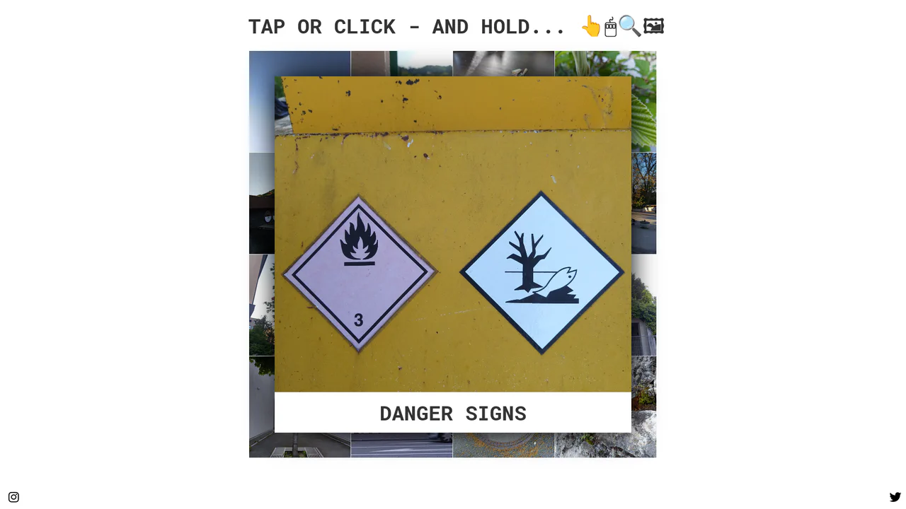
Tactile Long Press Image Grid
In a world obsessed with speed, we often forget the power of distinct intent. The standard “click” is binary and abrupt. This component introduces a moment of pause — a “breath” — allowing the user to peek into content without committing to a navigation event. By utilizing the “long press” (or click-and-hold) mechanic, we bridge the gap between desktop precision and mobile intuition, creating a gallery experience that feels organic and responsive to the user’s curiosity.
Chrome 57+
Edge 16+
Firefox 52+
Safari 10.1+
See the Pen Tactile Long Press Image Grid.
Single Image with Squircle Shape and Inner Shadow
Explore the power of CSS Grid with auto-fit for a responsive layout and SVG filtering techniques to give images a trendy squircle outline and unique shadow effect.
See the Pen Single Image with Squircle Shape and Inner Shadow.
Scroll-Driven Grid Animation with CSS-Doodle
A mesmerizing scroll-driven image grid powered by the cutting-edge animation-timeline: view() CSS property and the <css-doodle> web component.
See the Pen Scroll-Driven Grid Animation with CSS-Doodle.
Pure CSS Responsive Hex Grid
An adaptive hexagonal grid without media queries, built on Container Queries, where the column count and the position of each element are calculated in CSS via complex calc() functions. The code demonstrates progressive enhancement - with a fallback to @property and a tan(atan2()) math trick to emulate division in older browsers.
See the Pen Pure CSS Responsive Hex Grid.
Flexbox and quantity queries dynamically adjust image widths based on the number of items per row — one, two, or three images each receive an appropriate flex basis. The CSS relies on complex :nth-last-child selectors to detect the total count, keeping the markup clean.
A fluid image grid built with floated <li> elements — each item takes one‑third of the row. Placeholders use inset box‑shadow to simulate a recessed frame. On hover, two pseudo‑elements scale up: a gray background and a bordered black overlay, creating a layered spotlight effect.
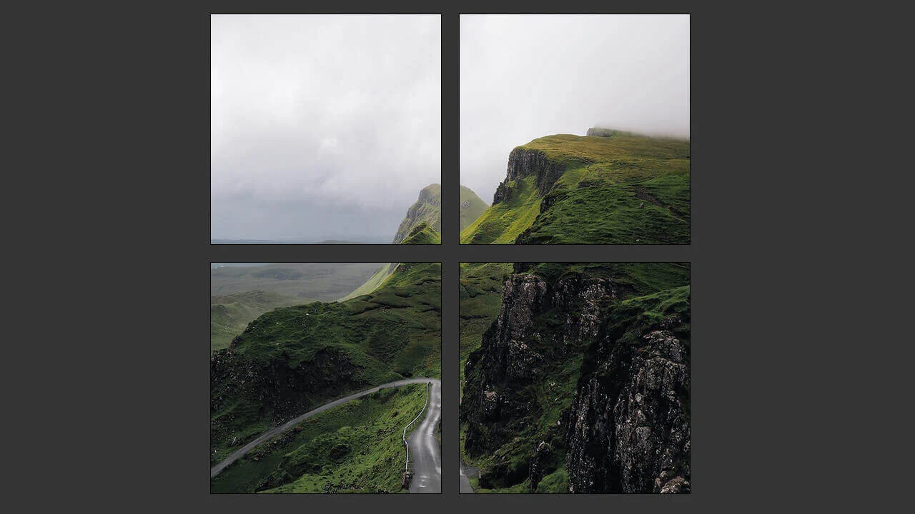
A fixed‑width container holds four floated images — each takes 45% width with 1.66% margins, creating a two‑by‑two grid. The layout relies on floats and percentage values, but the container’s fixed size limits true responsiveness. Borders and a dark background complete the minimal design.
Hexagons are cut with clip-path and floated into a honeycomb grid using negative margins. On hover, colored overlays and text fade in. No JavaScript — the effect is pure CSS.
This is a responsive image grid built with flexbox — four columns collapse into a single column on small screens. Background images are applied via utility classes; the divs themselves remain empty. The design is minimal and functional, with no JavaScript.
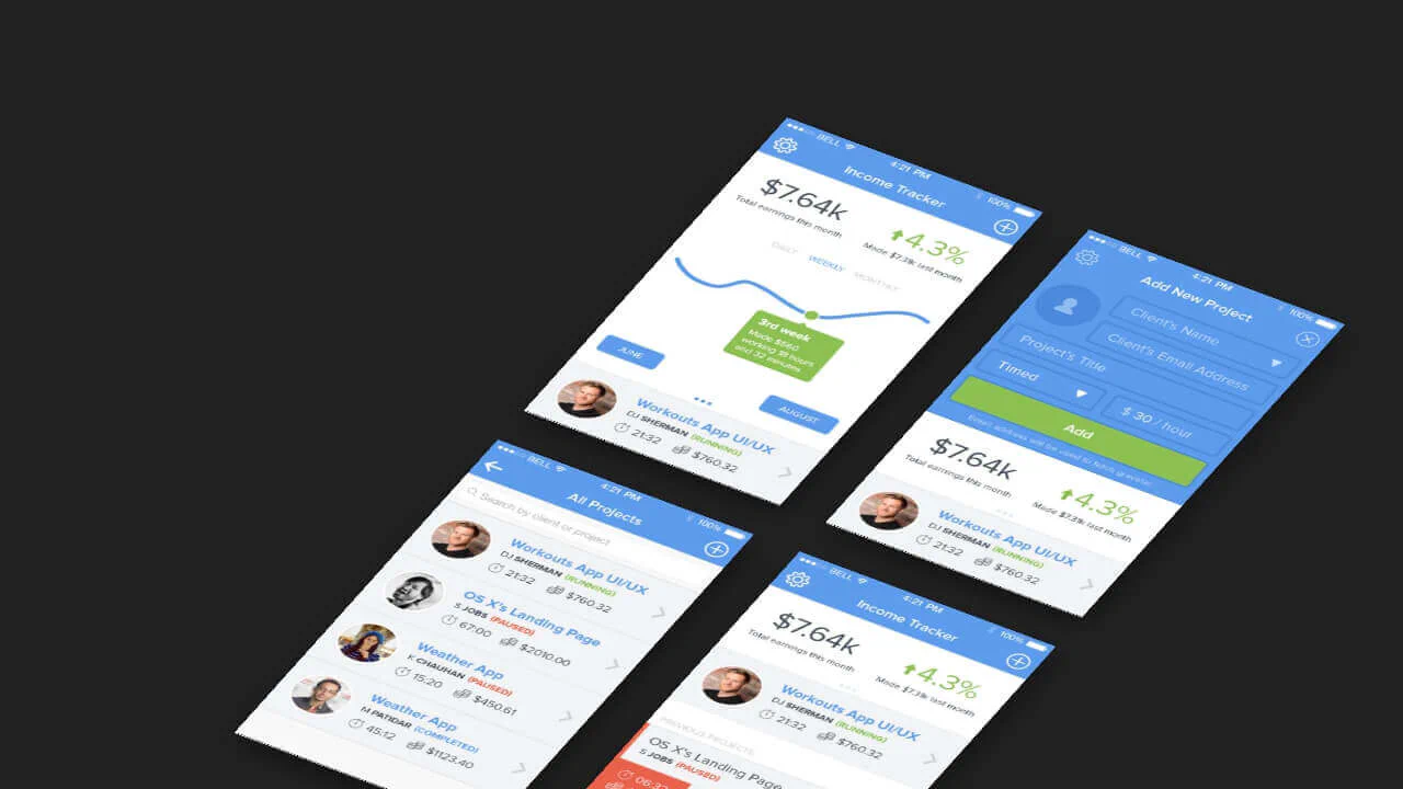
This 3D mockup grid uses CSS transforms to create a pseudo‑isometric perspective — the container is rotated, and each item has left/bottom faces drawn with pseudo‑elements. An inner <span> casts a shadow, adding depth. The layout is fixed‑width and non‑responsive, relying on absolute positioning and manual background images.
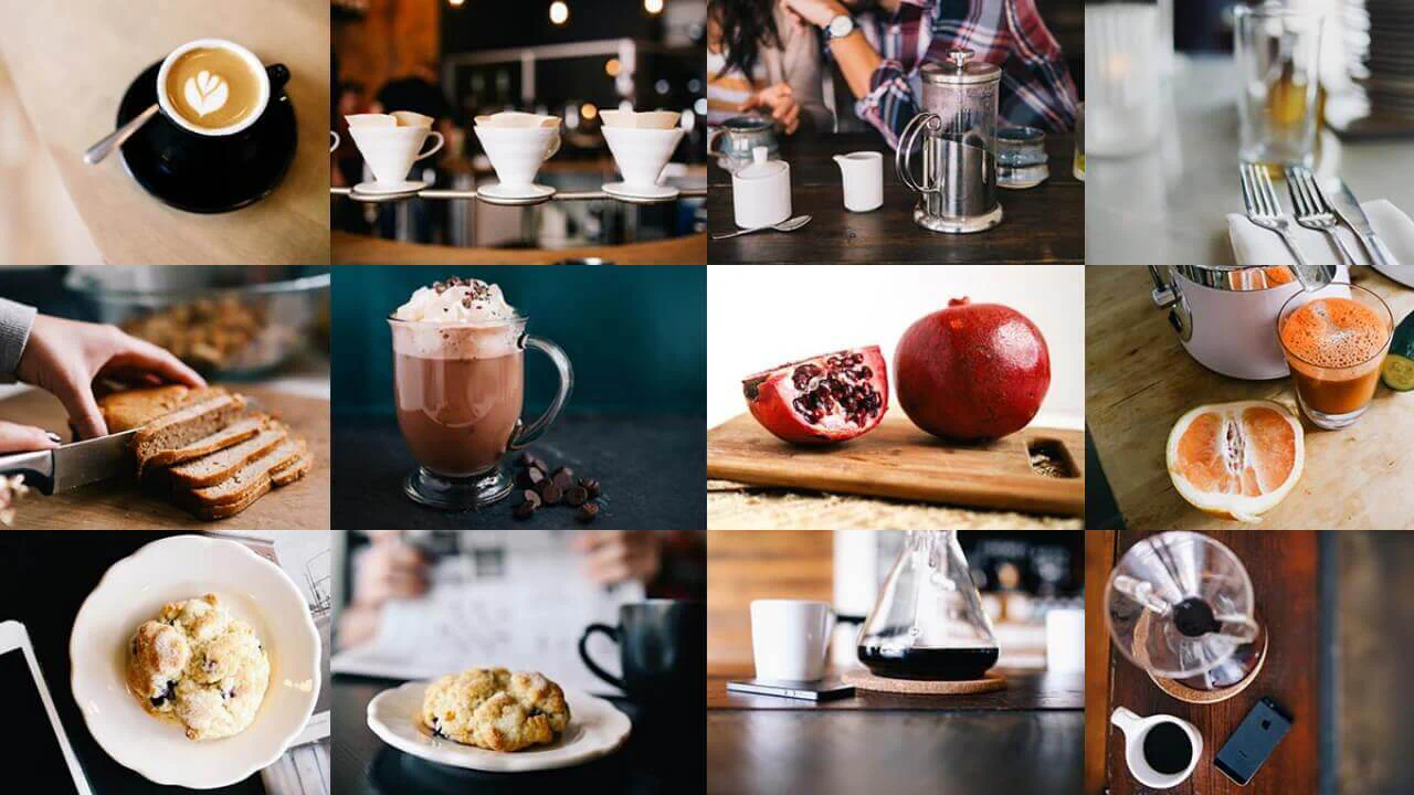
CSS Grid with auto‑fill, minmax, and dense packing creates a responsive masonry‑like layout. Random span classes give items varied sizes, while Pug loops generate weighted randomness for spans and background images from unsplash.it. No JavaScript — the layout is static and visually dense.
Bootstrap grid builds a responsive image gallery — tiles switch from two to three columns. Each tile has a background image; hover reveals a colored overlay with mix-blend-mode and shifts the text slightly. The design is clean and functional, relying on CSS transitions and flexbox.
Stylus mixins and variables build a responsive grid of skewed cards. On hover, each card shifts and reveals a border; the background image blends with a color overlay via background-blend-mode. The layout uses CSS Grid and absolute positioning for the arrow icon.s