20+ CSS Infographics
Data visualization typically demands charting libraries and JavaScript frameworks. Yet CSS can render charts, diagrams, and animated graphics with precision and minimal overhead. This collection proves static and interactive infographics are achievable with HTML and styling alone.
The Pure CSS Infographics showcase demonstrates techniques using CSS Grid for structured layouts, border and background properties for bar and pie chart construction, SVG for scalable vector graphics, and transform animations for dynamic reveals. Progress bars use width transitions; donut charts leverage conic-gradient; timeline diagrams employ ::before and ::after pseudo-elements. Semantic HTML markup ensures data structure remains accessible without visual styling.
Responsive infographics scale fluidly through viewport-relative units and flexible containers. Cross-browser compatibility spans modern browsers with tested rendering across devices.
Every demo runs live on CodePen for instant interaction. Download complete code snippets — all resources are free and production-ready.
Examples
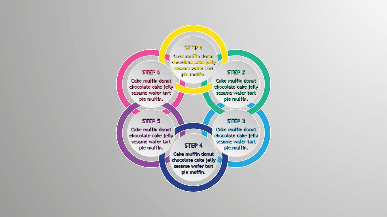
Pure CSS Circles Infographic
A circular step diagram constructed entirely with CSS transforms, where items are positioned radially using a custom property to calculate rotation angles.
See the Pen Pure CSS Circles Infographic.
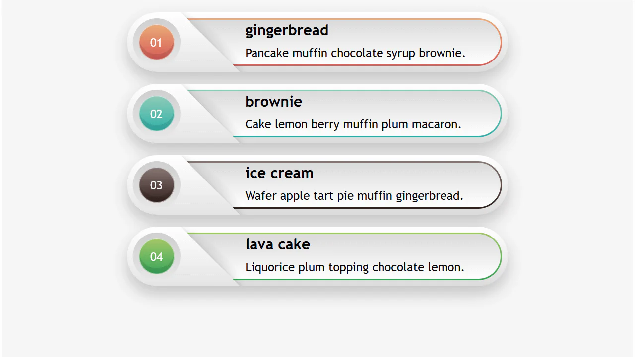
Responsive Infographic
A highly responsive list component utilizing a CSS variable switch technique to toggle layout states.
See the Pen Responsive Infographic.
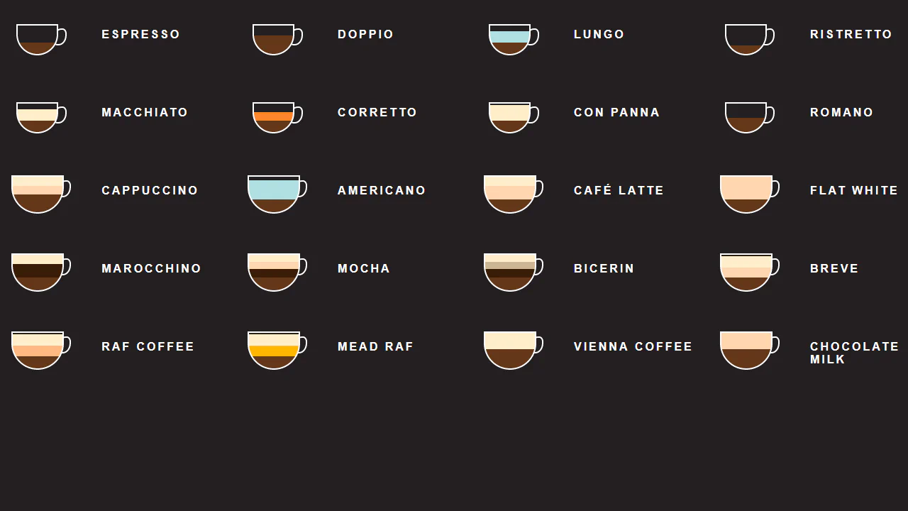
CSS Coffee Infographic
A pure CSS infographic visualizing coffee recipes through layered gradients within stylized cups.
See the Pen CSS Coffee Infographic.
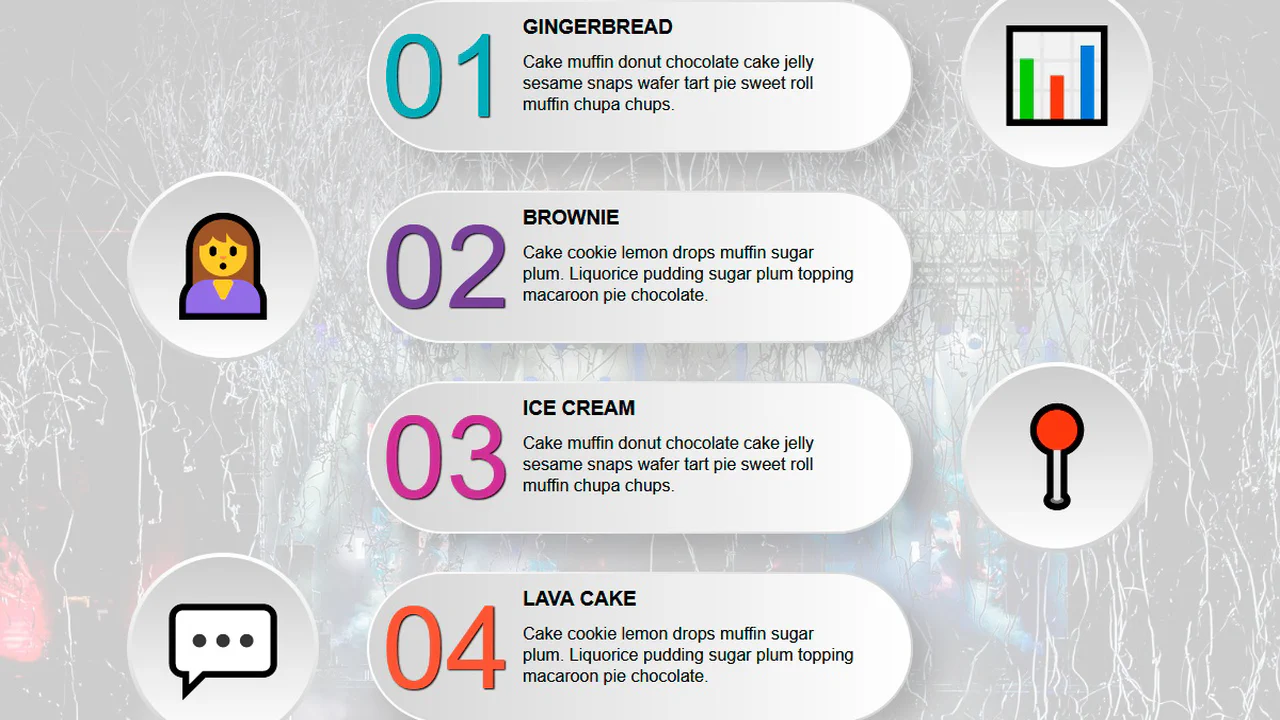
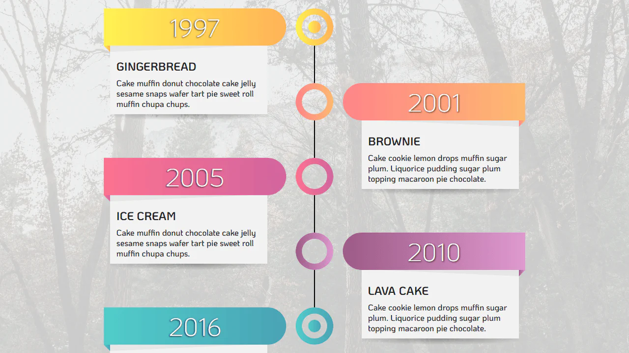
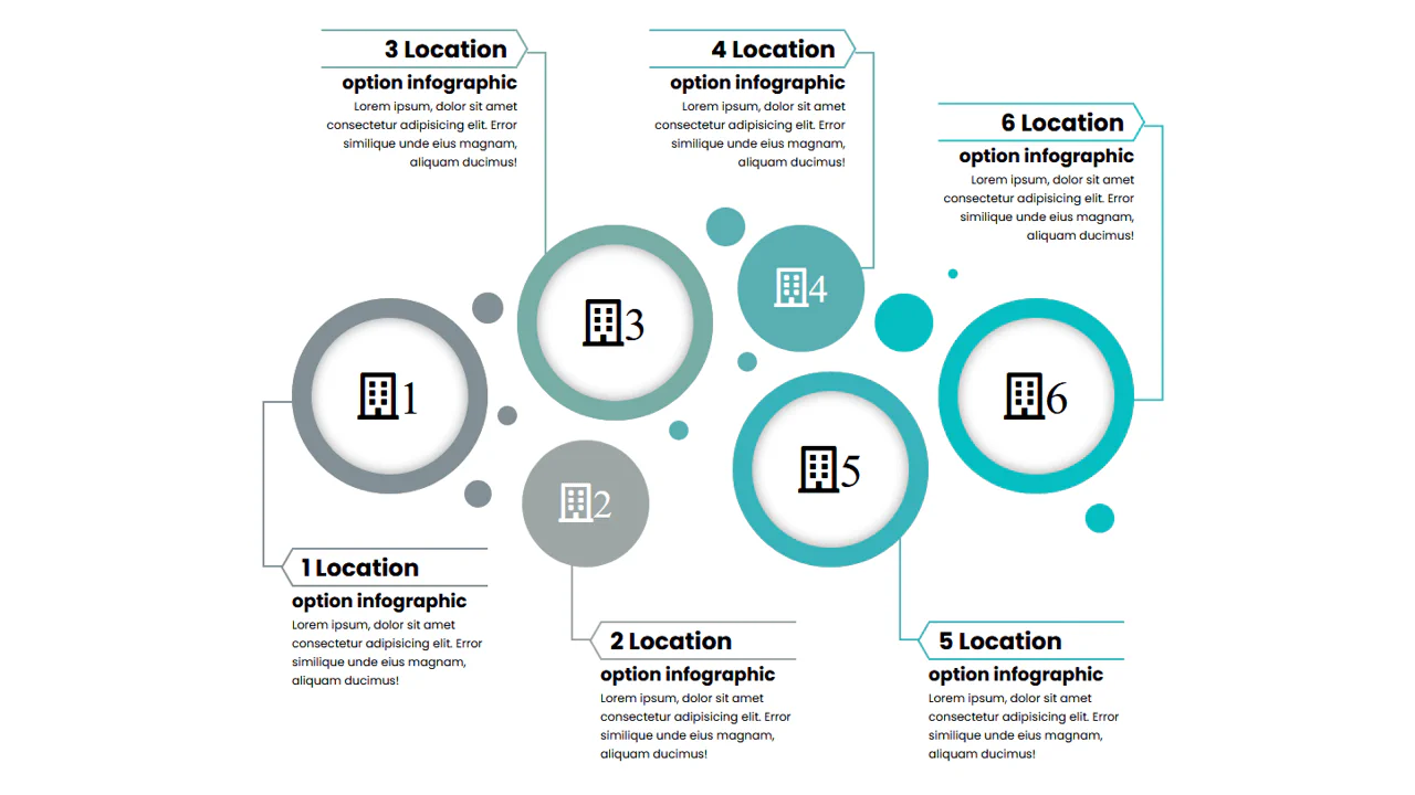
This is a static infographic built with absolute positioning — each circle and its connecting lines are manually placed via hardcoded offsets. CSS variables keep colors consistent. On narrow screens, the layout becomes horizontally scrollable, breaking the intended visual connection between elements.
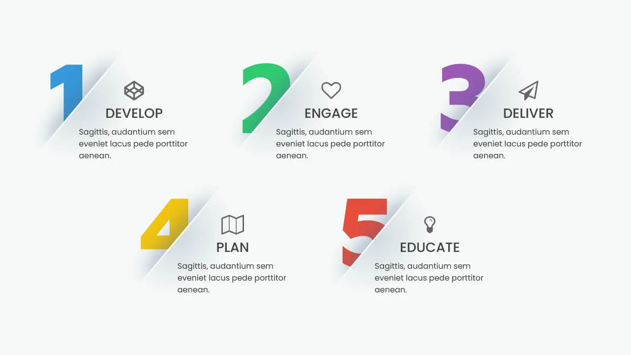
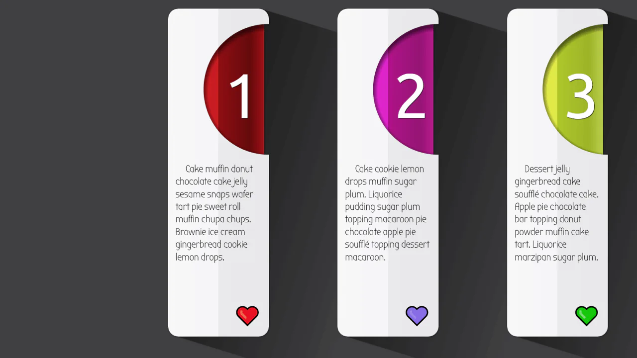
This infographic scales uniformly via a CSS custom property controlled by a slider — the entire component resizes as the root font‑size changes. Each card overlays a large number with a rotating semi‑circle that reveals on hover. The design is modular but relies on fixed em‑based dimensions inside the cards, which could break if content overflows.
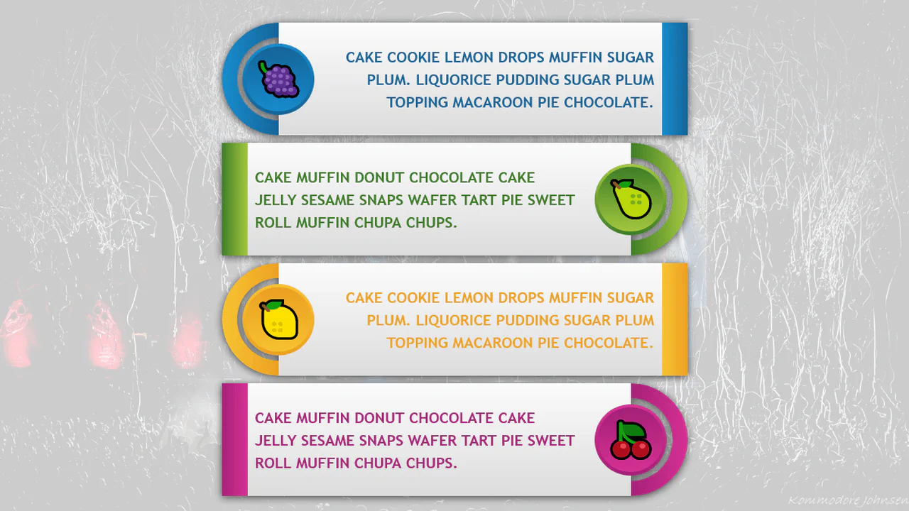
This is a responsive card layout generated by a Pug loop — each card contains an SVG icon, a title, and descriptive text. Custom properties and media queries switch between narrow and wide layouts; the body::before pseudo‑element adds a decorative dotted background that adapts to the layout. Icons are inline SVG symbols with stroke‑dasharray animations; hover effects change the icon’s shadow direction via a CSS custom property.
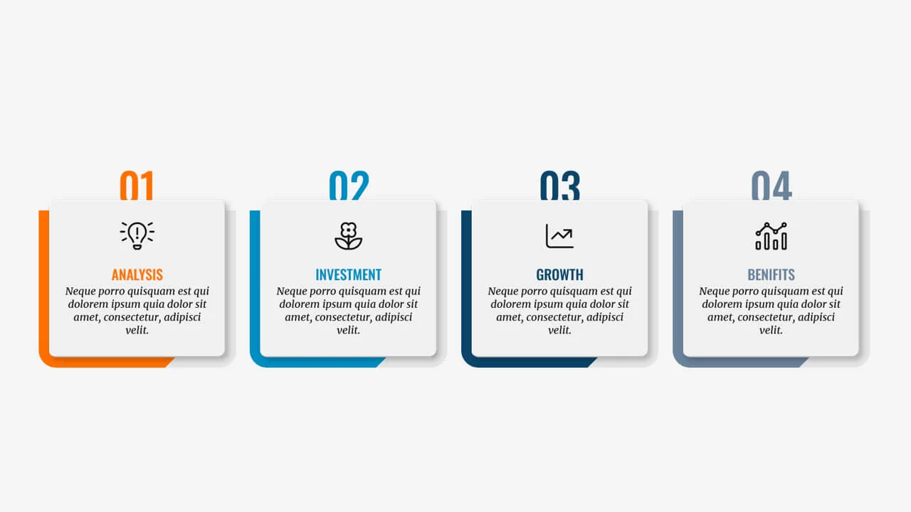
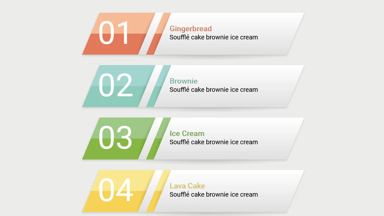
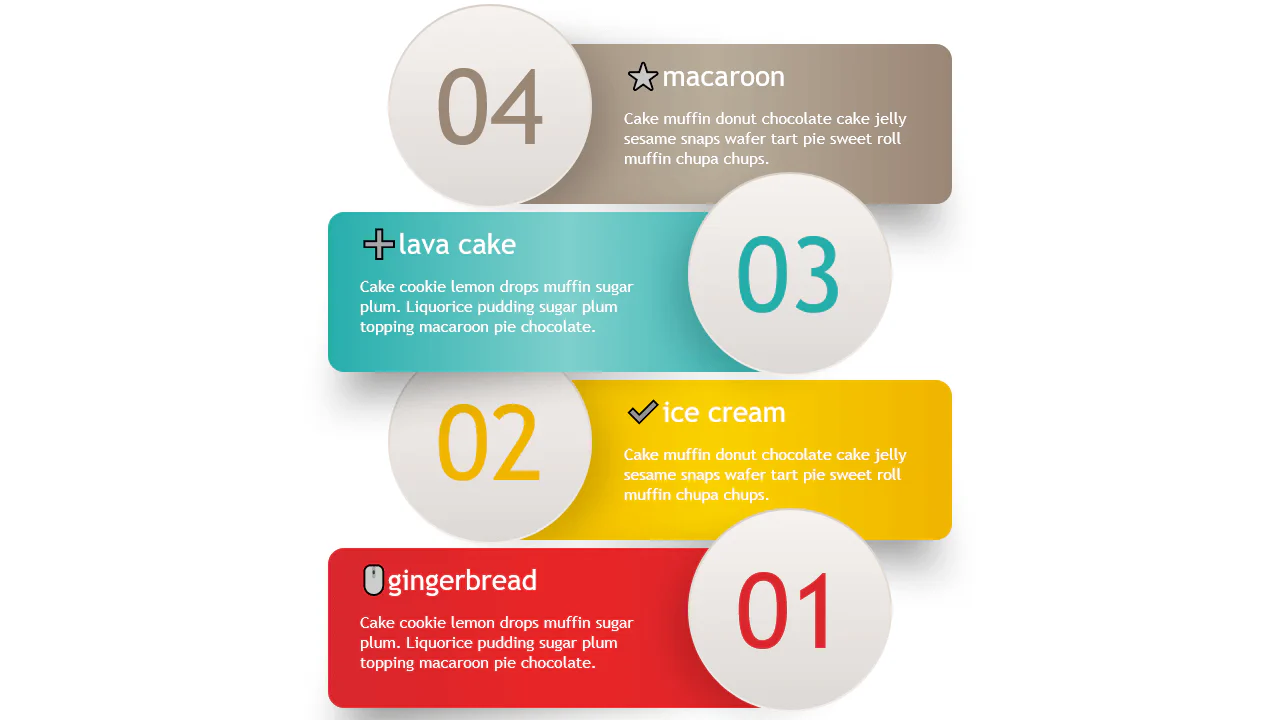
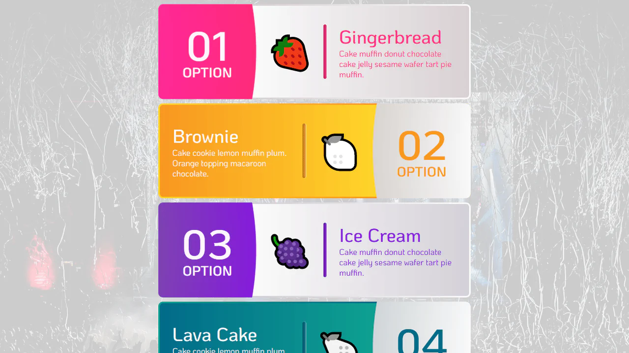
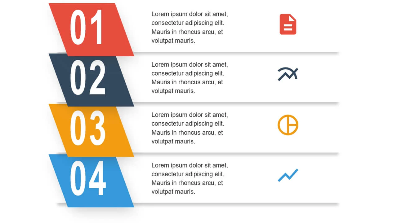
The code is a pure‑CSS card grid using <ol> for semantic numbering — each list item has a large, overlapping digit generated by a ::after pseudo‑element. The layout is responsive with auto‑fit and minmax. Background layering uses ::before to create a diagonal accent stripe and a protruding base. The design is static, fully reliant on custom properties for theming.
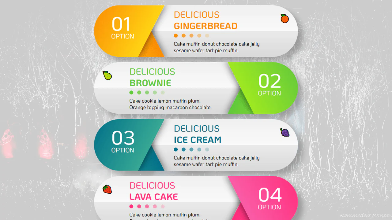
Pug loops generate a responsive infographic with alternating odd/even layout styles. A single custom property --p toggles the visual direction — clipping, padding, and gradient orientation flip based on the value. Media queries adjust the layout for narrow and mini screens, changing grid placement and font sizes. The design is dynamic but purely CSS-driven.
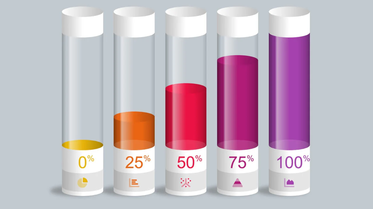
Five test‑tube‑style progress bars built with CSS custom properties, pseudo‑elements, and keyframe animations — the fill level is controlled by the --percent variable. The tube shape is achieved with border‑radius and mask‑image. The design is responsive, scaling with viewport‑based units.
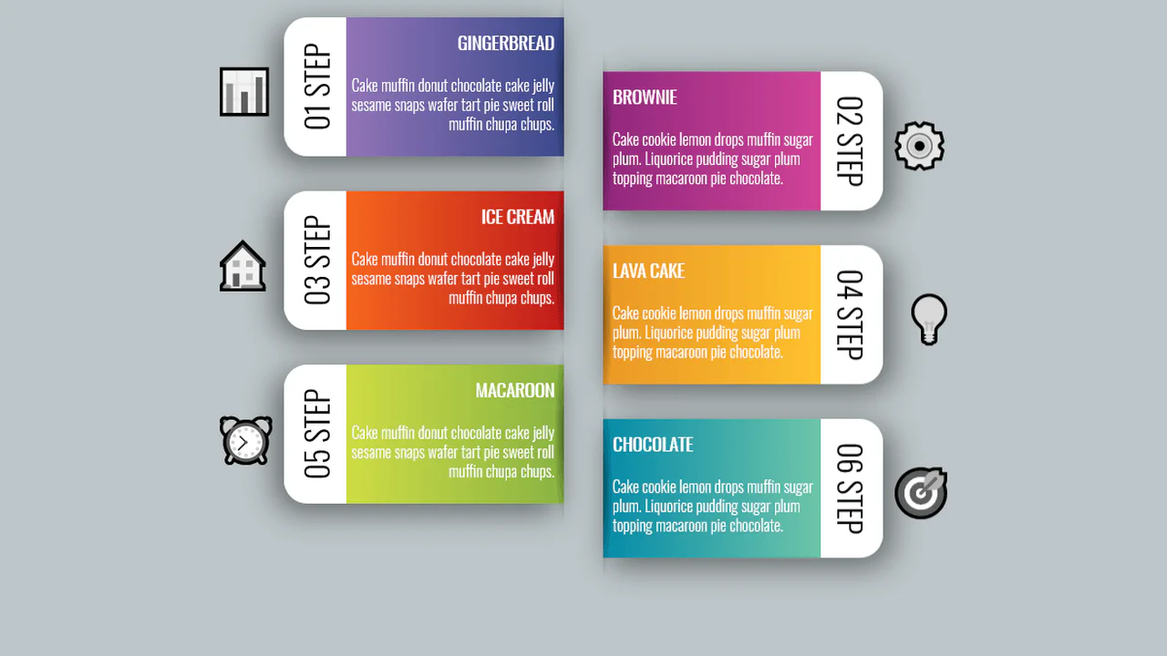
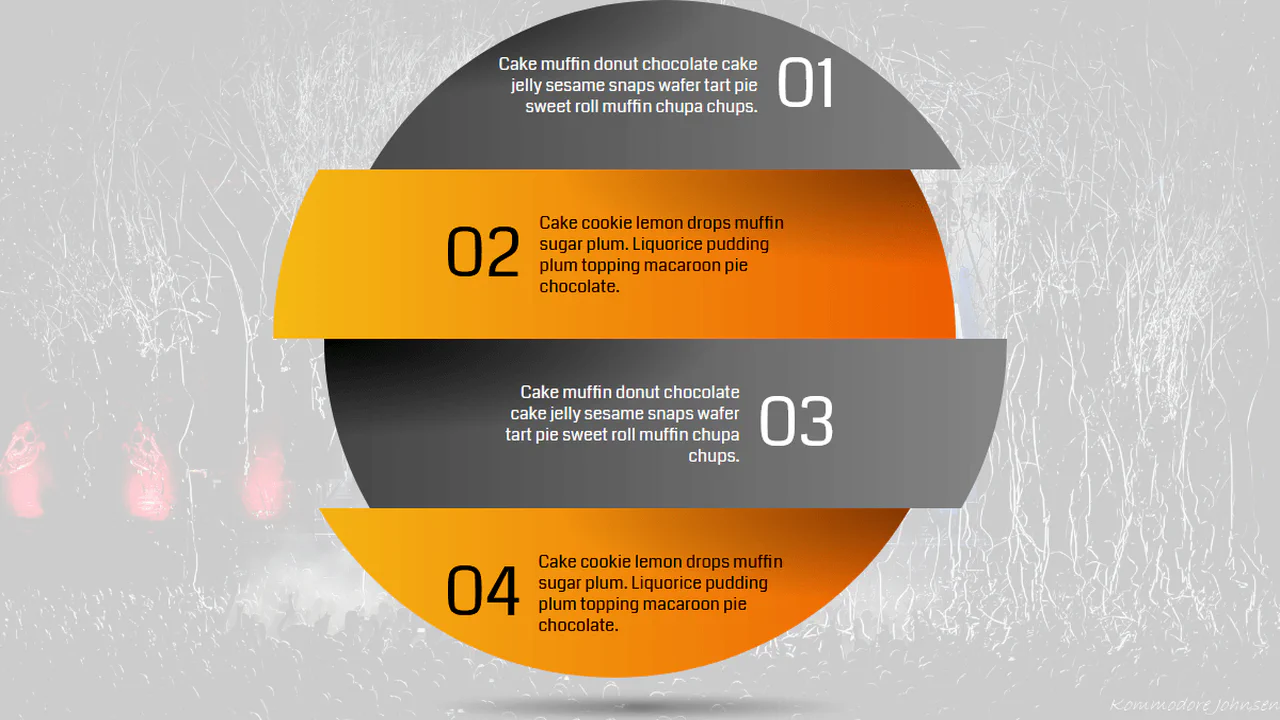
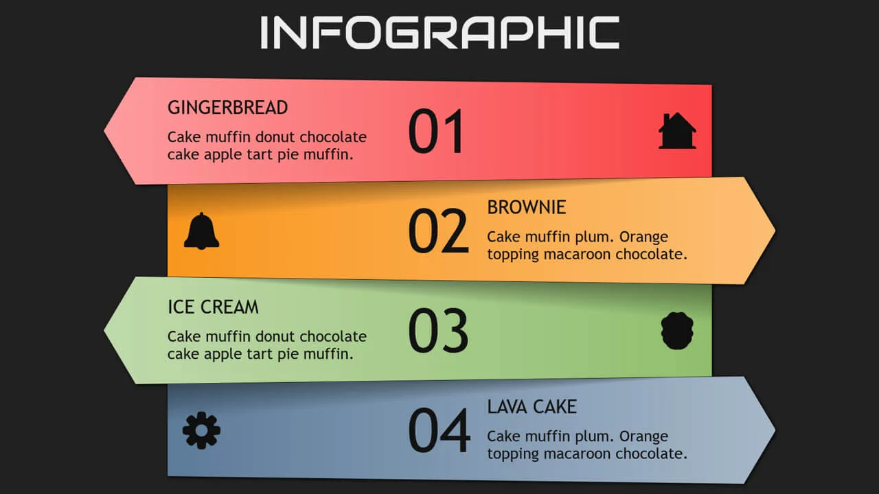
Bootstrap grid builds a layered infographic — each step is absolutely shifted via negative top margins. Animated entrance effects are staggered using animation delays. The design is purely visual with no interactive or data‑driven functionality.
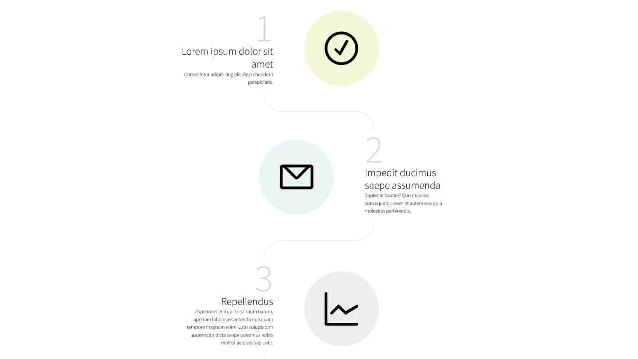
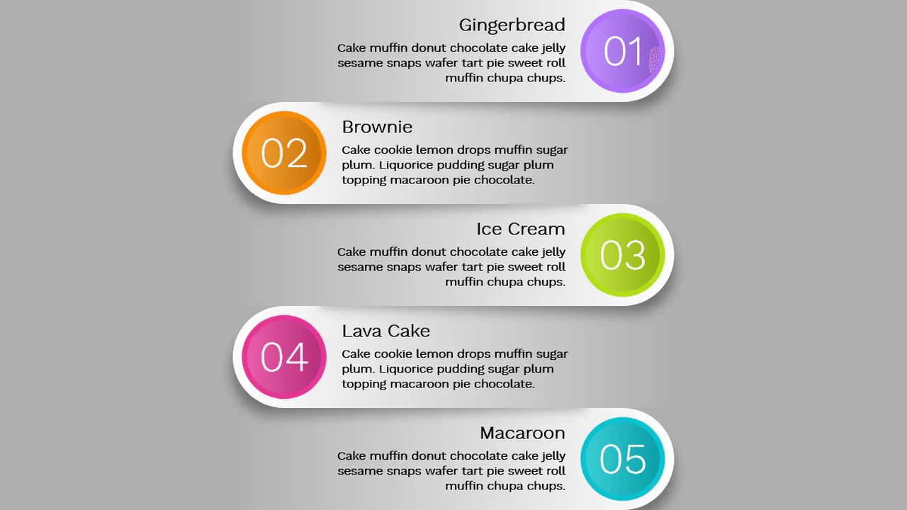
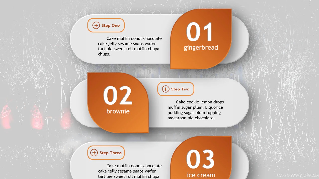
SCSS mixins handle responsive breakpoints — the layout switches between stacked (mobile) and side‑by‑side (desktop) views. Step numbers are generated with CSS counters; connector arcs are drawn using pseudo‑elements and border properties. No JavaScript — the design is purely visual and relies on careful positioning.
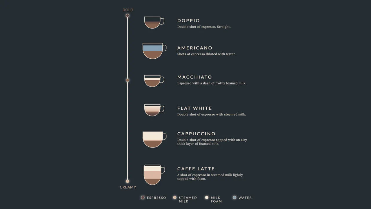
A fixed‑size coffee‑drink infographic built with absolute positioning — each cup is a <div> with layered gradients and a handle pseudo‑element. The vertical bar and circles mark intensity levels. No JavaScript; the design is static and purely illustrative.
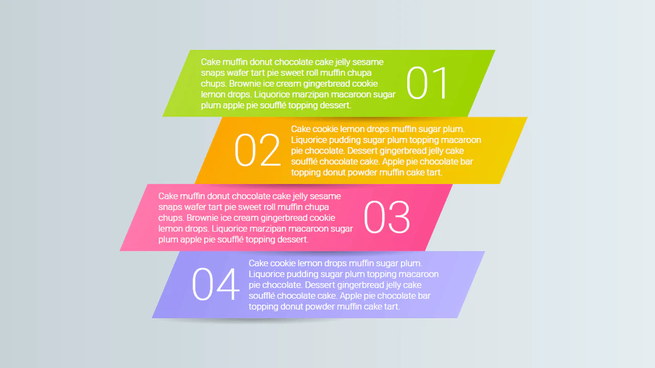
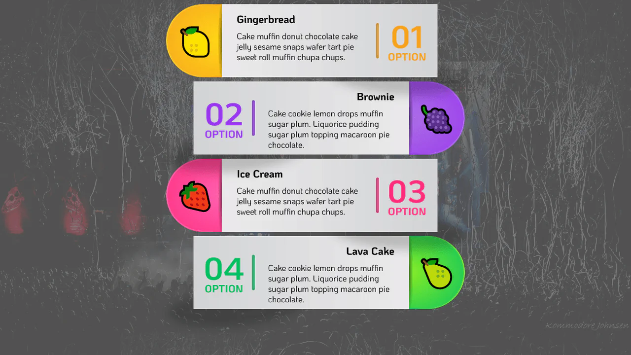
Pug loop generates four paragraphs with custom properties controlling layout and skew. Media queries switch between narrow and wide modes — :before shows step numbers via counters. The design is fully responsive and relies on pure CSS for dynamic styling — no JavaScript.