8 CSS Isometric Designs: Free Code Snippets & Examples
CSS isometric projections present a highly structured approach to displaying pseudo-3D depth on flat web layouts, arranging DOM elements along mathematically precise angle vectors. By angling containers to standard isometric coordinates, developers can build immersive grids, complex maps, and architectural card interfaces.
- Standard visual alignment utilizes a geometric transform stack, combining rotateX() and skewY() calculations to skew standard 2D rectangles precisely by 30 degrees.
- High-performance spatial hierarchies rely on structural z-axis offsets and nesting with transform-style: preserve-3d, allowing parent grids to project multiple layered children into coordinates.
- To minimize rendering calculations and preserve INP (Interaction to Next Paint), continuous isometric animations leverage the GPU-bound compositor thread via 3D matrix operations.
Discover these architectural design patterns to build complex, multi-dimensional structures that respond beautifully to dynamic user interaction.
Table of Contents:
Examples
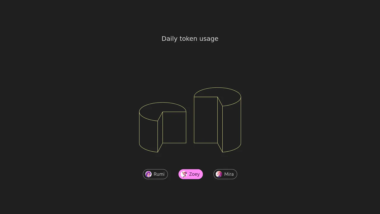
Isometric 3D SVG Morphing Chart
An interactive 3D isometric token usage chart powered by manual SVG path morphing. Instead of relying on heavy drawing libraries, a custom JavaScript interpolator parses matching vector commands and applies organic sine easing. Clicking the menu controls morphs the column heights and cylinder top caps synchronously, highlighted by vibrant rainbow keyframe animations.
 Chrome 73+
 Edge 79+
 Firefox 67+
 Safari 13+
See the Pen Isometric 3D SVG Morphing Chart.

Skeuomorphic Chess Pawn
This is a Skeuomorphic CSS Chess Pawn. It replaces static raster images with a resolution-independent, pure code illustration. Its function is to demonstrate high-fidelity rendering capabilities within the DOM, utilizing native styling properties to fake three-dimensional geometry, light, and mass.
Chrome 26+
Edge 12+
Firefox 16+
Safari 7+
See the Pen Skeuomorphic Chess Pawn.

Pure CSS Isometric Floating Layers Diagram
This Isometric Floating Layers Diagram is a visually striking React component designed to represent architectural stacks or multi-tiered systems. By combining SVG geometry with CSS animations, it creates a lightweight 3D isometric illusion. Each layer floats rhythmically, enhanced by vibrant gradients and drop shadows, making it perfect for landing pages explaining software infrastructure or service tiers. (Requires: react, react-dom)
Chrome 50+
Edge 79+
Firefox 50+
Safari 10+
See the Pen Pure CSS Isometric Floating Layers Diagram.

CSS Cube
A pure CSS isometric text cube constructed via 3D transforms and trigonometry-based SCSS calculations. It features dynamic styling controlled by :has() and CSS variables, allowing for runtime theme switching (tritone/monotone/dim) and dark mode adaptation without JavaScript logic.
See the Pen CSS Cube.

3D CSS Grid Inverse UV Projection Effect
The Screen-to-UV technique calculates cursor distance to cells in an isometric grid; the result controls a CSS variable to generate a “living” 3D surface effect using pure CSS/JS.
See the Pen 3D CSS Grid Inverse UV Projection Effect.
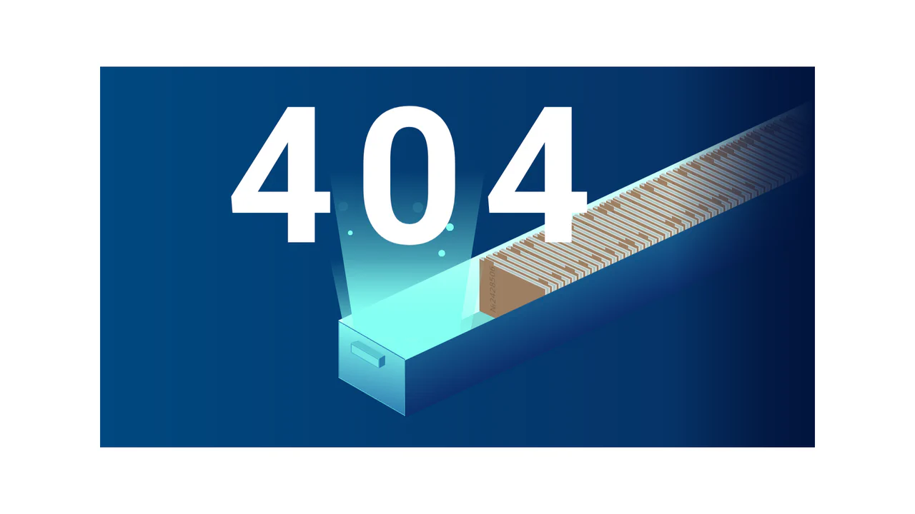
404 Isometric Animation
An isometric 404 page built entirely with pure CSS using transform: skew/rotate/perspective to create pseudo-3D depth and a bookshelf effect, showcasing mastery of spatial transformations.
See the Pen 404 Isometric Animation.
CSS Isometric Image Hover Effects
This component builds an interactive 3D gallery by rendering list-item card images in an isometric pseudo-depth projection. The structural logic applies 3D transforms (rotateX and rotateZ) to the image and shadow nodes, using rotated pseudo-elements to extrude solid physical edges beneath flat raster images. Upon hover, transitions smoothly reset the rotation to flat 2D space while contracting the offset shadow and restoring color saturation. Because the animation relies on GPU-accelerated transforms, the gallery achieves exceptional rendering performance with high tactile feedback.
See the Pen CSS Isometric Image Hover Effects.
CSSometric
This parametric simulation builds a kinetic wave of 3D cubes by layering translated pseudo-elements within an isometric CSS coordinate space. The structural logic applies custom inline delay offsets to index variables, driving synchronized scale deformation and color flash keyframes across a unified timing curve. While constructing 3D lighting natively via brightness filters on extruded side walls is mathematically elegant, animating multi-axis scaling and color shifts simultaneously across twelve isolated composited layers introduces significant rendering and GPU compositing overhead.
See the Pen CSSometric.