180+ CSS @keyframes Examples (Page 4)
Examples
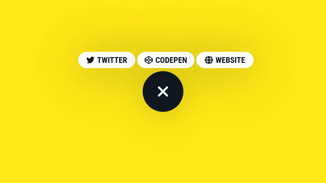
Expanding Social Share Button
A smooth, morphing circular button that expands on click to reveal three link items, utilizing complex CSS transitions, transition-delay, and a Pug template structure for dynamic content generation.
See the Pen Expanding Social Share Button.
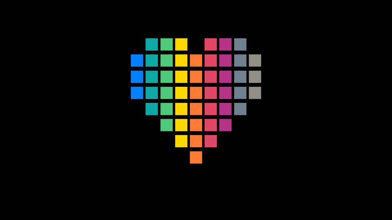
Pixel Heart Animation
A visually engaging pixel heart animation created purely using an HTML ul/li structure and CSS @keyframes, where the “pop-in” effect is achieved through smooth transform: scale transitions.
See the Pen Pixel Heart Animation.
Arrow Animations (CSS-Only Icon)
This highly reusable CSS-only icon features complex bidirectional animation and a ripple effect, achieved by leveraging CSS Custom Properties for state and using a minimal JavaScript cloning trick to instantly restart the animation on click.
See the Pen Arrow Animations (CSS-Only Icon).
Bounce Menu Animation (Pure CSS)
This striking burger menu animation is implemented purely with CSS keyframes and utilizes CSS custom properties for inverting the direction and precise positioning of each bar.
See the Pen Bounce Menu Animation (Pure CSS).

Feedback Reactions (Pure CSS)
Pure CSS custom properties and SVG for a neat, interactive feedback rating; see how variable-driven styling creates smooth state transitions and subtle 3D transforms.
See the Pen Feedback Reactions (Pure CSS).
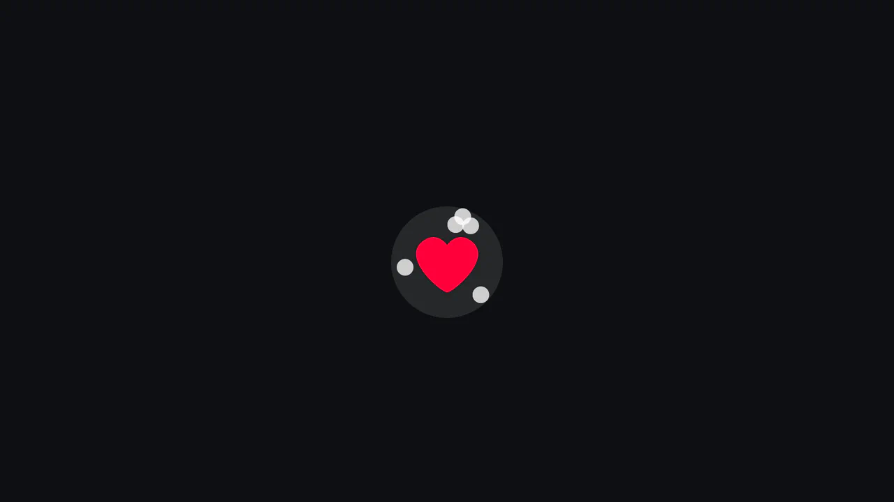
Heartless Confetti Button Effect
A clean implementation of the popular “confetti” effect for a button, using Vanilla JS to dynamically create/remove elements and set CSS variables, while the entire animation logic for movement and fading is handled by highly optimized CSS keyframes.
See the Pen Heartless Confetti Button Effect.

Playing Card 3D Preloader
An intricate infinite 3D stacking animation achieved purely with CSS transform-style: preserve-3d and complex @keyframes, leveraging translateZ for depth and precise animation-timing-function steps to smoothly cycle three cards in a continuous loop.
See the Pen Playing Card 3D Preloader.
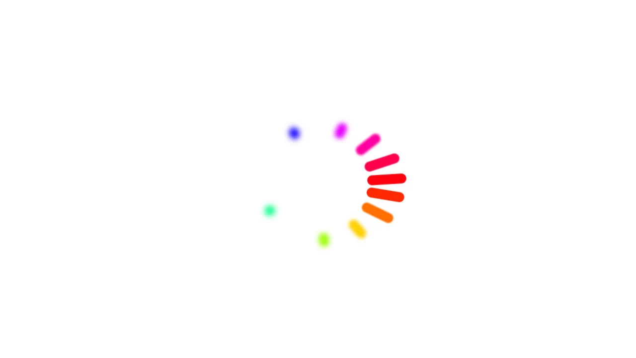
Color Wheel Loader using Animated Custom Properties
Advanced CSS animation utilizing ten-point delays (nth-child) to create a ripple effect and showcasing CSS Houdini capabilities for animating length and angle values.
See the Pen Color Wheel Loader using Animated Custom Properties.

GSAP 3 Animation Deck with 3D Transforms
A demo of multi-step animations using keyframes within GSAP, plus subtle work with CSS filters (brightness) to simulate 3D object lighting.
See the Pen GSAP 3 Animation Deck with 3D Transforms.
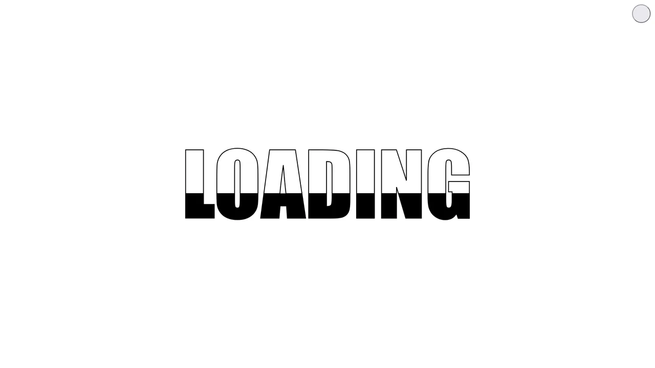
Loading Animation with CSS Custom Properties
The clean code illustrates how to use CSS variables for color control and a simple, yet effective mask animation to simulate a loading process.
See the Pen Loading Animation with CSS Custom Properties.

Spectacular Pure CSS Screen Transition
See how spectacular, complex animations built with pure CSS and JavaScript create dynamic, memorable screen changes.
See the Pen Spectacular Pure CSS Screen Transition.

Pure CSS Linear Circular Motion
Witness the power of pure CSS with this mesmerizing 3D mechanical animation, built using advanced 3D transforms and intricately choreographed keyframes — no JavaScript required.
See the Pen Pure CSS Linear Circular Motion.
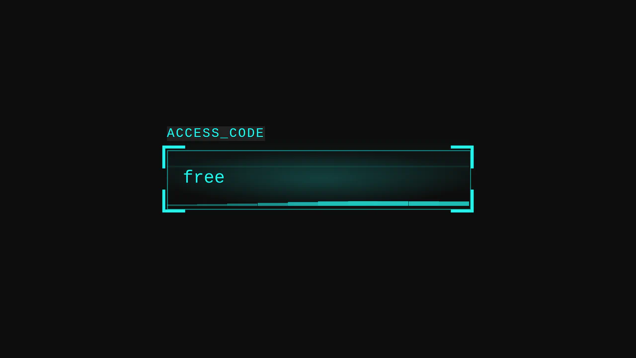
Cyberpunk Glitch Input
Here is an advanced example of an interactive UI element built entirely with CSS. The demo is technically notable for its approach to visualizing activity: it uses pseudo-elements and CSS variables to create glow effects, scanning lines, and a “data stream” that activates on input focus.
See the Pen Cyberpunk Glitch Input.
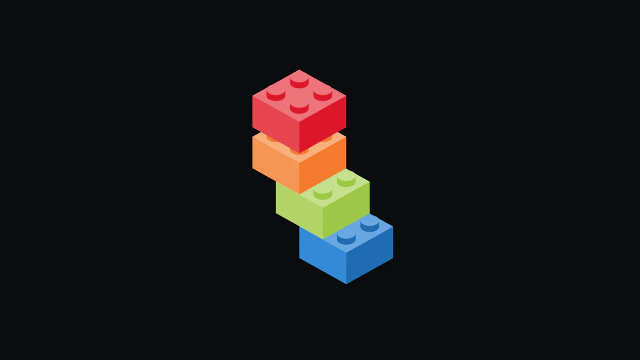
LEGO Stacking Preloader
A dynamic SVG loader created with Sass. It shows how to build multi-layered animation using nested g elements within SVG and Sass maps for flexible control over colors and styles.
See the Pen LEGO Stacking Preloader.
CSS 3D Sphere Animation
A 3D sphere where an SCSS @for loop calculates the transform for each ring, and the entire animation and structure, built on perspective and transform-style: preserve-3d, are fully configurable via variables.
See the Pen CSS 3D Sphere Animation.
Leverage the modern View Transitions API to seamlessly morph any element (e.g., button to dialog) using the view-transition-name property and custom CSS keyframes like flip-in.
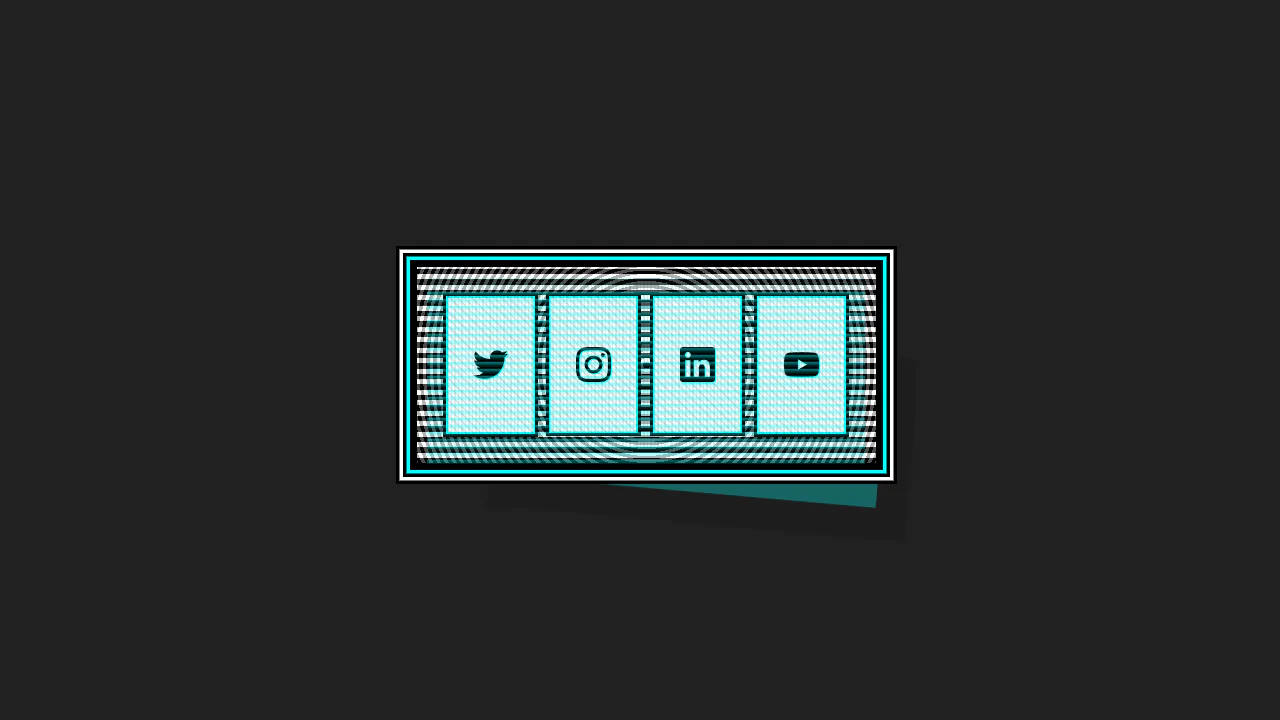
This Cyberpunk-inspired card features a complex box-shadow offset and text-shadow for the core CRT aesthetic, paired with a dynamic :hover state that uses transform to instantly swap the terminal view for a social icon grid.
CSS Light Sphere Animation #21
3D sphere from 21 concentric rings. Each ring — div with rotateX(90deg) and Z translation. Sizes and animation delays controlled via CSS variables. Rings pulse, changing color via hue-rotate. Rotation pauses on hover.
See the Pen CSS Light Sphere Animation #21.
CSS Shimmer Loading Effect
A classic skeleton loader pattern implemented via pure CSS. The shimmer effect utilizes a wide linear-gradient and animates background-position to simulate a passing wave of light indicating active data fetching.
See the Pen CSS Shimmer Loading Effect.

Flying Through Hexagons
A large-scale 3D scene where Sass procedurally generates both the trajectory of 72 rings using trigonometry, and the @keyframes for its “fly-through” mode via a Sass map. Animation is switched without JS using the “checkbox hack”, and the entire composition is built upon perspective and transform-style: preserve-3d.
See the Pen Flying Through Hexagons.
Animated Squiggly Border Glow Cards
A card with a neon border effect where two CSS animations are synchronized - stroke-dashoffset for the SVG frame and hue-rotate for the drop-shadow glow. Each card gets a unique theme via :nth-child and the --cardAccent CSS variable, while multi-layering with z-index positions the glow underneath the main content.
See the Pen Animated Squiggly Border Glow Cards.
Dark Ripple Pre-Loader (No-JS)
Dive into a dynamic ripple loader crafted using modern CSS capabilities, such as backdrop-filter for a stylish blur effect. The demo showcases how to leverage CSS Custom Properties for easy customization of the background and gradients without altering the core animation logic.
See the Pen Dark Ripple Pre-Loader (No-JS).
Gummy Buttons
A “gummy” button animation in pure CSS, where the effect is achieved by simultaneously animating transform: scale() and border-radius. Separate @keyframes are used for the :hover and :active states, creating a unique tactile response.
See the Pen Gummy Buttons.
Button
The main button has a semi-transparent background, the ::before pseudo-element contains the animated gradient, and ::after has a solid dark background that “cuts out” the inner part, leaving only the border visible.
See the Pen Button.
Climbing Cube
An illusion of an endlessly rolling 3D cube, achieved by synchronizing two @keyframes animations for rotation and sliding with an offset transform-origin. The complex rotation animation uses intermediate steps for a “bounce” effect, while a neon glow and -webkit-box-reflect complete the futuristic look.
See the Pen Climbing Cube.
CSS Rain Effect
Experience a realistic, interactive rain simulation built entirely with pure CSS/SCSS. The core technical feature is the use of CSS Custom Properties to dynamically change wind direction via hover and trigger a lightning effect using a simple :active state.
See the Pen CSS Rain Effect.
A fun, “breathing” grid of characters that responds to user interaction, emphasizing the selected element.
Virtual Credit Card UI
A demonstration of “living” cards with two looped @keyframes animations - one for smooth background panning, and another for creating a shimmering gradient highlight.
See the Pen Virtual Credit Card UI.
Love Is in the Air...
Explore the power of pure CSS for complex shapes and motion: a beautifully designed love letter featuring floating heart elements built entirely with CSS pseudo-elements and keyframe animations.
See the Pen Love Is in the Air....
CSS Bookmark
A state-driven animation, controlled via the “checkbox hack,” showcases the power of CSS @property (Houdini) for smoothly animating gradients and mask properties. A complex multi-layered bookmark shape is created with an SVG mask, while the entire activation effect choreography is built on synchronized @keyframes.
See the Pen CSS Bookmark.