180+ CSS @keyframes Examples (Page 5)
Examples
Arrow Keyframes Animation
A “snake” arrow style loader animation where each circle smoothly changes color using @keyframes, and animation-delay sets an offset for each element, creating a running wave effect.
See the Pen Arrow Keyframes Animation.

Eye-Catching Bootstrap 5 Button
A vibrant CTA button featuring a neon linear gradient and a continuous ‘shine’ animation implemented via a moving radial gradient on the ::before pseudo-element. On hover, it scales up and intensifies its colored drop-shadow for enhanced interactivity.
See the Pen Eye-Catching Bootstrap 5 Button.
3D Textbox
This UI component is a masterclass in CSS 3D transforms, using transform-style: preserve-3d to create a fully three-dimensional, interactive textbox. The 3D effect is achieved by rotating and positioning pseudo-elements with rotateY(90deg) and rotateX(90deg), demonstrating a sophisticated, purely decorative use of 3D space.
See the Pen 3D Textbox.

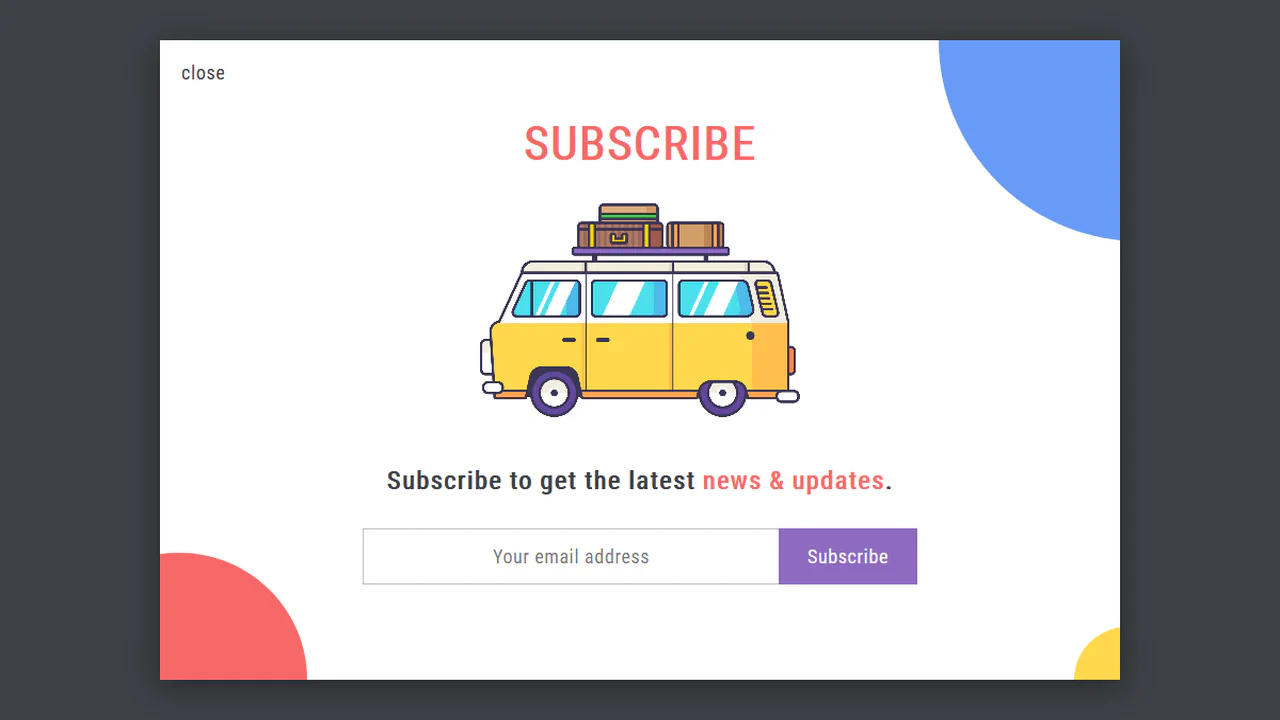
Simple Subscribe Form
This demo’s lively backdrop is created by injecting animated creatures into the form’s ::before and ::after pseudo-elements using Base64 data:image URLs. This visual flair is complemented by polished, pure CSS micro-interactions - the email input elegantly expands its width on :focus, while the submit button provides a tactile 3D press effect by manipulating box-shadow and transform: translateY().
See the Pen Simple Subscribe Form.
Pop-Up Overlay
This is a robust component built entirely with SCSS, leveraging a full suite of custom mixins for cross-browser animation, transform, and transition. A centralized variable block for the color palette makes the component highly themeable and maintainable.
See the Pen Pop-Up Overlay.

Contact Form with SVG Animation
This is a complete UI component blending aesthetic animation with functional form design. Staggered CSS keyframe animations bring the inline SVG to life, while the form itself features modern styling techniques, including a performant gradient-transition button and absolutely positioned Feather icons.
See the Pen Contact Form with SVG Animation.
A minimalist yet atmospheric thunderstorm scene, where a static cloud and lightning bolt are complemented by dynamic rain.
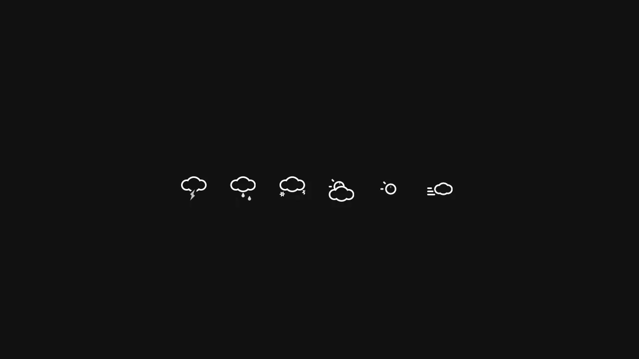
Animated SVG Weather Icons
A suite of animated weather icons utilizing inline SVG and CSS keyframes to create fluid, vector-based meteorological effects.
See the Pen Animated SVG Weather Icons.
Animated Weather Icons
A lightweight, scalable, and visually pleasing set of weather icons that can be easily adapted to any website color scheme.
See the Pen Animated Weather Icons.
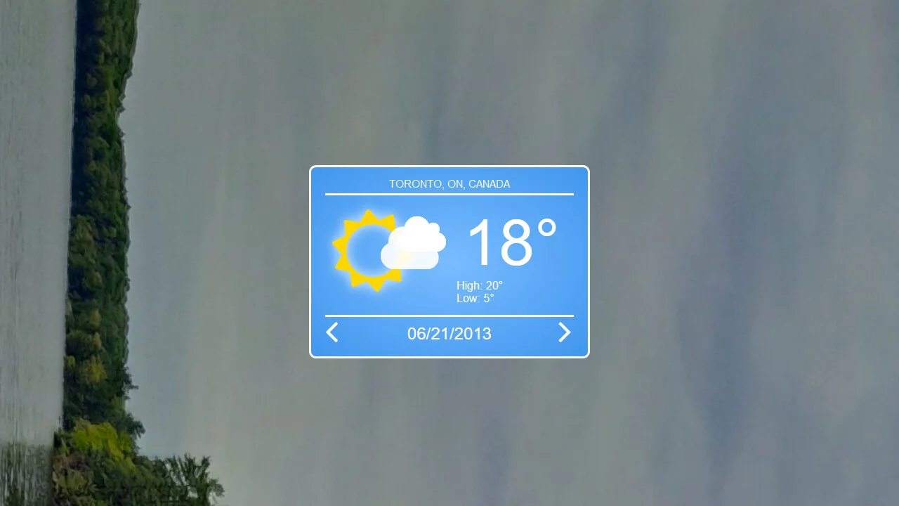
Weather Widget
A vivid weather widget styled with complex CSS radial gradients to mimic a sky backdrop. Classic float-based layout structures the content, while @keyframes bring life to FontAwesome icons, animating the sun’s rotation and the clouds’ drifting motion."
See the Pen Weather Widget.
A static grid that comes alive on hover: font cards “jump out” at the user with a springy animation, doubling in size for easy reading.
A smooth, rhythmic pulsation that creates a sense of “alive” waiting while keeping the page structure stable.
Retro CSS Slideshow
A demonstration of how two independent, infinite @keyframes animations can be layered to create a complex visual sequence. One set of animation-delay manages the colored transitions, while the second controls the smooth appearance of the background images, creating a dynamic slideshow effect.
See the Pen Retro CSS Slideshow.
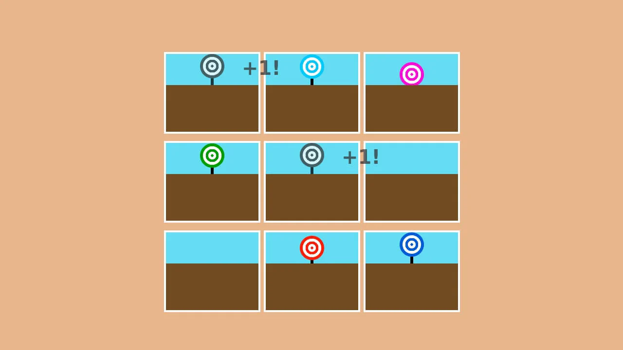
Pure CSS Carnival Game
A fun and dynamic reaction game where the user must click moving targets within a time limit, with the score automatically tracked using CSS.
See the Pen Pure CSS Carnival Game.
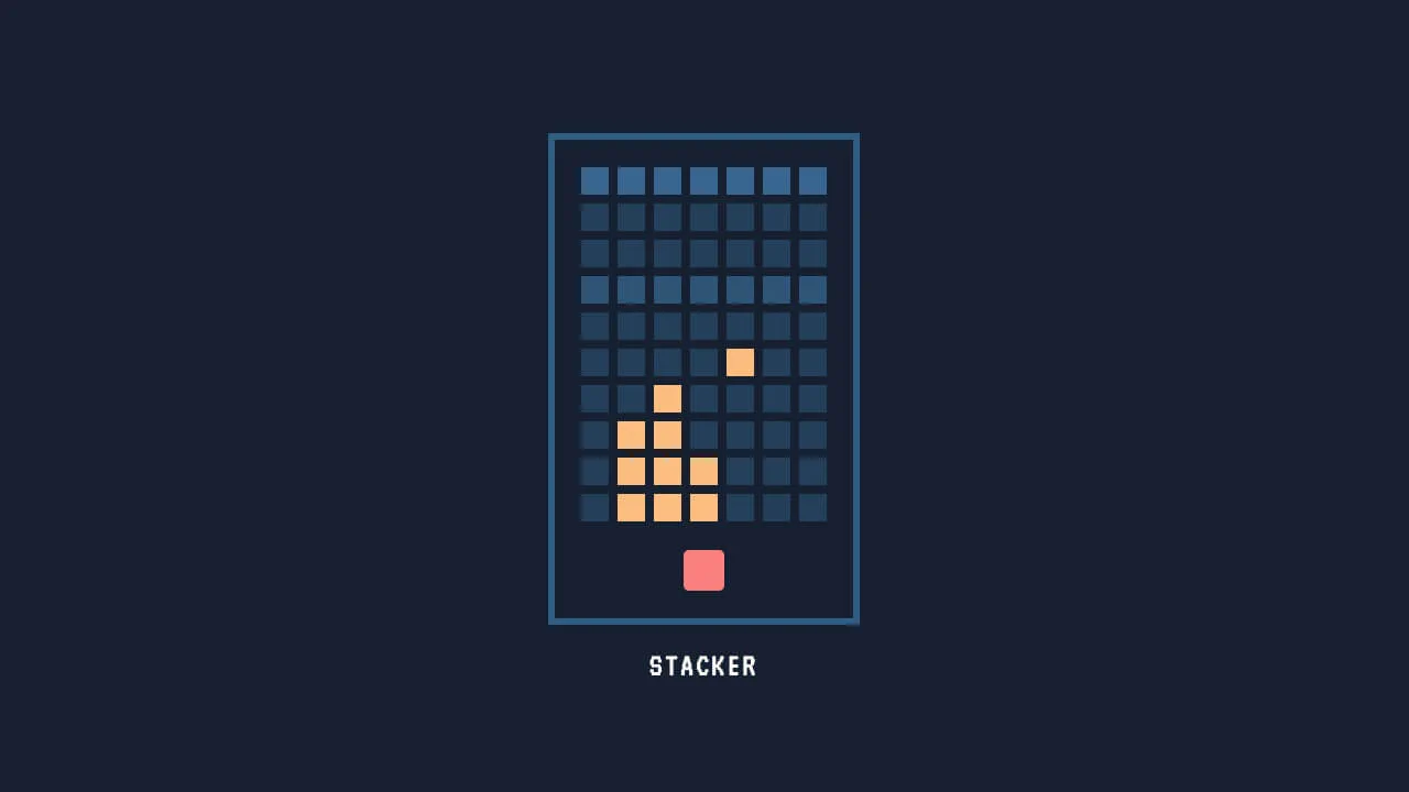
Pure CSS Game: Stacker
A fully playable “Stacker” arcade game built entirely with CSS, utilizing the radio button hack and animation timing control.
See the Pen Pure CSS Game: Stacker.
Scroll Down Icon Animation
Intuitive visual cues prompting the user to take action (scroll), executed in a minimalist style.
See the Pen Scroll Down Icon Animation.
A bright, dynamic countdown animation where the hand makes a full revolution for each digit, mimicking the operation of a mechanical projector or clock.
A high-precision visual timer that starts counting upon page load, operating smoothly (for hundredths) and rhythmically (for seconds), demonstrating the power of pure CSS for time management.
A pure CSS digital counter that simulates a ticking stopwatch from 00 to 59 using pseudo-elements and generated content.
3D Flip Clock Counter in Pure CSS
A realistic mechanical counter animation where the top half of the digit flips down to reveal the next one, maintaining the rhythm (units change faster than tens).
See the Pen 3D Flip Clock Counter in Pure CSS.
A stylish odometer-like counter animation crafted with SCSS.
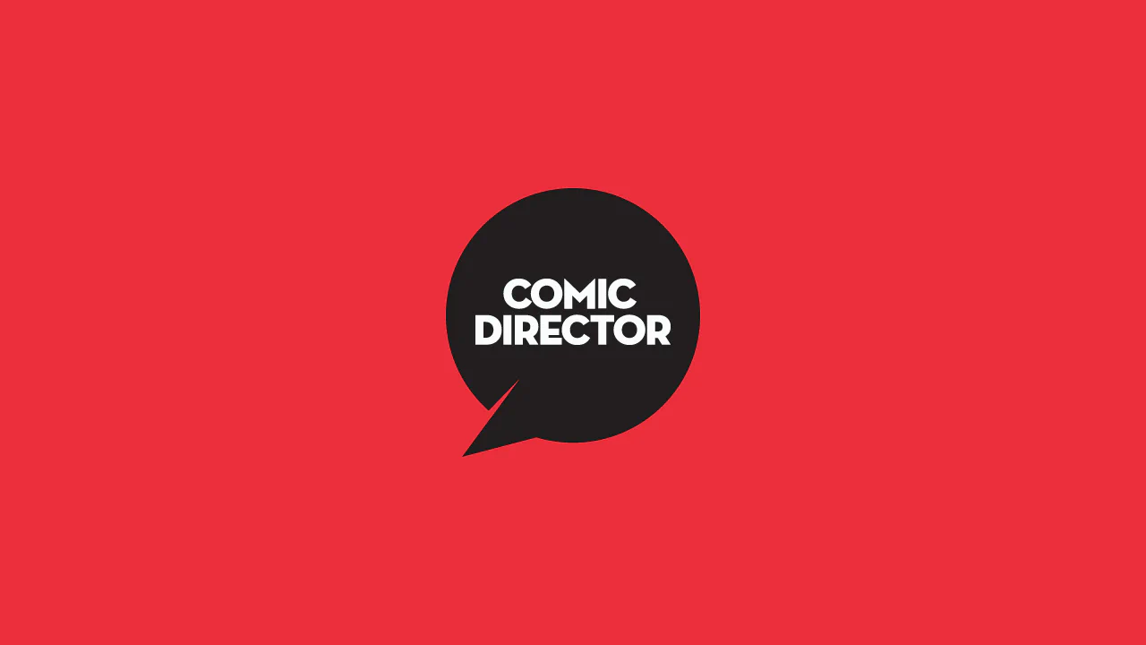
Comic Director Splash Animation
A dynamic splash screen where the layer reveal choreography is built on transform and transition-delay, applied to each element via :nth-child. The final layer “explodes” spectacularly using @keyframes and a custom cubic-bezier function, with the entire animation optimized for hardware acceleration.
See the Pen Comic Director Splash Animation.
A spectacular intro sequence where a barcode dynamically ‘grows’ from the void, forming a recognizable symbol before dissolving, creating the atmosphere of a spy thriller.
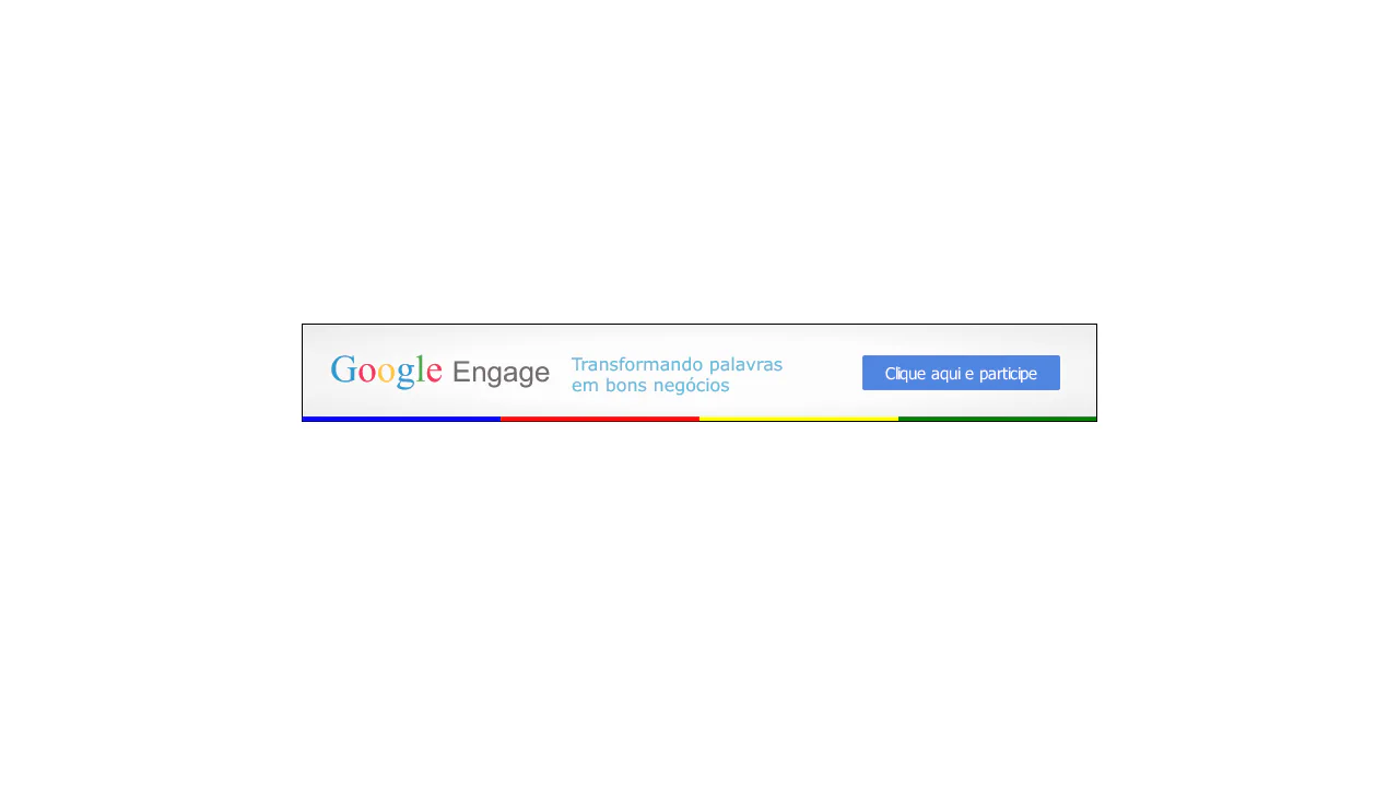
Banner Google Engage CSS
An animated presentation where text transitions into a graphical simulation of an advertising “engine” (AdWords), culminating in a final call to action."
See the Pen Banner Google Engage CSS.
Only CSS Loading Animation
An advanced SCSS technique - the percentage counter animation up to 100% is generated using a @for loop. It demonstrates dynamic content changes and multi-step @keyframes to create a realistic loading process.
See the Pen Only CSS Loading Animation.
Hop Over Notification Badge
A “jumping” notification badge animation where content is dynamically sourced from a data-bubble attribute via attr(). The effect is implemented on an ::after pseudo-element using @keyframes that synchronously animate transform and z-index to create an illusion of depth.
See the Pen Hop Over Notification Badge.

CSS Circle Notifications
A library of pure CSS animations for notification badges, where different effects like swing, tada, or bounce are triggered on parent element hover. The technique uses classes to switch the animation-name property via the :hover pseudo-selector, demonstrating a modular approach to creating microinteractions.
See the Pen CSS Circle Notifications.

Rainbowy Dashed Divider
A creative divider made by layering two pseudo-elements - an animated rainbow gradient and a masking dashed line that “punches” holes in it using a linear-gradient.
See the Pen Rainbowy Dashed Divider.
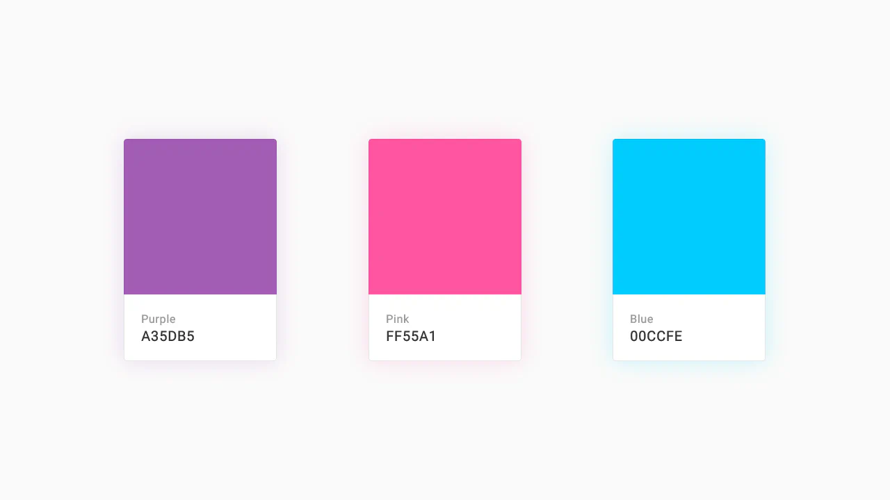
Color Palette
A responsive Flexbox grid featuring interactive cards that combine smooth transition and a @keyframes animation on hover. The implementation focuses on performance - using will-change - and styling flexibility through SASS variables and currentColor.
See the Pen Color Palette.
Material Design: Profile Card
This is a technically complex Material Design demo, relying on intricate CSS animation precisely controlled by @keyframes and Bézier curves, which creates a sequential element reveal effect; the key feature is the four-stage transformation of the card from a circle to a rectangle and the dynamic background fill, while the entire layout is responsive via media queries.
See the Pen Material Design: Profile Card.