180+ CSS @keyframes Examples (Page 6)
Examples
Material Design Card Effect
A flexible SCSS system for generating multi-layered, Material Design-style shadows - all logic is built on @functions and accessing list values with nth().
See the Pen Material Design Card Effect.

CSS3 Business Card
A demonstration of SCSS power, where a 3D card flip on hover is combined with the procedural generation of a “long shadow” via a @function and @for loop, while a custom @keyframes animation adds a wobble effect to the button.
See the Pen CSS3 Business Card.

Attractive Play Button
This interactive play button uses synchronized SVG stroke manipulation for its hover effect: the solid stroke fades out and dashes off, while the dotted stroke fades in and increases its width to take its place.
See the Pen Attractive Play Button.

Bouncing Play Button
An interactive SVG Play button featuring a complex bouncing animation generated with Bounce.js. The component’s state is managed by a JavaScript click listener that toggles CSS classes, triggering advanced keyframe animations powered by matrix3d for a highly dynamic UI effect.
See the Pen Bouncing Play Button.
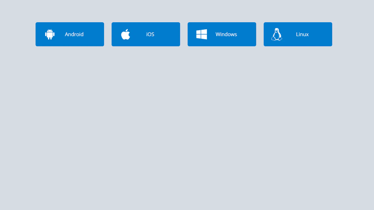
Download Buttons
A collection of operating system SVG icons, styled and animated with CSS. On hover, two synchronized animations are triggered: the icon smoothly scales up and rotates , while the caption smoothly slides out.
See the Pen Download Buttons.
Hover Over Me Button
A button with a multi-stage animation in pure CSS: on load, it smoothly appears “from the ground up” using @keyframes that animate opacity and transform: translateY(). On hover, a ::after pseudo-element, positioned underneath the button with z-index: -1, scales up and fades out, creating a “pulsating” wave effect.
See the Pen Hover Over Me Button.
Organic Button
A multi-step submit button animation where JavaScript setTimeout toggles loading and ready classes. In the “loading” state, @keyframes animates the button’s contraction and the appearance of pulsating circles created with pseudo-elements. In the “ready” state, the button expands and changes its text, showcasing a complex, synchronized animation.
See the Pen Organic Button.

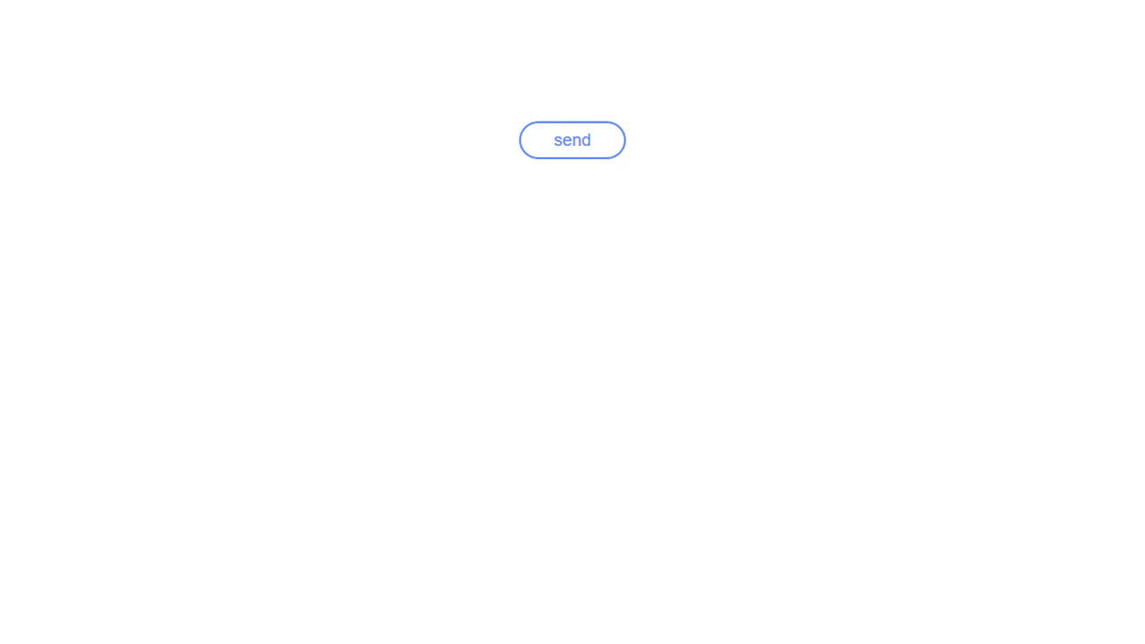
Send Button
A two-step animation where a click on a “ghost” button triggers two JS functions that add classes to start two animations. The first, transform: translate(), moves the icon, while the second, @keyframes fadeIn, fades in its background with a 0.4-second animation-delay, creating a sequential and synchronized effect.
See the Pen Send Button.
Material Floating Button CSS
A “Floating Action Button” effect, inspired by Google Inbox, implemented in pure CSS. Hovering over the container triggers a complex, multi-step @keyframes animation: the plus icon rotates and fades out, an edit icon appears, and child buttons cascade out with a “bounce” effect thanks to animation-delay, creating a cohesive and smooth interaction.
See the Pen Material Floating Button CSS.
The badge uses background: rgba() and backdrop-filter: blur(10px) to create a translucent, frosted look. A double layer with ::before adds depth and enhances the blur effect.
An interactive hover animation that separates elements in 3D space. On container hover, one element animates with transform: rotateX(70deg), while another gets a grow animation, creating an effect of depth and dynamism.
Eclipse Badge
An “eclipse” or running glint effect implemented in pure CSS. The @keyframes eclipse animation infinitely moves a white div from one edge to the other using transform: translateX, creating the illusion of a moving light source.
See the Pen Eclipse Badge.
CSS Particle Style Animation
Creating a depth of field effect in pure CSS - different animation speeds and filter: blur() values for each element create the illusion of a multi-layered space.
See the Pen CSS Particle Style Animation.
Particle Orb CSS
Creation of a 3D particle sphere using a single global @keyframes for container rotation and individual @keyframes, procedurally generated in a SCSS @for loop for each particle.
See the Pen Particle Orb CSS.
Quantum Project x Eedi
A 3D dot cube where each face is a separate div and the dots are nested divs. The 3D effect is achieved using transform-style: preserve-3d and perspective, with each face offset along the Z-axis by a different distance.
See the Pen Quantum Project x Eedi.
Retro CSS Slideshow
A demonstration of how two independent, infinite @keyframes animations can be layered to create a complex visual sequence. One set of animation-delay manages the colored transitions, while the second controls the smooth appearance of the background images, creating a dynamic slideshow effect.
See the Pen Retro CSS Slideshow.
CSS Text Filling with Water
The key technical trick is the use of the modern background-clip: text property for masking, allowing the animated wave background to shine through the text outline.
See the Pen CSS Text Filling with Water.
Drip Drop Animation
A dynamic, JavaScript-free animation of a water drop falling and rippling, using a specific cubic-bezier easing function to precisely simulate the realistic acceleration and motion of the falling object.
See the Pen Drip Drop Animation.
Water Drop
A pure CSS water drop animation featuring realistic ripples, utilizing a key technical feature: 3D transformation rotateX(75deg) on pseudo-elements to simulate the perspective of expanding concentric circles.
See the Pen Water Drop.
Waves
This lightweight demo showcases dynamic, animated waves built entirely with SVG and pure CSS keyframes, eliminating the need for complex JavaScript to create a smooth, scalable visual effect.
See the Pen Waves.
Auto Type CSS
A pure CSS typewriter animation where the text is revealed character-by-character by animating the width of an overlapping ::after pseudo-element, which simultaneously functions as the blinking cursor.
See the Pen Auto Type CSS.
Blazing Fire
A realistic blazing text effect created purely with CSS using multi-layered text-shadow, where each layer simulates thermal glow and flames, with continuous motion driven by @keyframes.
See the Pen Blazing Fire.
CSS Typing Animation
A performant typewriter effect where the text overlay and cursor are combined within the ::after pseudo-element, and the stepped reveal is achieved using the animation: typing X steps(N) forwards property.
See the Pen CSS Typing Animation.
Typing Text Animation
An implementation of the popular typewriter effect using two distinct @keyframes: one for the stepped text reveal via width animation and another for the realistic blinking cursor.
See the Pen Typing Text Animation.
Winter Is Coming
A pure CSS snowfall with a volumetric effect, achieved through a combination of box-shadow and parameter randomization within the @keyframes rule. An ideal example for implementing a high-performance seasonal animation without JavaScript.
See the Pen Winter Is Coming.
Let it Snow
See how to create an illusion of depth and movement in a snowfall using only animated multi-layer backgrounds.
See the Pen Let it Snow.
One Element CSS Snow
A revolutionary snow effect using just one HTML element. SCSS-powered radial-gradient generation and a three-layer background animation create realistic depth and high performance.
See the Pen One Element CSS Snow.
Building a Trapezoid
This demo features a mesmerizing pure CSS 3D animation, creating an infinite, revolving tunnel of six trapezoid shapes, expertly leveraging the perspective and transform-style: preserve-3d properties for deep depth and complex movement with a smooth ease-in-out keyframe animation.
See the Pen Building a Trapezoid.
Battery Charging Animation With Liquid
A compact battery icon created with a .battery container and a terminal pseudo-element , featuring a high-contrast design and a bright green .liquid fill that uses a repeating 2.25s animation cycle for continuous charging feedback.
See the Pen Battery Charging Animation With Liquid.
Striking hero image and heading reveal animation, controlled by CSS Custom Properties for timings and a custom easing function, delivering a smooth and precise UX.