8 CSS @layer Examples
For years, managing the CSS cascade has relied on fragile conventions like source order, BEM, or the dreaded !important rule. The @layer at-rule fundamentally changes CSS architecture by providing an explicit, native mechanism to control specificity. Using this updated collection allows developers to build scalable UI design systems where the origin of a style matters less than its intended layer, making CSS more predictable than ever.
Technically, these examples demonstrate how to define and order cascade layers (e.g., @layer reset, theme, components). Styles within a later-defined layer will always win over those in an earlier one, regardless of selector specificity. This makes integrating third-party libraries or component styles predictable and safe. The code also explores the revert-layer keyword for rolling back styles to a previous layer’s value, enabling more robust theming and component architecture.
Every free demo is built with semantic HTML and is designed for modern browser environments. Whether you need to download a boilerplate for a theming system or fork a specific example on CodePen, these resources provide a performant and maintainable foundation for your next large-scale project.
Examples

Scroll-Driven Glowing Slider
This is a Scroll-Driven Glowing Slider. It completely restyles a standard <input type="range"> into a high-fidelity, glowing interface component. Its primary function is to demonstrate how experimental CSS features (animation-timeline: scroll()) can link native input states directly to complex visual changes — like a dynamically resizing, blurred glowing track — without relying on heavy JavaScript event listeners. (Requires: Tweakpane, Normalize.css)
 Chrome 115+
 Edge 115+
See the Pen Scroll-Driven Glowing Slider.

Staggered Animated Hamburger Toggle Button
The Staggered Animated Hamburger Toggle Button is a highly refined navigation trigger. It utilizes aria-pressed states to drive complex, multi-stage CSS transitions. Its function is to provide an accessible, tactile entry point for menus, using staggered motion to visually explain the transformation from a “hamburger” to a “close” icon.
Chrome 99+
Edge 99+
 Firefox 97+
 Safari 15.4+
See the Pen Staggered Animated Hamburger Toggle Button.

Modern Container Query Product Cards
This snippet showcases Modern Container Query Product Cards. It represents the bleeding edge of CSS architecture, utilizing @scope, @layer, and @property to create highly encapsulated, fluid components. Its function is to provide a robust e-commerce card layout that automatically adjusts its internal styling and grid distribution based on the physical size of its container, not the viewport. (Requires: kiso.css)
Chrome 118+
Edge 118+
Firefox 128+
Safari 17.4+
See the Pen Modern Container Query Product Cards.

CSS :has() Notification Toggle
This is a CSS :has() Notification Toggle. It provides a fully functional, state-aware UI switch for settings panels without a single line of JavaScript. Its function is to allow the user to toggle a binary state (notifications on/off) and have the entire UI — including icons, labels, and descriptive text — update instantly based purely on the state of a hidden checkbox.
Chrome 105+
Edge 105+
Firefox 121+
Safari 15.4+
See the Pen CSS :has() Notification Toggle.

Auto-Generated Anchor Positioned TOC
This is an Auto-Generated Anchor Positioned TOC. It parses an article’s heading structure on the fly and constructs a sticky navigation menu. Its primary function is to replace heavy JavaScript scroll-spies (Intersection Observers) with native CSS Anchor Positioning and Scroll Targeting, moving an animated highlight alongside the active content section. (Requires: Tweakpane, GSAP)
Chrome 125+
Edge 125+See the Pen Auto-Generated Anchor Positioned TOC.

Cyberpunk Glitch Upgrade Modal
This is a Cyberpunk Glitch Upgrade Modal. It transforms a standard confirmation dialog into a highly stylized, cinematic interface. Its function is to provide explicit interaction boundaries using the native HTML Popover API, augmented with aggressive visual distortion (glitches) and integrated audio feedback for a deeply immersive user experience. (Requires: Tweakpane)
Chrome 114+
Edge 114+
Firefox 125+
Safari 17+See the Pen Cyberpunk Glitch Upgrade Modal.

Scroll-Driven Sticky Text Reveal
Scroll-Driven Sticky Text Reveal is a high-end typographic interface. It utilizes modern CSS scroll timelines to synchronize the visual state of a list with the user’s scroll position. As items move through a designated “focal point,” they transition from a dimmed state to a vibrant highlight, creating a seamless reading experience. (Requires: tweakpane)
Chrome 115+
Edge 115+
Safari 26+See the Pen Scroll-Driven Sticky Text Reveal.
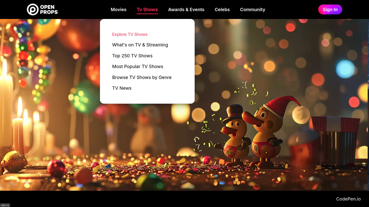
Dropdown Navigation
Navigation is the backbone of usability, but traditional dropdowns can feel cramped and elusive. This component expands the concept of a menu into a panoramic dashboard. It is not just a list of links; it is a structured map of your application’s architecture. (Requires: open-props, remixicon, normalize-css)
Chrome 99+
Edge 99+
Firefox 97+
Safari 15.4+
See the Pen Dropdown Navigation.