10+ CSS light-dark() Examples
Managing light and dark modes traditionally required repetitive media queries or complex scripts. This updated collection of CSS light-dark() examples removes that friction, allowing the interface to adapt natively to system preferences. Technology should simplify transitions between environments, and this function enables developers to define adaptive colors within a single property. Using these curated snippets ensures a cleaner codebase where logic dictates the visual state.
Technically, the logic relies on the light-dark(<color>, <color>) function, which reacts instantly to the color-scheme property. The code utilizes CSS Variables and semantic HTML to maintain high layout stability across theme shifts. This approach offloads theme-switching logic to the browser engine, ensuring a performant experience without blocking the Main Thread. This method eliminates redundant @media (prefers-color-scheme) blocks, keeping the stylesheet transparent and maintainable.
Every free demo in this library is cross-browser compatible and ready for modern production. Users can instantly download the raw code or fork an updated logic pattern on CodePen. These UI design components are strictly optimized for speed and transparency, providing a seamless experience across all modern mobile and desktop devices.
Examples
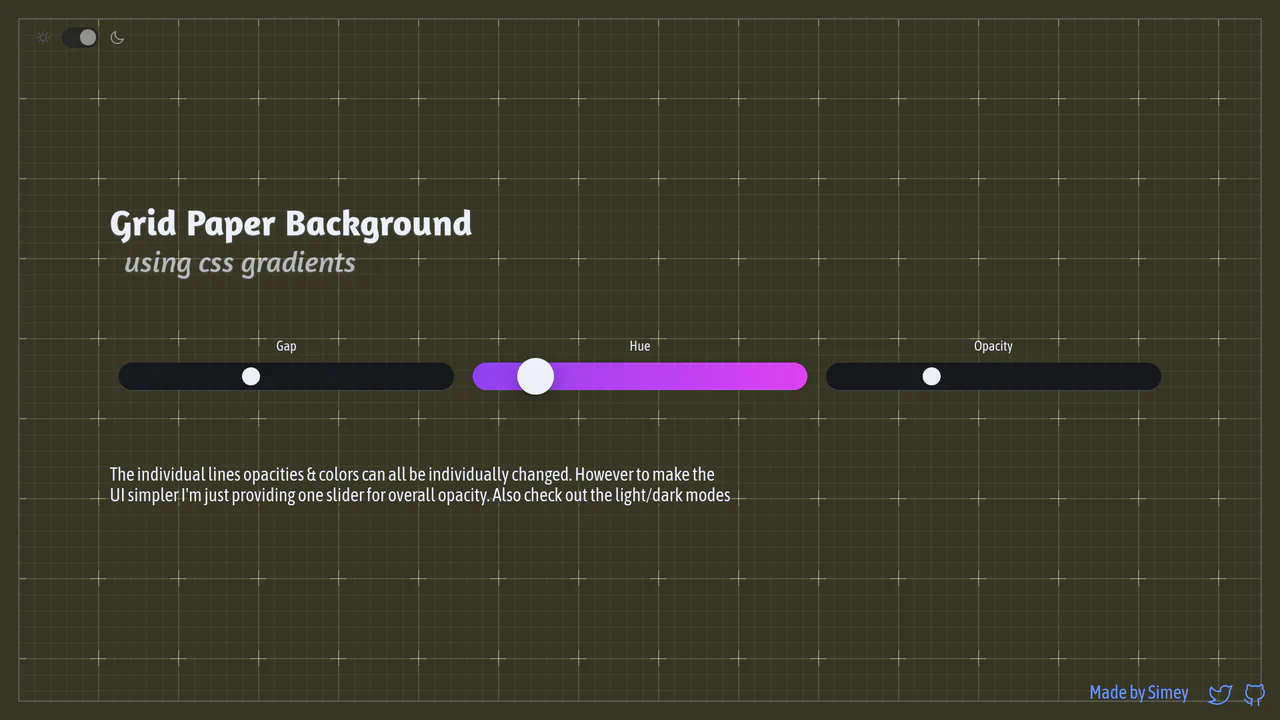
Procedural CSS Gradient Grid Background
An interactive graph notebook paper pattern drawn entirely via stacked, layered CSS gradients. By combining major and minor linear grid lines, radial cross masks, and corner border offsets, it forms a fully customizable procedural background. It utilizes CSS @property Houdini variables to smoothly transition gap sizing updates, alongside dynamic theme and color hue tuning.
 Chrome 110+
 Edge 110+
 Firefox 128+
 Safari 16.4+
See the Pen Procedural CSS Gradient Grid Background.
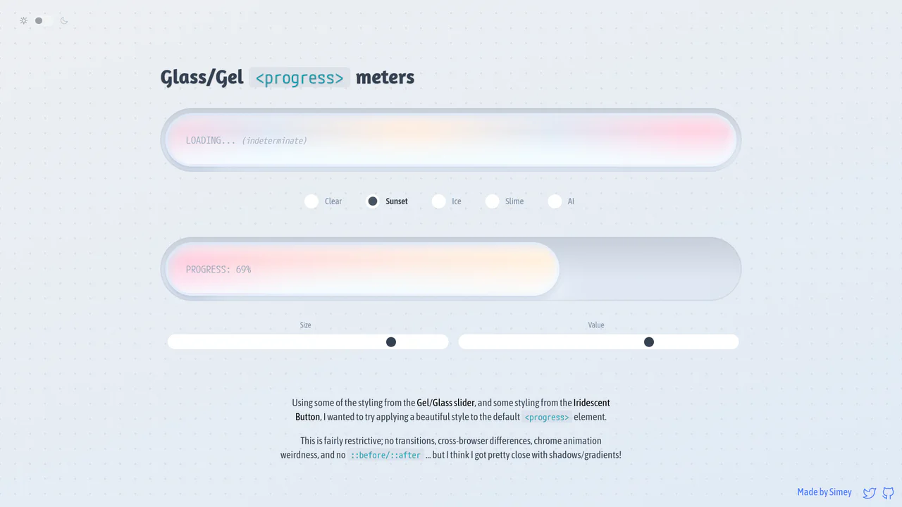
Glossy Glassmorphic Native Progress Meters
An advanced styling demonstration showing how to convert native <progress> elements into gorgeous glassmorphic ‘gel’ meters. Using native webkit and gecko pseudo-elements combined with oklch gradients, radial lighting masks, and @property Houdini variables, it builds high-performance indeterminate loading animations and responsive color themes with completely clean, semantic markup.
Chrome 111+
Edge 111+
Firefox 128+
Safari 16.4+See the Pen Glossy Glassmorphic Native Progress Meters.
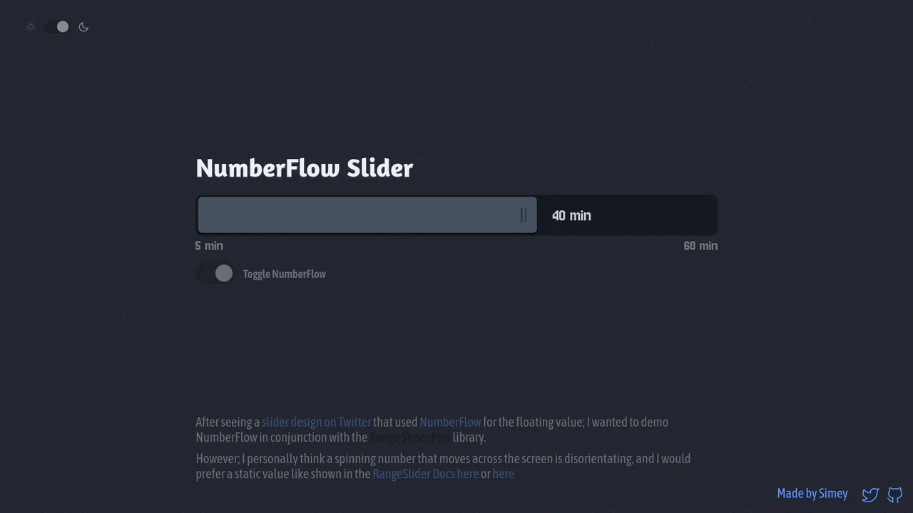
NumberFlow Floating Range Pips Slider
An interactive numeric range slider combining the Svelte Range Slider Pips library and the NumberFlow web component. Dragging the slider handle updates a floating badge indicator that slides horizontally, dynamically shifting its layout alignment to the left of the handle whenever it exceeds a 70% bar-width threshold. Includes a value-rolling automated intro animation. (Requires: svelte-range-slider-pips.js, number-flow.js)
Chrome 110+
Edge 110+
Firefox 120+
Safari 16.2+See the Pen NumberFlow Floating Range Pips Slider.
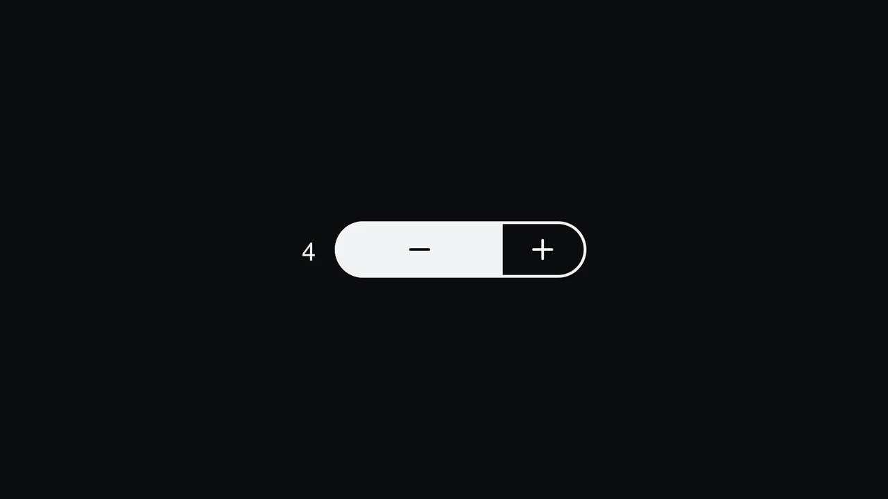
Pill Stepper Input with Sliding Fill
An elegant numeric stepper component styled as a cohesive rounded pill, built with React and SCSS. By translating the internal value into relative percentages, the control buttons, background fill, and icon symbols slide smoothly during interactions. Includes split focus-ring indicators built with the CSS :has() selector and native light-dark() modern theme support. (Requires: react.js, react.dom.js, lucide.react.js)
Chrome 110+
Edge 110+
Firefox 121+
Safari 16.2+
See the Pen Pill Stepper Input with Sliding Fill.
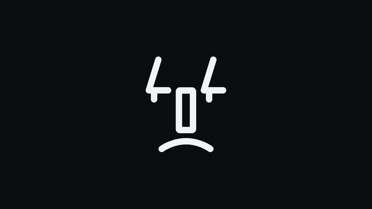
Animated 404 Face HTML, CSS & SVG
This is an Animated 404 Face SVG. It uses CSS keyframes to transform the static numbers “404” into a reactive, smiling face. Its function is to provide an engaging, lightweight fallback state for broken links, softening user frustration through characterful micro-interactions.
Chrome 123+
Edge 123+
Firefox 120+
Safari 17.5+See the Pen Animated 404 Face HTML, CSS & SVG.
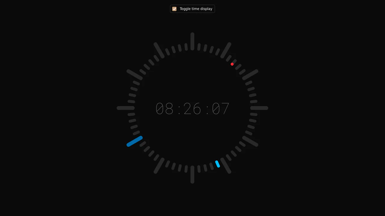
Minimalist Radial Dot Clock
This is a Minimalist Radial Dot Clock. It visualizes time through three concentric rings of geometric dots (hours, minutes, seconds) rather than traditional sweeping hands. Its function is to provide an ambient, modern alternative to standard analog or digital readouts, integrating seamlessly into high-end, futuristic interfaces.
Chrome 123+
Edge 123+
Safari 17.5+
Firefox 120+
See the Pen Minimalist Radial Dot Clock.

Sliding Theme Toggle Sidebar Menu
This is a Sliding Theme Toggle Sidebar Menu. It integrates an interactive light/dark mode switch directly into a scrollable navigation panel. Its function is to provide centralized control over the application’s visual environment while maintaining immediate access to primary routing options.
Chrome 59+
Edge 79+
Firefox 52+
Safari 10.1+
See the Pen Sliding Theme Toggle Sidebar Menu.
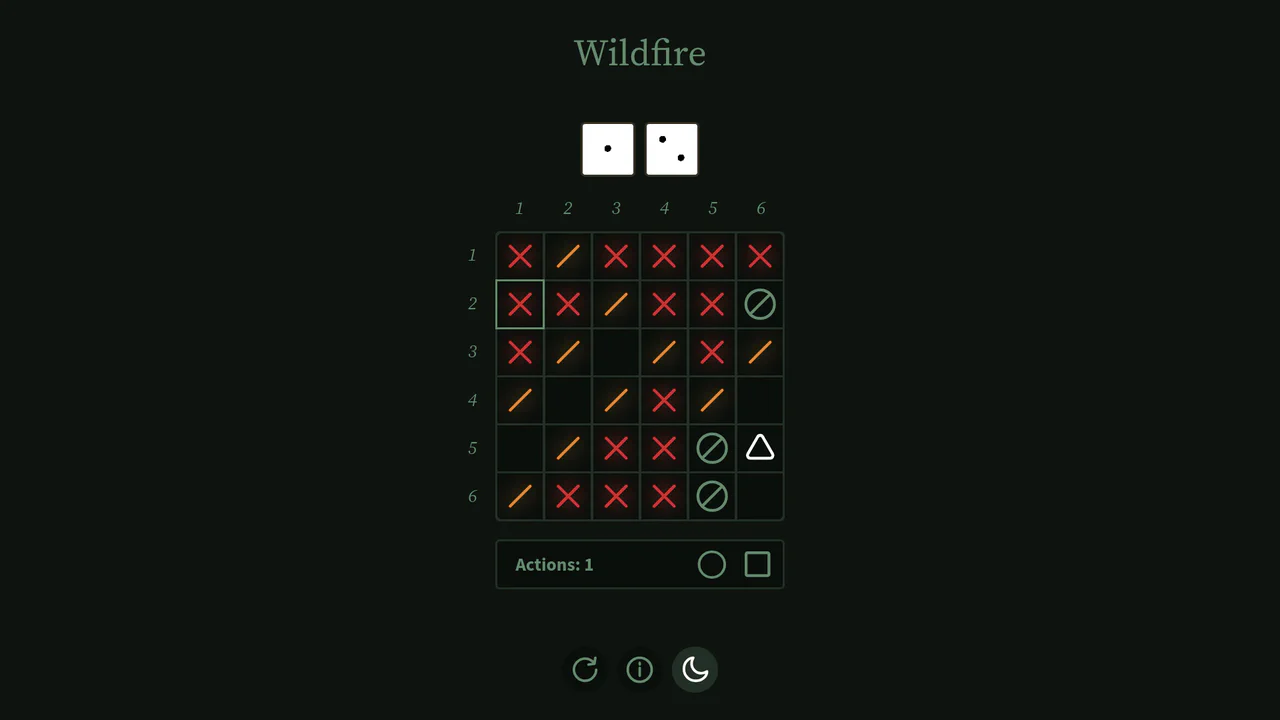
Interactive Board Game Prototype
This is an Interactive Board Game Prototype (“Wildfire”). It is a standalone, browser-based puzzle game where the player defends a “home” tile from procedurally generated “fire” tiles spreading across a 6x6 grid. It functions as an excellent study in grid mathematics, DOM-based state management, and turn-based game loops built entirely without canvas rendering or heavy game engine frameworks.
Chrome 60+
Safari 11+
Firefox 55+
Edge 79+
See the Pen Interactive Board Game Prototype.

Popping Form Controls
This is a Popping Form Controls component. It replaces standard browser checkboxes and radio buttons with highly stylized, interactive versions. Its function is to provide delightful micro-interactions by triggering a localized, physics-based confetti burst whenever an input is successfully checked.
Chrome 80+
Edge 80+
Firefox 75+
Safari 13.1+See the Pen Popping Form Controls.

Auto-Generated Anchor Positioned TOC
This is an Auto-Generated Anchor Positioned TOC. It parses an article’s heading structure on the fly and constructs a sticky navigation menu. Its primary function is to replace heavy JavaScript scroll-spies (Intersection Observers) with native CSS Anchor Positioning and Scroll Targeting, moving an animated highlight alongside the active content section. (Requires: Tweakpane, GSAP)
Chrome 125+
Edge 125+
See the Pen Auto-Generated Anchor Positioned TOC.

CSS Scroll-Driven Circular Typographic Scramble
This is a Scroll-Driven Circular Typographic Scramble. It utilizes experimental CSS animation-timeline to bind complex trigonometric and geometric transitions directly to the user’s scrollbar. Its function is to create a highly engaging, interactive hero section where chaotic, scattered letters perfectly align into a readable circular sentence as the user scrolls down.
Chrome 115+
Edge 115+See the Pen CSS Scroll-Driven Circular Typographic Scramble.

Animated SVG Alignment Toolbar
This is an Animated SVG Alignment Toolbar. It replaces static UI states with physical motion. Its function is to provide immediate, tactile feedback for spatial arrangement settings (Top, Middle, Bottom) using native form inputs.
Chrome 60+
Edge 79+
Firefox 55+
Safari 11+See the Pen Animated SVG Alignment Toolbar.

Animated Ripple Dot Grid Loader
This is an Animated Ripple Dot Grid Loader. It utilizes pure CSS and complex keyframe choreography to render a highly synchronized loading state. Its function is to communicate background processing while maintaining visual engagement. The effect is continuous and self-contained, requiring zero user interaction.
Chrome 123+
Edge 123+
Firefox 121+
Safari 17.4+See the Pen Animated Ripple Dot Grid Loader.
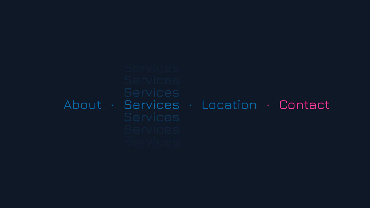
Vertical Ghost Text Hover Effect
This Vertical Ghost Text Hover Effect adds a spectral, sci-fi vibe to navigation menus without requiring extra HTML elements or pseudo-elements. By animating a stack of vertical text-shadows, the component creates a fading “echo” or “glitch” visual that expands outward when a user interacts with the link. It utilizes the modern light-dark() function to handle system theme preferences automatically.
Chrome 123+
Edge 123+
Safari 17.5+
Firefox 120+See the Pen Vertical Ghost Text Hover Effect.

Synchronized Pure CSS Skeleton Loader
This Synchronized Pure CSS Skeleton Loader pushes the boundaries of modern CSS by creating a unified “shimmer” effect that sweeps across multiple disparate elements simultaneously. Unlike standard skeleton loaders that animate each block independently, this implementation ensures a single, globally aligned gradient flow using advanced CSS math and Houdini properties.
Chrome 111+
Edge 111+
Safari 16.4+
Firefox 128+See the Pen Synchronized Pure CSS Skeleton Loader.

Theme Toggle
A smooth and striking transition between light and dark themes, where the background fills with “blinds” from the center outwards (or vice versa, thanks to symmetric --i indices), while the button playfully rotates.
See the Pen Theme Toggle.

Tri-State Theme Toggle with light-dark()
A practical example of the new light-dark() CSS function combined with native Web Components to create a flexible theme switcher. The entire system is controlled via data-attributes and includes an additional high-contrast mode for better accessibility.
See the Pen Tri-State Theme Toggle with light-dark().