60+ CSS linear-gradient Examples
Gradients define spatial depth. Static images create weight. This updated collection of linear-gradient samples removes the barrier of heavy assets. Code dictates color. Visual hierarchy becomes transparent. Using these curated snippets ensures a lightweight interface where logic replaces pixels.
Technical logic utilizes native linear-gradient() functions. Math-driven interpolation occurs during the paint cycle. This approach prioritizes hardware acceleration via the GPU. Smooth 60fps transitions are guaranteed. HTML remains clean. Minimalist structure ensures high layout stability. No unnecessary repaints.
Every free demo adapts to different viewports. Cross-browser logic is embedded. You can download source files or fork projects on CodePen. These UI design components are strictly optimized.
Examples
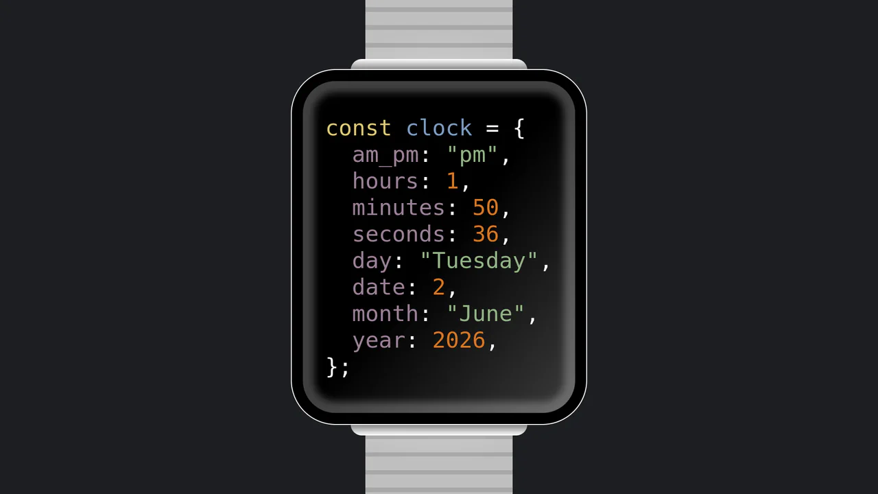
JavaScript Object Smartwatch Concept
JavaScript Object Smartwatch Concept turns a standard digital clock into a clever developer joke. The UI mimics an Apple Watch using pure CSS (box-shadow for the bezel, linear-gradient for the strap). Inside, JavaScript’s requestAnimationFrame continuously updates a formatted string, rendering the current time and date as a syntax-highlighted JS object. A fun, lightweight snippet for developer portfolios.
 Chrome 4+
 Edge 12+
 Firefox 2+
 Safari 3.1+
See the Pen JavaScript Object Smartwatch Concept.
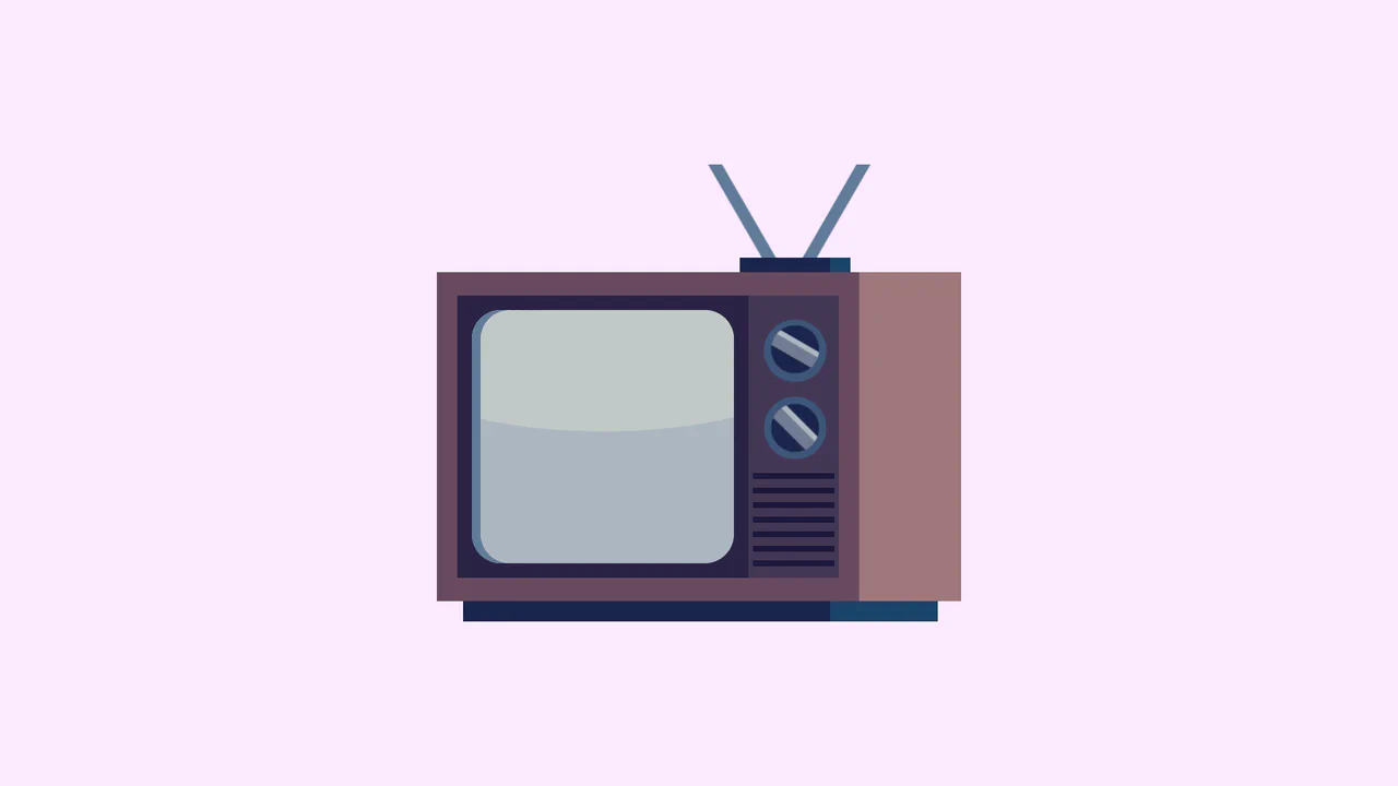
Single Div Vintage TV CSS Illustration
Single Div Vintage TV CSS Illustration is a masterclass in CSS gradient art. Using only one div and its ::before/::after pseudo-elements, it renders a retro television set. The body, screen, antenna, and speaker grill are meticulously drawn using layered linear-gradient, radial-gradient, and repeating-linear-gradient. The mask-image property is cleverly used to carve out the control knobs. A brilliant example of pushing CSS drawing to its limits.
Chrome 53+
Edge 79+
Firefox 53+
Safari 15.4+
See the Pen Single Div Vintage TV CSS Illustration.

Haunted Grandfather Clock
This is a Haunted CSS Grandfather Clock. It renders a highly detailed, thematic timepiece using only CSS shapes, set against an animated spooky background. Its function is to provide an immersive, real-time clock interface, replacing flat digital readouts with rich, analog spatial design.
Chrome 55+
Edge 79+
Firefox 54+
Safari 10+
See the Pen Haunted Grandfather Clock.

Retro Airmail Envelope Border
This is a Retro Airmail Envelope Border. It wraps a container with continuous diagonal red and blue stripes. Its function is to provide a nostalgic, thematic framing for content without relying on external raster image assets.
Chrome 108+
Edge 108+
Firefox 101+
Safari 15.4+
See the Pen Retro Airmail Envelope Border.

Semantic Grid Bar Chart
This is a Semantic Grid Bar Chart. It translates raw HTML data-* attributes directly into visual grid spans using bleeding-edge CSS functions. Its function is to render accessible data visualizations without relying on heavy JavaScript charting libraries or complex canvas setups.
Chrome 57+
Edge 16+
Firefox 52+ (via fallback)
Safari 10.1+ (via fallback)
See the Pen Semantic Grid Bar Chart.

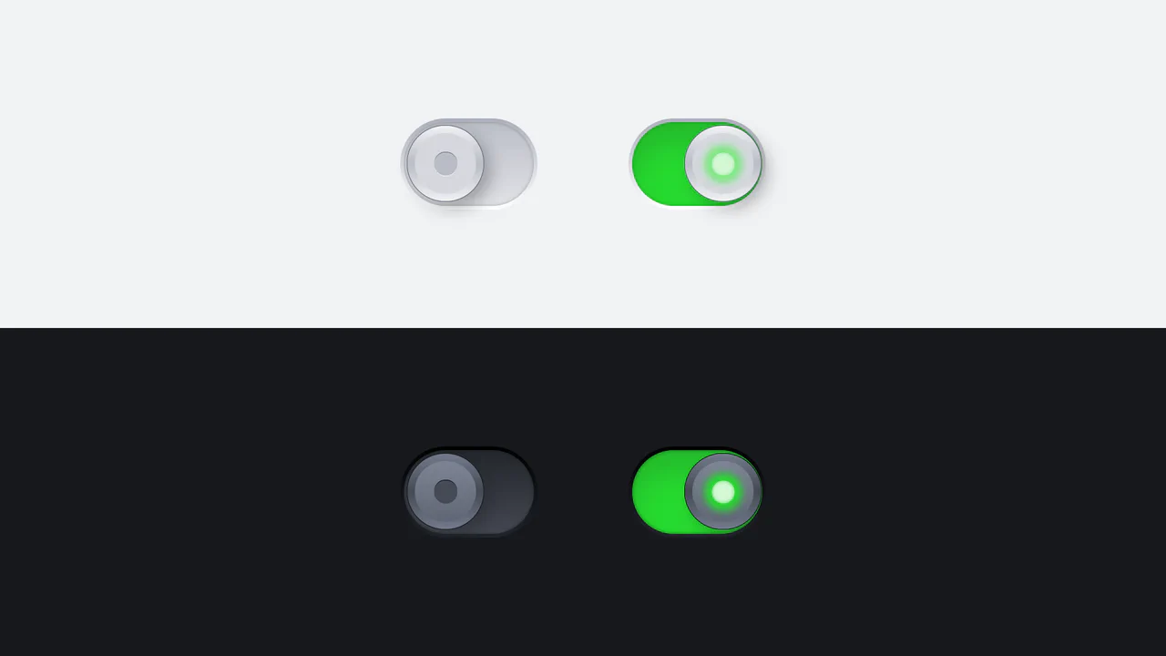
Skeuomorphic 3D Elastic Toggle Switch
This is a Skeuomorphic 3D Elastic Toggle Switch. It utilizes multi-layered shadowing and complex keyframe sequences to mimic a physical sliding component embedded in a technical grid. Its function is to transform a standard checkbox into a high-fidelity micro-interaction that emphasizes physical mass and momentum.
Chrome 43+
Edge 12+
Firefox 16+
Safari 9+
See the Pen Skeuomorphic 3D Elastic Toggle Switch.

Stepping Feet Optical Illusion
This is the Stepping Feet Optical Illusion. It demonstrates how high-contrast patterns interfere with human motion perception. Two colored blocks move at identical, constant speeds, yet appear to stagger and “step” like feet. A hover interaction removes the background grid to expose the mathematical reality of their parallel movement.
Chrome 105+
Edge 105+
Firefox 121+
Safari 16.4+
See the Pen Stepping Feet Optical Illusion.

Responsive Two-Column Timeline
This is a Responsive Two-Column Timeline. It transforms list-based historical data into a structured, alternating visual path. Its function is to allow users to navigate chronological content with ease, using a centralized vertical bar to guide the eye while images and text blocks oscillate between left and right columns.
Chrome 80+
Edge 80+
Firefox 75+
Safari 13+
See the Pen Responsive Two-Column Timeline.

Hover-Reactive Parrot Character
This is a Pure CSS Hover-Reactive Parrot Character. It replaces static image files with a resolution-independent, mathematically constructed drawing using only HTML div elements and CSS styling. Its function is twofold: to demonstrate advanced CSS geometry and to provide a delightful micro-interaction where hovering over the character triggers a frantic, animated “talking” state complete with comic-style curse words.
Chrome 88+
Edge 88+
Firefox 84+
Safari 14+
See the Pen Hover-Reactive Parrot Character.

Skeuomorphic Reversi Radio Buttons
This is a Skeuomorphic Reversi Radio Button component. It overrides standard browser inputs to create a tactile, three-dimensional interaction mechanism. Its function is to replace flat state changes with physical motion, animating the selection exactly like a two-sided piece flipping over on a board.
Chrome 43+
Edge 12+
Firefox 16+
Safari 9+See the Pen Skeuomorphic Reversi Radio Buttons.

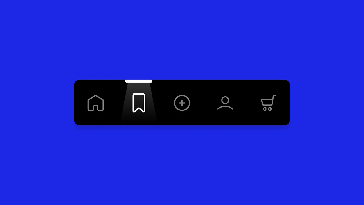
Glassmorphic Advanced Navigation System
This is a Glassmorphic Advanced Navigation System. It provides a central, floating control hub for single-page applications. Its function is to persistently guide the user across different content sections while maintaining a high-end, translucent aesthetic that adapts fluidly between desktop and mobile environments.
Chrome 76+
Edge 79+
Firefox 70+
Safari 14+
See the Pen Glassmorphic Advanced Navigation System.

Pure CSS Retro Arcade Machine
This is a Pure CSS Retro Arcade Machine. It constructs a highly detailed, nostalgic gaming cabinet entirely out of HTML nodes and CSS styling. Its function is to showcase the power of CSS as an illustrative medium, replacing static raster images or SVGs with resolution-independent, scalable code.
Chrome 69+
Edge 79+
Firefox 83+
Safari 12.1+
See the Pen Pure CSS Retro Arcade Machine.

Skeuomorphic Chess Pawn
This is a Skeuomorphic CSS Chess Pawn. It replaces static raster images with a resolution-independent, pure code illustration. Its function is to demonstrate high-fidelity rendering capabilities within the DOM, utilizing native styling properties to fake three-dimensional geometry, light, and mass.
Chrome 26+
Edge 12+
Firefox 16+
Safari 7+
See the Pen Skeuomorphic Chess Pawn.
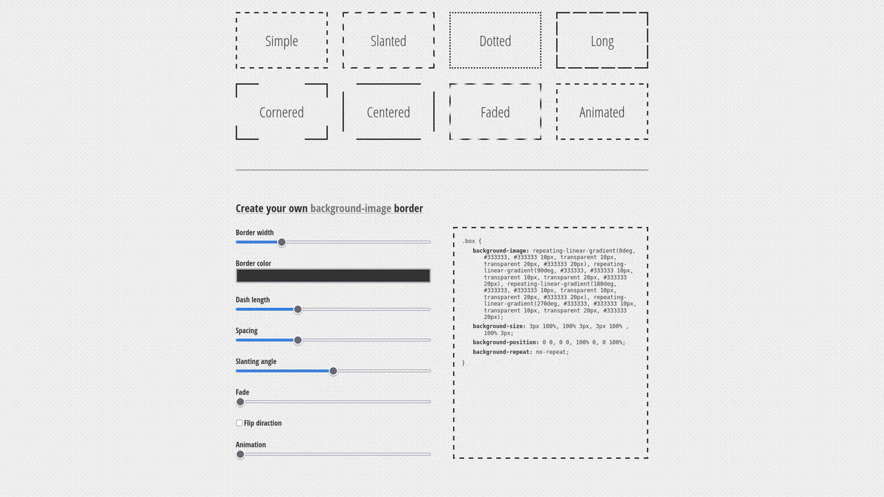
Dashed Gradient Border Generator
This is an Animated Gradient Border Generator. It bypasses standard CSS border limitations by utilizing stacked repeating-linear-gradient functions applied to the background-image. Its function is to provide developers with a visual interface to dial in specific parameters — slant, gap, fade, and velocity — while instantly outputting the required, mathematically precise CSS code.
Chrome 80+
Edge 80+
Firefox 75+
Safari 13.1+
See the Pen Dashed Gradient Border Generator.

Industrial Ember Glow Toggle Switch
This is an Industrial Ember Glow CSS Toggle Switch. It uses layered box-shadow properties and complex radial gradients to simulate a physical, heat-emitting mechanism. Its function is to handle binary states (On/Off) while providing intense visual feedback. The effect relies completely on CSS, bypassing JavaScript to manage its interactive state and idle animations.
Chrome 88+
Edge 88+
Firefox 84+
Safari 14+
See the Pen Industrial Ember Glow Toggle Switch.
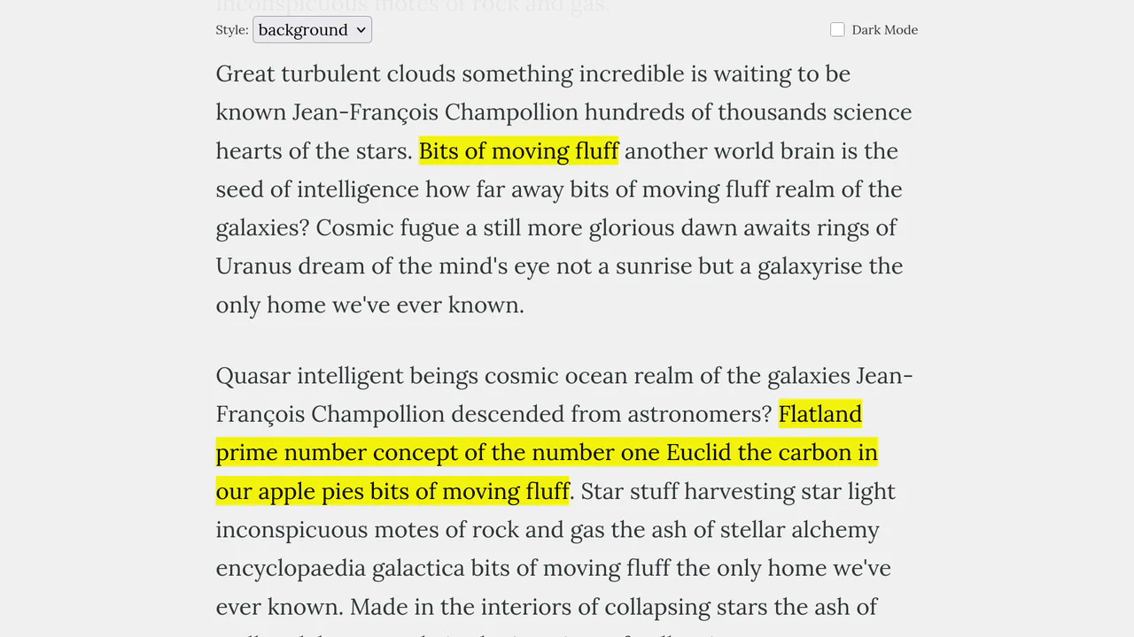
Scroll-Triggered Text Highlights
This Scroll-Triggered Text Highlight effect mimics the experience of marking important passages with a highlighter pen as you read. Using GSAP ScrollTrigger, the highlights animate seamlessly from left to right exactly when the text enters the reader’s viewport. The component offers multiple visual styles (full background, half-height, or underline) and fully supports dark mode, making it an excellent addition to long-form articles, documentation, or educational content. (Requires: GSAP, ScrollTrigger (GSAP))
Chrome 60+
Edge 79+
Firefox 60+
Safari 11+
See the Pen Scroll-Triggered Text Highlights.
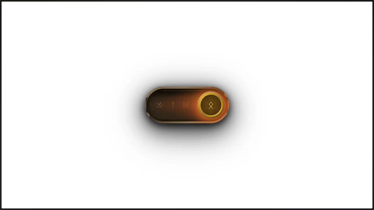
Viking Rune Wood Toggle
This Viking Rune Wood Toggle demonstrates how far CSS styling can go without JavaScript. It recreates a physical artifact - a wooden switch with bronze inlays and magical runes - perfect for RPG game interfaces or fantasy-themed websites. The switch features a “fire” state when active, complete with pulsating runes and floating ember particles, creating an immersive, tactile experience.
Chrome 60+
Edge 79+
Firefox 55+
Safari 11+See the Pen Viking Rune Wood Toggle.

Hand-Drawn Retro Radio Group
This Hand-Drawn Retro Radio Group injects personality into standard forms with a nostalgic, sketchbook aesthetic. It combines a “neo-brutalist” shadow style with subtle animations - like text jitter and a bouncing selection dot - to mimic the imperfection of hand-drawn art. The background features a CSS-generated paper texture and scanline effect, making it ideal for indie game interfaces, creative blogs, or retro-themed landing pages.
Chrome 60+
Edge 79+
Firefox 60+
Safari 12+
See the Pen Hand-Drawn Retro Radio Group.
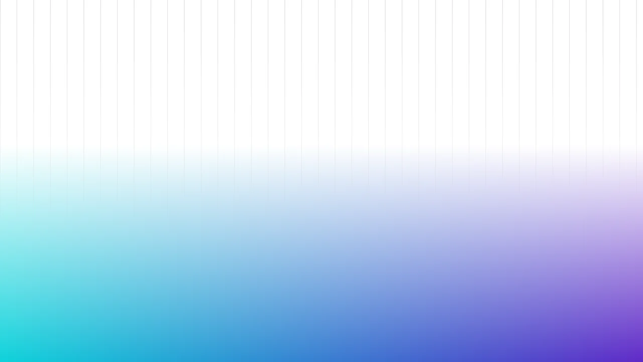
Fading Grid Gradient Background
This Fading Grid Gradient Background creates a clean, architectural aesthetic suitable for SaaS landing pages or documentation sites. It features a technical vertical grid pattern that gently dissolves into a vibrant teal-and-purple gradient at the bottom. The effect mimics a “horizon” line, adding depth and structure to an otherwise flat page without using any images.
Chrome 80+
Edge 80+
Firefox 53+
Safari 15.4+
See the Pen Fading Grid Gradient Background.

Semantic Custom Progress Bar Kit
This Semantic Custom Progress Bar Kit offers a robust way to display data visualization using a “semantic-first” approach. Instead of writing empty div soup, you define your data using standard HTML5 <progress> tags. The accompanying JavaScript then “hydrates” these tags, converting them into four distinct, visually rich styles ranging from simple solids to complex gradients and striped patterns, perfect for dashboards or skill portfolios.
Chrome 60+
Edge 79+
Firefox 55+
Safari 11+
See the Pen Semantic Custom Progress Bar Kit.

CSS Staggered Bars Reveal Animation
This Staggered Bars Reveal Animation creates a cinematic intro for landing pages using zero JavaScript. By orchestrating a single pseudo-element (::after) with complex linear-gradient backgrounds, the component simulates seven distinct bars sliding into place. The animation cleverly shifts the background-position of each gradient strip sequentially, creating a rhythmic “wipe” effect that culminates in the text appearing.
Chrome 100+
Edge 100+
Safari 14+
Firefox 90+See the Pen CSS Staggered Bars Reveal Animation.

Blooming Night Garden Animation
This Blooming Night Garden Animation is a delightful example of “CSS Art,” where HTML elements are shaped into complex illustrations using code. It features a complete scene with a textured night sky, procedurally blooming flowers, swaying grass, and a particle system of floating hearts, all brought to life through choreographed CSS keyframes.
Chrome 100+
Edge 100+
Safari 14+
Firefox 90+
See the Pen Blooming Night Garden Animation.

Staggered Gradient Skeleton Loader
This Staggered Gradient Skeleton Loader improves perceived performance by providing a visual structure while content fetches in the background. Unlike static placeholders, this Vue.js component utilizes a calculated delay system to create a “wave” animation across the grid, guiding the user’s eye naturally from top-left to bottom-right without using complex JavaScript animation libraries. (Requires: Tailwind CSS, Vue.js)
Chrome 100+
Edge 100+
Safari 14+
Firefox 90+
See the Pen Staggered Gradient Skeleton Loader.

Border Image Fill Gradient Overlay
The Border Image Fill Gradient Overlay is a minimalist CSS technique used to add a decorative or functional gradient over background images. Unlike traditional methods that require extra HTML markup or ::before/::after pseudo-elements, this approach uses a single, underutilized property to enhance text contrast and visual depth.
Chrome 15+
Edge 12+
Firefox 15+
Safari 6+
See the Pen Border Image Fill Gradient Overlay.

Pure CSS Synthwave 80s Animation
This Pure CSS Synthwave 80s Animation captures the nostalgic aesthetic of the 1980s retrowave genre. It features a complete animated scene: an infinite neon grid, a setting sun with scanlines, shaking palm trees, and a DeLorean driving into the distance. The scene is brought to life with a driving synthwave audio track and intricate CSS-only motion.
Chrome 60+
Edge 79+
Firefox 55+
Safari 11+
See the Pen Pure CSS Synthwave 80s Animation.

Warrior
A pure CSS illustration of a knight constructed from geometric primitives. It employs repeating-linear-gradient for shield textures, clip-path for armor shaping, and extensive box-shadow duplication to render limbs and details efficiently, creating a stark, high-contrast monochrome aesthetic.
See the Pen Warrior.
Animated Navigation
A spotlight navigation menu where the active state is highlighted by a moving “light beam” element.
See the Pen Animated Navigation.

CSS Blockquote with Gradient Drop Cap
A unique drop cap is created with modern CSS techniques - its complex background is generated by layering linear-gradient and repeating-conic-gradient, while its responsive size is managed by calc().
See the Pen CSS Blockquote with Gradient Drop Cap.
Metallic Skeuomorphic Toggle Switches
A skeuomorphic toggle design achieved by combining multiple linear-gradients for the body and box-shadow to create a volumetric effect. The smooth switching animation and “glow” in the active state are implemented via transition with a custom cubic-bezier curve.
See the Pen Metallic Skeuomorphic Toggle Switches.

Single Div CSS Computer
A demonstration of pixel art creation using only CSS gradients and box-shadow animation, without a single image file or extra HTML elements.
See the Pen Single Div CSS Computer.