60+ CSS linear-gradient Examples (Page 3)
Examples

Rainbowy Dashed Divider
A creative divider made by layering two pseudo-elements - an animated rainbow gradient and a masking dashed line that “punches” holes in it using a linear-gradient.
See the Pen Rainbowy Dashed Divider.
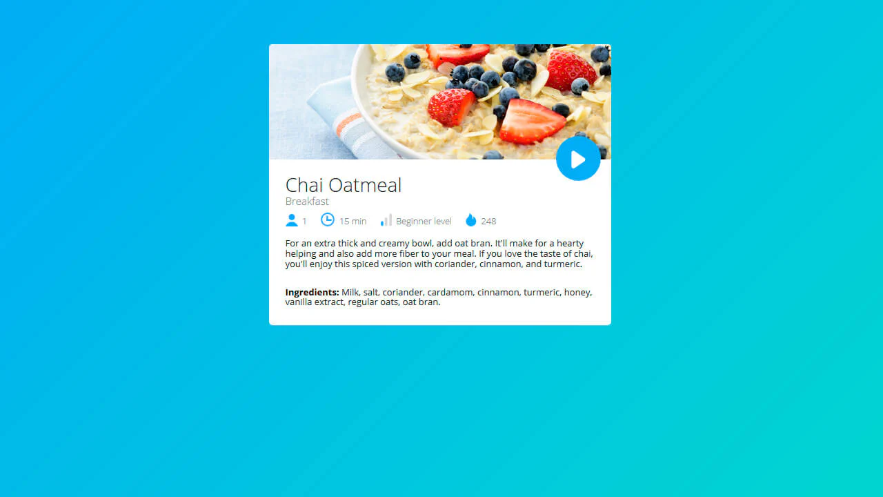
Recipe Card
A technically interesting solution for a UI card where recipe details (time, level) are organized via inline blocks within an unstyled list, styled using pseudo-classes for precise adjustment of child element margins and styles, avoiding excessive classes.
See the Pen Recipe Card.
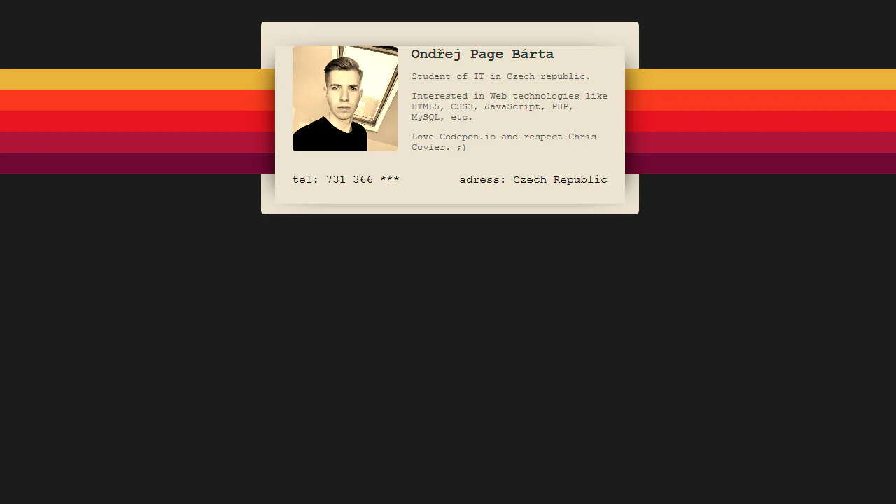
90's Profile Card
The business card design showcases pure CSS, utilizing linear-gradient and a pseudo-element to create a multicolor gradient background, alongside absolute positioning for layering; it also applies the CSS filter sepia(1) to the image and a box-shadow for depth, with all text styled in the monospace font courier.
See the Pen 90's Profile Card.
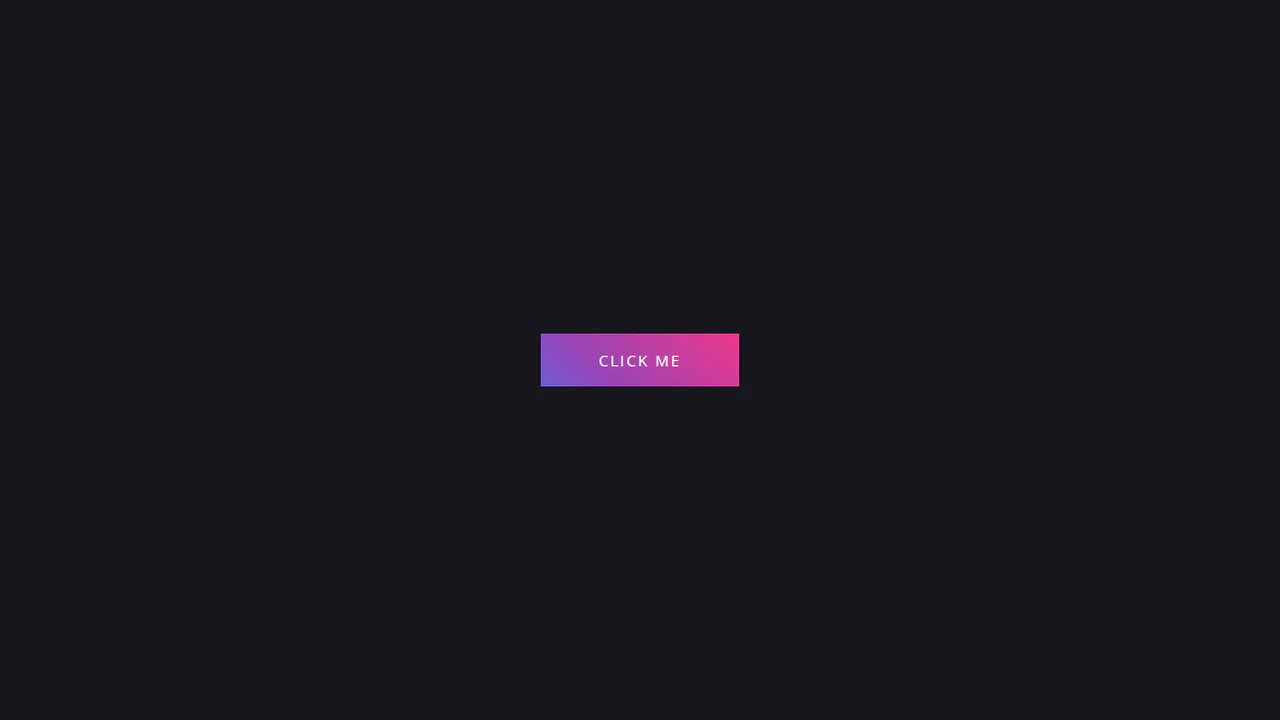
Gradient Button
This button implements an aesthetic “sliding gradient” hover effect using a large ::after pseudo-element filled with a multi-stop linear gradient, which is horizontally translated from -280px to -200px on hover.
See the Pen Gradient Button.
Gradient Hover Animated Ghost Button
The button animation uses SVG rect elements and CSS stroke-dasharray and stroke-dashoffset properties to create a sophisticated, drawing border effect that transitions smoothly on hover, highlighting the call-to-action.
See the Pen Gradient Hover Animated Ghost Button.
The badge uses background: rgba() and backdrop-filter: blur(10px) to create a translucent, frosted look. A double layer with ::before adds depth and enhances the blur effect.
CSS Particle Style Animation
Creating a depth of field effect in pure CSS - different animation speeds and filter: blur() values for each element create the illusion of a multi-layered space.
See the Pen CSS Particle Style Animation.