40+ CSS Link Styles
Hyperlinks drive digital navigation. Unstyled text creates friction between the user and the screen. CSS link styles clarify interaction points. This updated collection delivers raw, functional typography for modern UI design. Utilizing these curated snippets strips away visual noise, guiding focus instantly.
These examples rely on precise rendering logic. The code utilizes background-size and background-position with linear-gradient to construct dynamic, animated underlines without extra DOM nodes. Hover interactions leverage hardware acceleration, animating isolated properties like transform and opacity. This ensures a 60fps frame rate without reflows. The HTML structure remains strictly semantic, maintaining high layout stability and fast rendering.
Every free demo is fully responsive and cross-browser compatible. Users can instantly download the raw code or fork a style on CodePen.
Examples

Stylish Highlighter Link Hover Animation
This Highlighter Link Hover Effect provides a sophisticated micro-interaction for inline text links, moving beyond the standard static underline. By default, the link is covered by a soft, semi-transparent background fill; upon hovering, this “highlighter” block collapses into a thin underline while a directional arrow slides in from the right.
 Chrome 36+
 Edge 12+
 Firefox 16+
 Safari 9+
See the Pen Stylish Highlighter Link Hover Animation.
Link Split Hover Effect
A “tearing” text effect created by layering two <span>s with an asymmetrical clip-path. On hover, transform shifts the top part, ::after pseudo-elements draw the tear line, and an underline animates via background-position - the entire choreography is managed by transition-delay and a custom cubic-bezier function.
See the Pen Link Split Hover Effect.
Hover Effect #2
A performant text-swapping effect on hover, built on a synchronized animation - the original <span> is displaced by a ::after pseudo-element. The replacement content is sourced from a data-replace attribute via attr(), while smoothness and performance are ensured by transform: translate3d and a custom cubic-bezier function.
See the Pen Hover Effect #2.
Animated link underline via ::before pseudo-element. On hover, yellow bar slides from left to right with transform-origin change. Minimal code — only animation essence.
Double link animation: gradient text fill shifts on hover, creating color change effect. Simultaneously, underline slides in via ::before. background-clip: text restricts gradient to letter shapes.
Animated underline with color swap via two gradients. First (solid) slides right, second (rainbow) slides left, changing background-size. On hover, colors smoothly transition between each other.
Classic underline animation sliding from center. ::before pseudo-element scales width, changing transform-origin from right to left on hover. Minimal implementation without extra layers.
Two-part underline animation: short left part shrinks (scaleX(0.3)), long right part slides from behind clip-path boundary. Motion synchronized via cubic-bezier for smooth transition.
Link background animation: colored ::before rectangle expands upward on hover, filling entire text. z-index: -1 keeps layer behind text, creating background fill effect.
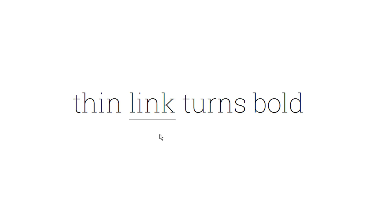
Letter-by-letter transition from thin to bold weight. Each letter wrapped in span with increasing delay, on hover delays applied in reverse order. Additional effects — shadow and border color change.
Animated squiggly underline via inline SVG. On hover, static underline replaced with squiggle-link featuring infinite shift animation, creating crawling wave effect. Gradient background mimics regular line at rest.
Gradient fill animation from bottom to top. ::before pseudo-element initially hidden below bottom border (translateY(calc(100% - 2px))), on hover slides up, turning text white. Gradient transitions from blue to green.