50+ CSS Logo Examples
Brand identity requires scalability. Pure CSS Logo Examples remove the weight of raster images and external SVG requests. This collection delivers vector-quality marks using raw code. Utilizing these curated snippets ensures the UI design remains lightweight. No pixels. No latency.
The logic relies on advanced geometric manipulation. The code utilizes border-radius, box-shadow, and clip-path to construct complex shapes within single HTML elements. Gradients replace solid fills. Rendering leverages the browser’s native engine, ensuring absolute layout stability and infinite scalability without blurring.
Every free demo is fully responsive and cross-browser compatible. Users can instantly download the raw code or fork a specific mark on CodePen. These updated assets are strictly optimized for performance, delivering a crisp, pixel-perfect experience across all modern devices.
Examples
Pure CSS Animated FF Conf Logo
A futuristic 3D data block where scrolling digital “circuits” are simulated purely in CSS by animating the background-position of linear-gradient patterns.
See the Pen Pure CSS Animated FF Conf Logo.
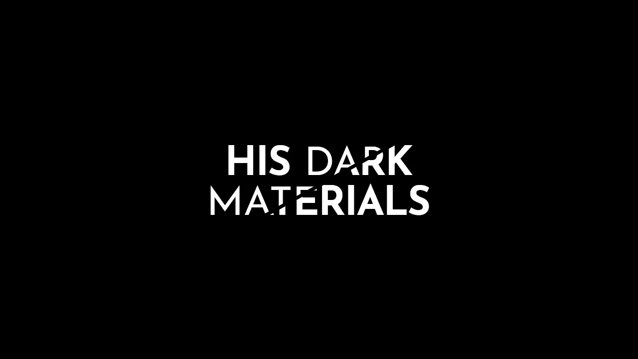
His Dark Materials: TV Series Logo
A stylish, graphic headline with a diagonal split, creating a sense of layering or a “cut-out” effect, ideal for posters or logos.
See the Pen His Dark Materials: TV Series Logo.
Netflix Logo
A minimalist, pure CSS recreation of the Netflix logo. The iconic “N” is constructed from three rectangular elements - a primary div and two pseudo-elements - using transform: skew() to form the central diagonal stroke and z-index layering to simulate the ribbon-like 3D effect, complete with a subtle drop shadow.
See the Pen Netflix Logo.

Nested CSS borders draw the Firebase flame — each triangle is a separate <div> positioned with relative/absolute offsets. The parent triangle uses transparent borders to create the base shape; overlaying triangles build the flame layers. The title sits below with a simple sans‑serif font. No JavaScript — purely illustrative.
The Git logo is built with a rotated square and absolutely positioned lines and circles. Each element is a separate <div> with fixed dimensions and offsets — the design is static and purely visual. No JavaScript or interactivity.
The GitLab logo is constructed entirely from CSS triangles — each part uses transparent borders on pseudo‑elements to create the overlapping shapes. Positioning relies on fixed offsets and negative margins; the result is a static, purely visual reproduction.

A single <div> with pseudo‑elements builds the Netflix logo — a linear gradient forms the outer red bars, while ::before creates the slanted middle stripe via skewX. ::after adds a black shadow at the base. The design is static and purely visual.
Sass variables and loops generate a complex hexagonal pattern in ::before — multiple conic gradients and positioned layers build the geometric design. A custom mixin clips the element into a triangle. The ::after pseudo‑element adds a decorative text. All styling is pure CSS; no images or JavaScript.

Two absolutely positioned circles with staggered CSS animations — one fades in and scales, the other slides in with blur. The text has separate letter‑spacing and blur animations. No JavaScript; the page is static after the animations finish.
A single <div> with a pseudo‑element builds a layered logo — the main circle uses a linear gradient; ::before positions a smaller rotated rectangle (with border radius) off‑center. The result is a static, minimal visual.
Three stacked sections with contrasting colors — each contains a bouncing circle and a static text. The circles animate with a custom bounce keyframe; the layout is simple and purely visual.
A rotating flower‑like shape built with six absolutely positioned <div> elements — each has a pseudo‑element that animates height to create a blooming effect. The background gradient sweeps continuously; hover dims the opacity. All animations are pure CSS, no JavaScript.

A single <div> styled with layered linear gradients forms a card with red vertical stripes. The ::after pseudo‑element creates a folded corner effect using a rotated white rectangle with red borders. No JavaScript — purely decorative.