80+ CSS Magazine Layouts
Editorial structures require absolute precision. The Pure CSS Magazine Layout Examples in this collection remove visual barriers between long-form text and the screen. High-performance UI design ensures that the narrative remains the focus, eliminating the friction of complex frameworks. Using these curated snippets provides a direct path to sophisticated editorial aesthetics where raw logic dictates the form.
Technically, these examples leverage CSS Grid and the Multi-column Layout module for advanced structural alignment. Logic-driven properties like shape-outside for organic text wrapping and initial-letter for stylized drop caps provide depth without the use of heavy scripts. Transitions for interactive elements utilize hardware acceleration to maintain 60fps performance on the compositor thread, ensuring high layout stability and minimal rendering latency.
Every free demo is fully responsive and cross-browser compatible. Users can instantly download the raw HTML code or fork a specific layout on CodePen.
Examples

Editorial Grid Magazine Layout
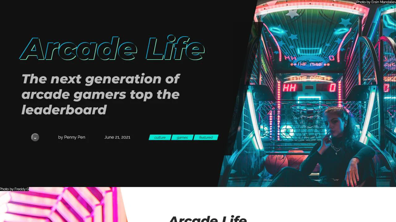
This is an Editorial CSS Grid Magazine Layout. It translates the overlapping, asymmetrical structures of print media into the browser. Its function is to break rigid top-to-bottom reading patterns, utilizing layered images and multi-column typography to construct visual tension and content hierarchy without relying on JavaScript.
 Chrome 57+
 Edge 16+
 Firefox 52+
 Safari 10.1+
See the Pen Editorial Grid Magazine Layout.

Minimalist Grid Editorial Layout
This is a Minimalist Grid Editorial Layout built for digital publishing. It translates traditional Swiss print design into a responsive web format using CSS Grid. The layout utilizes asymmetric columns and deliberate negative space to establish a clear hierarchy for long-form reading.
Chrome 88+
Edge 88+
Firefox 85+
Safari 14.1+
See the Pen Minimalist Grid Editorial Layout.
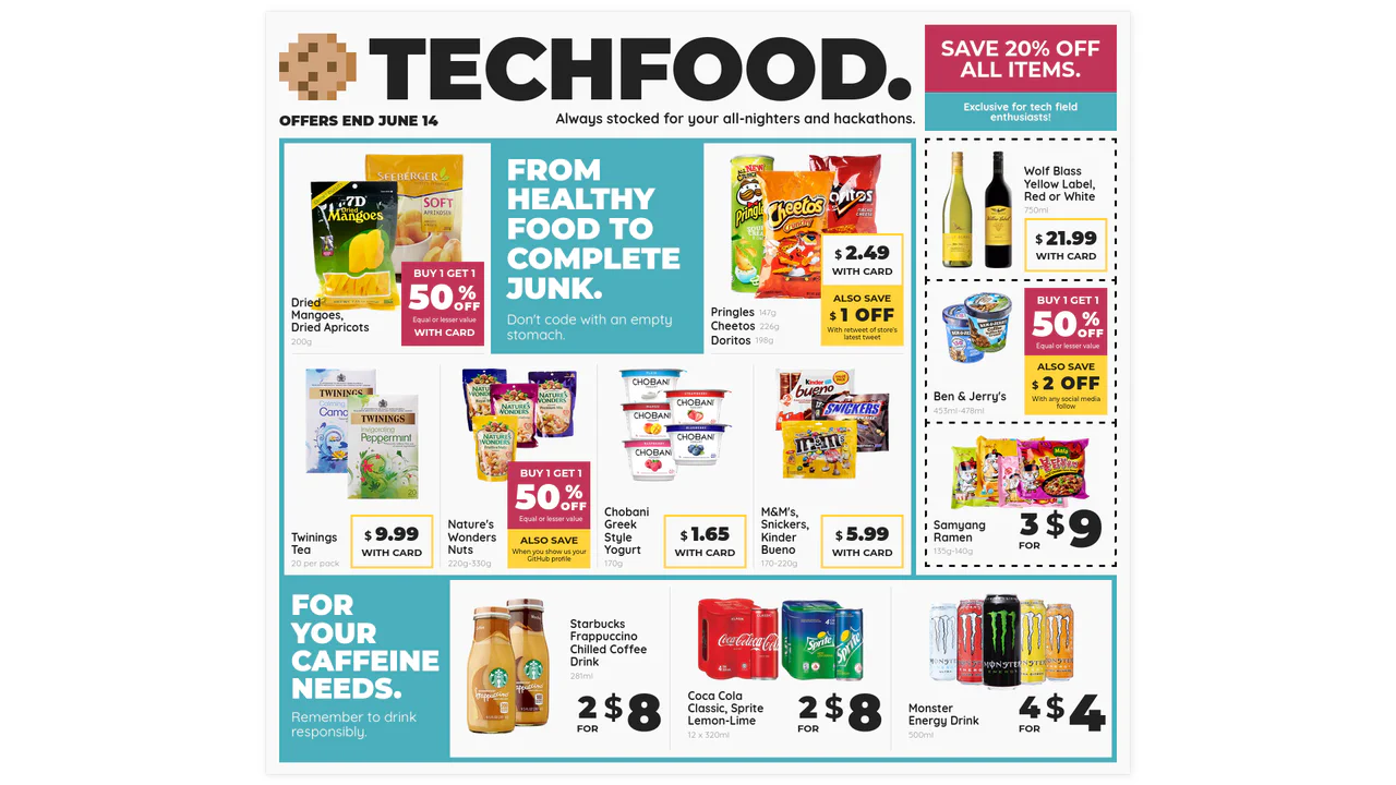
Techfood Grocery Grid Layout
Web layouts often suffer from “boxiness” — everything aligned in predictable, uniform rows. This design breaks that monotony by adopting the chaotic energy of a supermarket flyer. It utilizes the full power of CSS Grid to create irregular spans, varied densities, and tight packing, proving that the web can be as visually dense and information-rich as print media without sacrificing structure.
Chrome 57+
Edge 16+
Firefox 52+
Safari 10.1+
See the Pen Techfood Grocery Grid Layout.

Codepen Challenge: Article Details
This demo uses the JavaScript IntersectionObserver API to create a smart-scrolling navigation that appears on scroll and highlights the active section, all without performance-heavy event listeners.
See the Pen Codepen Challenge: Article Details.

Editorial Layout: Andy Warhol
A demonstration of a classic editorial layout realized with modern CSS, combining the power of Grid for structure with fine typographic controls like multi-column text and ::first-letter pseudo-elements.
See the Pen Editorial Layout: Andy Warhol.
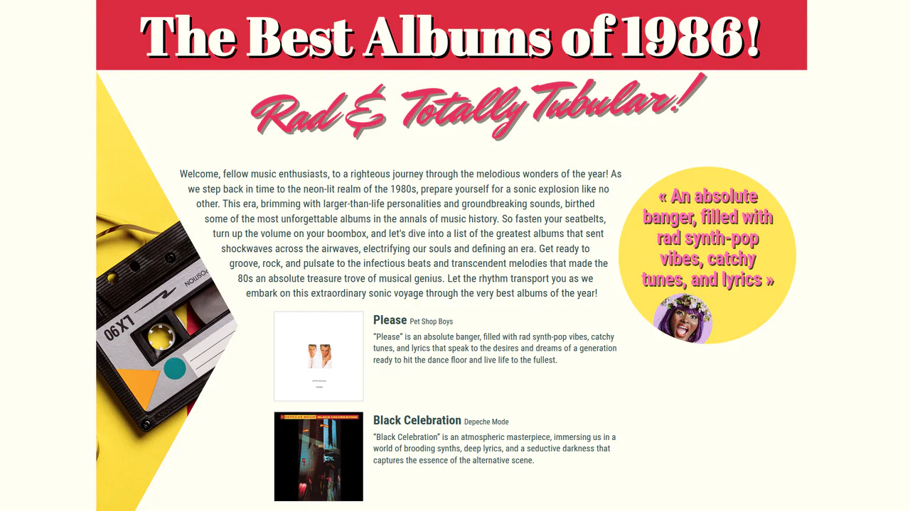
1980's Pop Magazine Pullquote
This demo showcases advanced CSS features like clip-path and shape-outside for creating non-rectangular layouts, while leveraging modern CSS units like clamp() and dvh for a fully responsive design across devices.
See the Pen 1980's Pop Magazine Pullquote.
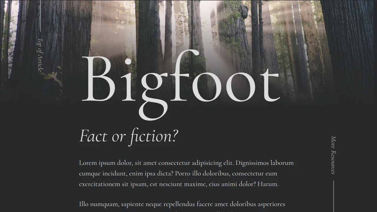
Bigfoot Editorial Article
The demo highlights the use of a hero image with a smooth, blended gradient, alongside subtle transform-based transitions and a non-standard menu design, all optimized for modern browsers.
See the Pen Bigfoot Editorial Article.

Magazine-style layout with CSS Grid using large numbers as visual anchors. Elements overlap and extend beyond grid boundaries, creating dynamic rhythm. Responsive via media queries reflows blocks for mobile.
Responsive magazine article with dynamic typography and decorative elements via skew and pseudo-elements. CSS variables control font sizes and colors across screen widths. Shapes and lines create visual rhythm, images floated within text.
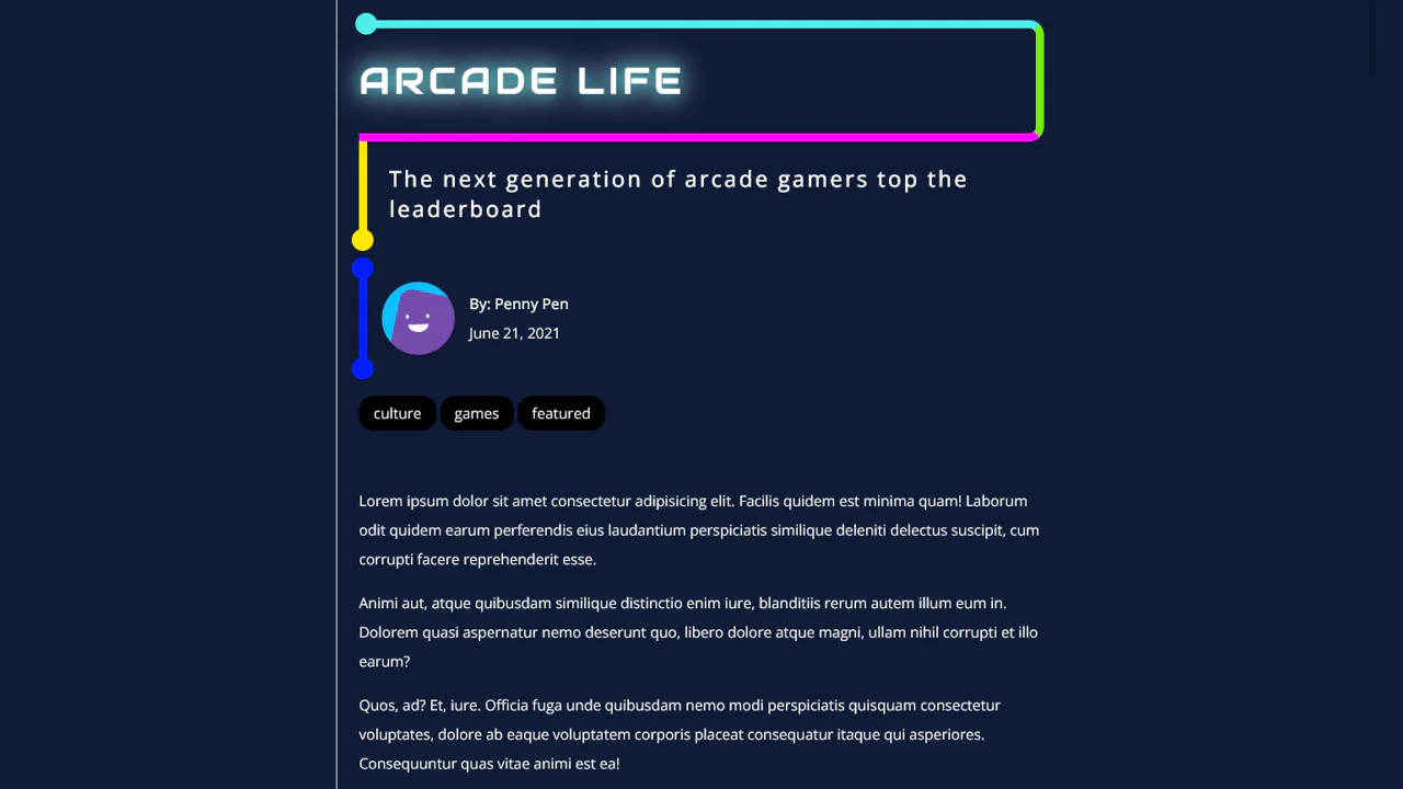
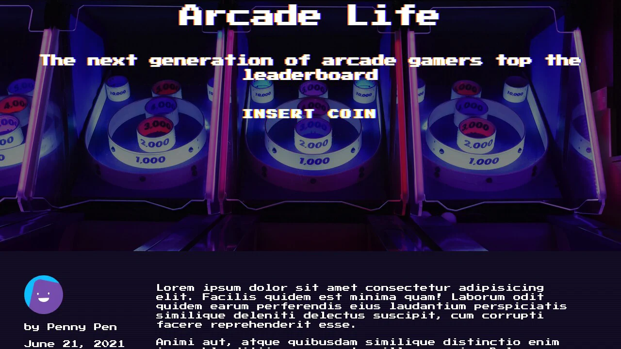
Magazine article in neon style with asymmetric borders and decorative circles on pseudo-elements. Headlines with multi-colored strokes, image captions placed below with bright background. Responsive layout using SCSS variables.
Magazine card grid with CSS Grid and responsive breakpoints. Headings in three sizes, text highlights (mark), and author blocks. Right column features an interactive podcast element with custom player. Column borders and spacing create clear structure.
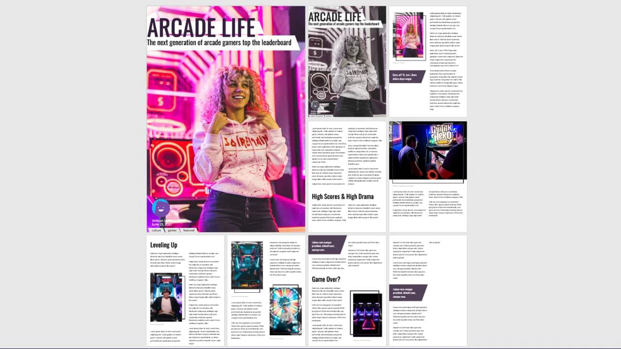
Interactive magazine layout with view mode switching (grid, list) via JavaScript. CSS Grid arranges pages in an 8×12 grid, transforms shift them on body class change. Decorative elements with skew, border and pseudo-elements create depth and rhythm. Images with saturate filters and nested pull quotes.
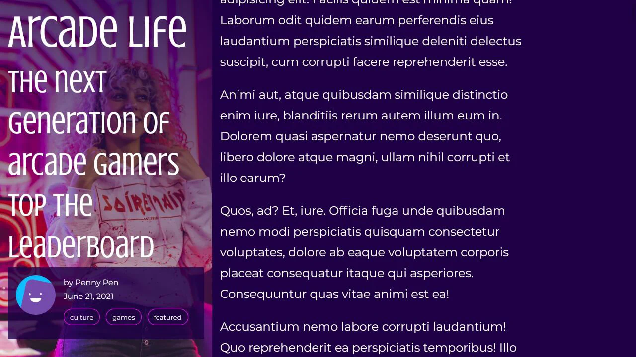
Responsive article with overlapping text and image blocks. CSS pseudo-elements and clip-path create angled corners, separating dark and light sections. On mobile, blocks stack vertically; on desktop, they overlap via absolute positioning.

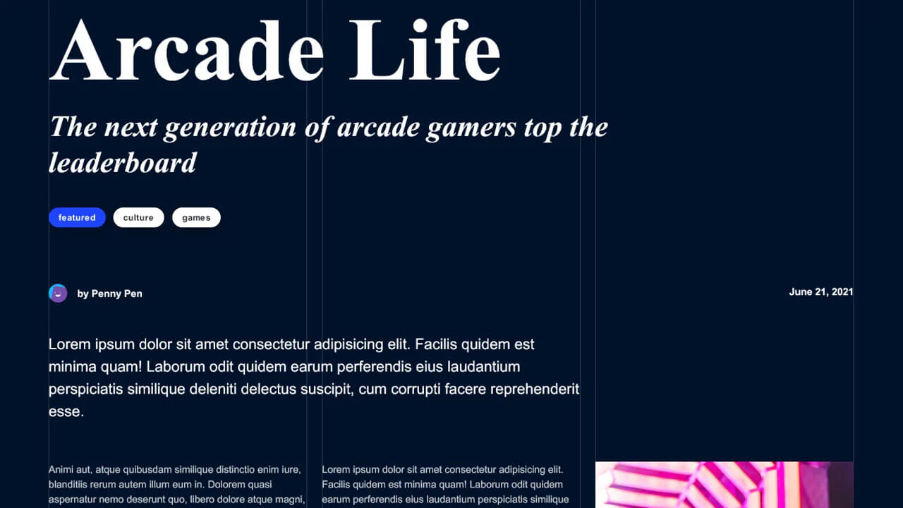
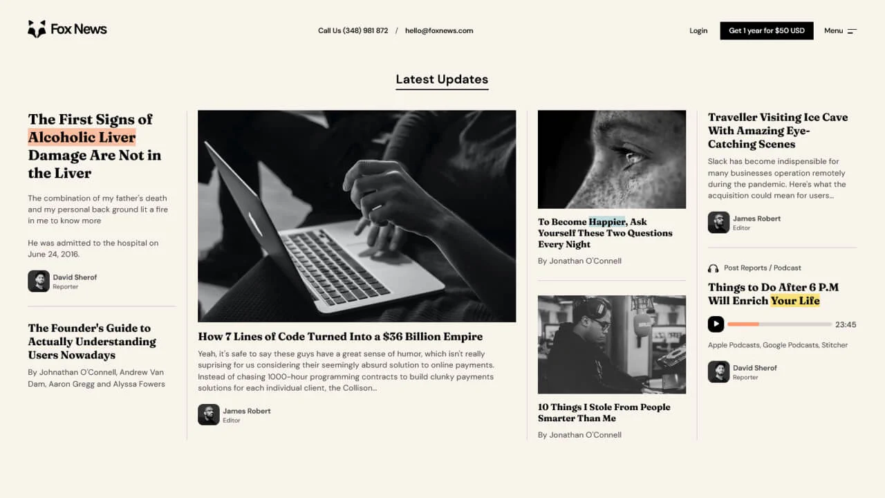
Magazine article with classic newspaper layout. Headings and metadata span full width, images floated within text. Diagonal background pattern via two gradients. Author avatar desaturates on hover.

Article layout with Bootstrap grid and custom typography. Playfair Display headings contrast with Poppins body text. Multi‑level structure featuring pull quotes, images, and responsive columns.