60+ CSS mask Examples
Traditional clipping is rectangular. CSS mask examples in this updated collection remove this barrier, allowing content to adopt complex, organic forms without heavy image files. Logic replaces pixels. Using these curated snippets ensures a lightweight interface where transparency dictates the design.
The code utilizes mask-image and mask-size properties to handle alpha-channel transparency. It prioritizes hardware acceleration via the GPU for 60fps performance. This approach ensures high layout stability while keeping the HTML strictly semantic. By offloading masking logic to the browser engine, the UI remains responsive and fast.
Every free demo is cross-browser compatible. Users can instantly download the raw code or fork a logic pattern on CodePen. These components are strictly optimized for performance.
Examples
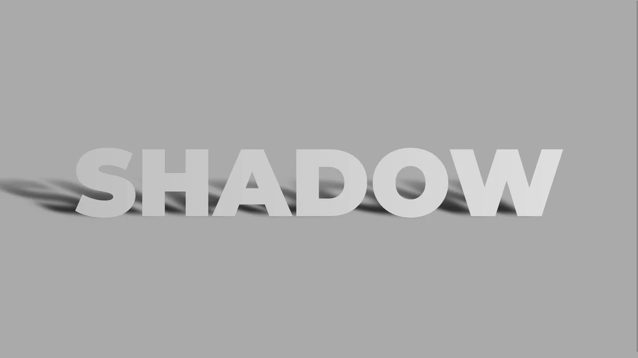
Skewed Perspective Drop Shadow Typography
A pure CSS typography effect that simulates a realistic, perspective-cast drop shadow. The main text is styled with a metallic linear gradient using background-clip: text. The shadow is generated via a ::before pseudo-element that duplicates the text content using attr(data-text). This shadow layer is then skewed, scaled down, blurred, and faded out using a linear gradient mask-image to mimic natural light diffusion.
 Chrome 53+
 Edge 79+
 Firefox 53+
 Safari 10.1+
See the Pen Skewed Perspective Drop Shadow Typography.
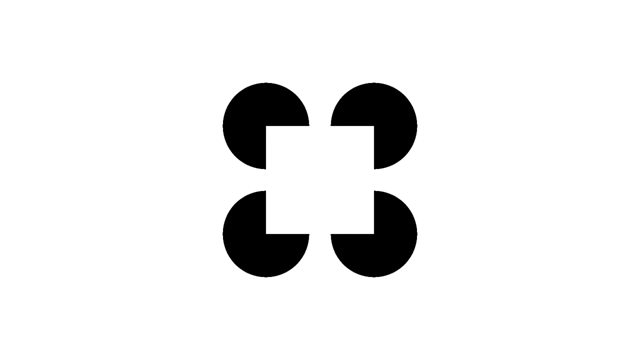
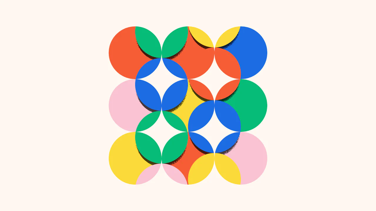
Pure CSS Kanizsa Square Optical Illusion
An elegant pure-CSS implementation of the classic Kanizsa Square optical illusion. Requiring zero HTML, the layout combines layered conic and radial gradients inside a single pseudo-element to render four black ‘Pacman’ circles. This arrangement triggers a Gestalt perception where the brain automatically draws subjective white boundary contours to construct a floating foreground square.
Chrome 69+
Edge 79+
Firefox 83+
Safari 12.1+
See the Pen Pure CSS Kanizsa Square Optical Illusion.
Interactive CSS Tear Strip Animation
Interactive CSS Tear Strip Animation simulates the satisfying physical action of tearing open a cardboard package. It cleverly uses an invisible <input type="range"> linked to the CSS Scroll-Driven Animations API (animation-timeline: --thumb). As the user drags the slider, CSS variables dynamically update clip-path, box-shadow, and transform properties to reveal the content beneath while curling the torn strip. A JavaScript fallback ensures compatibility for browsers without native scroll-timeline support.
Chrome 115+
Edge 115+
Firefox 110+
Safari 16.4+
See the Pen Interactive CSS Tear Strip Animation.
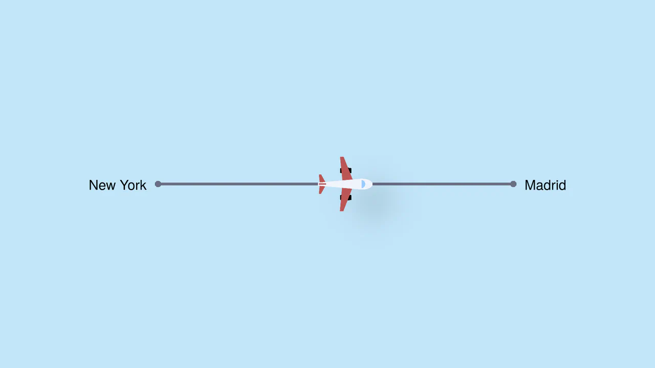
Pure CSS Trigonometric Flight Range Slider
Pure CSS Trigonometric Flight Range Slider uses CSS math functions like sin() and clamp() to dynamically scale a custom airplane thumb and cast realistic altitude shadows based on the input’s current percentage. It features a responsive container query that swaps the plane for a helicopter on narrow screens, and includes dedicated high-contrast mode styles for robust accessibility.
Chrome 111+
Edge 111+
Firefox 110+
Safari 16+See the Pen Pure CSS Trigonometric Flight Range Slider.
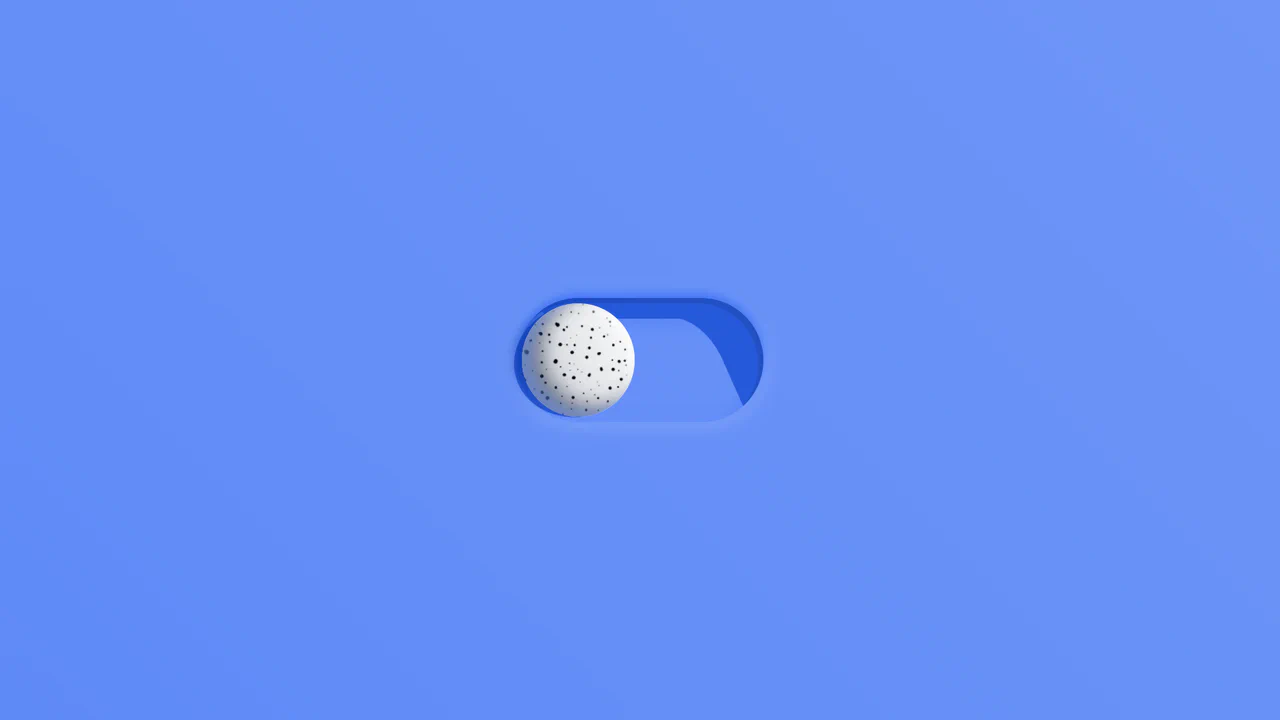
Rollback Ball 3D Toggle Switch
Rollback Ball 3D Toggle Switch is a highly tactile, skeuomorphic switch concept. When clicked, a textured 3D ball realistically rolls across the track, cast-shadows shifting in unison. An ES6 JavaScript class dynamically reads the CSS animation duration, disables the input during the roll, and automatically resets the toggle state once the animation completes. A stellar example of interactive micro-design.
Chrome 55+
Edge 79+
Firefox 54+
Safari 10+
See the Pen Rollback Ball 3D Toggle Switch.
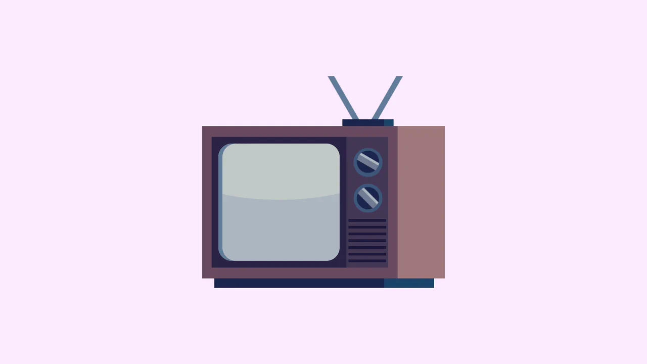
Single Div Vintage TV CSS Illustration
Single Div Vintage TV CSS Illustration is a masterclass in CSS gradient art. Using only one div and its ::before/::after pseudo-elements, it renders a retro television set. The body, screen, antenna, and speaker grill are meticulously drawn using layered linear-gradient, radial-gradient, and repeating-linear-gradient. The mask-image property is cleverly used to carve out the control knobs. A brilliant example of pushing CSS drawing to its limits.
Chrome 53+
Edge 79+
Firefox 53+
Safari 15.4+
See the Pen Single Div Vintage TV CSS Illustration.
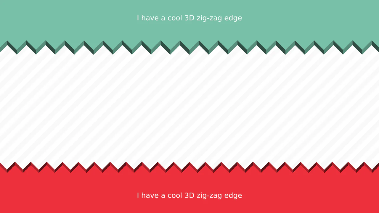
3D Zig-Zag Edge CSS Dividers
3D Zig-Zag Edge CSS Dividers creates a paper-cut illusion using only CSS. It relies on conic-gradient applied to both the background (for shading) and -webkit-mask (for the jagged shape). CSS variables control the size and depth of the teeth. This approach requires zero extra DOM elements or SVG files, making it a highly optimized solution for section transitions.
Chrome 69+
Edge 79+
Firefox 83+
Safari 12.1+
See the Pen 3D Zig-Zag Edge CSS Dividers.

3D Star Wars Lightsaber Theme Toggle
3D Star Wars Lightsaber Theme Toggle relies on trigonometric CSS functions sin() and cos() to rotate vector elements along a 3D spherical path as the toggle slides. Custom numeric transitions are facilitated by redefining modern @property rules inside a @layer properties block, animating the --progress variable dynamically across state-driven keyframes. While providing a deeply thematic visual experience, performing continuous trigonometric transformations and animating complex CSS masks can trigger layout rasterization strain on standard devices, requiring GPU acceleration layers to preserve smooth 3D motion.
Chrome 111+
Edge 111+
Firefox 128+
Safari 16.4+
See the Pen 3D Star Wars Lightsaber Theme Toggle.
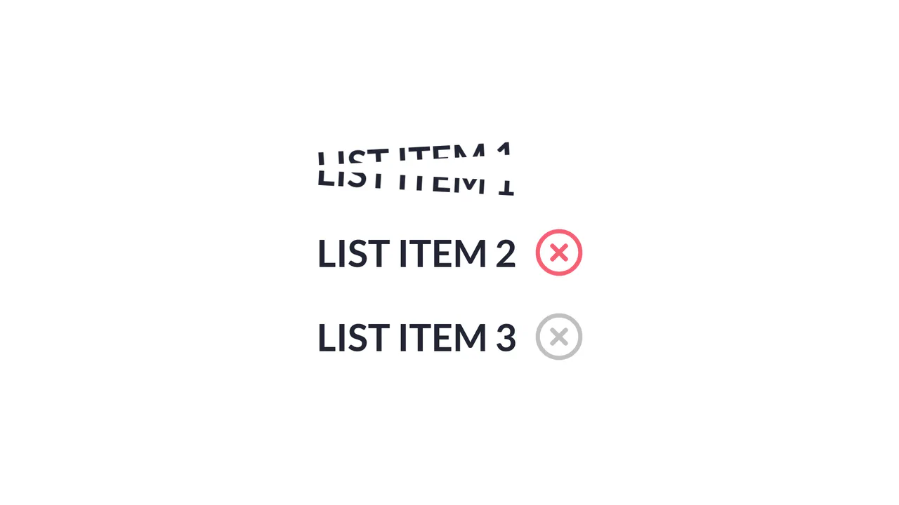
Slice Action List Item
Slice Action List Item achieves a physical text-splitting illusion by duplicating each text node into two overlapping, masked <span> blocks aligned via absolute positioning and CSS pseudo-elements. A jQuery handler triggers a sequential timeline: an SVG checkmark collapses, a dynamically generated absolute .line animates across the list item simulating a laser slice, and then both text halves rotate outward in opposite directions. The implementation provides a distinct, highly engaging micro-interaction, although triggering jQuery .animate() alongside CSS transforms can lead to inconsistent frame timing if layout changes overlap with GPU-accelerated compositing layers. (Requires: jquery.js)
Chrome 56+
Edge 79+
Firefox 51+
Safari 10.1+
See the Pen Slice Action List Item.
Animated SVG Lasso Selection
This is an Animated SVG Lasso Selection. It simulates a digital cursor drawing marquee selections around hidden text nodes, triggering organic pop-in animations and complex spatial transforms. Its function is to provide a highly stylized, cinematic narrative intro, demonstrating the intersection of vector graphics and timeline-based JavaScript animation. (Requires: gsap.js, tweenmax.js, morphSVG.js, drawSVGplugin.js)
Chrome 60+
Edge 79+
Firefox 55+
Safari 11+
See the Pen Animated SVG Lasso Selection.
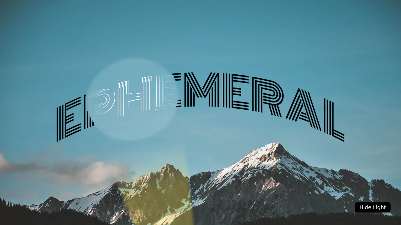
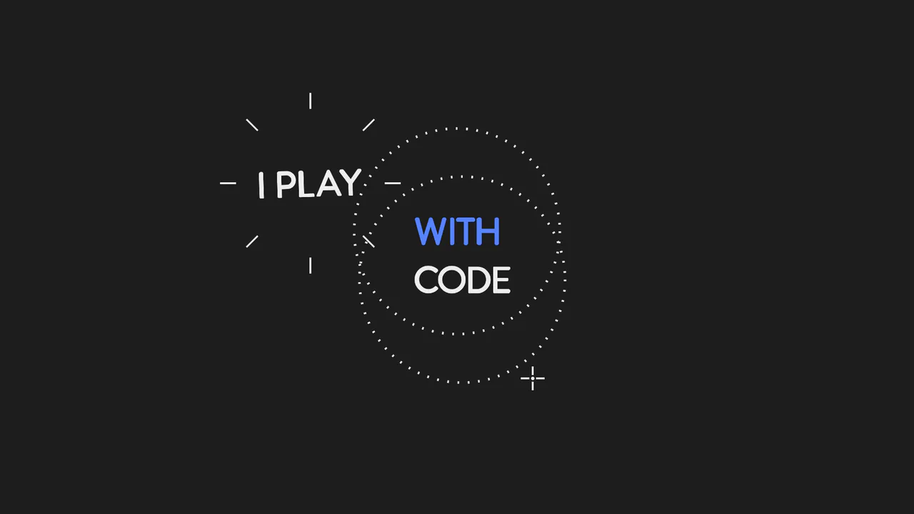
SVG Flashlight Reveal Effect
This is an SVG Flashlight Reveal Effect. It animates a volumetric cone of light across a dark canvas, using SVG masking to dynamically reveal and illuminate hidden text. Its function is to create a cinematic, narrative-driven focal point, turning standard typography into an exploratory visual experience.
Chrome 51+
Edge 79+
Firefox 54+
Safari 10+
See the Pen SVG Flashlight Reveal Effect.
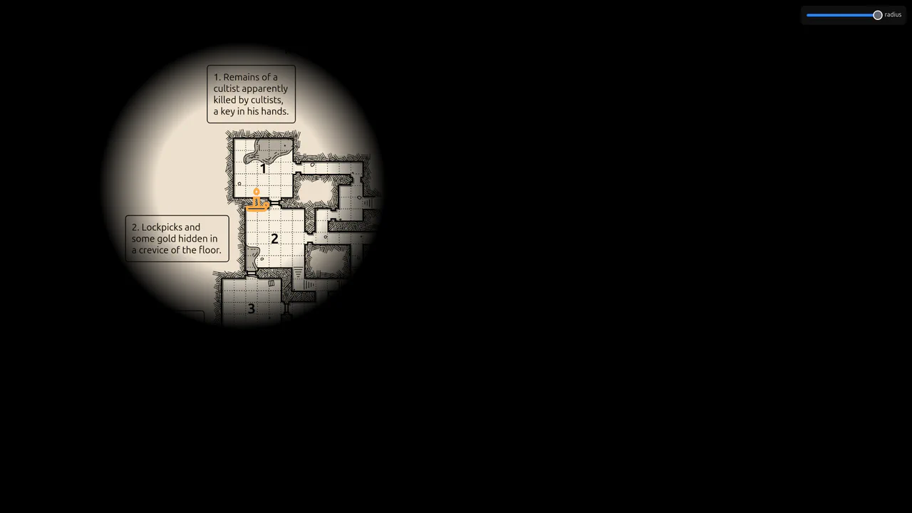
Flickering Torchlight Reveal Overlay
This is a Flickering Torchlight Reveal Overlay. It pairs a custom cursor with a dynamic radial mask to selectively expose underlying content. Its function is to restrict visibility to the immediate cursor vicinity, replacing open layouts with an exploratory, constrained interaction model.
Chrome 80+
Edge 80+
Firefox 75+
Safari 14+
See the Pen Flickering Torchlight Reveal Overlay.
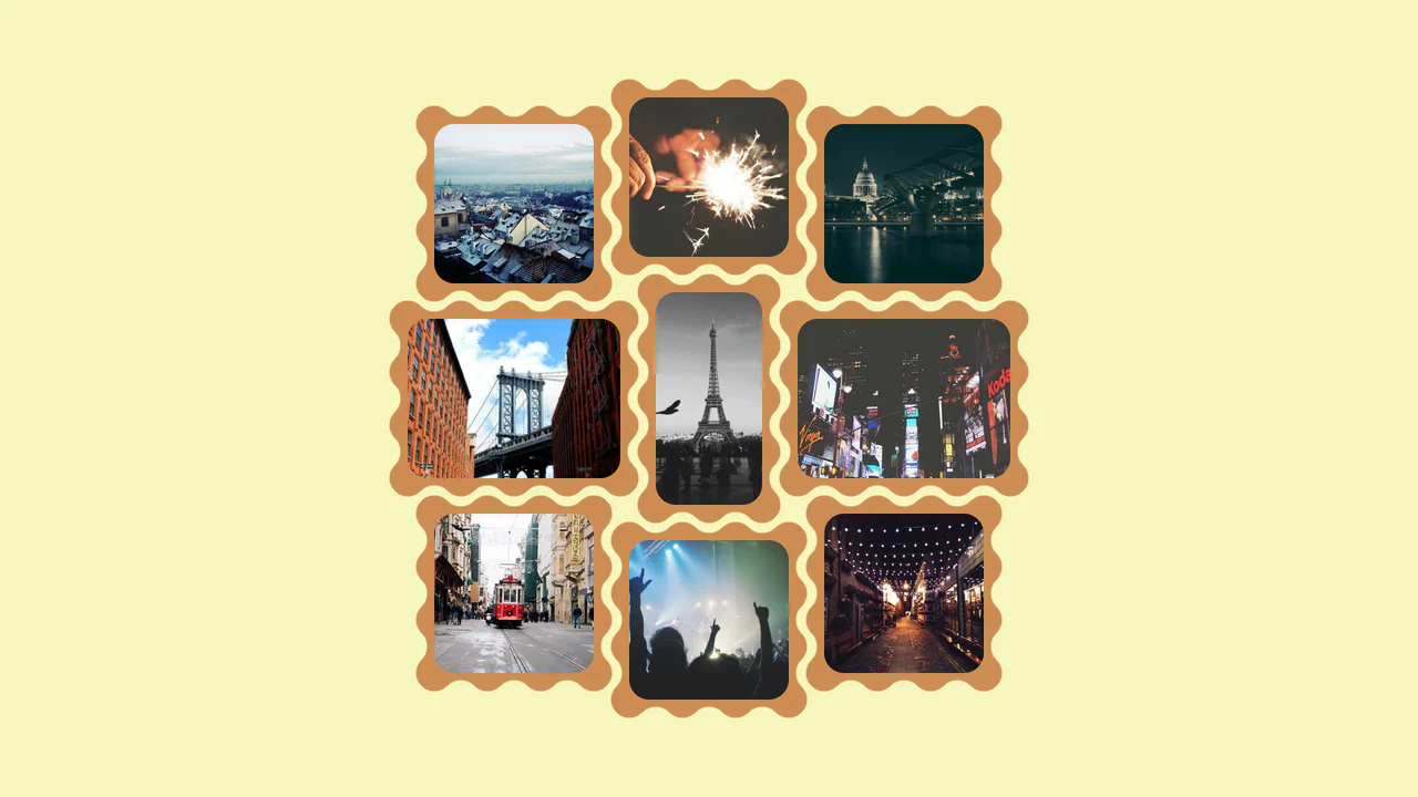
Interlocking Wavy Image Grid
This is an Interlocking Wavy Image Grid. It applies procedural scalloped edges to raster images and shifts them into a tight, puzzle-like masonry formation. Its function is to break rigid, rectangular bounds in visual galleries, converting standard blocks into an organic, cohesive texture.
Chrome 111+
Edge 111+
Firefox 112+
Safari 15.4+See the Pen Interlocking Wavy Image Grid.

Pure CSS Faded Infinite Text Marquee
This is a Faded Infinite CSS Text Marquee. It creates a continuous, horizontal scrolling display for text elements using advanced CSS animation math. Its function is to showcase lists of keywords, tags, or announcements in a constrained space, using gradient masks to seamlessly blend the moving text into the background.
Chrome 104+
Edge 104+
Firefox 104+
Safari 14.1+
See the Pen Pure CSS Faded Infinite Text Marquee.
Kinetic SVG Parallax Grid Mask
This is a Kinetic SVG Parallax Grid Mask. It utilizes mathematical cursor tracking to offset a vectorized masking layer, revealing a secondary layer of animated, stepped shapes beneath. Its function is to create a playful, exploratory spatial interaction that rewards user movement without relying on heavy WebGL contexts. (Requires: GSAP)
Chrome 60+
Edge 79+
Firefox 55+
Safari 12+
See the Pen Kinetic SVG Parallax Grid Mask.
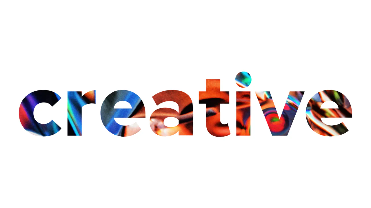
WebGL Liquid Distortion Typography Mask
This is a WebGL Liquid Distortion Typography Mask. It uses fluid simulation to distort a background image, revealed only through a vector cutout. Its function is to transform standard text headers into deeply interactive, kinetic focal points. (Requires: OGL.js, TweenMax.js)
Chrome 60+
Edge 79+
Firefox 55+
Safari 12+
See the Pen WebGL Liquid Distortion Typography Mask.
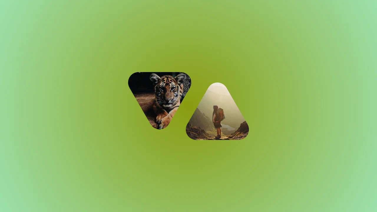
Morphing Rounded Triangle Image Mask
This is a Morphing Rounded Triangle Image Mask. It relies on advanced CSS mathematics and masking to clip raster graphics into smooth, interlocking geometric shapes. Its function is to replace standard grid layouts with organic, tessellating image tiles that physically react to user interaction.
Chrome 111+
Edge 111+
Firefox 117+
Safari 16.4+See the Pen Morphing Rounded Triangle Image Mask.

Cinematic Masked Video Hero
This is a Cinematic Masked Video Hero. It layers solid and outlined typography over an SVG-clipped video element to create optical depth. Its function is to immediately capture attention on landing, breaking away from standard rectangular layouts through organic polygon masking and staggered motion. (Requires: gsap-js)
Chrome 90+
Edge 90+
Firefox 89+
Safari 15+
See the Pen Cinematic Masked Video Hero.
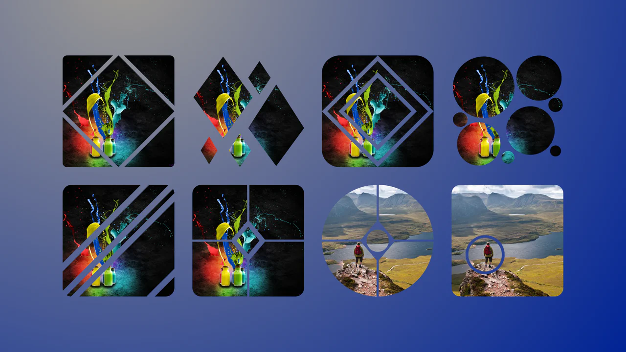
Complex Geometric Image Masks
This is a collection of Complex Geometric Image Masks. It shapes standard rectangular images into precise, multi-part vector forms using a single HTML node. Its function is to break rigid grid layouts and introduce structural visual interest without requiring external SVG assets.
Chrome 88+
Edge 88+
Firefox 71+
Safari 13.1+
See the Pen Complex Geometric Image Masks.
Swinging Spotlight Text Reveal
This is a Swinging Spotlight Text Reveal. It uses a virtual pendulum mask to selectively illuminate static vector letters as it passes over them. Its function is to direct user focus and add a tactile, environmental lighting effect to primary typographic elements. (Requires: gsap-js)
Chrome 49+
Edge 79+
Firefox 51+
Safari 10+See the Pen Swinging Spotlight Text Reveal.

Interactive Drag-and-Drop Jigsaw Puzzle
This is an Interactive Drag-and-Drop Jigsaw Puzzle. It dissects a single raster image into an interlocking grid of movable pieces without relying on a single line of JavaScript. Its function is to gamify visual content, converting passive image consumption into a tactile, logic-driven interaction.
Chrome 84+
Edge 84+
Firefox 90+
Safari 15.4+See the Pen Interactive Drag-and-Drop Jigsaw Puzzle.

Asymmetric SVG Mask Grid Gallery
This is an Asymmetric SVG Mask Grid Gallery. It builds a complex, interlocking masonry-style mosaic using CSS Grid areas, applying organic SVG masks to each thumbnail. Its primary function is to break free from rigid, boxy layouts, offering a highly stylized, interactive photo showcase complete with a native JavaScript lightbox modal.
Chrome 120+
Edge 120+
Firefox 53+
Safari 15.4+
See the Pen Asymmetric SVG Mask Grid Gallery.
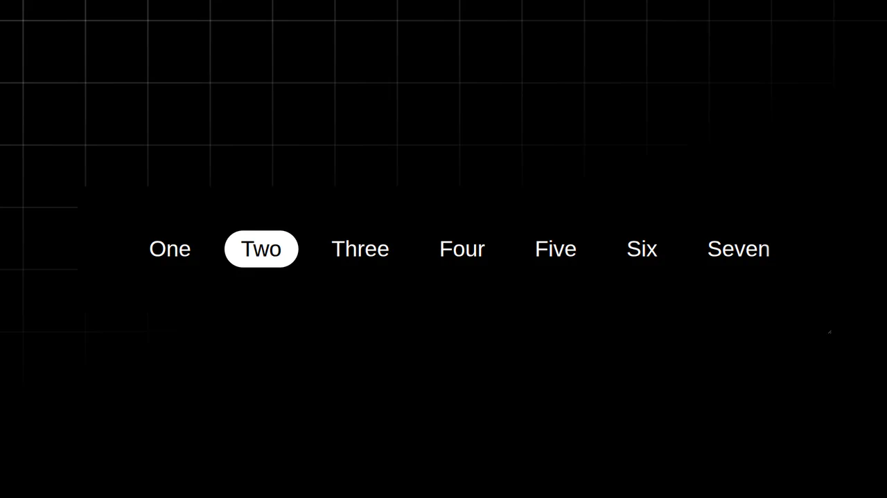
Resizing Tab Bar with Anchor Positioning
This is a Resizing Tab Bar with Anchor Positioning. It demonstrates a modern approach to building a horizontally scrollable navigation menu with a sliding “active” indicator. Its function is to provide a highly fluid, decoupled visual highlighter that perfectly tracks the currently selected tab — even when the container is resized or scrolled — without relying on heavy JavaScript coordinate calculations. (Requires: Normalize.css)
Chrome 125+
Edge 125+See the Pen Resizing Tab Bar with Anchor Positioning.

Odometer Number Counter
This is an Odometer Number Counter. It visualizes numerical changes (such as MRR, follower counts, or revenue) using a mechanical rolling effect. Its function is to provide a highly configurable, tactile alternative to instant number swapping, bringing physical momentum to digital dashboards. (Requires: React, ReactDOM, dat.gui)
Chrome 90+
Edge 90+
Firefox 88+
Safari 15+See the Pen Odometer Number Counter.

Interactive Feather Reveal 404 Page
This is an Interactive Feather Reveal 404 Page. It utilizes the Canvas 2D API to transform a sterile error screen into a generative digital canvas. The component records user movement to stamp intricate feather-shaped paths that alternate between solid black fills and clipped fragments of external bird photography. (Requires: GSAP, Lodash)
Chrome 45+
Edge 12+
Firefox 31+
Safari 9+
See the Pen Interactive Feather Reveal 404 Page.
Dynamic Circular Avatar Gallery
This is a Dynamic Circular Avatar Gallery. It arranges a series of profile images into a perfect circle that smoothly expands when interacted with. Its function is to showcase user groups or team members in a compact, engaging format, using cutting-edge CSS math instead of JavaScript to handle complex radial positioning and dynamic item counting.
Chrome 119+
Edge 119+See the Pen Dynamic Circular Avatar Gallery.

Dynamic Color-Extracting Media Player
This is a Dynamic Color-Extracting Media Player. It serves as a fully functional frontend music card component. Its primary function is to fetch real track data from the iTunes API, analyze the retrieved album artwork using the HTML Canvas API, and mathematically adjust its own UI color palette to perfectly complement the image.
Chrome 79+
Edge 79+
Firefox 75+
Safari 14+
See the Pen Dynamic Color-Extracting Media Player.

Cosmic 3D Galaxy Button
This is a Cosmic 3D Galaxy Button. It replaces a standard solid color hover state with a dynamic, multi-layered particle system. Its function is to serve as a high-impact primary call-to-action, using spatial depth and global page illumination to draw maximum user focus.
Chrome 105+
Edge 105+
Firefox 121+
Safari 15.4+See the Pen Cosmic 3D Galaxy Button.
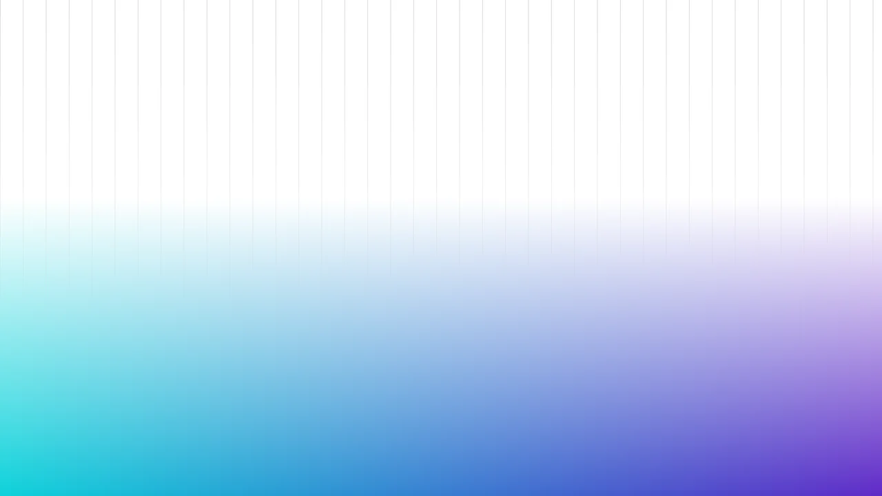
Fading Grid Gradient Background
This Fading Grid Gradient Background creates a clean, architectural aesthetic suitable for SaaS landing pages or documentation sites. It features a technical vertical grid pattern that gently dissolves into a vibrant teal-and-purple gradient at the bottom. The effect mimics a “horizon” line, adding depth and structure to an otherwise flat page without using any images.
Chrome 80+
Edge 80+
Firefox 53+
Safari 15.4+
See the Pen Fading Grid Gradient Background.

Rounded Triangle CSS Image Mask
This Rounded Triangle CSS Image Mask offers a mathematically perfect way to shape visuals into equilateral triangles with soft, professional edges. It is an ideal choice for high-end portfolio galleries, creative team sections, or landing pages where standard rectangular or circular crops feel too conventional. By leveraging modern CSS math, the shape remains perfectly symmetrical regardless of the image dimensions.
Chrome 105+
Edge 105+
Firefox 121+
Safari 15.4+See the Pen Rounded Triangle CSS Image Mask.