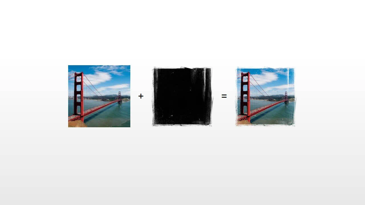
60+ CSS mask Examples (Page 2)
Examples

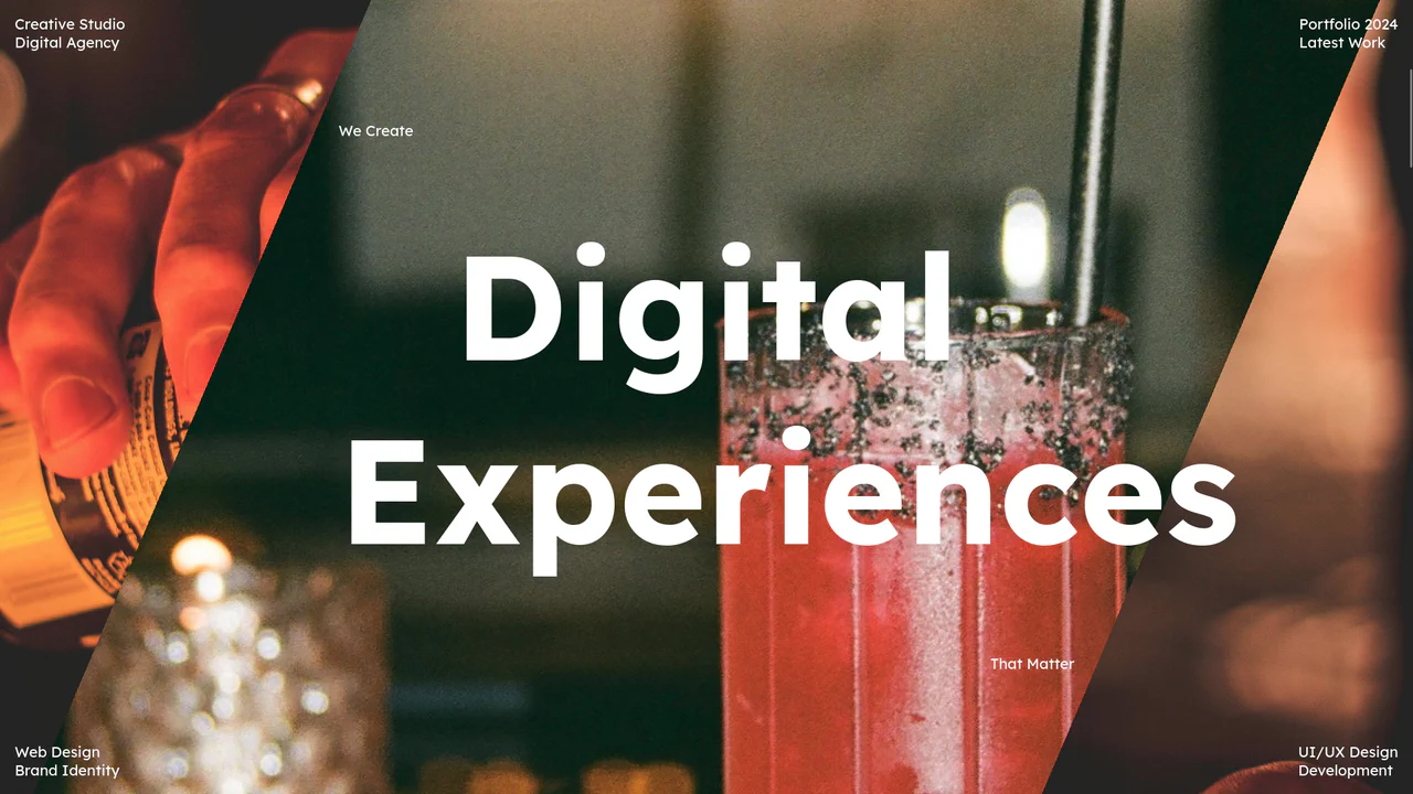
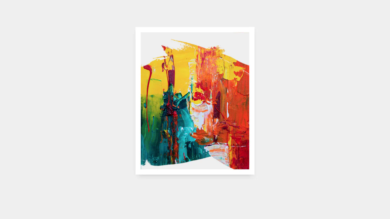
Holographic 3D Interactive Card
This Holographic 3D Interactive Card is a premium UI component inspired by rare physical trading cards. It features a sophisticated depth effect where the logo floats independently from the iridescent background, reacting dynamically to mouse movements or touch input. The use of modern CSS APIs ensures high-performance rendering of complex gradients and masks, creating a truly immersive “collectible” feel for digital assets.
 Chrome 85+
 Edge 85+
 Safari 16.4+
 Firefox 128+
See the Pen Holographic 3D Interactive Card.

Geometric Custom Range Sliders
These Geometric Custom Range Sliders push the boundaries of form styling by abandoning the standard “circle on a line” look. Created by CSS math wizard Ana Tudor, this set utilizes SCSS trigonometry to generate complex thumb shapes (like triangles and hollow pills) and CSS Mask Composition to carve out negative space. The result is a set of distinct, scalable inputs that rely on a single HTML <input> tag without any wrapper divs.
Chrome 84+
Edge 84+
Firefox 70+
Safari 15.4+
See the Pen Geometric Custom Range Sliders.
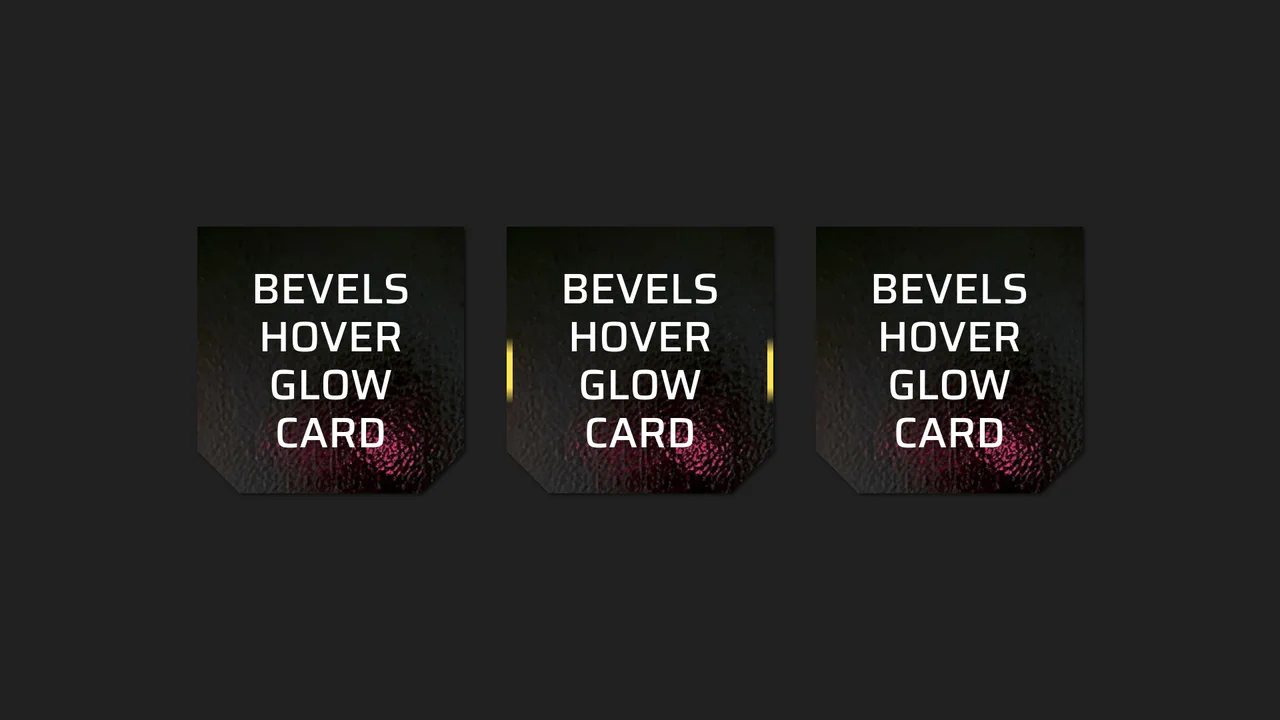
Beveled Corner Glow Cards
This Beveled Corner Glow Card component demonstrates the bleeding edge of CSS UI styling. It primarily utilizes the new corner-shape property to create chamfered (angled) edges without complex clip-paths, while implementing a sophisticated CSS Mask fallback for older engines. The interaction features a “scanning” light beam effect on the border, powered by CSS Houdini for buttery smooth interpolation.
Chrome 120+
Edge 120+
Firefox 120+
Safari 17+See the Pen Beveled Corner Glow Cards.

Glassmorphism Profile Info Card
This Glassmorphism Profile Info Card is a high-end UI component that replicates the sleek, frosted-glass aesthetic found in modern operating systems like iOS and macOS. It features a sophisticated interplay between background imagery and foreground content, using advanced CSS masking and backdrop filters to create a natural sense of depth and hierarchy.
Chrome 76+
Edge 79+
Firefox 103+
Safari 9.1+
See the Pen Glassmorphism Profile Info Card.

Hyperplexed Evervault Card Hover Effect
This Hyperplexed Evervault Card Hover Effect utilizes dynamic character generation and CSS masking to create a high-tech “decryption” visual. It replicates the sophisticated card interactions found on the Evervault website, blending procedural text with mouse-responsive radial gradients.
Chrome 80+
Edge 80+
Firefox 75+
Safari 13+
See the Pen Hyperplexed Evervault Card Hover Effect.

Pure CSS Synthwave 80s Animation
This Pure CSS Synthwave 80s Animation captures the nostalgic aesthetic of the 1980s retrowave genre. It features a complete animated scene: an infinite neon grid, a setting sun with scanlines, shaking palm trees, and a DeLorean driving into the distance. The scene is brought to life with a driving synthwave audio track and intricate CSS-only motion.
Chrome 60+
Edge 79+
Firefox 55+
Safari 11+See the Pen Pure CSS Synthwave 80s Animation.
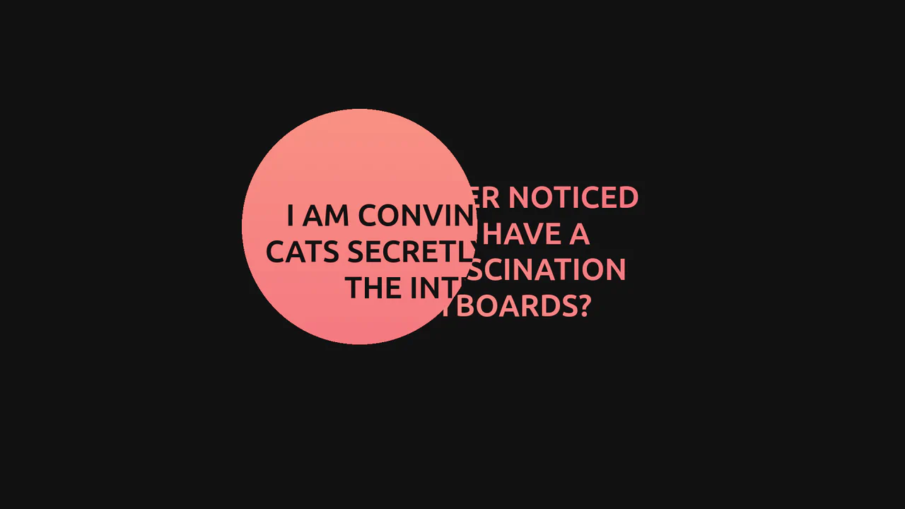
GSAP Mask Mouse Effect
An intriguing user experience where hidden messages and a vibrant gradient background are revealed only under a “spotlight” following the cursor, featuring expansion animations upon interaction.
See the Pen GSAP Mask Mouse Effect.
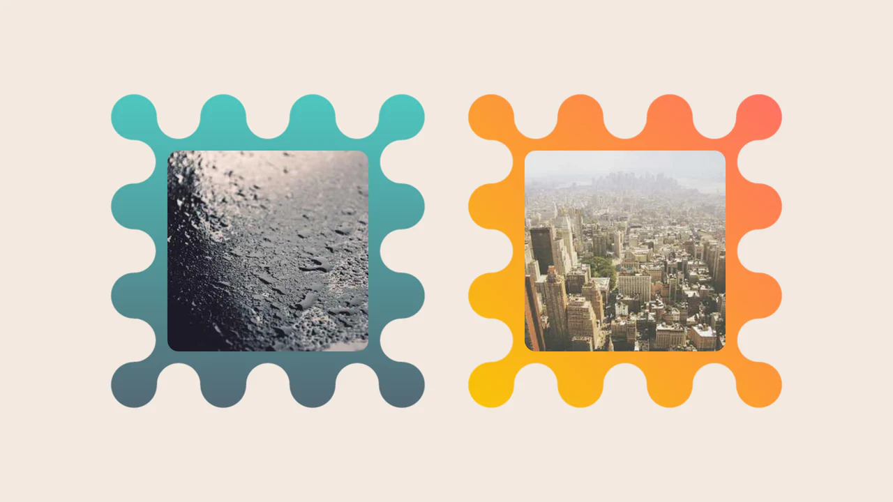
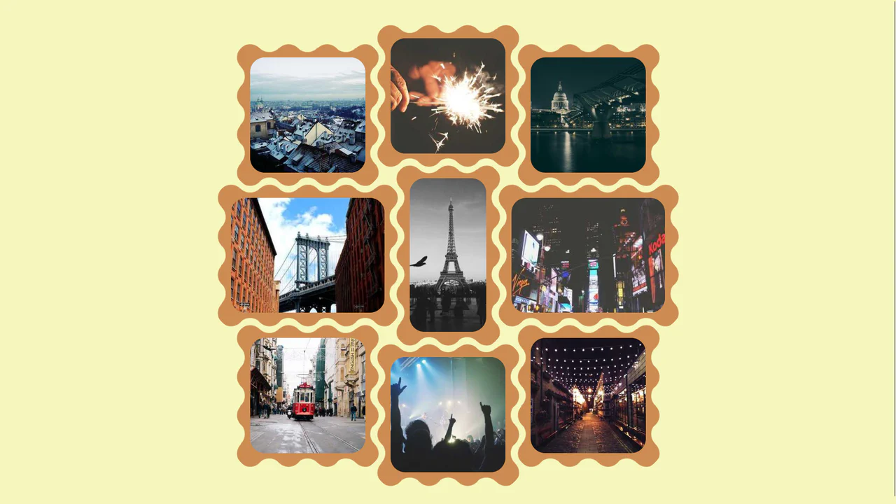
Images Inside Wiggly Boxes
A decorative image frame created entirely with CSS mask compositing. It combines radial-gradient layers with conic-gradient and the intersect composite operator to sculpt a scalloped, wavy border, while the CSS round() function ensures perfect pattern alignment along the edges.
See the Pen Images Inside Wiggly Boxes.
Scroll-Triggered Image Stack with Gradient Mask Reveal
As the user scrolls down, images transition not by simple sliding or fading, but through a complex diagonal “wiping” animation controlled by dynamic gradients, all while the text content remains fixed over the changing background.
Wavy Image Gallery
Images appear as jigsaw puzzle pieces with interlocking edges that can visually fit together.
See the Pen Wavy Image Gallery.

Invert Radius Shape with Cool Hover Effect
A sophisticated hover effect utilizing CSS Houdini to animate a complex image mask.
See the Pen Invert Radius Shape with Cool Hover Effect.

Wall of Text: Blogged
A futuristic, interactive blog card featuring AI-generated content fetched dynamically via JavaScript. The layout utilizes advanced CSS techniques like :has() for expandable sections, masking and blend modes for rich graphical elements, and variable-driven cursor tracking animations, creating a dynamic and engaging reading experience.
See the Pen Wall of Text: Blogged.
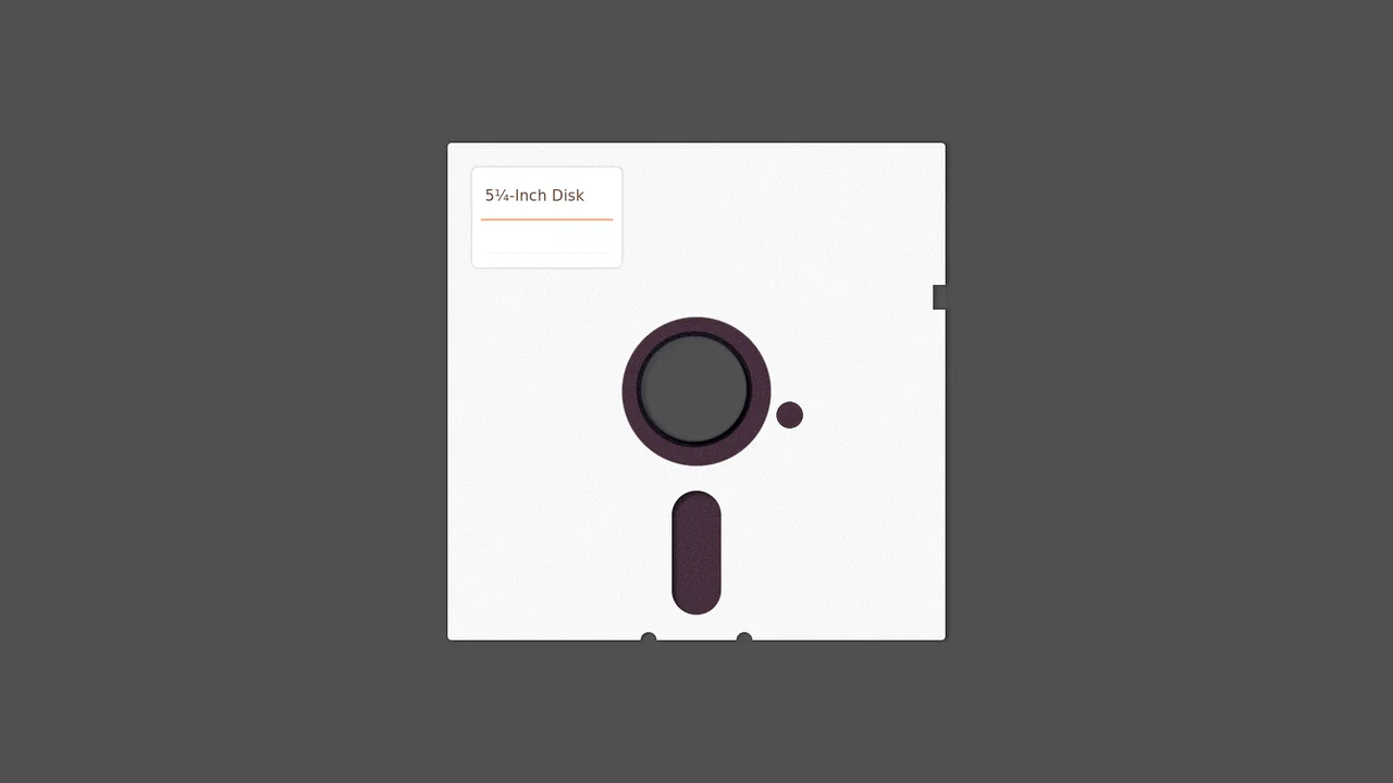
5¼-Inch Floppy Disk
A purely CSS-generated skeuomorphic representation of a vintage 5.25-inch floppy disk.
See the Pen 5¼-Inch Floppy Disk.

Single Element Progress
Elegant, segmented radial charts that smoothly fill upon page load, showcasing the capabilities of modern CSS without JavaScript.
See the Pen Single Element Progress.
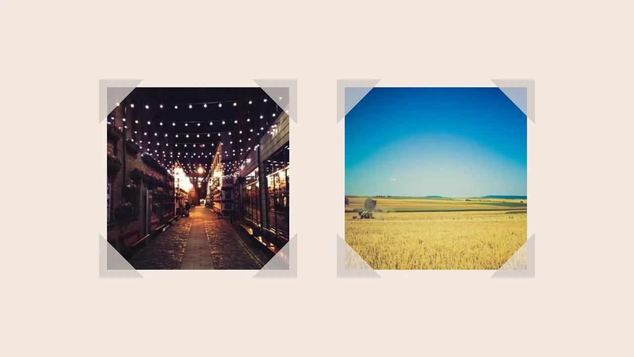
Fancy Corner Decoration for Images
A border effect for an <img> tag - the size of the decorative edge, created with repeating-conic-gradient and -webkit-mask, is dynamically calculated via a complex calc() function controlled by CSS variables.
See the Pen Fancy Corner Decoration for Images.

Dissolving Image Edges
Creating a “grainy” edge effect for a circular image using SVG filters. The effect is achieved through a complex combination of feGaussianBlur and feTurbulence primitives with multiple feComposite operations to control the alpha channel.
See the Pen Dissolving Image Edges.
GSAP Sprite Mask Animation
The demo uses GSAP to programmatically control the CSS mask property and applies the ease: steps() function for precise, frame-by-frame switching between 20 sprite mask states, creating a drawing or layered revelation effect.
See the Pen GSAP Sprite Mask Animation.
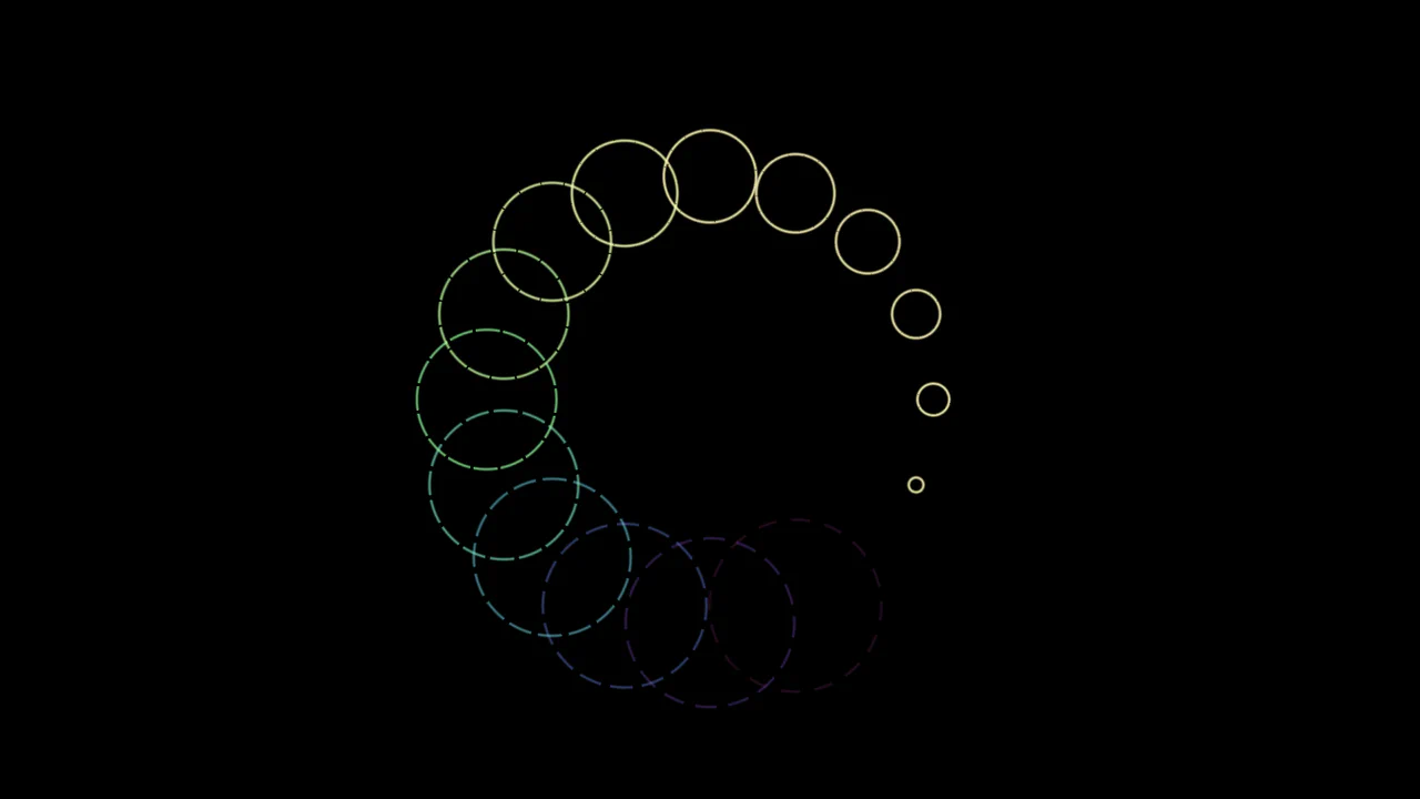
Pure CSS Loader #11/2020 - Ripples
Spectacular animated ring loader built on the advanced capabilities of CSS Houdini to define and smoothly transition custom properties, enabling complex and dynamically changing geometry via conic and radial gradients.
See the Pen Pure CSS Loader #11/2020 - Ripples.
Smooth Corners with CSS
A progressive technique for creating complex UI shapes using the CSS Houdini Paint API - a squircle is generated by the smooth-corners worklet, surpassing the capabilities of border-radius. The shape’s curvature is dynamically controlled via the --smooth-corners CSS Custom Property, while the effect itself is built with a combination of pseudo-elements, mask, and clip-path.
See the Pen Smooth Corners with CSS.
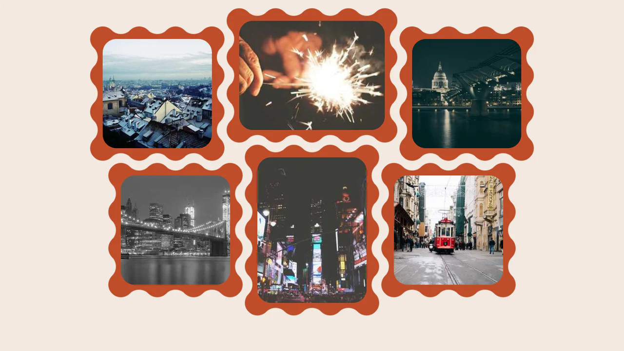
CSS Grid creates a 3‑column base, then each image is individually shifted with translate to break the alignment — resulting in a scattered, organic layout. The wave‑shaped border is drawn using mask with repeating radial gradients; the design is purely visual and static.
Scroll Mask Indicators
A modern and clean way to indicate scrollability: the “fade-to-mist” effect is implemented using mask-image and linear-gradient, while key parameters of the fade phase are precisely tuned using @property.
See the Pen Scroll Mask Indicators.
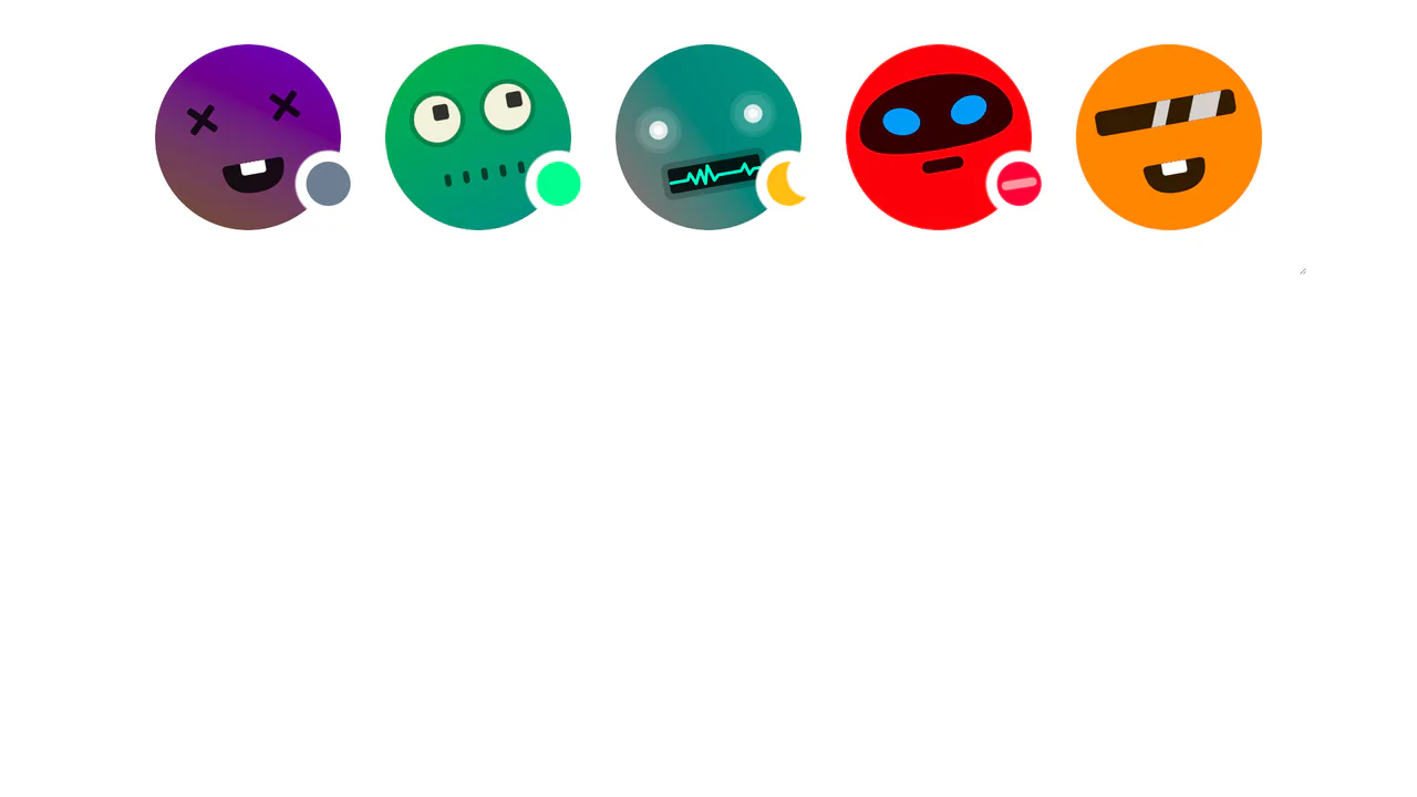
Avatar status indicators positioned with CSS masks and trigonometry (cos, sin). Custom properties --status-angle, --status-size, --status-offset control the dot’s position along the circumference; a radial‑gradient mask cuts a hole for the indicator to peek through. JavaScript only tweaks the variables — the logic itself is pure CSS.
CSS Bookmark
A state-driven animation, controlled via the “checkbox hack,” showcases the power of CSS @property (Houdini) for smoothly animating gradients and mask properties. A complex multi-layered bookmark shape is created with an SVG mask, while the entire activation effect choreography is built on synchronized @keyframes.
See the Pen CSS Bookmark.