10+ CSS Masonry Layouts
Traditional grids restrict content. This Pure CSS Masonry Layout collection removes structural rigidity, allowing varied item heights to flow naturally. High-performance UI design prioritizes content-first logic, eliminating the friction of heavy external libraries. Clear paths between information and the screen.
Technically, these examples rely on CSS Grid with the masonry value or the Multi-column Layout module. By avoiding JavaScript for positioning, the browser maintains absolute layout stability. Transitions leverage hardware acceleration, ensuring 60fps performance on the rendering thread. The HTML remains strictly semantic, keeping the DOM lightweight and updated. No technical noise.
Every free demo is fully responsive and cross-browser compatible. Users can instantly download the raw code or fork a specific project on CodePen.
Examples
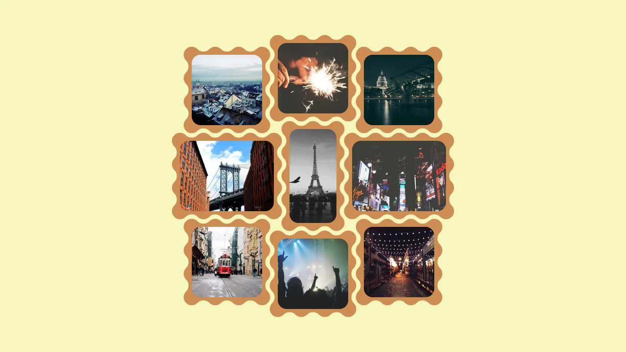
Interlocking Wavy Image Grid
This is an Interlocking Wavy Image Grid. It applies procedural scalloped edges to raster images and shifts them into a tight, puzzle-like masonry formation. Its function is to break rigid, rectangular bounds in visual galleries, converting standard blocks into an organic, cohesive texture.
 Chrome 111+
 Edge 111+
 Firefox 112+
 Safari 15.4+
See the Pen Interlocking Wavy Image Grid.

Grid Lightbox Gallery Effect
This is a CSS Grid Lightbox Gallery Effect. It structures an asymmetric image grid that expands individual photos into a full-screen, blurred overlay upon interaction. Its primary function is to focus user attention on a single visual asset while maintaining the context of the underlying page through transparency.
Chrome 76+
Edge 79+
Firefox 103+
Safari 13+
See the Pen Grid Lightbox Gallery Effect.

CSS Scroll-Driven Masonry Reveal
This Scroll-Driven Masonry Reveal creates a playful, tactile experience where content cards appear to be “dealt” onto the screen as the user scrolls. By leveraging the native CSS Scroll-driven Animations API, it achieves smooth, main-thread-free entrance effects without a single line of JavaScript. The layout adapts intelligently from 2 to 8 columns, making it a robust solution for image galleries or blog archives. (Requires: Open Props (CSS Library))
Chrome 115+
Edge 115+
Safari 26+
Firefox (flag/polyfill)
See the Pen CSS Scroll-Driven Masonry Reveal.

Animated Portfolio with SVG ClipPath Hover Effect
This interactive portfolio showcases a masonry-style layout built with two overlapping CSS Grids, where grid-row: span and grid-column: span create the complex pattern. The key interaction is a unique “spotlight” reveal effect on hover, powered by a JavaScript-controlled SVG <clipPath> that dynamically updates the position of a <circle> mask to follow the mouse.
See the Pen Animated Portfolio with SVG ClipPath Hover Effect.
A fluid, responsive gallery that automatically adjusts to screen size and provides rich visual feedback on hover.
A responsive masonry-style image gallery constructed using CSS floats and media queries to manage varied tile dimensions.
A dense, neat grid of cards with varying heights (Pinterest-style) that correctly rearranges upon window resizing and content loading.
Responsive Flexbox gallery with column count changing (3 → 2 → 1) via media queries. Hovering the container dims all images, individual item highlights. Titles absolutely positioned over pictures.
Responsive CSS multi‑column masonry with variable‑height tiles. Media queries adjust column count, pseudo‑elements show a counter and an emoji, background color and hover controlled by an SCSS mixin. Minimal yet flexible structure without images.
Responsive CSS Grid with grid-auto-flow: dense and span-* classes to create tiles of varying sizes. repeat(auto-fill, minmax(180px, 1fr)) automatically adjusts column count, while dense flow fills the gaps. A simple yet clear demonstration of Grid capabilities.
Vertical page orientation (writing-mode) creates an unusual reading grid. Horizontal quote tiles are arranged in a CSS Grid with dense auto‑placement. span-* classes control item height, media queries adapt the grid to screen height.

Fixed‑height flexbox container with column wrap. Every sixth item has a predefined height, creating a mosaic rhythm without media queries. JavaScript adds/removes cards and inserts random images.

CSS multi‑column gallery (columns). Images and captions automatically flow into 200px‑wide columns. Hover removes grayscale and changes border color. Minimal code with no media queries.

Responsive image grid with CSS Grid using auto-fit and a minimum column width of 250px. Classes .wide, .tall, and .big let specific items span more space, creating a mosaic layout. Images are fitted into cells with object-fit: cover.

Masonry‑style layout using CSS Grid with fixed rows and manual cell placement. Images adapt to cells via object-fit: cover. No JavaScript — just Grid and explicit coordinates.
