10+ CSS Material Design Cards
Material Design provides a unified system for visual hierarchy, making CSS Material Design Cards essential for structured, intuitive UI design. Using this updated collection allows developers to implement consistent, tactile layouts that guide user attention effectively, bypassing the need to build complex shadow and spacing rules from scratch.
Technically, these snippets rely on precise box-shadow layering and transition properties to simulate elevation and physical depth. The underlying HTML structure integrates with Flexbox and CSS Grid to maintain strict layout stability. By utilizing hardware acceleration for hover states and ripple effects, the code ensures smooth 60fps performance without triggering expensive layout repaints, keeping the rendering cycle highly optimized.
Every free demo in this library is fully responsive and cross-browser compatible. Developers can easily download the source code or fork a specific project on CodePen to customize dimensions, typography, and colors.
Examples

Creative Section Design
A visually rich, animated section with cards that respond to hover (a colored border appears), creating a sense of interactivity and depth.
See the Pen Creative Section Design.
This is a technically complex Material Design demo, relying on intricate CSS animation precisely controlled by @keyframes and Bézier curves, which creates a sequential element reveal effect; the key feature is the four-stage transformation of the card from a circle to a rectangle and the dynamic background fill, while the entire layout is responsive via media queries.
Material Design Card Effect
A flexible SCSS system for generating multi-layered, Material Design-style shadows - all logic is built on @functions and accessing list values with nth().
See the Pen Material Design Card Effect.
Material Card with Animated Featured Image
A pure CSS card transformation effect on :hover, where a circular background element morphs into a rectangle via a transition of the border-radius property, while a custom cubic-bezier(.3, 0, 0, 1.3) function gives the motion a unique “elasticity”.
See the Pen Material Card with Animated Featured Image.
Material Cards
A responsive card grid on Flexbox, using SCSS with variables for easier style management. A complex transition effect fires on :hover, synchronously animating the box-shadow for a “lift” effect, text colors, and the width of a dynamic header underline.
See the Pen Material Cards.
A card with a collapsible middle section. Clicking the circular button toggles the visibility of an additional content panel, while the button icon rotates.
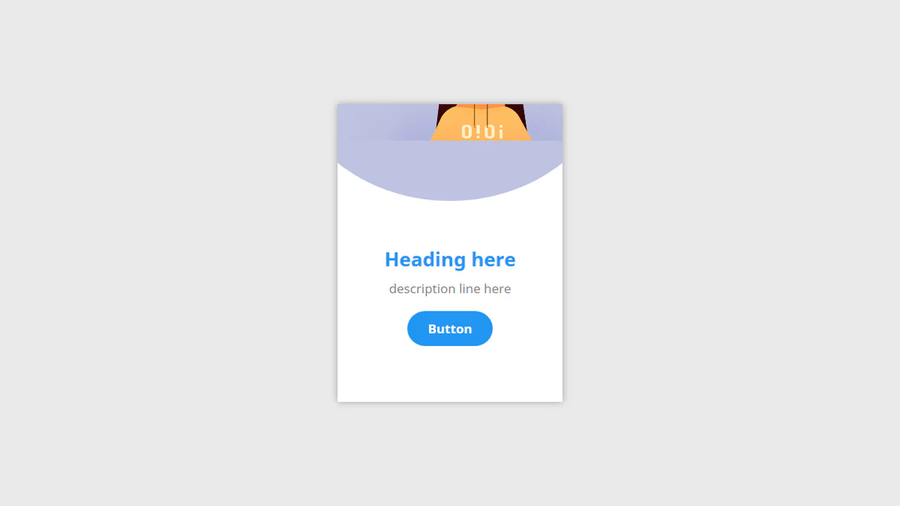
A hover‑expand card. The circular background stretches into a banner, and the text and button reposition.

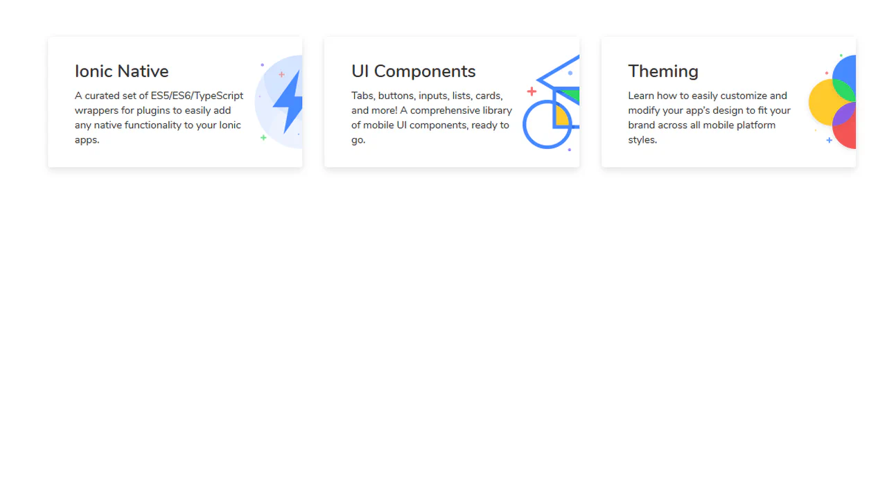
A modular card layout built with Material Design Lite. Two cards sit within a responsive grid, each containing a media block, title, supporting text, and action buttons. The structure is predictable — media, content, actions — and the interaction is limited to button ripples.

This is a technically complex Material Design demo, relying on intricate CSS animation precisely controlled by @keyframes and Bézier curves, which creates a sequential element reveal effect; the key feature is the four-stage transformation of the card from a circle to a rectangle and the dynamic background fill, while the entire layout is responsive via media queries.

A statistics card with a toggleable bar chart. Clicking the circular button triggers a timed sequence: the button relocates, the graph data fades in, and bar heights animate. Each transition uses a distinct easing and delay — a choreographed state change that reveals information only when requested.
A staggered card entrance sequence. The main card scales in, followed by its header, then a grid of mini cards scale in with a subtle bounce.

A hover‑reveal card for a skill. The header collapses, the icon scales, and each list item slides in with a staggered delay. The motion is timed — a progressive disclosure of information triggered by cursor focus.
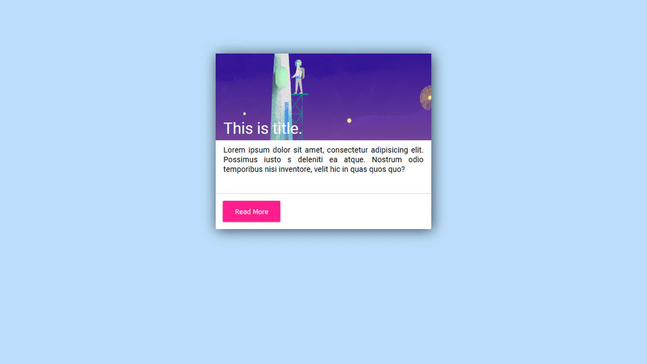
A material‑style card with an image, description, and a call‑to‑action button. On click, the button generates a ripple — a direct visual confirmation of the touch point. The card also features a subtle entrance animation and a hover shadow.