50+ CSS mix-blend-mode Examples
Visual interaction requires seamless layering. The CSS mix-blend-mode examples in this updated collection remove rigid boundaries between overlapping elements. Modern UI design dictates that typography and media should interact organically. Utilizing curated snippets replaces heavy image editing with raw, code-driven color synthesis. Function dictates form.
The architecture relies strictly on mathematical blending operations — such as multiply, screen, and difference — applied directly to the DOM nodes. The code utilizes hardware acceleration to process pixel calculations on the GPU, maintaining a locked 60fps performance during interactive states. The HTML structure remains strictly semantic, ensuring absolute layout stability without triggering costly browser repaints or layout shifts when elements intersect.
Every free demo is fully responsive and cross-browser compatible. Users can instantly download the raw code or fork a specific composition on CodePen. These assets are strictly optimized for accessibility, delivering a fast, frictionless experience across all modern mobile and desktop devices.
Examples
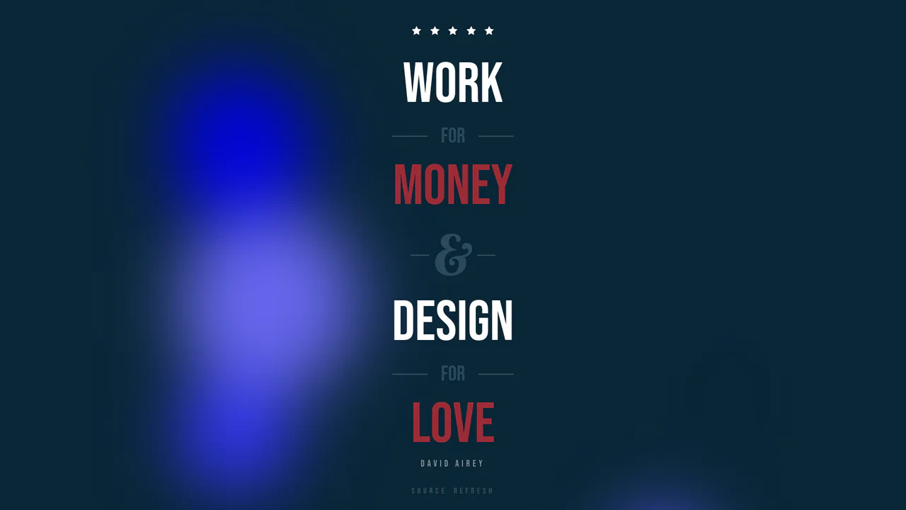
Liquid Glow Blend Mode Poster
This design layout overlays sharp, classic typography onto a fluidly shifting background of colored orbs. Underneath the layout, an HTML5 Canvas draws drifting, colored circles that are diffused into a soft glow by a heavy CSS blur filter. By applying mix-blend-mode: lighten (or overlay), the letters dynamically blend with the shifting light underneath, producing a premium print-like digital editorial.
 Chrome 49+
 Edge 79+
 Firefox 47+
 Safari 10+
See the Pen Liquid Glow Blend Mode Poster.
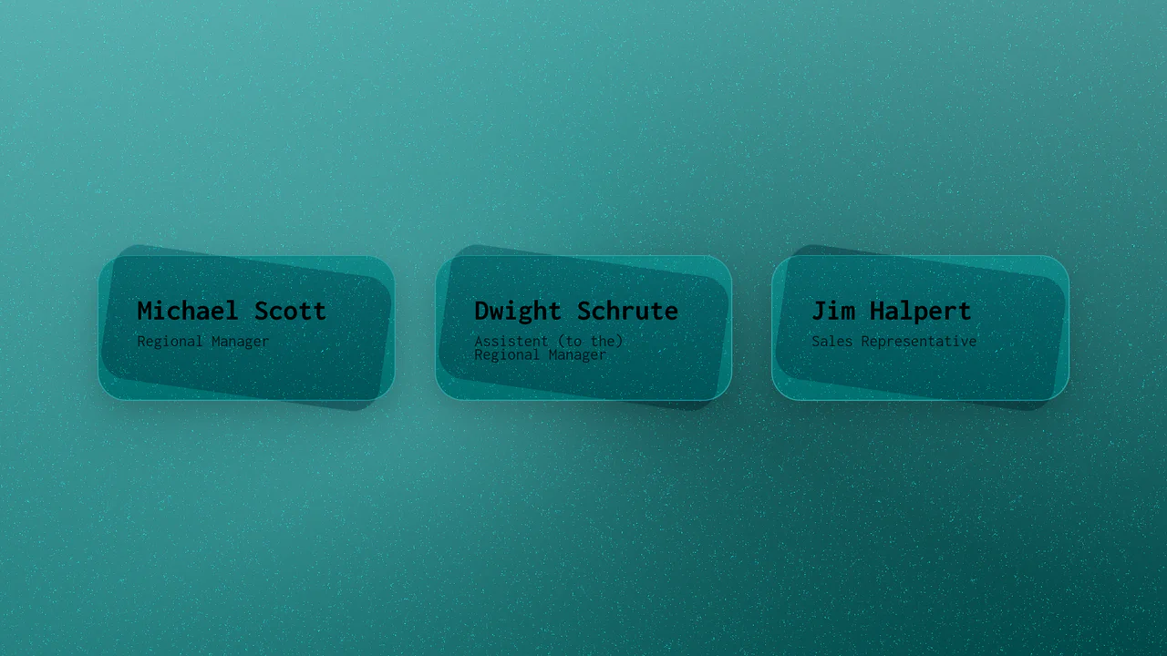
Textured 3D Layered Grid Cards
This lightweight grid layout styles nested cards with an organic paper feel entirely through vector code. It utilizes a base64-encoded SVG filter featuring specular lighting and turbulence to inject a matte noise texture over solid colors. By applying an offset ::after pseudo-element rotated by 8deg with mix-blend-mode: overlay, each card gains a shifted tactile depth layer without heavy graphics.
Chrome 105+
Edge 105+
Firefox 103+
Safari 16+
See the Pen Textured 3D Layered Grid Cards.
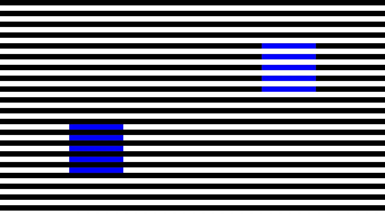
Simultaneous Contrast CSS Optical Illusion
An interactive pure-CSS representation of Adelson’s simultaneous contrast optical illusion. Built with zero HTML, the layout implements contrasting mix-blend-mode properties (darken and lighten) over a repeating black-and-white striped background. This makes two identical green squares appear as completely different shades until a hover gesture collapses the stripes to reveal they are the exact same color.
Chrome 41+
Edge 79+
Firefox 32+
Safari 8+
See the Pen Simultaneous Contrast CSS Optical Illusion.
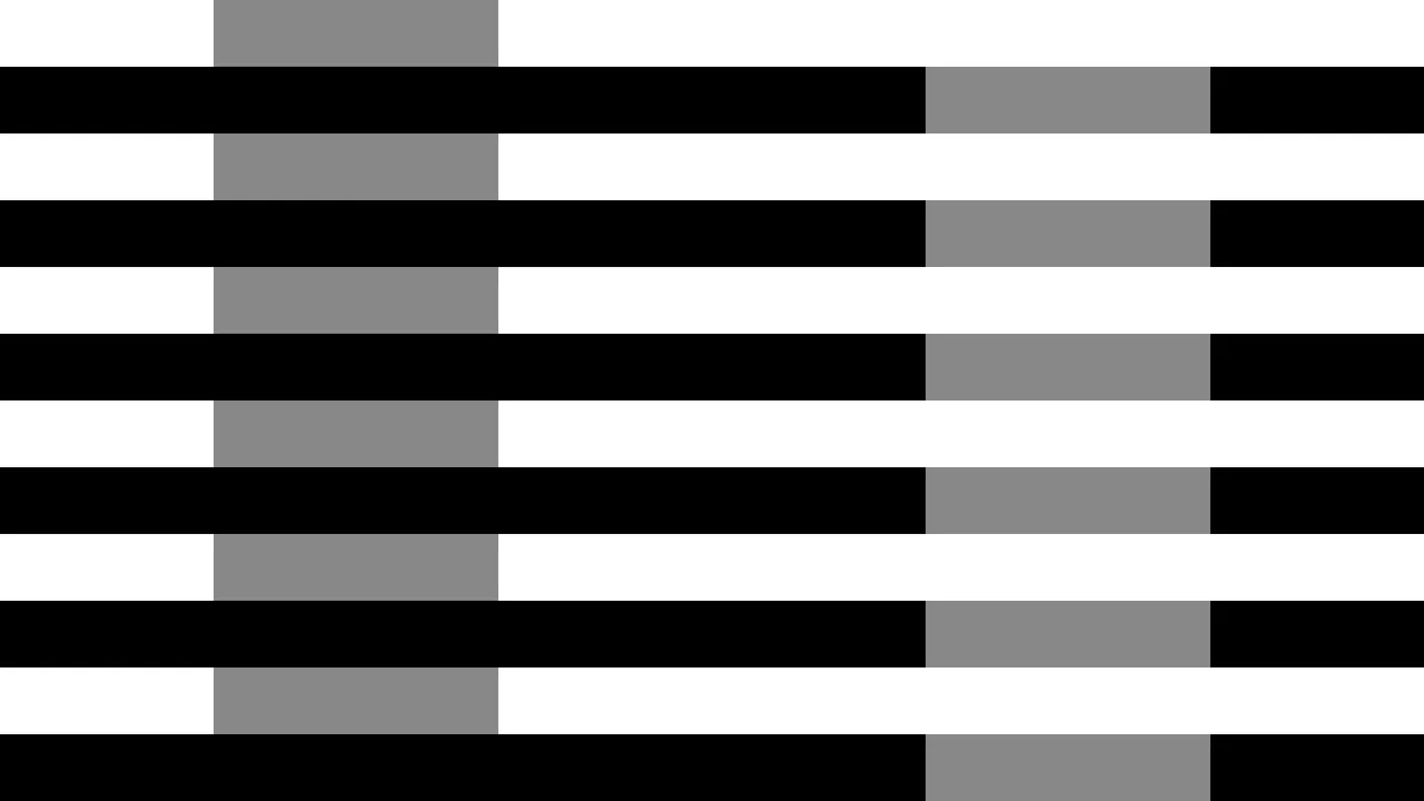
White's Brightness Contrast CSS Illusion
An elegant pure-CSS implementation of White’s brightness illusion. Operating with zero HTML markup, the stylesheet utilizes contrasting mix-blend-mode values (darken and lighten) to overlay identical solid gray columns over a repeating black-and-white horizontal striped background. This contextual setup tricks the visual system, making one gray bar appear perceptually darker than the other.
Chrome 41+
Edge 79+
Firefox 32+
Safari 8+See the Pen White's Brightness Contrast CSS Illusion.
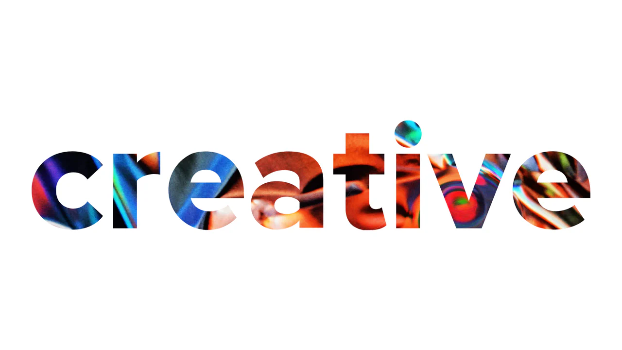
WebGL Liquid Distortion Typography Mask
This is a WebGL Liquid Distortion Typography Mask. It uses fluid simulation to distort a background image, revealed only through a vector cutout. Its function is to transform standard text headers into deeply interactive, kinetic focal points. (Requires: OGL.js, TweenMax.js)
Chrome 60+
Edge 79+
Firefox 55+
Safari 12+
See the Pen WebGL Liquid Distortion Typography Mask.
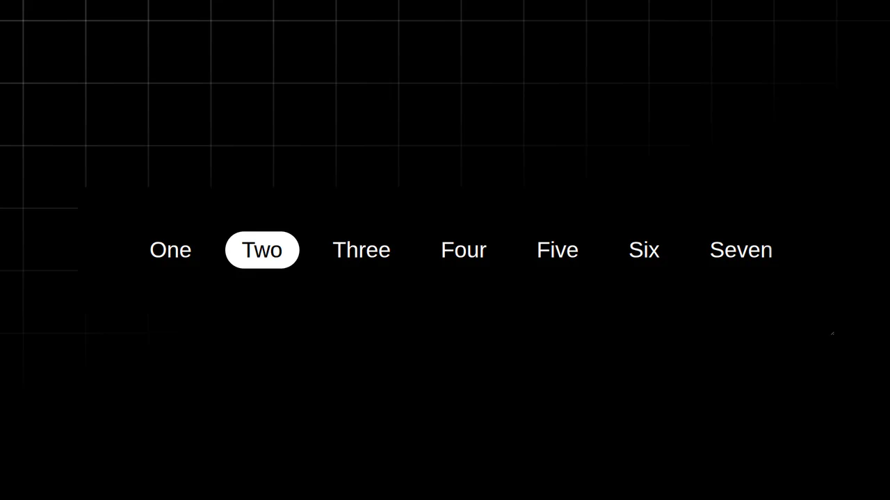
Resizing Tab Bar with Anchor Positioning
This is a Resizing Tab Bar with Anchor Positioning. It demonstrates a modern approach to building a horizontally scrollable navigation menu with a sliding “active” indicator. Its function is to provide a highly fluid, decoupled visual highlighter that perfectly tracks the currently selected tab — even when the container is resized or scrolled — without relying on heavy JavaScript coordinate calculations. (Requires: Normalize.css)
Chrome 125+
Edge 125+
See the Pen Resizing Tab Bar with Anchor Positioning.

Iridescent 3D Neumorphic Button
This is an Iridescent 3D Neumorphic Button. It pushes CSS styling to the limit, using stacked gradients, oklch color spaces, and advanced blend modes to create a button that feels like a piece of polished, translucent hardware. Its function is to serve as a high-fidelity “Hero” element, delivering a tactile, light-responsive experience that feels alive under the cursor.
Chrome 105+
Edge 105+
Firefox 121+
Safari 15.4+
See the Pen Iridescent 3D Neumorphic Button.

Lenis Smooth Scroll Cinematic Experience
This is a Lenis Smooth Scroll Cinematic Experience. It transforms a standard single-page portfolio or narrative website into an immersive, high-end digital journey. Its primary function is to replace jarring browser scrolling with the fluid, physics-based motion of Lenis, while using GSAP’s ScrollTrigger plugin to orchestrate a complex sequence of cinematic animations, including a “film roll” header, an expanding video player, and a dramatic footer reveal. (Requires: Lenis, GSAP, ScrollTrigger)
Chrome 80+
Edge 80+
Firefox 75+
Safari 14.1+
See the Pen Lenis Smooth Scroll Cinematic Experience.

CSS :has() Character Select Screen
This is a CSS :has() Character Select Screen. It replicates the classic user interface of a fighting game’s selection menu, using modern CSS to handle all state logic. Its function is to demonstrate how the :has() pseudo-class can completely replace JavaScript for managing visibility in a selection-based UI, triggering changes in the main content area based on the state of a radio button group. (Requires: Vue)
Chrome 105+
Edge 105+
Firefox 121+
Safari 15.4+See the Pen CSS :has() Character Select Screen.

Staggered Particle Blob Effect
This is a Staggered Particle Blob Effect. It clusters multiple DOM nodes into a cohesive, glowing entity that tracks cursor movement. Its function is to provide highly organic, procedural background interaction, replacing static canvases with an ecosystem of independent, mathematically linked elements. (Requires: AnimeJS)
Chrome 79+
Edge 79+
Firefox 71+
Safari 13+
See the Pen Staggered Particle Blob Effect.

Animated Electric Border CSS Card
This is an Animated Electric Border CSS Card. It utilizes an embedded SVG filter to render a dynamic, unstable boundary. Its function is to isolate data and establish a clear focal point. The effect is self-contained and persistent, demanding attention through continuous motion.
Chrome 111+
Edge 111+
Firefox 113+
Safari 15.4+
See the Pen Animated Electric Border CSS Card.

Dynamic Article Hover Cursor
The mouse cursor is the primary bridge between user and interface, yet it often remains a passive arrow. This component reimagines the cursor as an active participant in the narrative. By morphing the pointer into a contextual “Read” badge that reacts to specific content, we reduce cognitive load and create a more intent-driven browsing experience. It feels less like clicking links and more like exploring a curated magazine.
Chrome 105+
Edge 105+
Firefox 121+
Safari 15.4+See the Pen Dynamic Article Hover Cursor.

Neon Elastic Stroke Radio Button
This Neon Elastic Stroke Radio Button reimagines the standard form input as a high-energy, futuristic interface element. When selected, two overlapping SVG circles (one pink, one blue) animate around the checkmark area with a satisfying elastic “bounce.” The effect mimics a neon light tube flickering on, enhanced by CSS drop-shadow filters and mix-blend-mode for a vibrant, glowing finish. (Requires: GSAP)
Chrome 50+
Edge 79+
Firefox 50+
Safari 10+
See the Pen Neon Elastic Stroke Radio Button.

Mouse-Tracking Linear Shine Button
This Mouse-Tracking Linear Shine Button adds a high-end, tactile feel to your UI. Unlike standard hover effects that simply swap colors, this component tracks the user’s cursor position to drag a realistic light reflection across the button’s surface. Built with React and Tailwind CSS, it utilizes reactive CSS variables to control gradient positions, creating a dynamic lighting effect that feels physical and responsive. (Requires: React, React DOM, Tailwind CSS)
Chrome 49+
Edge 79+
Firefox 32+
Safari 8+
See the Pen Mouse-Tracking Linear Shine Button.

Scroll-Driven Image Swapper
This Scroll-Driven Image Swapper demonstrates the bleeding edge of web animation. It uses the native CSS Scroll-driven Animations API to create a complex parallax-like effect where two columns of different heights scroll in sync. As you scroll, the images in the shorter column slide and crossfade to match the context of the taller column. Crucially, the code implements a Progressive Enhancement strategy: it checks for native browser support and falls back to GSAP ScrollTrigger for browsers that haven’t implemented the spec yet. (Requires: GSAP, ScrollTrigger)
Chrome 115+
Edge 115+. Firefox/Safari (via GSAP Polyfill)See the Pen Scroll-Driven Image Swapper.

Atmospheric Split-View Gallery
This Atmospheric Split-View Gallery creates an immersive, story-driven experience reminiscent of a digital scrapbook. It combines a full-screen horizontal slider with a “flip-card” mechanic to reveal hidden content. The visual style defines the component, utilizing CSS mix-blend-mode to fuse historical black-and-white photography with a grunge paper texture, creating a cohesive, vintage aesthetic. (Requires: swiped-events.js)
Chrome 41+
Edge 79+
Firefox 32+
Safari 8+
See the Pen Atmospheric Split-View Gallery.

Hyperplexed Evervault Card Hover Effect
This Hyperplexed Evervault Card Hover Effect utilizes dynamic character generation and CSS masking to create a high-tech “decryption” visual. It replicates the sophisticated card interactions found on the Evervault website, blending procedural text with mouse-responsive radial gradients.
Chrome 80+
Edge 80+
Firefox 75+
Safari 13+
See the Pen Hyperplexed Evervault Card Hover Effect.

Pure CSS Mix-Blend-Mode Dark Toggle
This Pure CSS Mix-Blend-Mode Dark Toggle offers a lightweight, JavaScript-free solution for theming. Instead of manually redefining colors for a dark theme, it utilizes a full-screen “curtain” overlay with a specific blending mode to mathematically invert the page’s color palette. The result is a smooth, wiping transition that instantly creates a high-contrast dark mode.
Chrome 41+
Edge 79+
Firefox 32+
Safari 8+
See the Pen Pure CSS Mix-Blend-Mode Dark Toggle.

Moiré Psy-Dance Party VIP Access Card (CSS Only)
A psychedelic 3D VIP card animation powered by pure CSS.
See the Pen Moiré Psy-Dance Party VIP Access Card (CSS Only).

Animated Grid Tracks with :has()
A pure CSS expanding gallery powered by the modern :has() selector. Hovering triggers a grid-template-columns transition, widening the active item while revealing content via opacity and transform animations, all styled with blend modes for a tinted monochrome aesthetic.
See the Pen Animated Grid Tracks with :has().

Elastic Portfolio Navigation with GSAP
An energetic, high-tech menu providing powerful visual feedback upon interaction, perfectly suited for cyberpunk or sci-fi themed websites.
See the Pen Elastic Portfolio Navigation with GSAP.

Holographic Name Card with Hover Effects
An interactive 3D holographic card where JavaScript maps pointer coordinates to scoped CSS Custom Properties like --pointer-x. The physical lighting simulation relies on complex gradient layering, mask-image, and mix-blend-mode, all dynamically driven by these calculated values to create realistic depth and glare.
See the Pen Holographic Name Card with Hover Effects.
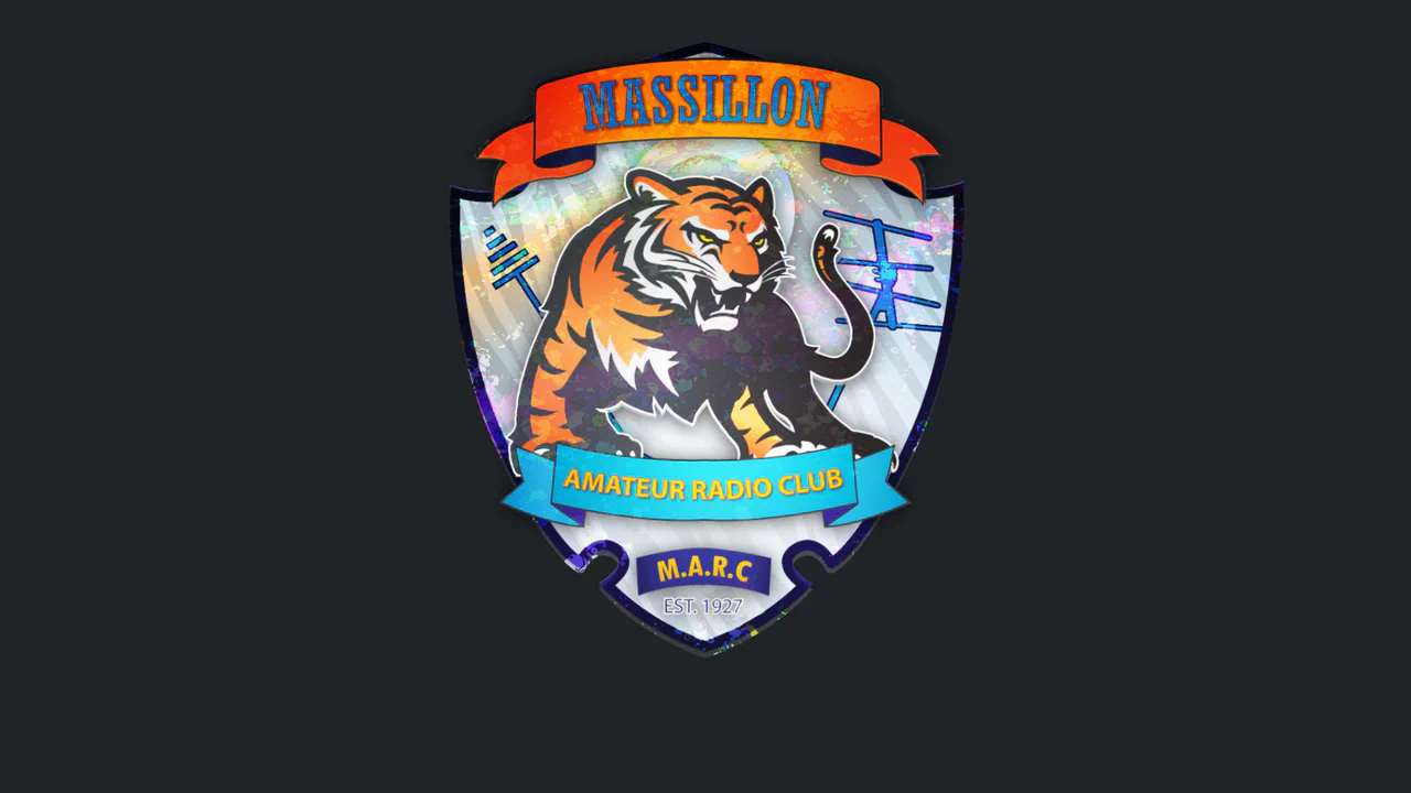
Amateur Radio Badge 3D
A highly sophisticated holographic badge simulation utilizing CSS 3D transforms and layered mix-blend-mode effects. JavaScript tracks mouse movement to dynamically update CSS variables, driving complex parallax shifts, lighting gradients, and SVG-masked glares for a realistic, tactile depth experience.
See the Pen Amateur Radio Badge 3D.
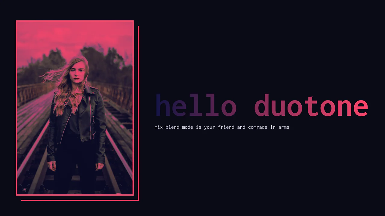
Image Duotoning with SCSS
A pure CSS duotone filter effect achieved by stacking layers with mix-blend-mode. The image is set to darken against a colored container, while an overlay pseudo-element uses lighten to tint the highlights, creating a cohesive two-color aesthetic controlled by SCSS variables.
See the Pen Image Duotoning with SCSS.

Sketch Button
A high-tech, visually rich button that reacts to interaction with a burst of light tracing its borders, making the interface feel alive and responsive.
See the Pen Sketch Button.
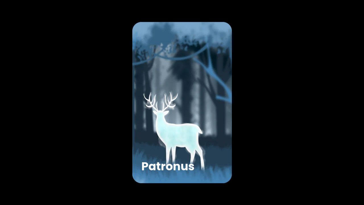
3D Patronus Magic Card
An enchanting 3D parallax card featuring a multi-layered depth effect driven by mouse interaction.
See the Pen 3D Patronus Magic Card.

RGB Dot Preloader
A hypnotic, kaleidoscopic loader where white dots decompose into their RGB constituents during motion, generating a sensation of energy and complexity.
See the Pen RGB Dot Preloader.
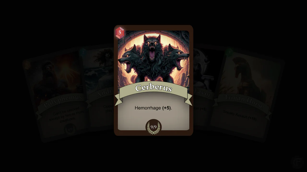
LapisCordis: A Greco-Roman Mythological Card Game
A high-quality, atmospheric Trading Card Game (TCG) interface featuring smooth animations, a tangible sense of depth, and “magical” visual effects upon interaction.
See the Pen LapisCordis: A Greco-Roman Mythological Card Game.

Social Feed: Poll with Animation
Upon selection, the interface instantly springs to life: bars fill smoothly, numbers tally up, and the winning option is highlighted with a festive animation, creating a delightful and engaging user experience (micro-interaction).
See the Pen Social Feed: Poll with Animation.
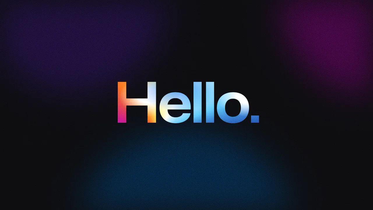
Grainy Gradient Text with CSS Houdini
A holographic typography effect achieved through CSS Houdini properties to animate complex gradient coordinates. The text features a grainy texture generated by SVG noise filters and blended with conic and radial gradients using background-blend-mode: color-burn, creating a shimmering, fluid color movement clipped directly to the character shapes.
See the Pen Grainy Gradient Text with CSS Houdini.