10+ CSS Mobile Menus
Mobile navigation dictates orientation. CSS Mobile Menu Examples remove the friction of heavy JavaScript, allowing the interface to expand natively. This collection provides professional, minimalist blocks for modern UI design, organizing links into tactile, responsive sequences. Utilizing curated snippets guarantees layout stability while keeping the DOM transparent and fast.
Technically, these examples rely on the checkbox hack and media queries to manage state without external dependencies. The code utilizes Flexbox for precise alignment and transform: translateX for smooth appearance. Motion leverages hardware acceleration — animating properties like opacity and transform — to maintain a locked 60fps performance on the compositor thread. The HTML structure remains strictly semantic, supporting accessible navigation.
Every free demo is fully responsive and cross-browser compatible. Users can instantly download the raw code or fork an updated interaction on CodePen. These assets are strictly optimized for performance, delivering a fast, frictionless experience across all modern devices.
Examples
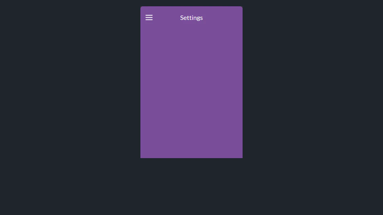
Menu expands via transform: translateY with staggered delay: each layer moves in logical sequence. State managed via wrapper classes, no hidden flags. Animation triggers only on user action — no main thread blocking.

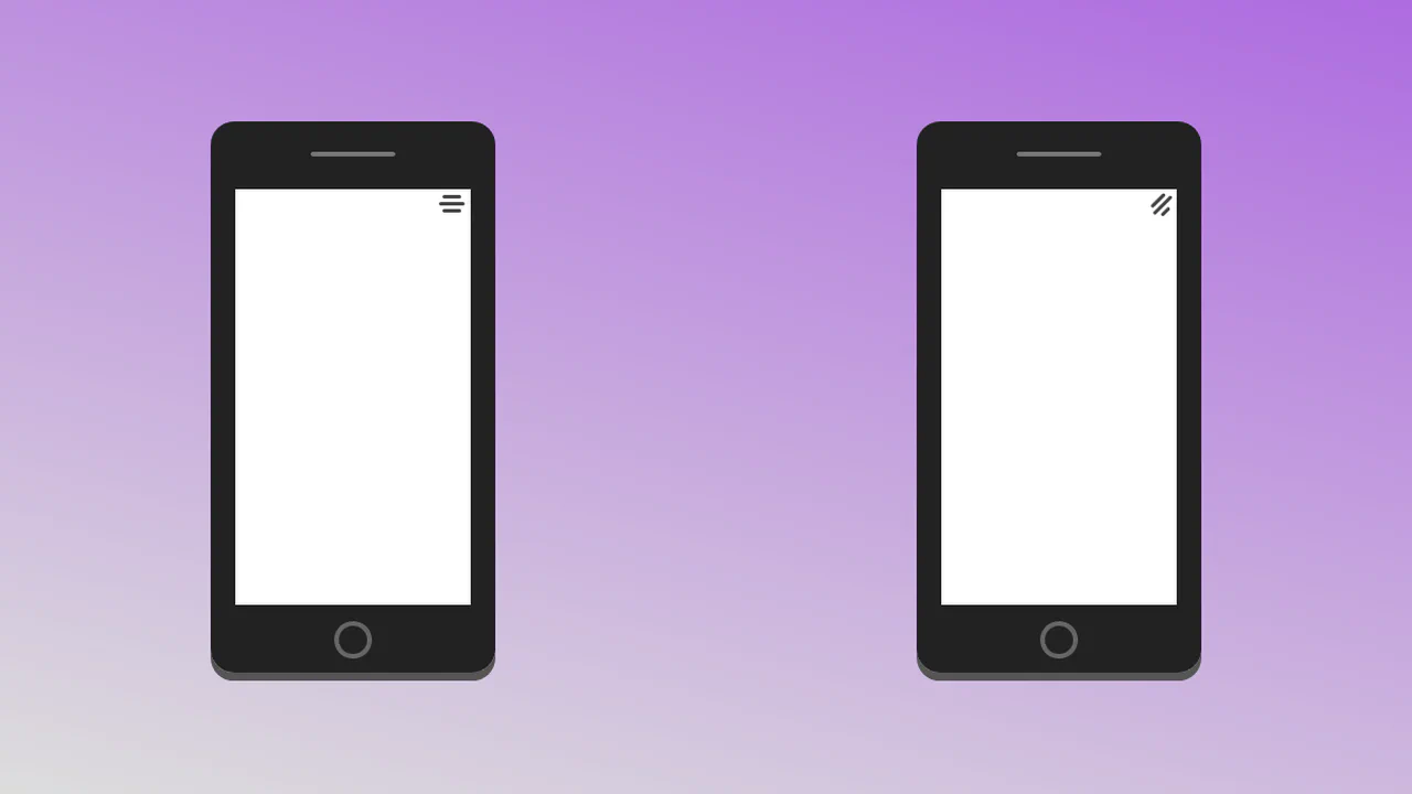
Menu activates via classList.toggle: state managed explicitly, no hidden flags. Items appear in reverse-staggered sequence — each animates in logical order. Icon and background transformations sync via cubic-bezier, avoiding unnecessary repaints.

A minimalist, JS-controlled expanding menu widget. It uses CSS transforms to animate the toggle icon into a cross and simultaneously slides the menu items sideways, achieving a bouncing content reveal effect.

A scrollable content area embedded within a fixed phone frame mockup, synchronized with background image changes via JavaScript. The UI features distinct visual states, resembling item selection or theme changes on a mobile screen.

An interactive Hotspot widget featuring stylized icons and visual depth created via CSS shadows and gradients. The positioning logic for the interactive points is handled by JavaScript, dynamically revealing the icons upon user interaction with the main trigger button.

A CSS mockup of a mobile screen featuring a JS-controlled hamburger button that toggles transformations on the main body content. Activation transforms the hamburger icon into a cross while the page body rotates and scales, demonstrating style theme switching.

A mobile interface mockup featuring a navigation menu toggled by the CSS “checkbox hack.” The SCSS styles control the hamburger-to-cross icon animation and provide staggered reveals for the menu links, resulting in a smooth, interactive UI pattern.

A mobile interface mockup featuring a navigation menu controlled via CSS focus states on the hamburger icon. The SCSS styles use max-height transitions for the menu reveal and a gradient background on the toggle for visual emphasis.

An adaptive mobile navigation menu controlled by the CSS :target selector for toggling its state. The design features CSS transforms for the hamburger-to-cross animation and a stylized pseudo-element for a background “splash” effect, offering interaction purely through stylesheet logic.

A scroll-controlled menu display featuring temporary 3D transformation effects on its items when scrolling stops. JavaScript manages the state change, and SCSS applies complex 3D transforms to create a subtle parallax or ‘depth’ effect on the list items.

A CSS-controlled navigation component activated via the “checkbox hack.” The design features an animated hamburger icon transforming into a cross, while menu items slide out sequentially using CSS transforms and staggered delays for a smooth reveal effect.
A mobile navigation menu mockup toggled via JavaScript, featuring advanced CSS animations for the transition states. The design uses SCSS for complex transforms (rotate, translate3d) and staggered delays to animate menu items sliding out from the hamburger icon.

A mobile interface mockup featuring a slide-out navigation menu controlled via the CSS “checkbox hack.” The design uses complex transitions and transform-origin to animate the hamburger icon into a cross while menu items slide in sequentially, providing smooth navigational feedback.


Tilt to Make Room for Menu
A creative mobile UI concept featuring a 3D perspective menu built with pure CSS and SVG animations. By leveraging perspective and rotateX properties alongside smooth cubic-bezier transitions, this snippet delivers a high-performance interactive experience, making it an ideal component for advanced frontend design and mobile-first web apps.
See the Pen Tilt to Make Room for Menu.