10+ CSS Morphing Effects: Free Code Snippets & Examples
CSS morphing effects establish seamless, organic transformations between distinct geometric shapes, transitioning vectors and paths programmatically to deliver fluid interface transitions. By changing the contours of containers, icons, and backgrounds, this design system introduces a highly engaging dynamic layer to standard layouts.
- Modern layout engines natively morph inline vector shapes by animating the d property of SVG paths directly in stylesheets, eliminating the need for bulky JavaScript motion libraries.
- High-performance clipping mask morphs leverage the clip-path property, using CSS coordinates to calculate fluid layout transformations natively on the GPU compositor.
- To guarantee responsive INP (Interaction to Next Paint) metrics, performant morph layouts isolate repaint cycles by declaring structural container bounds via modern CSS containment.
Investigate these procedural contour-shifting designs to master the integration of fluid, morphing vector kinematics into your digital design systems.
Table of Contents:
Examples
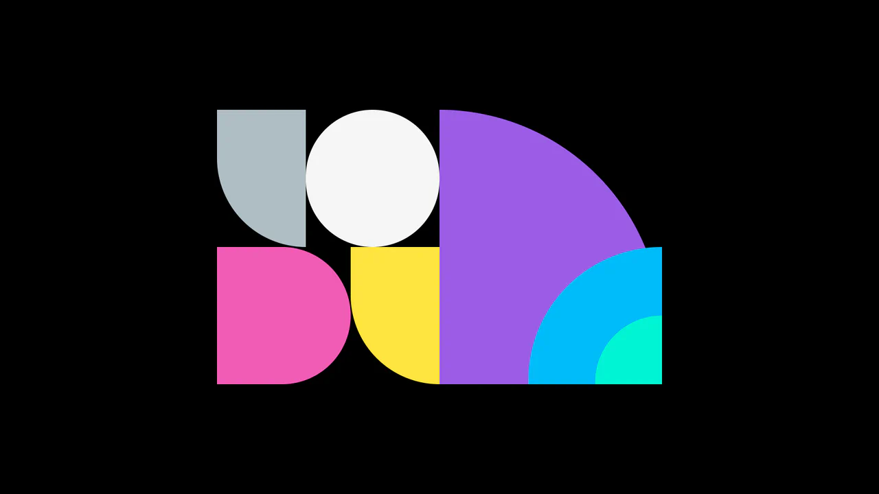
Dynamic CSS Shape Morphing Grid
A mesmerizing geometric animation driven entirely by CSS transitions and HTML data-* attributes. A lightweight JavaScript interval randomly cycles through predefined configuration states, updating the parent wrapper’s data attributes. The CSS responds by smoothly interpolating the left, top, width, height, and border-radius properties of seven colored child elements, creating fluid, abstract shape-shifting compositions.
 Chrome 36+
 Edge 12+
 Firefox 16+
 Safari 9+
See the Pen Dynamic CSS Shape Morphing Grid.

Animated Striking Checkbox
This is an Animated Striking Checkbox. It transforms a standard checkbox into a highly expressive UI element that physically becomes the strikethrough line for its associated label. Its function is to provide satisfying, immediate feedback for to-do list items, visually linking the action of checking a box to the result of striking out the text.
Chrome 60+
Edge 79+
Firefox 55+
Safari 11+
See the Pen Animated Striking Checkbox.

Pure CSS Morphing Dark Mode Toggle
This Pure CSS Morphing Dark Mode Toggle is a sophisticated implementation of a theme switcher that eliminates the need for JavaScript. By utilizing the modern CSS :has() relational selector and complex transform logic, the component morphs a sun icon into a moon icon seamlessly. It offers a premium feel through the use of custom cubic-bezier timing and modular CSS construction.
Chrome 105+
Edge 105+
Safari 15.4+
Firefox 121+See the Pen Pure CSS Morphing Dark Mode Toggle.

Micro-Interaction Loading Button
This Micro-Interaction Loading Button demonstrates how to pack multiple feedback states into a single UI element without cluttering the interface. It starts as a clean “Submit” button. Hovering reveals a directional arrow, hinting at action. Clicking triggers a seamless loading sequence where the arrow transforms into a spinner, finally resolving into a checkmark to confirm success.
Chrome 49+
Edge 15+
Firefox 43+
Safari 10+
See the Pen Micro-Interaction Loading Button.

Up Arrow
A rectangular button smoothly shrinks into a circle, the text fades out, and an upward-pointing arrow begins to cyclically rise within it.
See the Pen Up Arrow.

Gooey Clock
A functional clock face featuring a morphing, lava-lamp-like background created by filtering overlapping SVG shapes.
See the Pen Gooey Clock.

Transaction List with View Transitions
A seamless master-detail interface leveraging the native View Transitions API to animate structural DOM changes without external libraries.
See the Pen Transaction List with View Transitions.
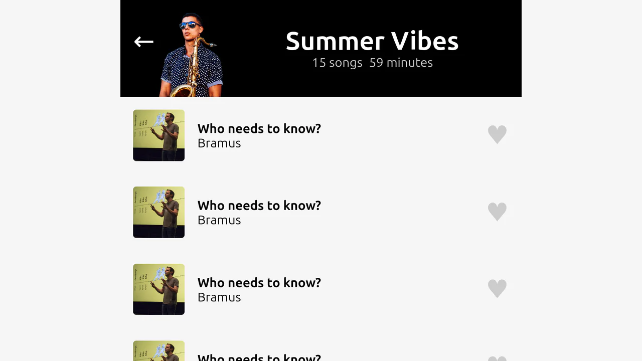
View Transitions: Playlist Header
A music player UI demo showcasing the power of the View Transitions API. By assigning unique view-transition-name properties to key elements (cover, title, tracks), the browser orchestrates a complex morphing animation between “expanded” and “mini-player” states, fine-tuned with custom CSS durations and delays.
See the Pen View Transitions: Playlist Header.
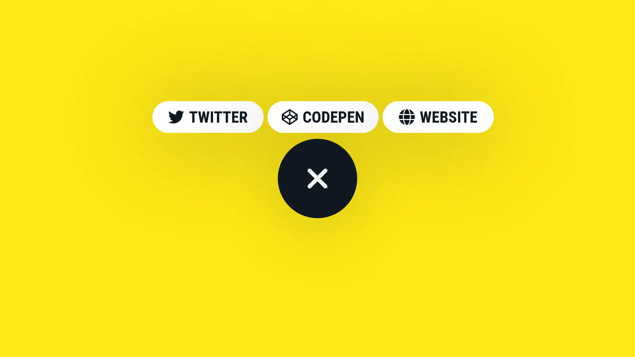
Expanding Social Share Button
A smooth, morphing circular button that expands on click to reveal three link items, utilizing complex CSS transitions, transition-delay, and a Pug template structure for dynamic content generation.
See the Pen Expanding Social Share Button.
Interactive Menu Icon Animation
This example shows how a Toggle Class and CSS Custom Properties orchestrate complex transitions (with varied easing and delay for each line) to create a professional interactive icon.
See the Pen Interactive Menu Icon Animation.

Leverage the modern View Transitions API to seamlessly morph any element (e.g., button to dialog) using the view-transition-name property and custom CSS keyframes like flip-in.
Centaur Slider
Slider with visual centaur transformation. As slider moves, human-to-horse ratio changes: individual body parts appear/disappear via opacity and scale toggles. Positioning via :has(input[value]). SVG sprite with named parts.
See the Pen Centaur Slider.
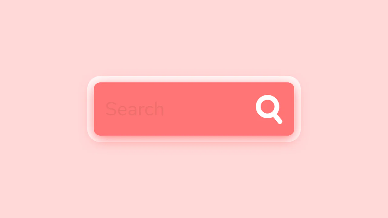
Search Form With Animated Search Button
This is a fully interactive search bar. On :hover, a coordinated set of CSS transitions transforms the icon’s geometry - from a circle to a rounded rectangle - while its pseudo-elements reconfigure from a handle into a cross, creating a fluid and polished UI element.
See the Pen Search Form With Animated Search Button.

Button Interaction
A UI element “morphing” technique using CSS transition. The smooth change of width, height, and border-radius creates a transformation effect, while transform: rotate() adds dynamism. JavaScript is used only as a trigger.
See the Pen Button Interaction.