10+ CSS Movie Cards: Free Code Snippets & Examples
Movie cards are the discovery engine of streaming platforms — they must convey genre, rating, and visual tone through a single poster thumbnail. CSS movie cards deliver this with zero JavaScript overhead, keeping the browsing experience fast and the metadata accessible.
- Each card uses semantic HTML with
<figure>and<figcaption>for the poster and metadata, ensuring screen readers can associate the movie title with its visual representation without custom ARIA roles. - The hover overlay uses
opacitytransitions on aposition: absolutelayer, revealing rating badges and synopsis text without triggering layout recalculations or disturbing the poster grid. - Responsive grids rely on CSS Grid’s
auto-fillwithminmax(180px, 1fr)to automatically adjust column counts, while Container Queries resize overlay text and badge sizes based on the available grid cell width.
Browse the collection to find a movie card format that fits your platform — from minimalist poster-only cards to rich cards with gradient overlays and genre tags.
Table of Contents:
Examples

Animated Movie Schedule Blocks
This is an Animated Movie Schedule Block component. It structures chronological event data (like cinema showtimes) into a visual grid. Its function is to condense information using a pure CSS hover interaction, where an image poster slides away to reveal structured metadata (genre, time, title) through intersecting animated panels.
 Chrome 36+
 Edge 12+
 Firefox 16+
 Safari 9+
See the Pen Animated Movie Schedule Blocks.
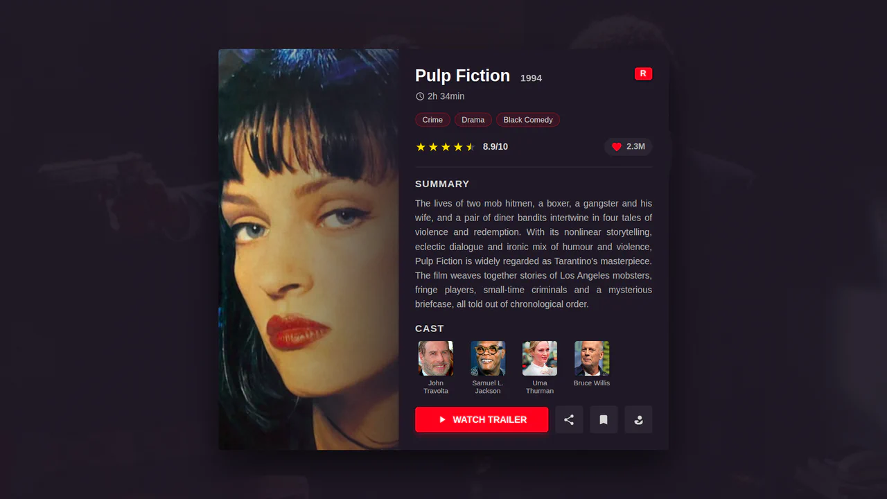
Movie Card: Pulp Fiction
A well-structured and responsive movie card where the layout is built using a combination of Flexbox and CSS Grid. All visuals - colors, shadows, spacing - are controlled via CSS Custom Properties, and the composition smoothly changes from a vertical to a horizontal layout via a media query.
See the Pen Movie Card: Pulp Fiction.

Movie Card
A visually rich card where a skewed background is created using transform: skewY on a pseudo-element. It showcases pure CSS solutions for interactive elements: a ‘star’ rating system based on hidden radio inputs, and custom tooltips that pull content from data-* attributes. The two-column layout is built using classic float.
See the Pen Movie Card.

Movie Card Interactive UI
A horizontal card built with preprocessors (Sass/Pug) and a classic float layout. It demonstrates complex interactive elements in pure CSS - a “star” rating on radio inputs and a button with a smooth transition animation of its color and background icon on :hover.
See the Pen Movie Card Interactive UI.
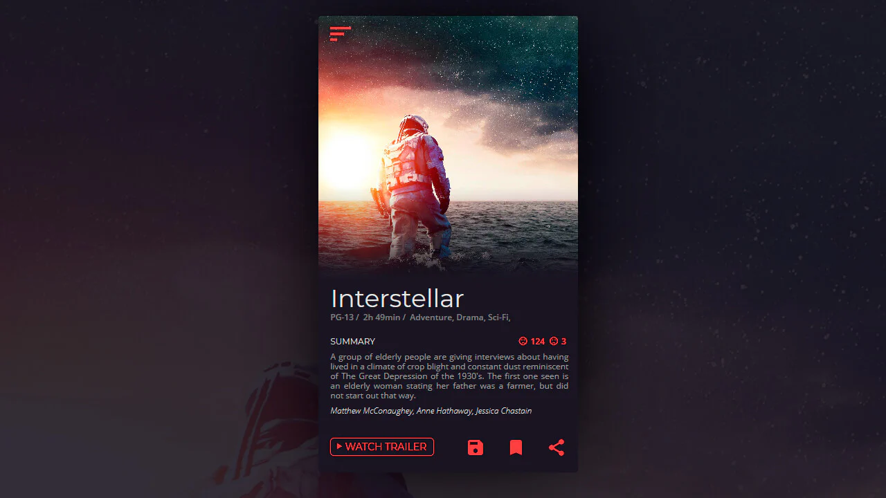
Daily UI Movie Card
The layout consists of a header image with a gradient overlay, title and metadata, a summary section, and action buttons. Typography and spacing follow a clear hierarchical order.
See the Pen Daily UI Movie Card.
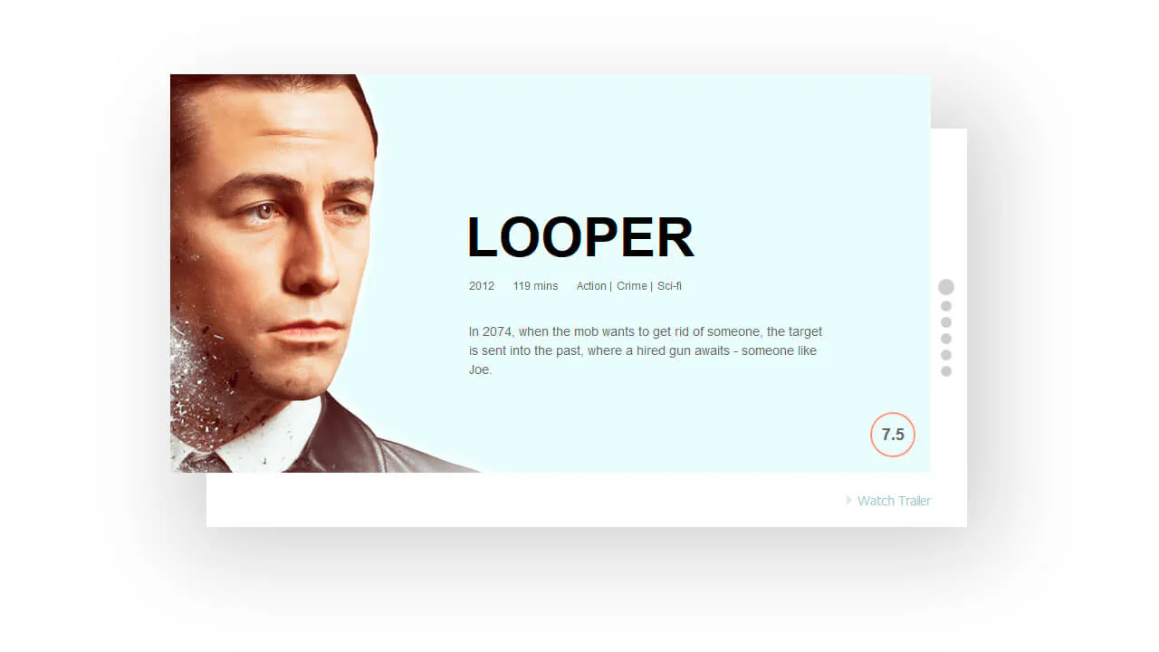
Movie Card
A carousel of movie cards with embedded YouTube trailers. Navigation dots switch the active card, and a button plays or hides the trailer. The card content slides and fades, while the video expands over the layout.
See the Pen Movie Card.
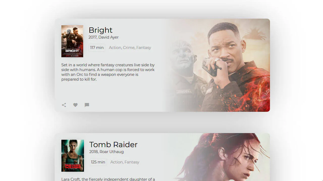
Movie Card
A movie card with a hover scale effect. The layout places the poster, title, metadata, description, and social icons in a structured hierarchy. A blurred background extends the visual depth. Responsive adjustments reorganize the content for smaller screens.
See the Pen Movie Card.
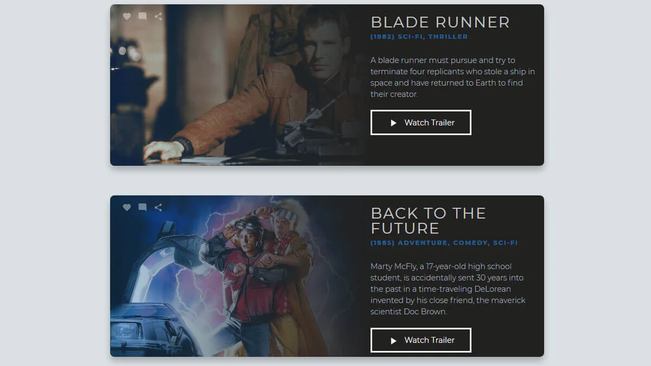
Movie Cards
A movie card with a layered composition. The background image fills the card, overlaid by a gradient that ensures text readability. Content (title, metadata, description, and a call‑to‑action button) occupies the right side on larger screens and stacks vertically on mobile. Social icons are subtly integrated.
See the Pen Movie Cards.
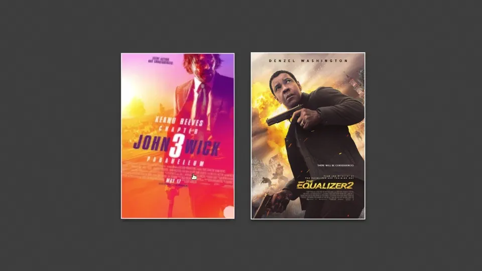
CSS clip-path Card Hover Effects
Interaction is built on a simple principle: hover triggers transformation. Image darkening and scaling create depth, while text emerges from the corner using clip-path. Transitions use cubic-bezier for natural motion.
See the Pen CSS clip-path Card Hover Effects.
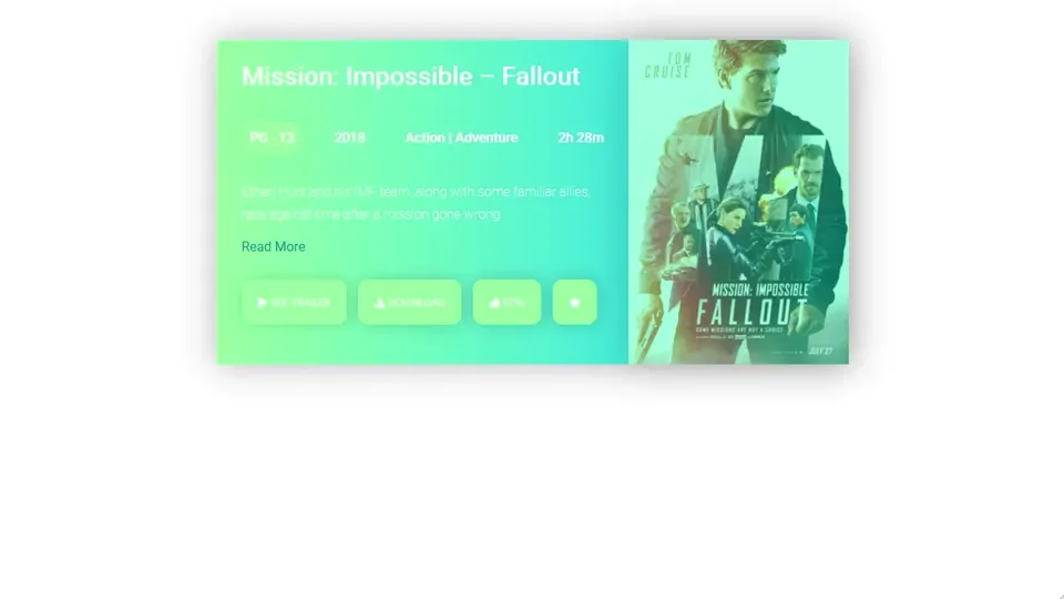
Movie Card UI
The structure relies on a horizontal split. Information on the left, visual focus on the right. Categories, year, and genre are placed in a dedicated block with clean typography. Buttons respond to hover with scaling.
See the Pen Movie Card UI.
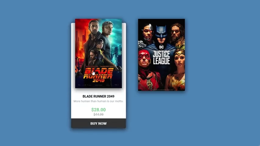
Movie Ticket Animation
The poster acts as a fixed anchor. On hover, a ticket with information and price emerges from behind it. The bounceIn animation adds a springy feel.
See the Pen Movie Ticket Animation.

Movie Card Design Flex
The layout uses flexible horizontal distribution: image, content, and a vertical price strip. The price block uses vertical writing mode to save space and create visual emphasis. Color-coded tags are separate elements for clear categorization.
See the Pen Movie Card Design Flex.
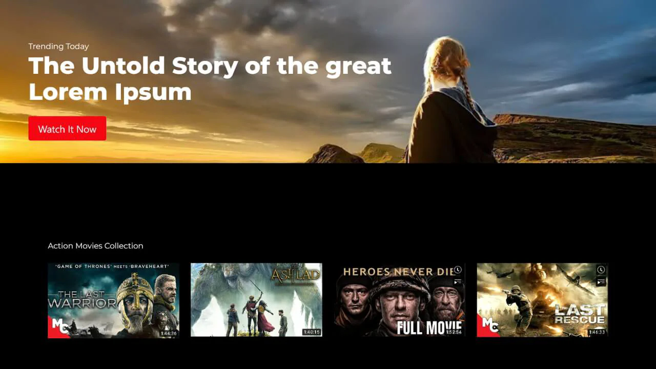
Netflix Inspired Movie Gallery
A large background image sets the tone. The title overlays directly onto it, with a button highlighted in brand red. The movie cards below use reflection and smooth scaling on hover to create a sense of depth.
See the Pen Netflix Inspired Movie Gallery.