10+ CSS Neon Effects: Free Examples & Code Snippets
CSS neon effects replicate the vibrant, high-chroma glow of physical gas-discharge tubes, casting atmospheric, fluorescent lighting over modern digital layouts. By layering soft, multi-radius shadows behind typography and borders, this styling pattern injects rich, retro-futuristic spatial depth into flat interfaces.
- Authentic volumetric light decay is constructed by stacking multiple layers of text-shadow and box-shadow, blending tight core intensities with expansive outer halos.
- Modern neon palettes utilize the native oklch() color space to render highly saturated, luminous hues that maintain perceptually uniform brightness across all screens.
- To preserve critical INP (Interaction to Next Paint) responsiveness, continuous pulsing animations avoid changing blur properties, shifting instead to opacity transitions on the compositor thread.
Master these luminous styling patterns to integrate captivating, high-energy neon typography and glowing card states into your dark-mode UI systems.
Table of Contents:
Examples

Generative Glitch Cube Art
This is Generative Glitch Cube Art. It is a piece of procedural digital art created entirely with CSS. Its function is to demonstrate how complex, three-dimensional geometry and dynamic lighting effects can be simulated without JavaScript or SVG, relying solely on multi-layered conic-gradient backgrounds and CSS custom property animation.
 Chrome 85+
 Edge 85+
 Safari 16.4+
 Firefox 128+
See the Pen Generative Glitch Cube Art.

Pure CSS Synthwave 80s Animation
This Pure CSS Synthwave 80s Animation captures the nostalgic aesthetic of the 1980s retrowave genre. It features a complete animated scene: an infinite neon grid, a setting sun with scanlines, shaking palm trees, and a DeLorean driving into the distance. The scene is brought to life with a driving synthwave audio track and intricate CSS-only motion.
Chrome 60+
Edge 79+
Firefox 55+
Safari 11+See the Pen Pure CSS Synthwave 80s Animation.

Cosmic Neon Text Effect
A spectacular, interactive heading design: on hover, the text stroke disappears, giving way to a powerful, multi-colored neon glow. It’s a perfect demonstration of pure CSS capabilities for creating complex typography and “wow” effects.
See the Pen Cosmic Neon Text Effect.
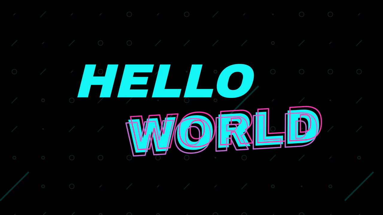
Sticky Neon Layered Text Effect
React drives an interactive, cursor-aware text transformation, while the layered Neon effect is achieved purely with CSS using pseudo-elements and the text-stroke property.
See the Pen Sticky Neon Layered Text Effect.

Neon Clock
A technical showcase demonstrating how to control the neon glow intensity and color scheme using CSS variables and the hsl() function, while delivering a realistic neon tube effect on each digital segment via subtle text-shadow and box-shadow styling.
See the Pen Neon Clock.

Retro Neon Flicker Clock
Experience a retro digital clock that updates via setInterval and new Date(), with CSS-powered flickering using classList.toggle('flicker') for blur and opacity effects, plus randomized intervals for authentic neon vibes - all in pure JS and CSS.
See the Pen Retro Neon Flicker Clock.

Hot Ones Neon Sign Animation
A neon sign effect built with SVG and CSS filters. The addition of a flickering animation using @keyframes and a jQuery class toggle makes the component both realistic and interactive.
See the Pen Hot Ones Neon Sign Animation.
Animated Squiggly Border Glow Cards
A card with a neon border effect where two CSS animations are synchronized - stroke-dashoffset for the SVG frame and hue-rotate for the drop-shadow glow. Each card gets a unique theme via :nth-child and the --cardAccent CSS variable, while multi-layering with z-index positions the glow underneath the main content.
See the Pen Animated Squiggly Border Glow Cards.
Button
The main button has a semi-transparent background, the ::before pseudo-element contains the animated gradient, and ::after has a solid dark background that “cuts out” the inner part, leaving only the border visible.
See the Pen Button.
Climbing Cube
An illusion of an endlessly rolling 3D cube, achieved by synchronizing two @keyframes animations for rotation and sliding with an offset transform-origin. The complex rotation animation uses intermediate steps for a “bounce” effect, while a neon glow and -webkit-box-reflect complete the futuristic look.
See the Pen Climbing Cube.