90+ CSS Neumorphism Examples
Physicality dictates digital intuition. CSS Neumorphism examples remove harsh edges, creating interfaces that appear extruded from the background itself. This updated collection delivers soft, tactile blocks for modern UI design. Utilizing these curated snippets replaces flat graphics with raw, logic-driven depth.
Technically, these examples rely on dual box-shadow properties — combining light and dark offsets — to simulate directional lighting. The code utilizes exact color matching between the element and its parent container. Interactive states leverage hardware acceleration, animating the shadow spread and transform: scale to provide “pressed” feedback at a locked 60fps. The HTML structure remains strictly semantic, ensuring high layout stability without DOM bloat.
Every free demo is fully responsive and cross-browser compatible. Users can instantly download the raw code or fork an element on CodePen. These assets are optimized to address contrast concerns inherent to soft UI, delivering an accessible, performant experience across all modern devices.
Examples
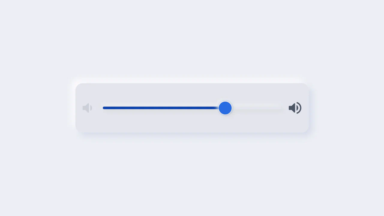
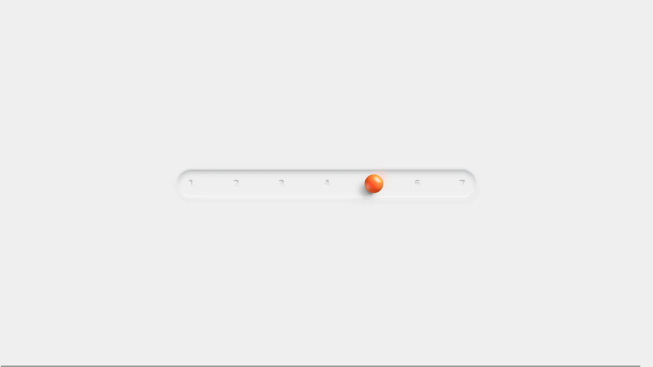
Neumorphic Volume Slider with Ripple Glow
An elegant neumorphic volume slider featuring an active thumb focus glow and directional icon highlights. Built with a single native range input and styled with modern CSS Custom Properties, it implements the Houdini @property API to transition colors smoothly across sliding states. Dragging shifts opacity focus to the corresponding volume icon based on directional vector calculations in pure CSS.
 Chrome 85+
 Edge 85+
 Firefox 128+
 Safari 16.4+
See the Pen Neumorphic Volume Slider with Ripple Glow.
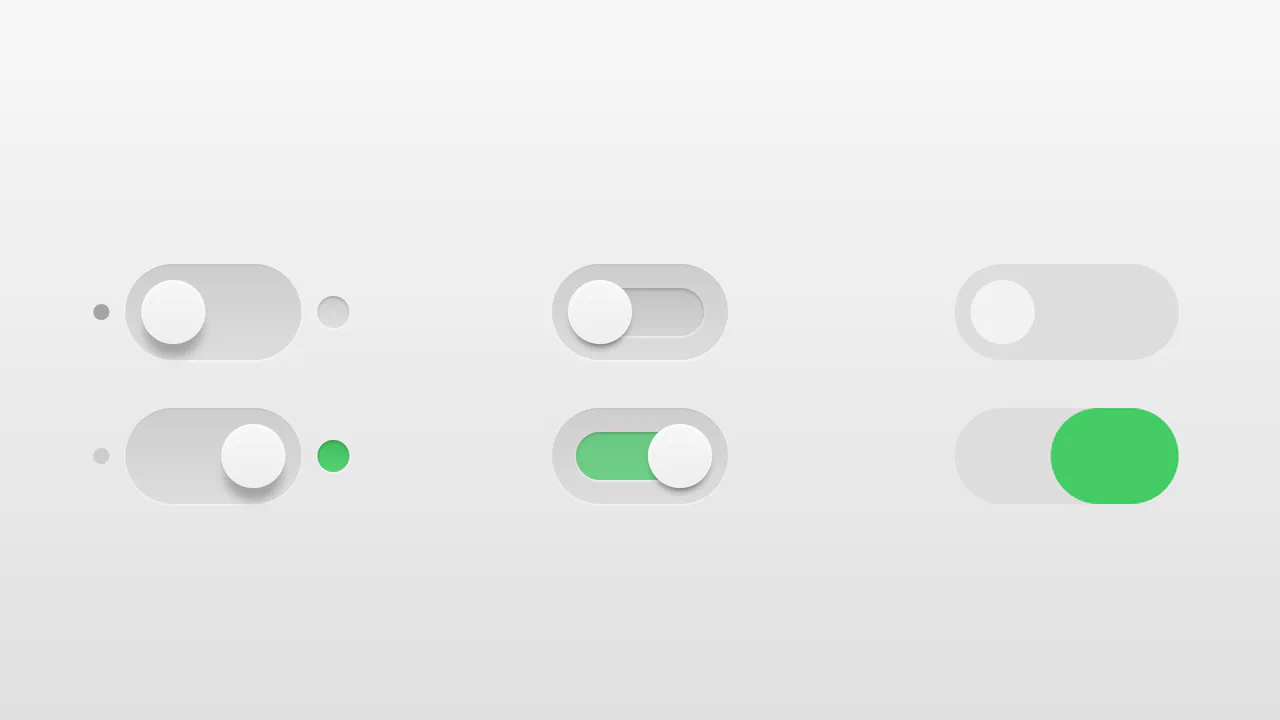
Realistic 3D CSS Toggle Switches
“Realistic 3D CSS Toggle Switches” showcase three distinct switch variations using the classic checkbox hack. Built entirely without JavaScript, they rely on CSS box-shadow and linear-gradient to create tactile, 3D inset depths. State changes are smoothly animated via transition on pseudo-elements. A lightweight, robust solution for adding polished micro-interactions to forms.
Chrome 26+
Edge 12+
Firefox 16+
Safari 6.1+
See the Pen Realistic 3D CSS Toggle Switches.
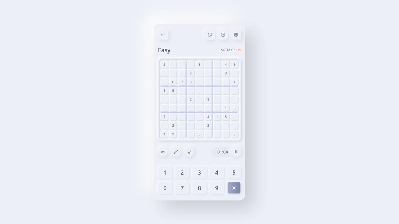
Neumorphic React Sudoku Interface
This is a Neumorphic React Sudoku Interface. It renders a fully interactive 9x9 puzzle grid using soft, extruded UI elements (neumorphism) combined with smart cross-axis highlighting. Its function is to provide a highly tactile, visually clean environment for complex data entry, reducing cognitive load during gameplay by automatically tracking the user’s focal point. (Requires: react.js, react-dom.js)
Chrome 60+
Edge 79+
Firefox 55+
Safari 11+
See the Pen Neumorphic React Sudoku Interface.
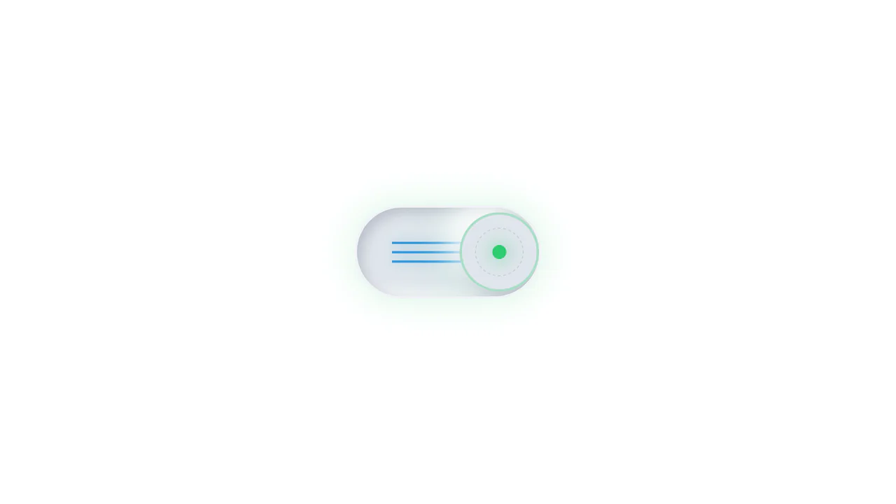
Neumorphic Mechanical Toggle Switch
This is a Neumorphic Mechanical Toggle Switch. It replaces the default browser checkbox with a tactile, extruded hardware-style button. Its function is to govern binary states (on/off) while providing strong physical visual feedback through inverted shadows, glowing indicators, and spring-loaded motion.
Chrome 80+
Edge 80+
Firefox 70+
Safari 14+
See the Pen Neumorphic Mechanical Toggle Switch.
Neumorphic 3D Range Slider
This is a Neumorphic 3D Range Slider. It replaces the default browser input track with a recessed tactile trench and a volumetric, glassmorphic sphere. Its function is to provide highly physical, stepped input selection, making data entry feel like interacting with premium hardware.
Chrome 88+
Edge 88+
Firefox 80+
Safari 14+
See the Pen Neumorphic 3D Range Slider.

Skeuomorphic Lunar Desk Calendar
The Skeuomorphic Lunar Desk Calendar is a digital recreation of the traditional “Hardware Store Calendar”. It bridges the gap between physical paper textures and dynamic digital logic, providing users with both Gregorian and Lunar dates. Its function is to serve as a high-fidelity desktop widget that celebrates heritage design through modern CSS geometry.
Chrome 80+
Edge 80+
Firefox 75+
Safari 13.5+
See the Pen Skeuomorphic Lunar Desk Calendar.

Iridescent 3D Neumorphic Button
This is an Iridescent 3D Neumorphic Button. It pushes CSS styling to the limit, using stacked gradients, oklch color spaces, and advanced blend modes to create a button that feels like a piece of polished, translucent hardware. Its function is to serve as a high-fidelity “Hero” element, delivering a tactile, light-responsive experience that feels alive under the cursor.
Chrome 105+
Edge 105+
Firefox 121+
Safari 15.4+
See the Pen Iridescent 3D Neumorphic Button.

Neumorphic Drag Dial Thermostat
This is a Neumorphic Drag Dial Thermostat. It provides a tactile, skeuomorphic interface for setting numerical values (like temperature) through rotational dragging or keyboard input. The dial dynamically reveals cool-to-warm gradient colors based on the current value, enhancing the physical “feel” of a smart home control panel. (Requires: GSAP, Draggable)
Chrome 60+
Safari 11+
Firefox 55+
Edge 79+
See the Pen Neumorphic Drag Dial Thermostat.

Kinetic 144-Clock Digital Display
This Kinetic 144-Clock Digital Display is a stunning example of procedural animation. Inspired by physical kinetic art installations (like those by Humans Since 1982), it uses a grid of 144 individual analog clocks to form digital numbers. React manages the “target state” of every single clock hand, while CSS transitions handle the smooth, synchronized movement, creating a mesmerizing flow of time. (Requires: React, react-dom)
Chrome 60+
Edge 79+
Firefox 60+
Safari 12+
See the Pen Kinetic 144-Clock Digital Display.
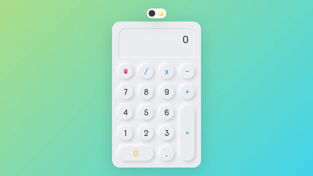
Neumorphic Dark Mode Calculator
This Neumorphic Dark Mode Calculator brings the “Soft UI” trend to life with a fully functional mathematical tool. It features a realistic, extruded plastic look achieved through complex CSS box-shadows. A prominent toggle allows users to switch between a clean light theme and a high-contrast dark mode, instantly updating the shadow physics to maintain the illusion of depth.
Chrome 60+
Edge 79+
Firefox 55+
Safari 11+
See the Pen Neumorphic Dark Mode Calculator.

Neumorphic Loader
A tactile Neumorphic progress indicator where JavaScript drives the animation state by updating a custom property --progress. The visual logic relies on CSS conic-gradient utilizing calculated color stops to dynamically render the filling arc, while complex layered box-shadow creates a soft, extruded 3D aesthetic.
See the Pen Neumorphic Loader.

Neumorphism Search Bar
A highly kinetic and skeuomorphic Search Input component designed with a Neumorphism aesthetic. The interactive state management (focus, submit) relies on imperative Vanilla JavaScript class toggling. The component features complex icon transformation and animated loading states: the search icon’s pseudo-elements execute ‘jumping’ transitions via a custom cubic-bezier function when active, and enter a loading spin via @keyframes spinner during submission.
See the Pen Neumorphism Search Bar.

Neu Times!
A neumorphic digital clock featuring a vertical sliding mechanism reminiscent of slot machines.
See the Pen Neu Times!.

Expanding Cards
A vertical neumorphic accordion that uses CSS Flexbox transitions to dynamically expand content panels. JavaScript toggles the .active class, triggering a smooth flex-grow animation that enlarges the selected panel while revealing its detailed content via opacity transitions, creating a tactile and responsive settings interface.
See the Pen Expanding Cards.

Pure CSS Dark Mode Toggle Switch
This is a toggle switch that allows selecting between skeuomorphic and neumorphic design styles. It also features a dark/light theme change triggered by toggling the switch itself.
See the Pen Pure CSS Dark Mode Toggle Switch.

Animated Bottom Tab Bar with CSS Transitions
A showcase of five distinct tab bar animations orchestrated primarily through CSS transitions and sibling combinators, minimizing JavaScript dependency. The implementation leverages CSS Custom Properties for dynamic theming and intricate nth-child logic to drive fluid indicator movements, ranging from simple sliding lines to complex, claymorphic ‘pop-out’ interactions.
See the Pen Animated Bottom Tab Bar with CSS Transitions.

Neumorphic Color Palette with Sound
This interactive color palette collection utilizes JavaScript’s getComputedStyle and execCommand('copy') to extract RGB values from CSS-defined elements, convert them to HEX, and copy to clipboard. The neumorphic design is achieved through complex box-shadow properties that create extruded shapes, while click handlers trigger a full-screen toast notification (show class) that displays the copied value with dramatic typography and audio feedback.
See the Pen Neumorphic Color Palette with Sound.

Neumorphism Waves Animation
Pure CSS ripple animation with neumorphic styling. Checkbox-triggered wave sequence using scale transforms and opacity transitions.
See the Pen Neumorphism Waves Animation.

3D Capsule Slider Button
A combination of the ‘checkbox hack’ and 3D transforms to create an interactive neumorphism-style switcher. JavaScript only adds classes, while the entire transform: rotateX() animation and complex box-shadow are controlled by CSS.
See the Pen 3D Capsule Slider Button.

Neumorphic Multi-Buttons with CSS Feedback
An effective button group where the hover effect is created via inset box-shadow - and the click confirmation animation is implemented using transform and opacity on the ::after pseudo-element.
See the Pen Neumorphic Multi-Buttons with CSS Feedback.

Neumorphic Multi-Buttons with GSAP Tooltip
Interactive buttons with dual animation - GSAP handles the tooltip appearance, while a CSS class change on click triggers the SVG checkmark animation via stroke-dashoffset.
See the Pen Neumorphic Multi-Buttons with GSAP Tooltip.

Neumorphic Soft UI Radio Buttons and Checkboxes
This demo explores the Neumorphic or Soft UI design trend, implementing a complete set of custom radio buttons, checkboxes, and toggle switches using only pure CSS box-shadow properties to achieve the signature concave/convex 3D-like effect, while a concise Vanilla JS script manages the dynamic background gradient on state change.
See the Pen Neumorphic Soft UI Radio Buttons and Checkboxes.

Neomorphic Calendar Card Component
A neomorphic calendar card component with SCSS-driven depth and complex CSS transformations, featuring a concise vanilla JavaScript implementation to display the live UTC date and month.
See the Pen Neomorphic Calendar Card Component.

Fingerprint Scan Animation
Explore an interactive SVG fingerprint animation brought to life by the GSAP DrawSVGPlugin and a clever use of a GIF-textured stroke. Hovering over the button triggers the layered, staggered path animation for a satisfying “scan” reveal.
See the Pen Fingerprint Scan Animation.

Neuomorphic Fingerprint Scanner
A complex 3D effect with a deep glow, achieved by combining multiple box-shadow and radial-gradient styles. Key feature: layered fingerprint scanning using two SVG elements and the clever application of mix-blend-mode.
See the Pen Neuomorphic Fingerprint Scanner.
Dark Ripple Pre-Loader (No-JS)
Dive into a dynamic ripple loader crafted using modern CSS capabilities, such as backdrop-filter for a stylish blur effect. The demo showcases how to leverage CSS Custom Properties for easy customization of the background and gradients without altering the core animation logic.
See the Pen Dark Ripple Pre-Loader (No-JS).
Neon loader with gradient ring and multiple shadows. Inner circle rotates and blends via mix-blend-mode: color-burn. Layered shadows create 3D glass effect.

Neuromorphic Keyboard
A sleek neuromorphic keyboard UI crafted entirely with CSS Grid and Pug. The design leverages layered box-shadow properties to create the signature soft, extruded button effect, while :hover and :active pseudo-classes simulate tactile key presses.