20+ CSS Notifications
System feedback requires visibility without interruption. CSS Notifications inform users of state changes — success, error, or warning — without blocking the workflow. This updated collection delivers non-intrusive alert components for modern UI design. Utilizing these curated snippets replaces heavy JavaScript libraries with lightweight, native styling logic.
These examples rely on position: fixed and precise z-index layering for screen placement. Animation states leverage hardware acceleration, managing properties like transform: translateY and opacity for smooth 60fps entry and exit transitions.
Every free demo is fully responsive and cross-browser compatible. Users can instantly download the raw code or fork a toast alert on CodePen. These assets are strictly optimized for performance, delivering an accessible, unobtrusive experience across all modern devices.
Examples

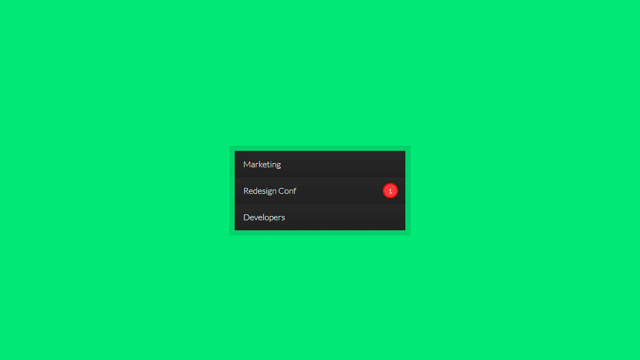
CSS :has() Notification Toggle
This is a CSS :has() Notification Toggle. It provides a fully functional, state-aware UI switch for settings panels without a single line of JavaScript. Its function is to allow the user to toggle a binary state (notifications on/off) and have the entire UI — including icons, labels, and descriptive text — update instantly based purely on the state of a hidden checkbox.
 Chrome 105+
 Edge 105+
 Firefox 121+
 Safari 15.4+
See the Pen CSS :has() Notification Toggle.

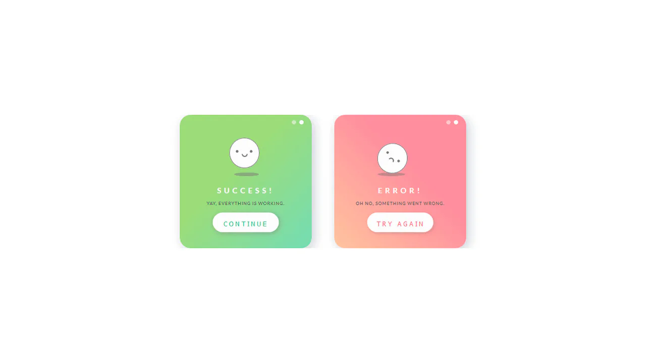
Animated Feedback Alert Cards
These Animated Feedback Alert Cards provide a high-polish way to communicate application states like success, ongoing processes, and errors. Each card utilizes a cohesive design system of rounded geometry and custom SVG icons that “draw” themselves into existence, offering immediate and delightful tactile feedback to the user.
Chrome 36+
Edge 12+
Firefox 16+
Safari 9+
See the Pen Animated Feedback Alert Cards.
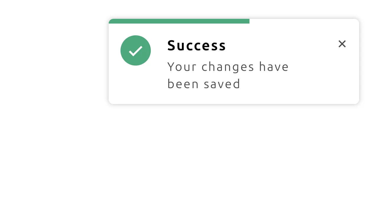
CSS Notification with Progress Animation
This demo shows how to build a dynamic notification using CSS-driven animations. It features a progress bar that shrinks over time and a hover state that pauses the countdown, all without any JavaScript.
See the Pen CSS Notification with Progress Animation.
Hop Over Notification Badge
A “jumping” notification badge animation where content is dynamically sourced from a data-bubble attribute via attr(). The effect is implemented on an ::after pseudo-element using @keyframes that synchronously animate transform and z-index to create an illusion of depth.
See the Pen Hop Over Notification Badge.

CSS Circle Notifications
A library of pure CSS animations for notification badges, where different effects like swing, tada, or bounce are triggered on parent element hover. The technique uses classes to switch the animation-name property via the :hover pseudo-selector, demonstrating a modular approach to creating microinteractions.
See the Pen CSS Circle Notifications.

Animated notification with bell and counter. Bell wobbles (bell), clapper moves (rad), number pulses in (zoom). Moon in background moves diagonally infinitely (moon-moving). All elements built from simple blocks without images.
Pulsing notification badge via box-shadow animation. On hover, background gradient switches to tomato. Bourbon mixins for gradients and vendor prefixes. Red circle with number pulses by changing shadow radius.
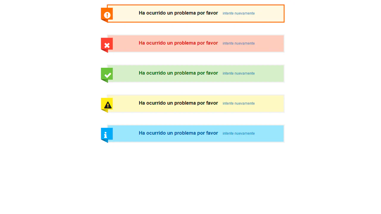
Set of animated status icons (success, error, warning, info) styled like SweetAlert. Each icon assembled from multiple elements with animations: checkmark draws (animateSuccessTip/Long), cross assembles (animateXLeft/Right), exclamation mark pulses (pulseWarning). All animations timed synchronously.
Messenger notification simulation. Blue circle with triangular tail, inside animated typing dots (mesgload with delays). Red banner with scrolling text creates incoming message effect.
Animated bell icon with SVG graphics. On hover/focus, body and clapper move along complex trajectory synchronized via $frameLength variable. Notification number appears with bounce animation.
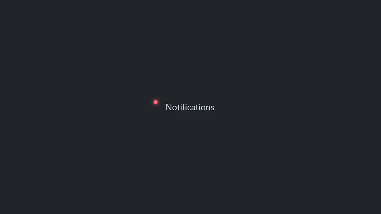
Open Props usage demo for customization. Red dot before paragraph via ::before styled with CSS variables. inset-inline-start adapts to text direction.
Animated notification checkbox with envelope and bell. On check, animations trigger: checkmark draws, bell shakes, clapper vibrates. CSS variables control effect synchronization.
Animated bell from three Material Icons layers. Each layer has its own rotation and opacity animation, creating pulsating motion and ringing effect. Top layer fades in, middle rotates, bottom changes opacity.

macOS interface simulation with animated notification. Notification slides in from right: expands, scales up, then shrinks to circle and fades. Simultaneously, inner icon and text fade out, while number “1” fades in at screen corner.