20+ CSS nth-child Examples
Pattern recognition removes cognitive friction. The CSS nth-child examples collection organizes repetitive data natively, eliminating the barrier between raw information and the screen. Modern UI design dictates that visual rhythm should not rely on manual class assignments. Curated snippets ensure clean alternating layouts directly from the source code.
Structural logic relies on the :nth-child() pseudo-class for precise DOM targeting. The code applies styling patterns without bloated JavaScript loops. State changes leverage hardware acceleration, animating properties like transform and opacity to ensure 60fps performance on the rendering thread. The HTML remains strictly semantic, guaranteeing absolute layout stability and preventing costly browser repaints.
Every free demo is fully responsive and cross-browser compatible. Users can instantly download the raw code or fork an updated layout on CodePen. These assets are strictly optimized for accessibility, delivering a performant experience across all modern devices.
Examples

Whimsical CSS Bubble Preloader
Whimsical CSS Bubble Preloader is a pure CSS animation that simulates rising bubbles that pop and scatter tiny droplets. Using HTML layout without JavaScript, it relies entirely on staggered @keyframes delays, absolute positioning, and math-based rotations via :nth-child. Radial gradients generate realistic reflections, while drop-shadow adds depth. A smart choice for lightweight, playful interfaces, though the dense DOM structure for droplets might feel redundant for some.
 Chrome 52+
 Edge 15+
 Firefox 49+
 Safari 9.1+
See the Pen Whimsical CSS Bubble Preloader.
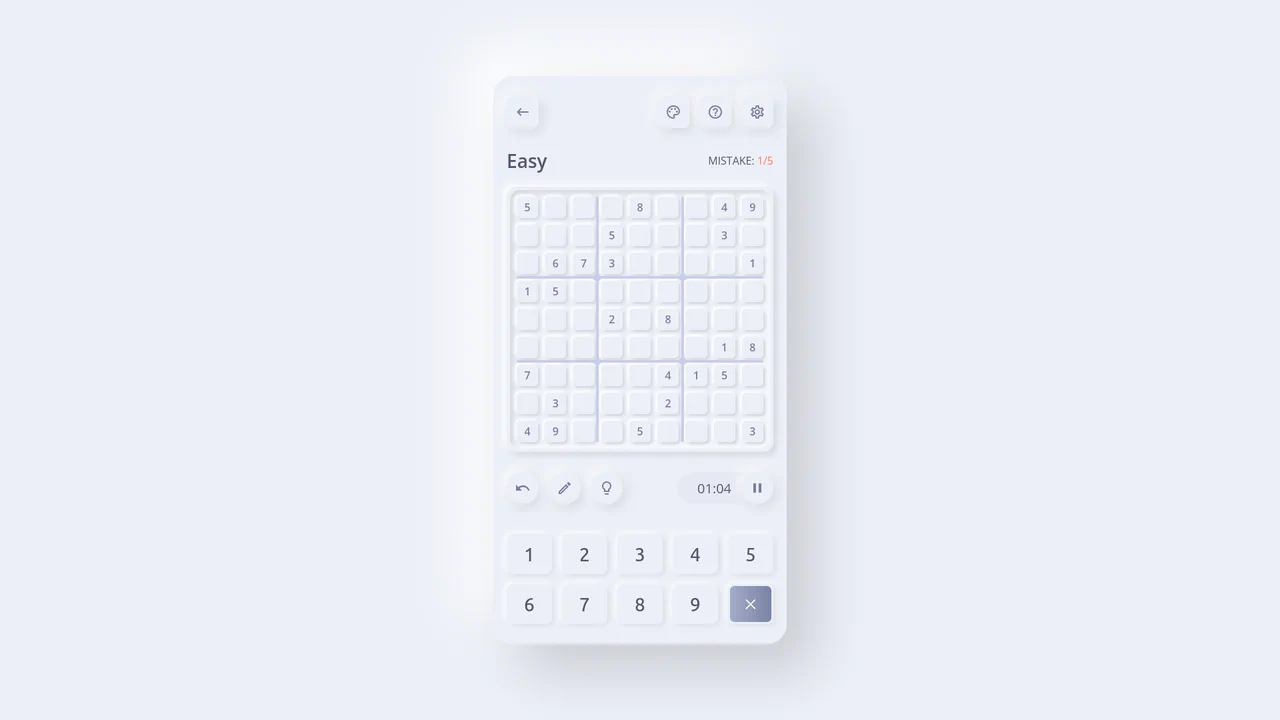
Neumorphic React Sudoku Interface
This is a Neumorphic React Sudoku Interface. It renders a fully interactive 9x9 puzzle grid using soft, extruded UI elements (neumorphism) combined with smart cross-axis highlighting. Its function is to provide a highly tactile, visually clean environment for complex data entry, reducing cognitive load during gameplay by automatically tracking the user’s focal point. (Requires: react.js, react-dom.js)
Chrome 60+
Edge 79+
Firefox 55+
Safari 11+
See the Pen Neumorphic React Sudoku Interface.

Mouse-Reactive Floating Image Gallery
This is a Mouse-Reactive Floating Image Gallery. It places an oversized grid of visual assets behind the viewport, hidden by the overflow. Its function is to provide an immersive, explorative navigation experience where the user’s cursor physically steers the scene across a scattered landscape of content.
Chrome 36+
Edge 12+
Firefox 48+
Safari 9+
See the Pen Mouse-Reactive Floating Image Gallery.

Fancy Image Hover Effects with Splitting.js
Explore a variety of sophisticated hover effects, where complex animation patterns are created using advanced CSS selectors like :nth-child(-n + 3). These selectors target specific ranges of “cells” generated by Splitting.js.
See the Pen Fancy Image Hover Effects with Splitting.js.

Cascading Image Slider
An elegant slider where the entire scrolling logic is built not on transforms, but on DOM manipulation. JavaScript uses appendChild and prepend to reorder the elements, and CSS instantly picks up the changes via :nth-child and transition to create a smooth, cascading effect.
See the Pen Cascading Image Slider.

BMO CSS Illustration with nth-child
An example of creating CSS art using pseudo-elements and nth-of-type, enhanced with a JS easter egg - a mouseover spam detector to call the Vibration API.
See the Pen BMO CSS Illustration with nth-child.
Interactive Fireworks with Babylon.js and CSS nth-child
An example of efficient resource management in Babylon.js - completed particle systems are tracked and completely removed from the scene with the dispose() method, preventing memory leaks.

Blocks Clock with Pixel Art Digits
This retro-style clock leverages CSS Grid for its 3x5 matrix display, dynamically updating the digit structure by manipulating the parent element’s class, while setInterval(setTime, 500) ensures a responsive time refresh.
See the Pen Blocks Clock with Pixel Art Digits.

Background Triangle Pattern
A clever technique for creating triangles using CSS border (width: 0; height: 0; border: ... solid transparent). The transparent side and top borders allow border-bottom to form a triangle, and its color is cyclically changed via the SCSS selector :nth-child(5n+...).
See the Pen Background Triangle Pattern.
Animated Squiggly Border Glow Cards
A card with a neon border effect where two CSS animations are synchronized - stroke-dashoffset for the SVG frame and hue-rotate for the drop-shadow glow. Each card gets a unique theme via :nth-child and the --cardAccent CSS variable, while multi-layering with z-index positions the glow underneath the main content.
See the Pen Animated Squiggly Border Glow Cards.
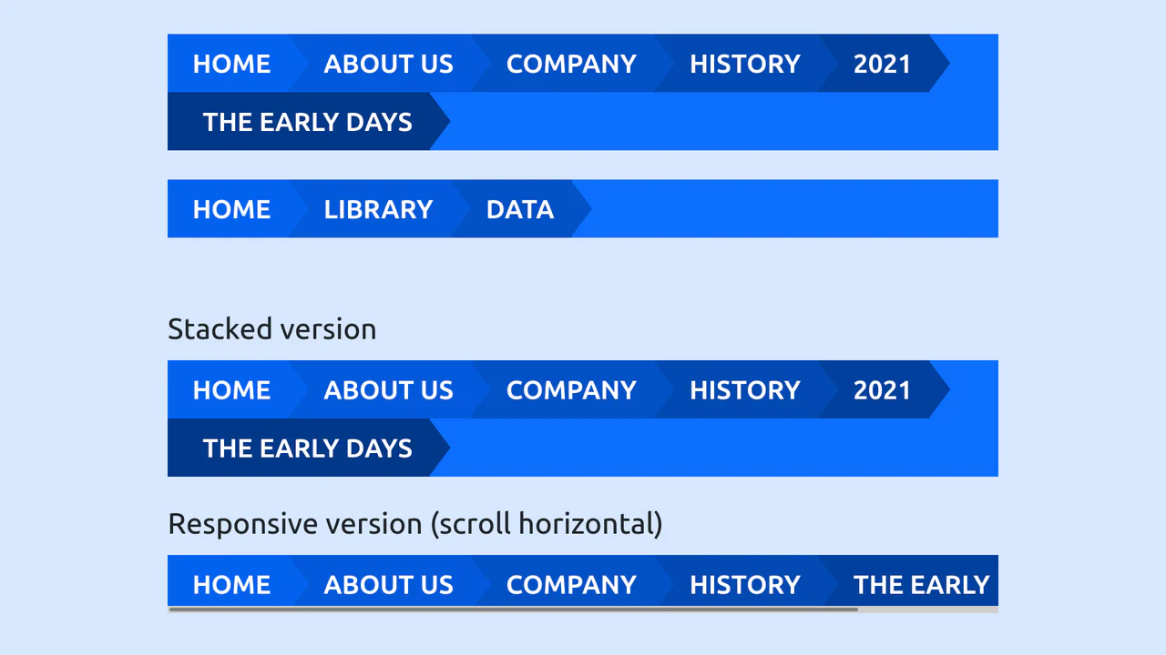
Bootstrap 5 Breadcrumb Example
A chevron-style Bootstrap customization where SCSS darken creates a gradient depth. The geometry relies on ::after border hacks, with :nth-child controlling color progression and z-index stacking.
See the Pen Bootstrap 5 Breadcrumb Example.


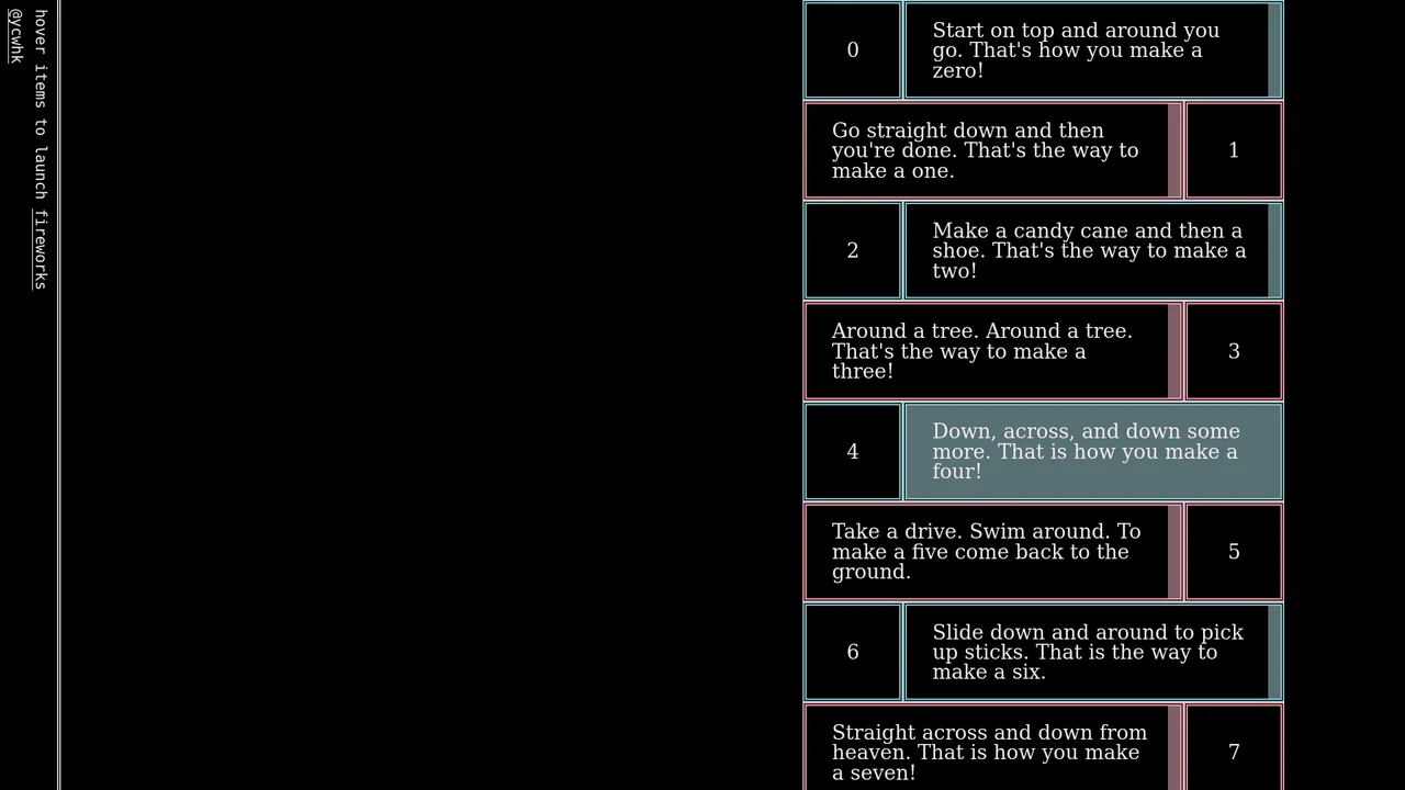
Interactive typographic composition where the numbers 0 through 9 are constructed entirely from CSS geometric primitives. Each glyph is rendered using a combination of border-radius, linear-gradient, and rotate transforms, nested within a <dl>, <dt>, <dd> structure. The layout relies on absolute positioning to define the unique visual space for each element.

Interactive card-based list using CSS transforms. dt and dd elements react to hover states via rotateX and scale, creating a dynamic focus effect. The layout is organized within a semantic <dl> definition list structure.

Generative organic form built using CSS variables, SASS loops, and the Pug template engine. Dynamic petal geometry is derived from the golden ratio (--golden) and trigonometric calculations, forming an organic pattern. Transformation animations simulate the blooming effect, while color shifts are handled via HSL interpolation.

Interactive alphabetical atlas implemented via CSS Flexbox and Data URIs. Each letter element acts as a container for dynamically embedded SVG icons optimized for high-performance rendering. The color palette is managed via nth-child selectors to create a rhythmic alternation of hues.
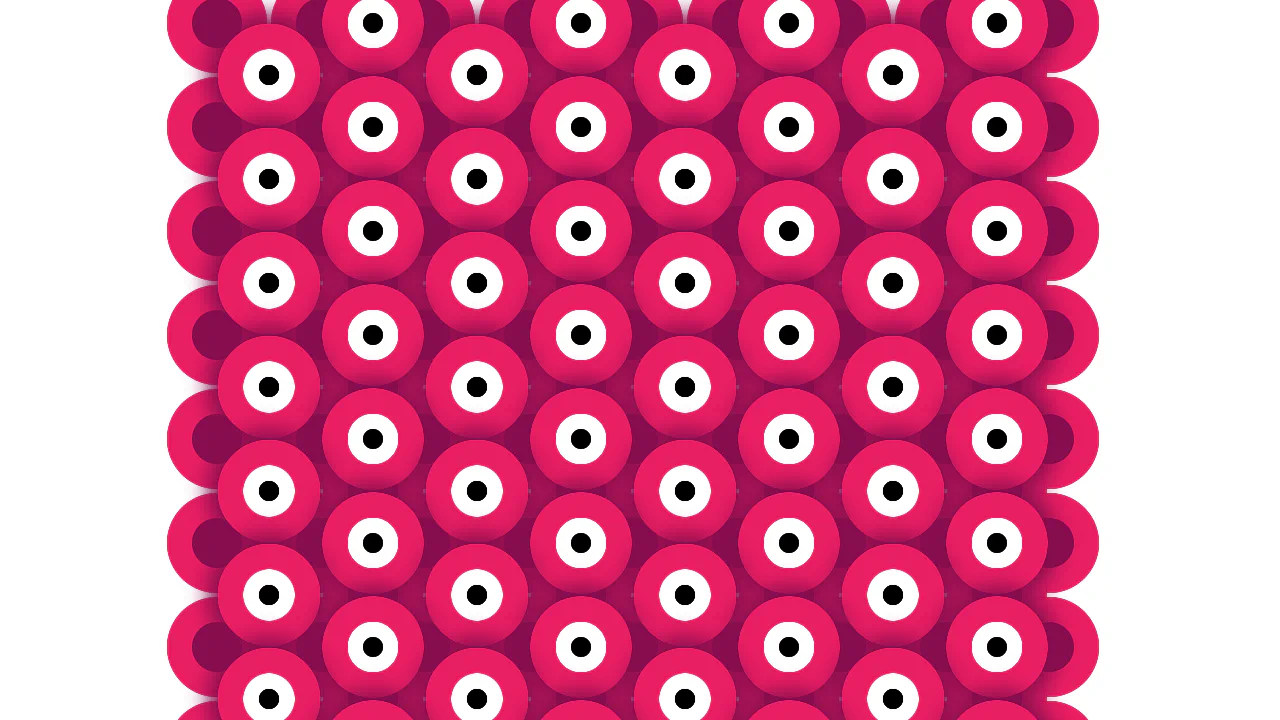
Generative animation based on a grid of DOM elements. JavaScript initializes 255 nodes, visually arranged via Flexbox. CSS nth-child selectors using progression formulas establish the rhythmic pattern of active elements, while keyframe animations simulate a pulsing effect.

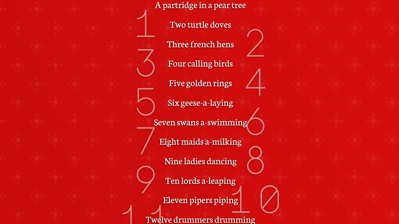
12 nth Selectors
This list uses cascading position: sticky and offset heights to stack elements vertically on scroll. Built without JavaScript, it features custom CSS counters that alternate large backdrop digits left and right. An inline SVG mouse indicator animates briefly at the bottom to suggest scrolling before fading away.
See the Pen 12 nth Selectors.


Periodic Table
A responsive table where hovering over a cell triggers an instant 3x magnification pop-up atop other elements, allowing details to be read while keeping the interface stable.
See the Pen Periodic Table.
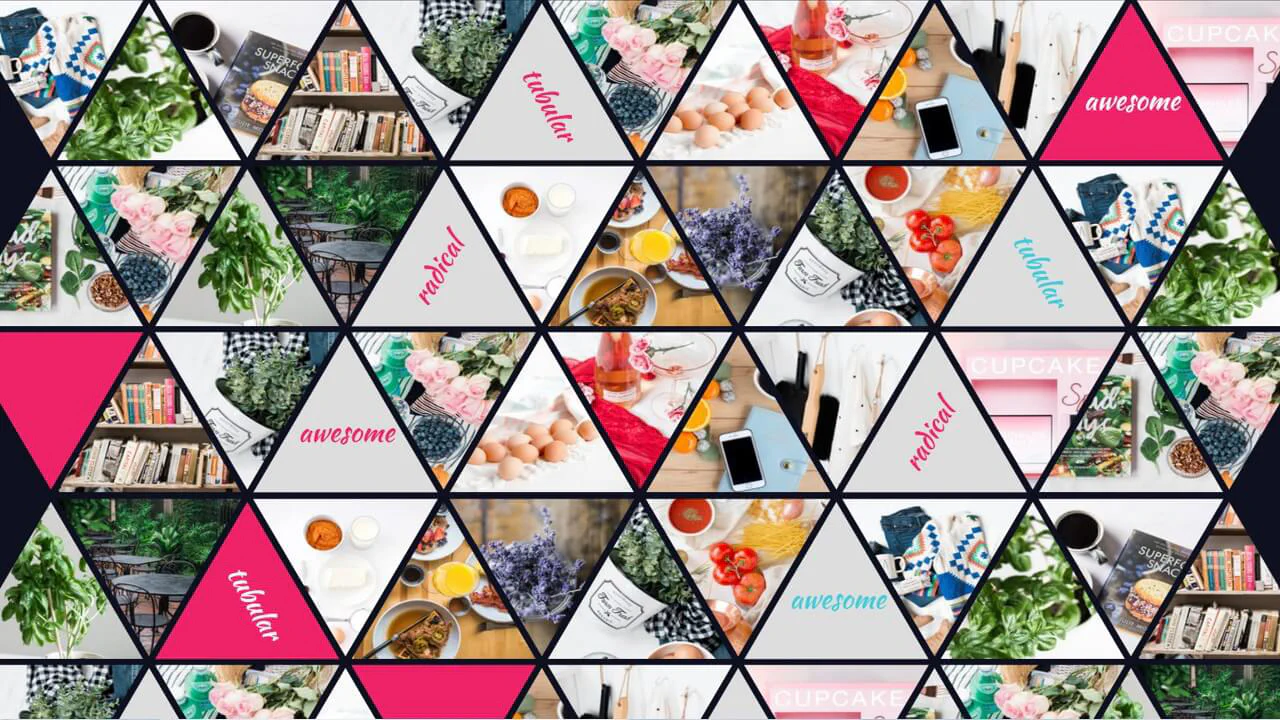
Triangle Grid with nth-child
Responsive hexagon grid with photos. Odd/even elements have opposite clip-path cuts, creating honeycomb. SCSS loop injects random Unsplash images. Some cells have text overlay.
See the Pen Triangle Grid with nth-child.

Comic Director Splash Animation
A dynamic splash screen where the layer reveal choreography is built on transform and transition-delay, applied to each element via :nth-child. The final layer “explodes” spectacularly using @keyframes and a custom cubic-bezier function, with the entire animation optimized for hardware acceleration.
See the Pen Comic Director Splash Animation.
CSS Particle Style Animation
Creating a depth of field effect in pure CSS - different animation speeds and filter: blur() values for each element create the illusion of a multi-layered space.
See the Pen CSS Particle Style Animation.