10+ CSS Optical Illusions: Free Code Snippets & Examples
CSS optical illusions demonstrate the profound capabilities of browser rendering engines to manipulate cognitive perception, creating depth, impossible geometry, and motion without the payload of heavy image assets. By constructing patterns like Moiré shifts, Poggendorff alignments, and color contrast anomalies, developers can construct high-impact landing pages and creative portfolios.
- Complex geometric alignment is engineered using repeating-conic-gradient and radial shading, generating intricate physical overlaps purely through CSS pattern math.
- Color and value contrast illusions, like Adelson’s checkerboard, rely on mix-blend-mode properties to calculate contextual luminance adjustments on overlapping layers.
- To protect INP (Interaction to Next Paint) performance, animated illusions offload extreme coordinate transformations entirely to the browser’s compositor thread.
Experiment with these geometric visual puzzles to master the intersection of cognitive psychology and performance-first web design.
Table of Contents:
Examples
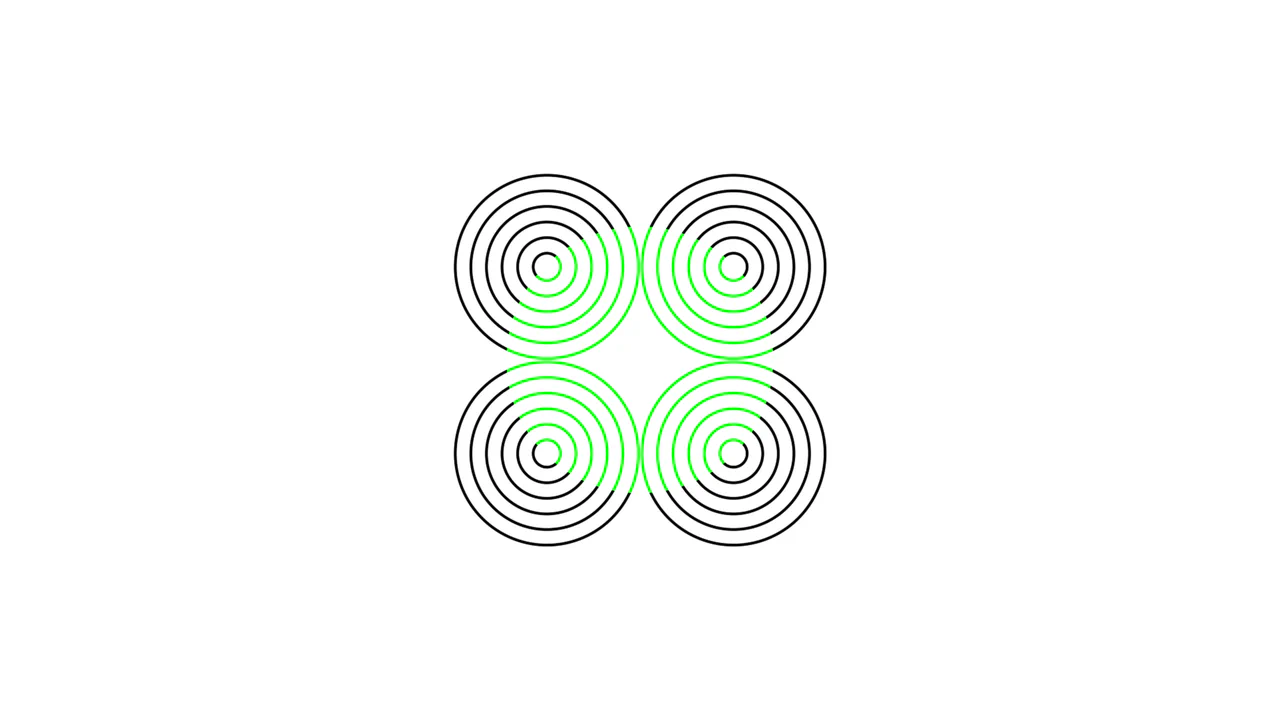
Neon Color Spreading CSS Optical Illusion
An elegant pure-CSS demonstration of the neon color spreading optical illusion. Operating with zero HTML markup, the stylesheet overlays concentric repeating radial ring quadrants and a central green circle, combining them via background-blend-mode: lighten. This causes the green pigment to visually bleed into the black gaps, tricking the brain into perceiving a glowing lime-colored sphere.
 Chrome 35+
 Edge 79+
 Firefox 30+
 Safari 8+
See the Pen Neon Color Spreading CSS Optical Illusion.
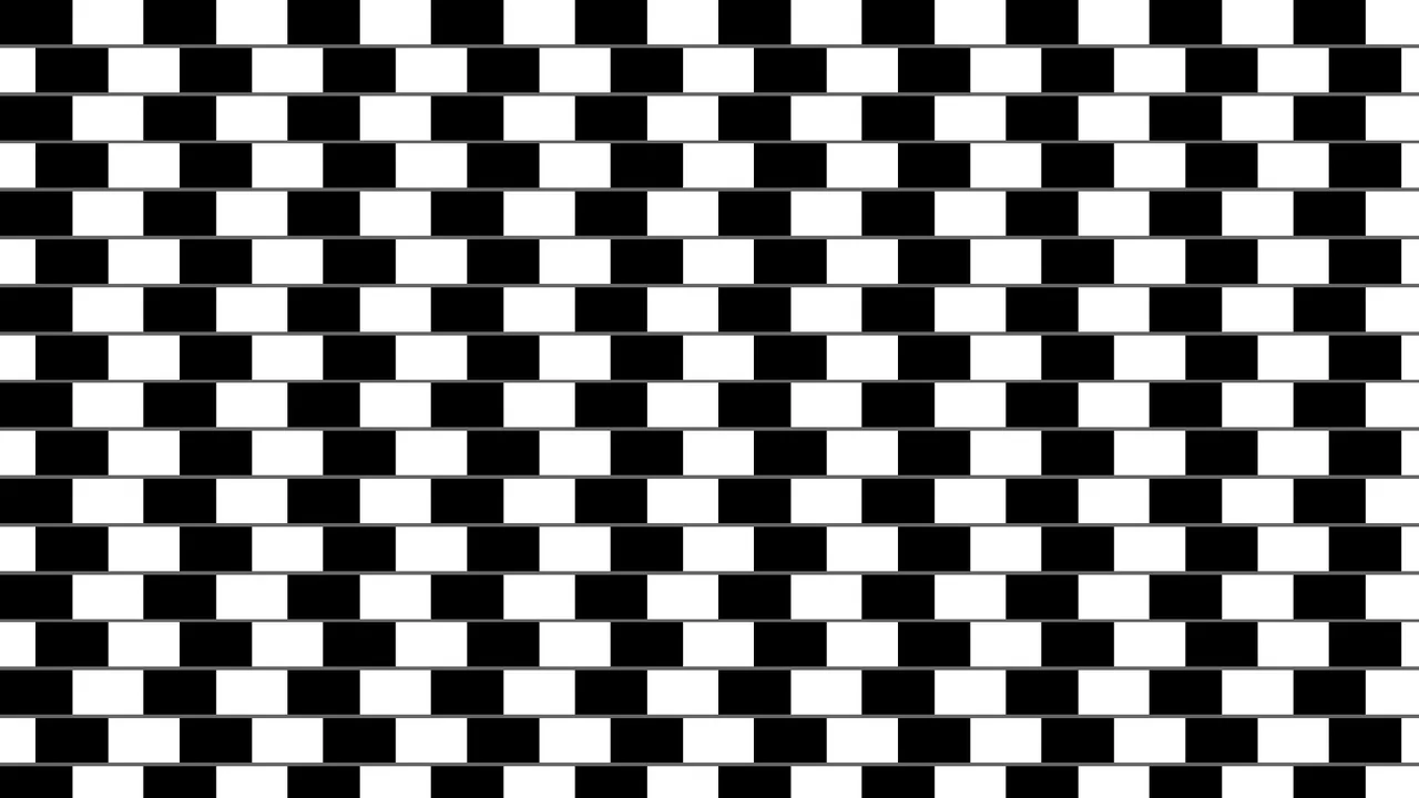
Pure CSS Café Wall Optical Illusion
An interactive pure-CSS representation of the classic Café Wall optical illusion. Built with zero HTML markup, the layout layers gray linear separators and offset black-and-white conic gradients to create a pattern where perfectly parallel lines appear tilted. Hovering over the page realigns the checkerboard columns to immediately debunk the cognitive illusion.
Chrome 69+
Edge 79+
Firefox 83+
Safari 12.1+See the Pen Pure CSS Café Wall Optical Illusion.
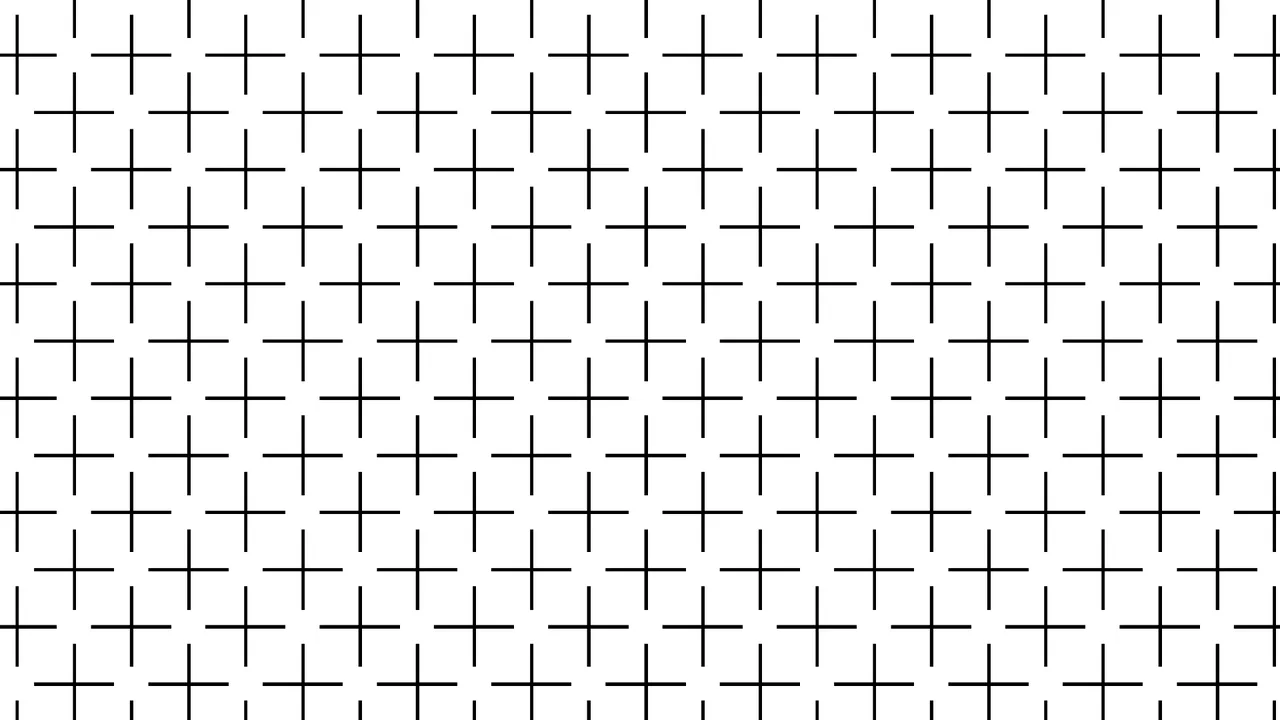
Pure CSS Ehrenstein Optical Illusion
An elegant pure-CSS implementation of the classic Ehrenstein optical illusion. Requiring zero HTML, the stylesheet utilizes offset conic-gradient() coordinates to render a repeating grid of vertical and horizontal lines. When looking at the resulting pattern, the human visual system automatically completes the missing intersections, perceiving non-existent bright white discs.
Chrome 69+
Edge 79+
Firefox 83+
Safari 12.1+See the Pen Pure CSS Ehrenstein Optical Illusion.
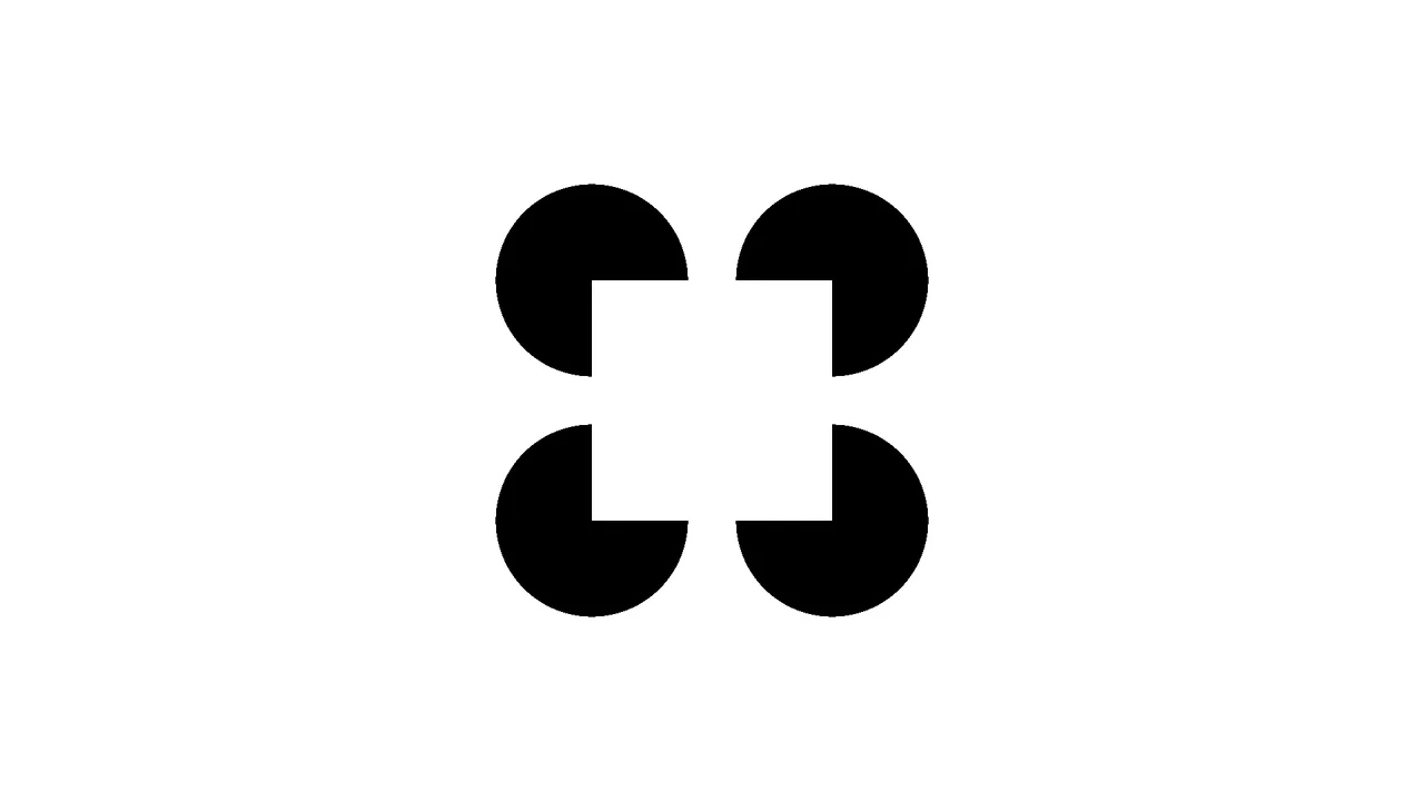
Pure CSS Kanizsa Square Optical Illusion
An elegant pure-CSS implementation of the classic Kanizsa Square optical illusion. Requiring zero HTML, the layout combines layered conic and radial gradients inside a single pseudo-element to render four black ‘Pacman’ circles. This arrangement triggers a Gestalt perception where the brain automatically draws subjective white boundary contours to construct a floating foreground square.
Chrome 69+
Edge 79+
Firefox 83+
Safari 12.1+See the Pen Pure CSS Kanizsa Square Optical Illusion.
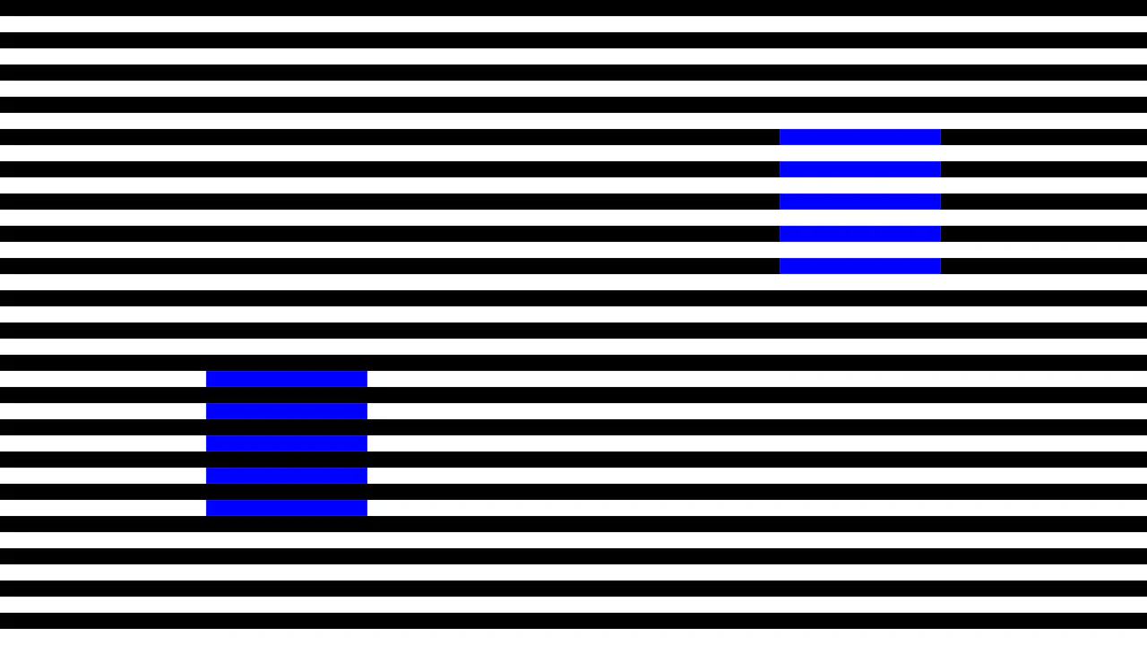
Simultaneous Contrast CSS Optical Illusion
An interactive pure-CSS representation of Adelson’s simultaneous contrast optical illusion. Built with zero HTML, the layout implements contrasting mix-blend-mode properties (darken and lighten) over a repeating black-and-white striped background. This makes two identical green squares appear as completely different shades until a hover gesture collapses the stripes to reveal they are the exact same color.
Chrome 41+
Edge 79+
Firefox 32+
Safari 8+See the Pen Simultaneous Contrast CSS Optical Illusion.
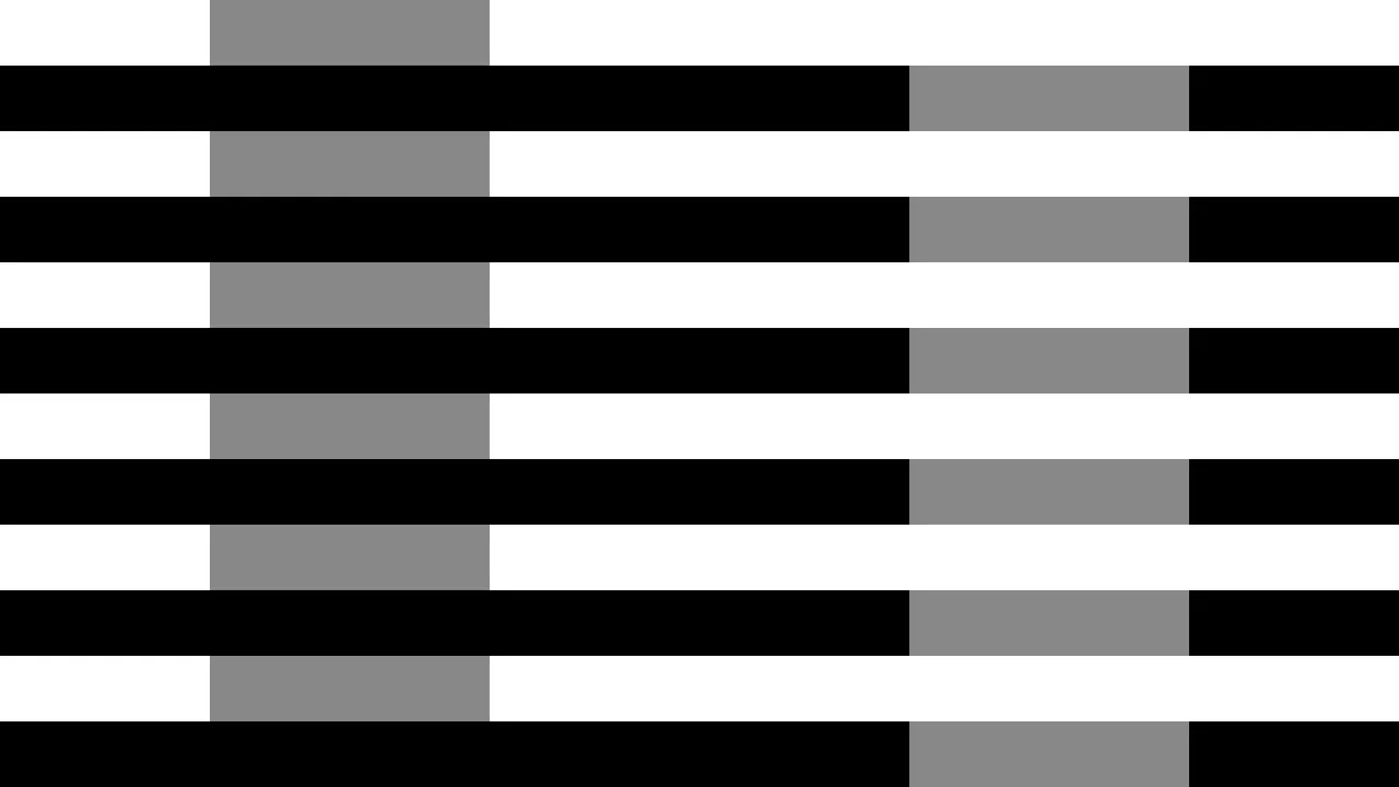
White's Brightness Contrast CSS Illusion
An elegant pure-CSS implementation of White’s brightness illusion. Operating with zero HTML markup, the stylesheet utilizes contrasting mix-blend-mode values (darken and lighten) to overlay identical solid gray columns over a repeating black-and-white horizontal striped background. This contextual setup tricks the visual system, making one gray bar appear perceptually darker than the other.
Chrome 41+
Edge 79+
Firefox 32+
Safari 8+See the Pen White's Brightness Contrast CSS Illusion.
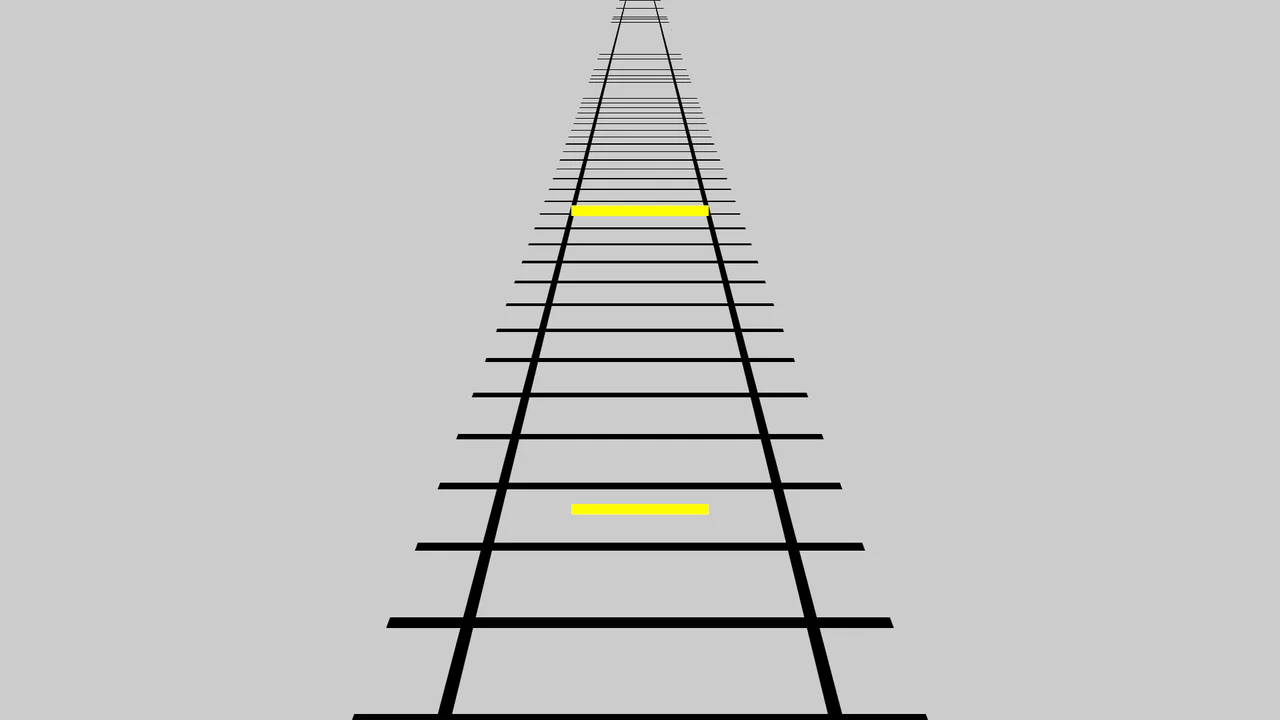
Perspective Railway Optical Illusion
This is a Perspective Railway Optical Illusion. It leverages CSS 3D transforms to create a vanishing point, tricking the human brain into perceiving two identical horizontal lines as different sizes (the Ponzo illusion). Its function is to provide an engaging, interactive visual puzzle for users, demonstrating the power of spatial context in UI design without external assets.
Chrome 104+
Edge 104+
Firefox 110+
Safari 16.4+See the Pen Perspective Railway Optical Illusion.
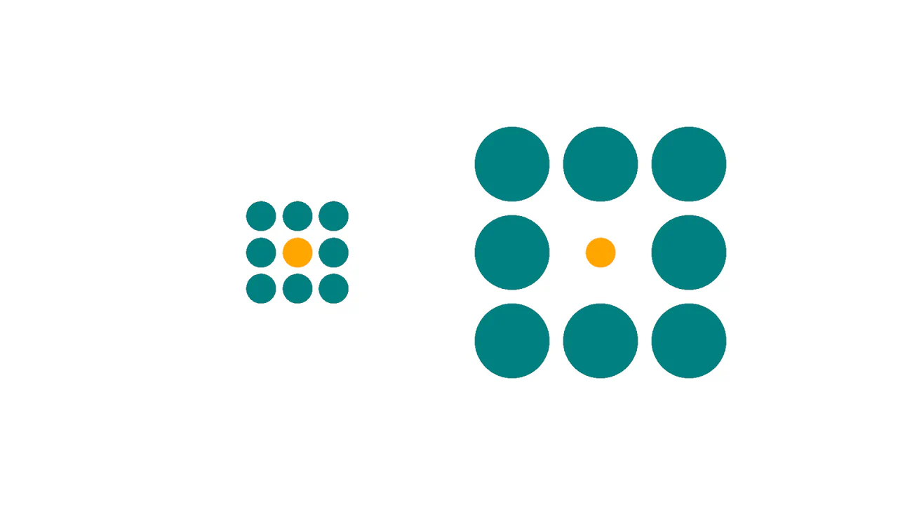
Ebbinghaus Illusion
This is a Pure CSS Ebbinghaus Optical Illusion. It uses mathematically sized radial gradients on a single element to trick the brain into perceiving two identical circles as different sizes. Its function is to provide an interactive, visual “gotcha” moment, demonstrating how relative scale affects human perception, revealed instantly via a smooth hover transition.
Chrome 112+
Edge 112+
Firefox 112+
Safari 16.5+See the Pen Ebbinghaus Illusion.
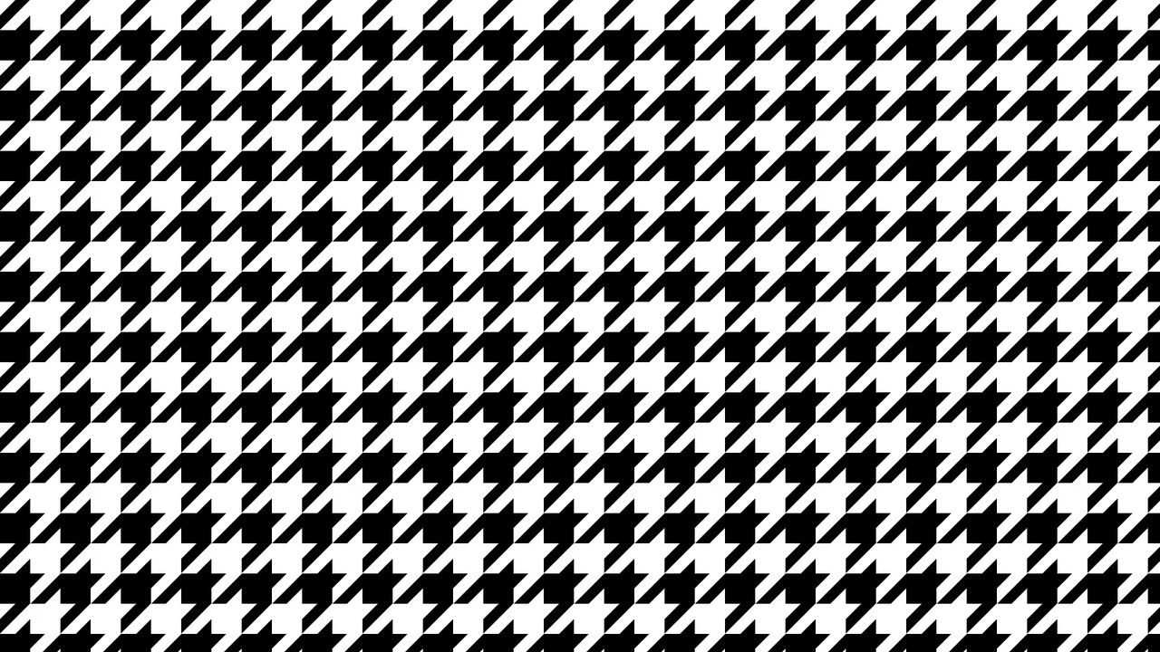
Optical Illusion CSS Background Pattern
This is an Optical Illusion CSS Background Pattern. It generates a complex, interlocking geometric tessellation using only mathematical gradient overlays. Its function is to provide a visually striking, lightweight background texture without requiring external image assets.
Chrome 69+
Edge 79+
Firefox 83+
Safari 12.1+See the Pen Optical Illusion CSS Background Pattern.

Pulsing Circle Optical Illusion
This is a Pulsing Circle Optical Illusion. It generates a static, high-contrast geometric pattern that exploits peripheral vision to create a false sense of motion. Its function is to serve as a lightweight, visually arresting background or artistic centerpiece using only a handful of CSS properties and zero JavaScript.
Chrome 69+
Edge 79+
Firefox 83+
Safari 12.1+See the Pen Pulsing Circle Optical Illusion.

Stepping Feet Optical Illusion
This is the Stepping Feet Optical Illusion. It demonstrates how high-contrast patterns interfere with human motion perception. Two colored blocks move at identical, constant speeds, yet appear to stagger and “step” like feet. A hover interaction removes the background grid to expose the mathematical reality of their parallel movement.
Chrome 105+
Edge 105+
Firefox 121+
Safari 16.4+See the Pen Stepping Feet Optical Illusion.
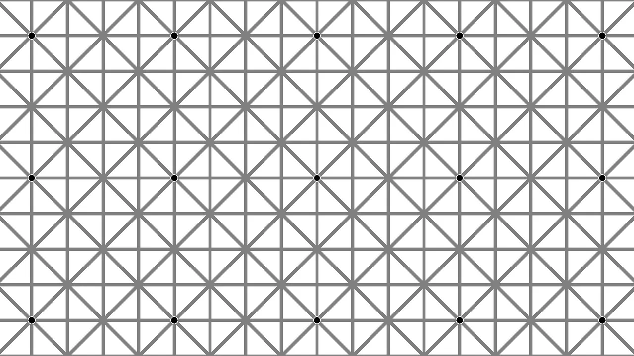
Optical Illusion Effect with CSS
A CSS-only pattern generator creating a grid of intersecting lines with dots at intersections. Four diagonal and axis-aligned linear-gradient layers plus one radial-gradient layer for dots, all sized to var(--sq). The line gradient uses a repeating pattern of 0–100% with variable thickness (var(--lt)).
See the Pen Optical Illusion Effect with CSS.
Checkbox Illusion
Checkbox illusion with optical pattern. Repeating conic gradient background creates grid. Pseudo-elements with layered gradients and mix-blend-mode: difference shift position on toggle, creating 3D shape motion effect. clip-path forms diamond mask.
See the Pen Checkbox Illusion.