10+ CSS Panels: Free Code Snippets & Examples
Panels structure complex interfaces into logical content zones — they define where navigation sits, where content flows, and where controls live. CSS panels use Grid and transform-based slide animations to create responsive interfaces that adapt without breaking their spatial relationships.
- Each panel uses CSS Grid with
grid-template-areasfor explicit placement, allowing complex dashboard layouts where panels can be resized or reordered by changing only the grid definition. - Collapsible side panels use
transform: translateX()withtransitionfor slide-in animations, keeping the panel movement on the compositor thread and avoiding layout recalculations in the main content area. - Semantic HTML with
<aside>,<main>, and<section>elements ensures that panel regions are properly identified by screen readers, whilearia-hiddendynamically marks off-screen panels as hidden.
Browse the collection to find a panel structure that fits your interface architecture — from two-column admin layouts with collapsible sidebars to multi-region data dashboards with resizable panels.
Table of Contents:
Examples

Expanding Flexbox Panels
This expanding panel gallery’s core animation is powered by CSS Flexbox, where the flex property is transitioned to create a fluid expansion effect. The state is managed by a minimal vanilla JavaScript snippet that simply toggles an .active class on click. This .active class also triggers a multi-layered text animation, using a delayed transition on the <h1>’s opacity and filter: blur() properties for a polished, cinematic reveal.
See the Pen Expanding Flexbox Panels.

Dual Sliding Panels
An adaptive split-screen layout where panels unfold in 3D - along the Y-axis on desktop and the X-axis on mobile. A JS controller manages the state via classes, while all the complex animation, optimized with will-change and perspective, is written in Stylus.
See the Pen Dual Sliding Panels.

CSS-only Sliding Panels Using Transforms
A responsive Flexbox split layout that switches from horizontal to vertical via a media query. The “sliding doors” effect is created with pure CSS using transform and the sibling selector, while the parallax on hover is achieved with different content movement speeds controlled by LESS variables.
See the Pen CSS-only Sliding Panels Using Transforms.
Pure CSS Panels
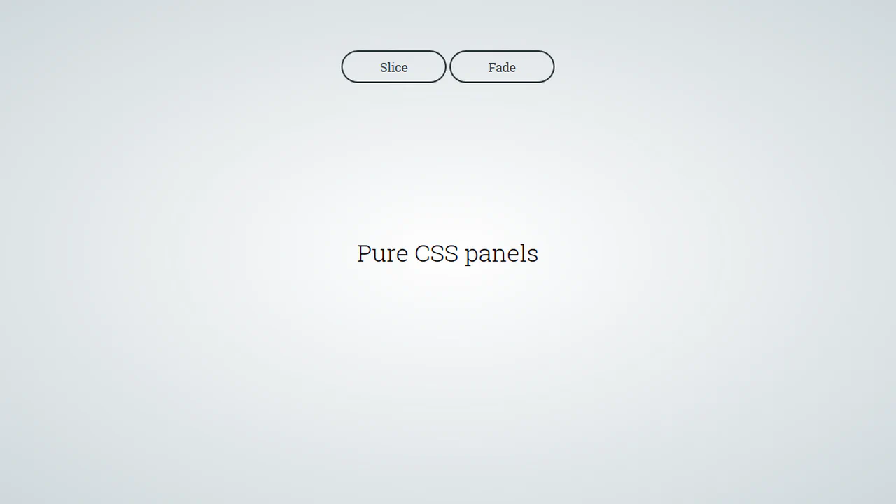
A pure CSS solution for full-screen panels controlled via :target - clicking a link triggers their appearance animation. It demonstrates various effects with a two-stage animation: first the panel appears, then its content follows with a transition-delay.
See the Pen Pure CSS Panels.


Horizontal gallery with skewed panels. Each section skewed via skewX, background shifted opposite for compensation. On hover, panel expands, content fades in, overlay fades out. Button toggles background images visibility.
Flex Panels
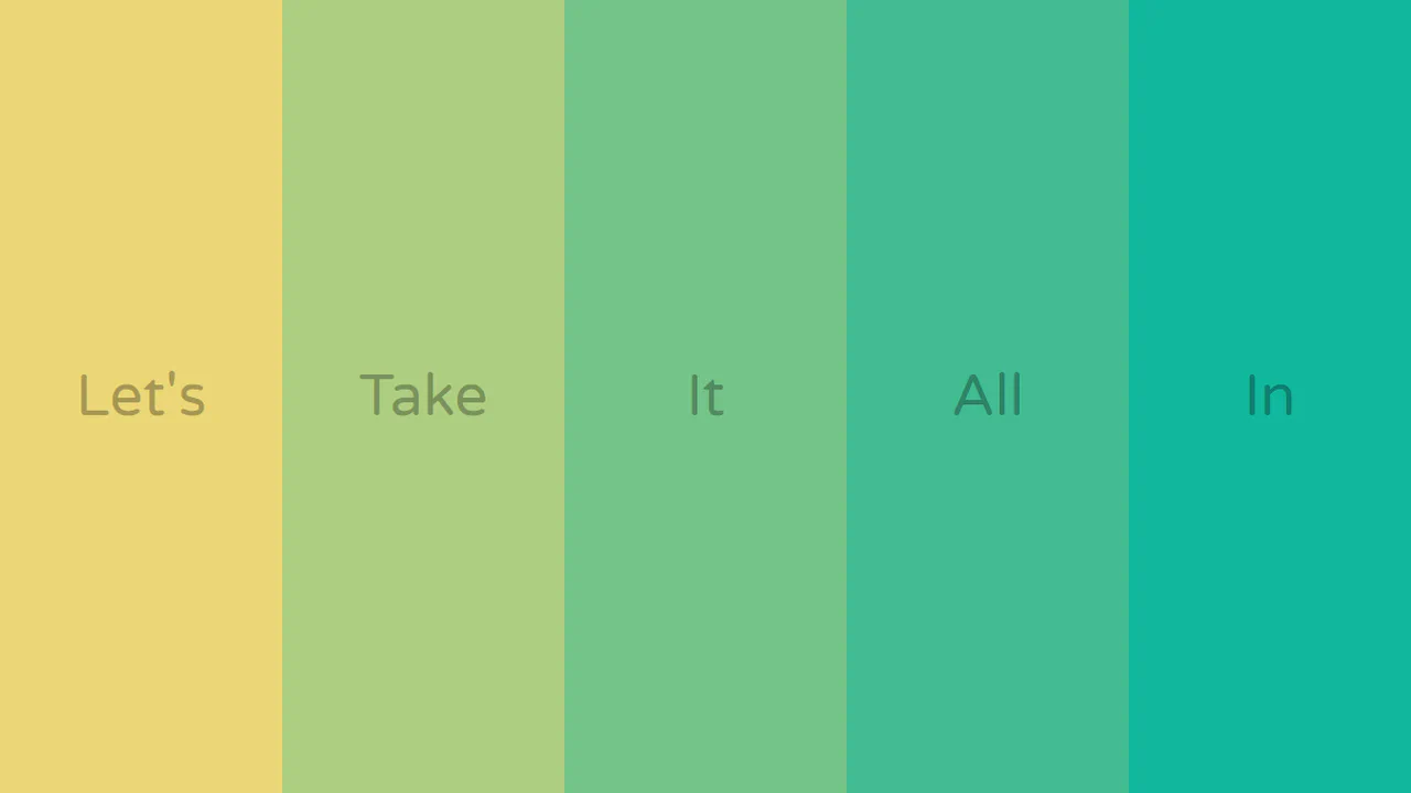
Gallery with expanding panels. On click, panel expands, font size increases. Top and bottom text slide from outside (translateY), appearing when adjacent panel opens. Animations synchronized via transitionend events.
See the Pen Flex Panels.
Multiple Sliding Panels
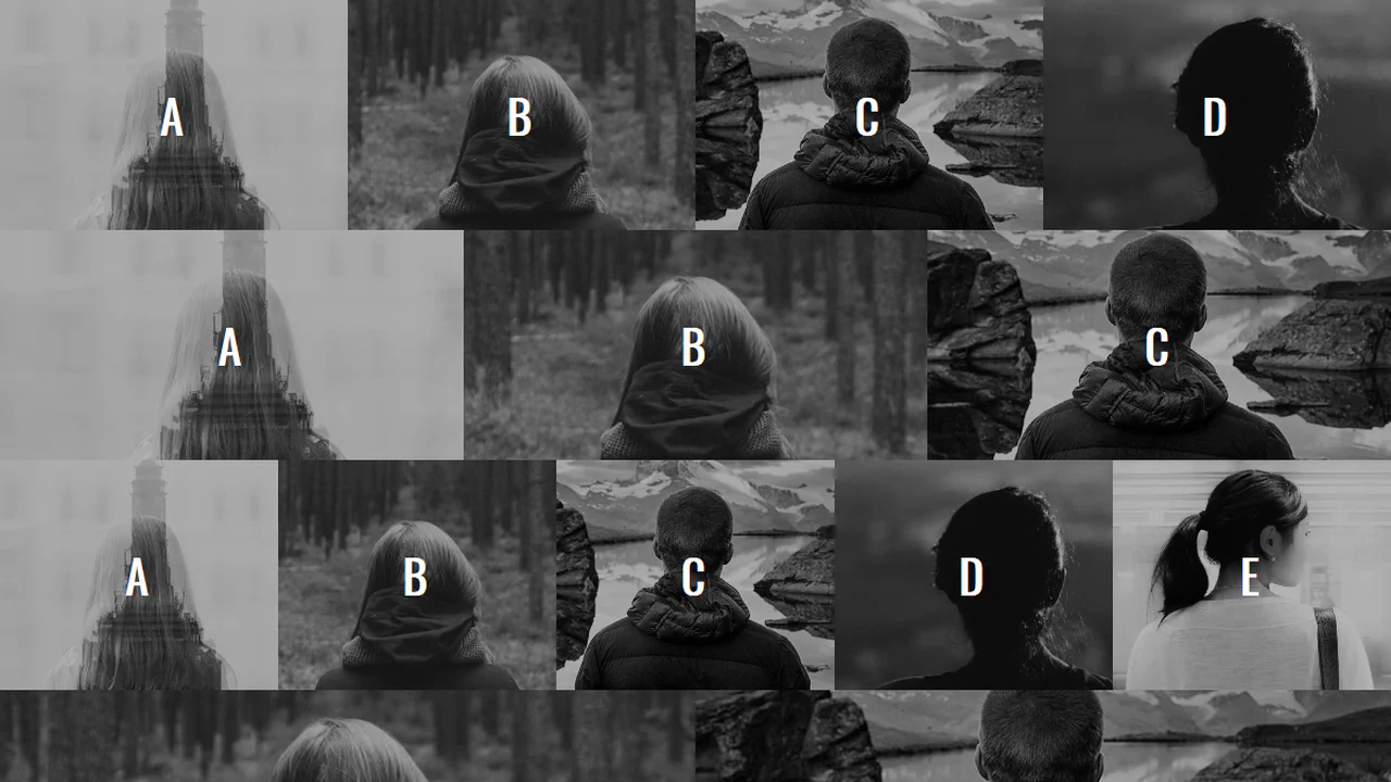
Gallery with sliding panels and color correction. On hover, active panel shifts forward, neighbors move aside. Grayscale filter and overlay disappear, revealing color image. @offset variable controls shift depth.
See the Pen Multiple Sliding Panels.
Pure CSS Hover
Horizontal gallery with width change on hover. Default three equal sections. On hover, one expands to 40%, neighbors shrink to 30%, grayscale and gradient removed. Smooth via transition-duration.
See the Pen Pure CSS Hover.
Expanding Panels
Responsive three-section menu. On mobile — vertical stack, on desktop — horizontal panels with rotated titles. On hover, section expands, title returns to normal orientation and scales up.
See the Pen Expanding Panels.

Full-Width Panel Expansion
Responsive gallery with CSS variables for dynamic positioning. On hover, active panel slides forward, neighbors slide aside. LESS loops generate --items and --i variables per panel, controlling shift via calc.
See the Pen Full-Width Panel Expansion.
Panel Switch Interaction
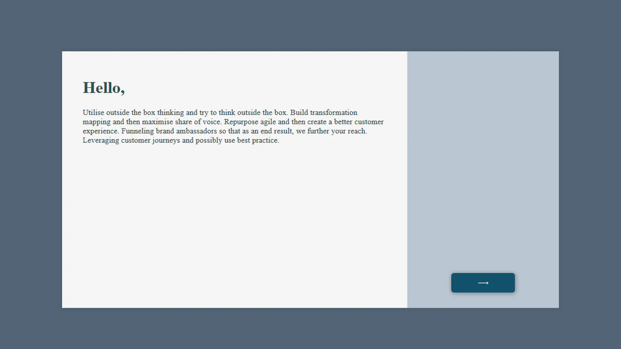
Animated switcher between two panels. On click, right-open class redistributes flex values: one panel collapses, other expands, side bars swap roles. Smooth via transition on all changing properties.
See the Pen Panel Switch Interaction.
Budging Bars
Animated menu with overlapping panels. Each item positioned with shift via translateX and margin-left. On focus/hover, panel slides forward, neighbors reset.
See the Pen Budging Bars.
Expanding Sections
Horizontal menu with expanding sections. On hover, section widens, overlay darkens. Background images fixed, content centered. Smooth via transition on flex and background-color.
See the Pen Expanding Sections.
Reflection
This interactive 3D showcase splits a landscape image across four panels. Powered by GSAP, the timeline pushes the panels deep into 3D space (z: -300), flips them 180 degrees, and offsets background-positions to reveal a mirrored reverse side, while simultaneously animating a clip-path overlay to unveil the header text.
See the Pen Reflection.
Zig-Zag Sliding Panels (CSS Grid)
This pure CSS gallery weaves image columns using interlocking, zig-zag masks. By combining angled conic-gradient declarations, the stylesheet crops adjacent edges into matching triangular teeth. Odd elements use vertical custom variable offsets to align the weave, while hover transitions smoothly expand the active card’s width.
See the Pen Zig-Zag Sliding Panels (CSS Grid).
Rounded Edges Sliding Panels
This interactive image gallery weaves adjacent cards using complex CSS-only jigsaw masks. Combining repeated linear-gradient and radial-gradient masks, the images lock together seamlessly. Toggling hover dynamically expands an image’s width to 15vw while the interlocking curve masks maintain their precise alignment.
See the Pen Rounded Edges Sliding Panels.
Tekken Characters Cards
This gaming-inspired character selection grid replicates arcade selection screens. Toggling hover reveals high-resolution, absolute-positioned foreground fighter avatars that dynamically pop out past the card boundaries. The underlying card slides and scales while dyeing the background in a semi-transparent purple highlight.
See the Pen Tekken Characters Cards.