20+ CSS Paper Effects: Free Examples & Code Snippets
CSS paper effects deliver sophisticated skeuomorphic tactile depth to flat layouts, simulating organic physical paper textures, notebook lines, and sharp 3D folds. By mimicking realistic paper behavior, this structural styling system structures user interface panels into familiar, approachable focal hierarchies.
- Complex folds and origami geometries are modeled using clip-path polygons combined with high-contrast conic-gradient overlays to represent physical shadow falloffs.
- Realistic fiber structures and subtle grain textures utilize native SVG filter primitives mapped directly as background elements, avoiding heavy external bitmap loads.
- To preserve critical INP (Interaction to Next Paint) performance, interactive page-curling transitions rely exclusively on GPU-composited 3D transforms.
Discover these dimensional paper layouts to seamlessly integrate tactile, physical mechanics and realistic shadow styling into your application.
Table of Contents:
Examples
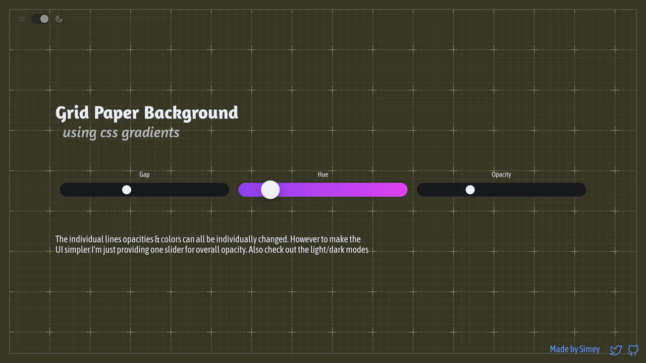
Procedural CSS Gradient Grid Background
An interactive graph notebook paper pattern drawn entirely via stacked, layered CSS gradients. By combining major and minor linear grid lines, radial cross masks, and corner border offsets, it forms a fully customizable procedural background. It utilizes CSS @property Houdini variables to smoothly transition gap sizing updates, alongside dynamic theme and color hue tuning.
 Chrome 110+
 Edge 110+
 Firefox 128+
 Safari 16.4+
See the Pen Procedural CSS Gradient Grid Background.
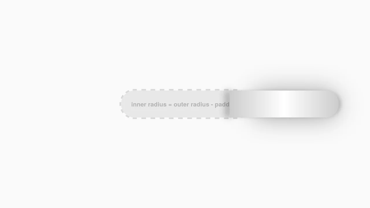
Interactive CSS Tear Strip Animation
Interactive CSS Tear Strip Animation simulates the satisfying physical action of tearing open a cardboard package. It cleverly uses an invisible <input type="range"> linked to the CSS Scroll-Driven Animations API (animation-timeline: --thumb). As the user drags the slider, CSS variables dynamically update clip-path, box-shadow, and transform properties to reveal the content beneath while curling the torn strip. A JavaScript fallback ensures compatibility for browsers without native scroll-timeline support.
Chrome 115+
Edge 115+
Firefox 110+
Safari 16.4+
See the Pen Interactive CSS Tear Strip Animation.

Hand-Drawn Retro Radio Group
This Hand-Drawn Retro Radio Group injects personality into standard forms with a nostalgic, sketchbook aesthetic. It combines a “neo-brutalist” shadow style with subtle animations - like text jitter and a bouncing selection dot - to mimic the imperfection of hand-drawn art. The background features a CSS-generated paper texture and scanline effect, making it ideal for indie game interfaces, creative blogs, or retro-themed landing pages.
Chrome 60+
Edge 79+
Firefox 60+
Safari 12+
See the Pen Hand-Drawn Retro Radio Group.
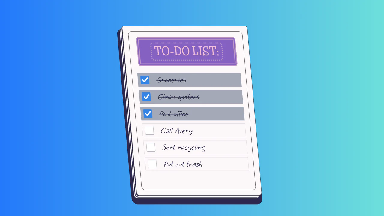
To-Do List
A stylized paper notepad To-Do list featuring a skew transformation and stack-effect shadows. Clicking checkboxes toggles a strikethrough style on handwritten list items via JavaScript class manipulation.
See the Pen To-Do List.
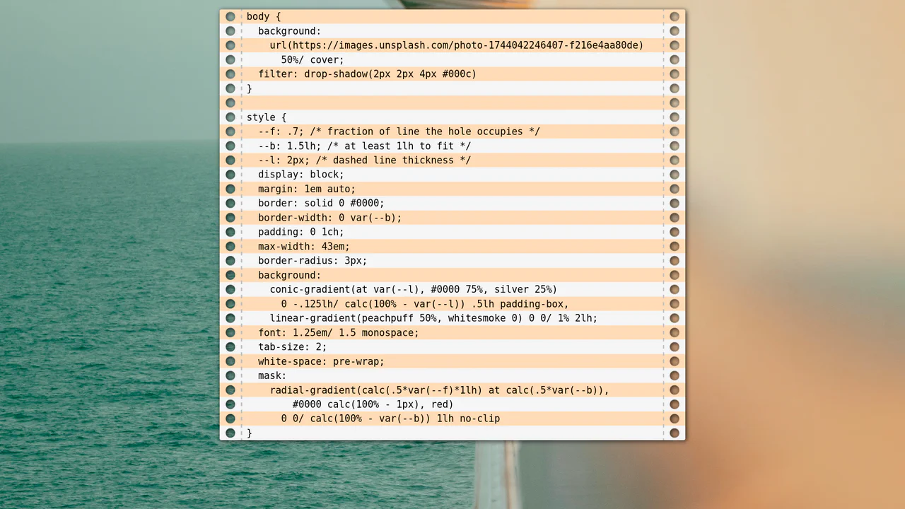
Lined Paper Background with Perforations
Achieve a realistic punched-paper effect using pure CSS by mastering conic-gradient to precisely mask the perforations and linear-gradient for the alternating lined background.
See the Pen Lined Paper Background with Perforations.
Love Is in the Air...
Explore the power of pure CSS for complex shapes and motion: a beautifully designed love letter featuring floating heart elements built entirely with CSS pseudo-elements and keyframe animations.
See the Pen Love Is in the Air....
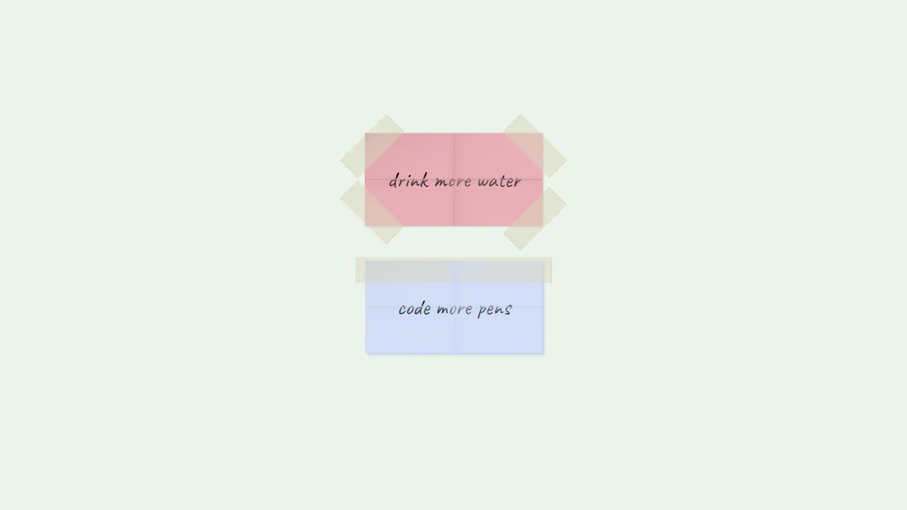
Paper with Sellotaped Corners
Taped Sticky Notes Illustration replicates taped memo pads using CSS gradients. Creases are drawn across the .paper containers using thin crossed lines on a ::after pseudo-element. Translucent adhesive tape strips are rendered at the corners and top using opacity: 0.5 and dotted side borders to mimic torn dispenser edges. It is a highly creative vector layout done entirely without images.
See the Pen Paper with Sellotaped Corners.
Folded Paper Login Form
3D Folding Login Form is an interactive, zero-JavaScript sign-in interface. It positions :before and :after pseudo-elements on the left and right edges, skewing them with transform: skewY(-35deg) to simulate folded side flaps. On hover or input focus via CSS :focus-within, the form flattens and the side flaps unfold smoothly. It is a highly tactile, responsive CSS layout.
See the Pen Folded Paper Login Form.
Paper
CSS Binder Ring Shader compares two methods of rendering realistic binder rings on notebook sheets. The first .paper uses an intricate combination of layered linear and radial CSS gradients. The second .paper--alt simplifies this by using an inline SVG data URL pattern. While both deliver crisp, vector-based binders, the SVG approach is vastly easier to maintain and performance-friendly.
See the Pen Paper.
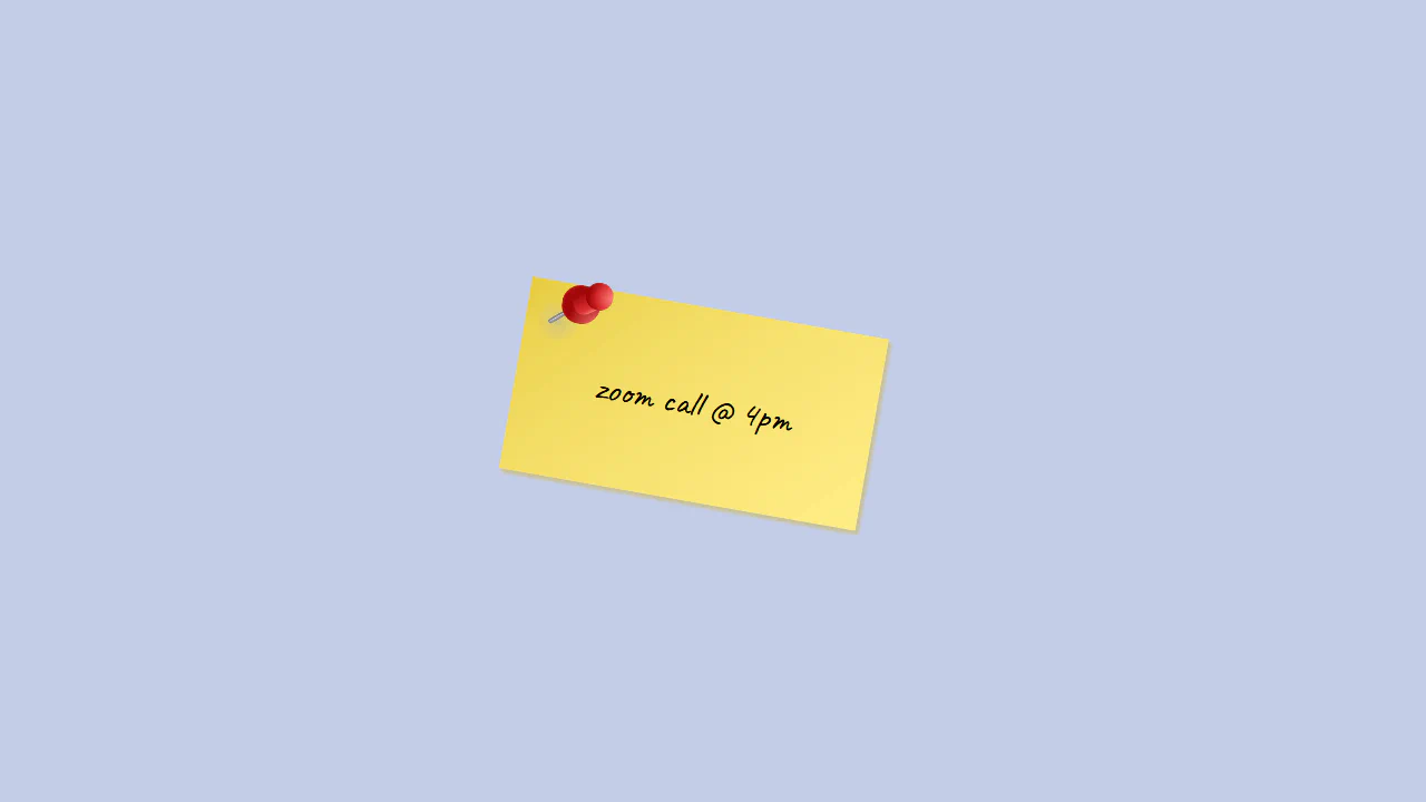
Pinned Card
Pinned Sticky Note Vector is a pure CSS graphic of a yellow memo card held by a red pushpin. It tilts the paper card with transform: rotate(10deg) and uses linear gradients for page shading. The pin is compiled of multiple layered shapes: a metallic-look linear needle, a blurred shadow circle, and a plastic red grip molded using radial gradients on ::before and ::after wrappers.
See the Pen Pinned Card.

3D Tilting Moleskine Notebooks
A realistic 3D Moleskine notebook component built with pure CSS and SCSS, utilizing perspective and rotateY transforms. This snippet features detailed paper textures created with linear gradients and a smooth opening animation on hover, offering a high-performance UI/UX solution for digital portfolios or creative web apps.
See the Pen 3D Tilting Moleskine Notebooks.
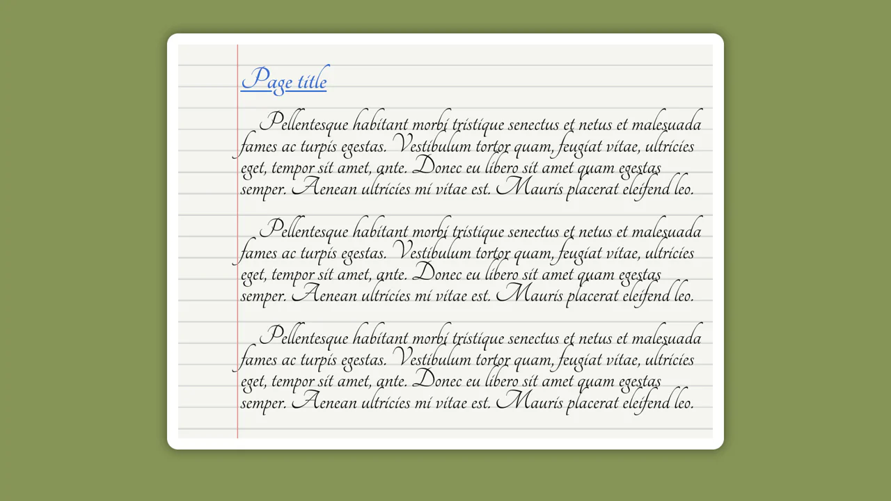
Styled Paper With Subtle Lines and Shadow
Modern CSS Lined Paper showcases a robust notepad layout built with the modern lh (line-height) CSS unit. By sizing repeating gradients to exactly 1lh, the background ruled lines scale flawlessly with font changes without text-drifting. It uses layered linear gradients to render the red vertical margin and the header mask. It is a highly responsive, standards-compliant typography layout.
See the Pen Styled Paper With Subtle Lines and Shadow.
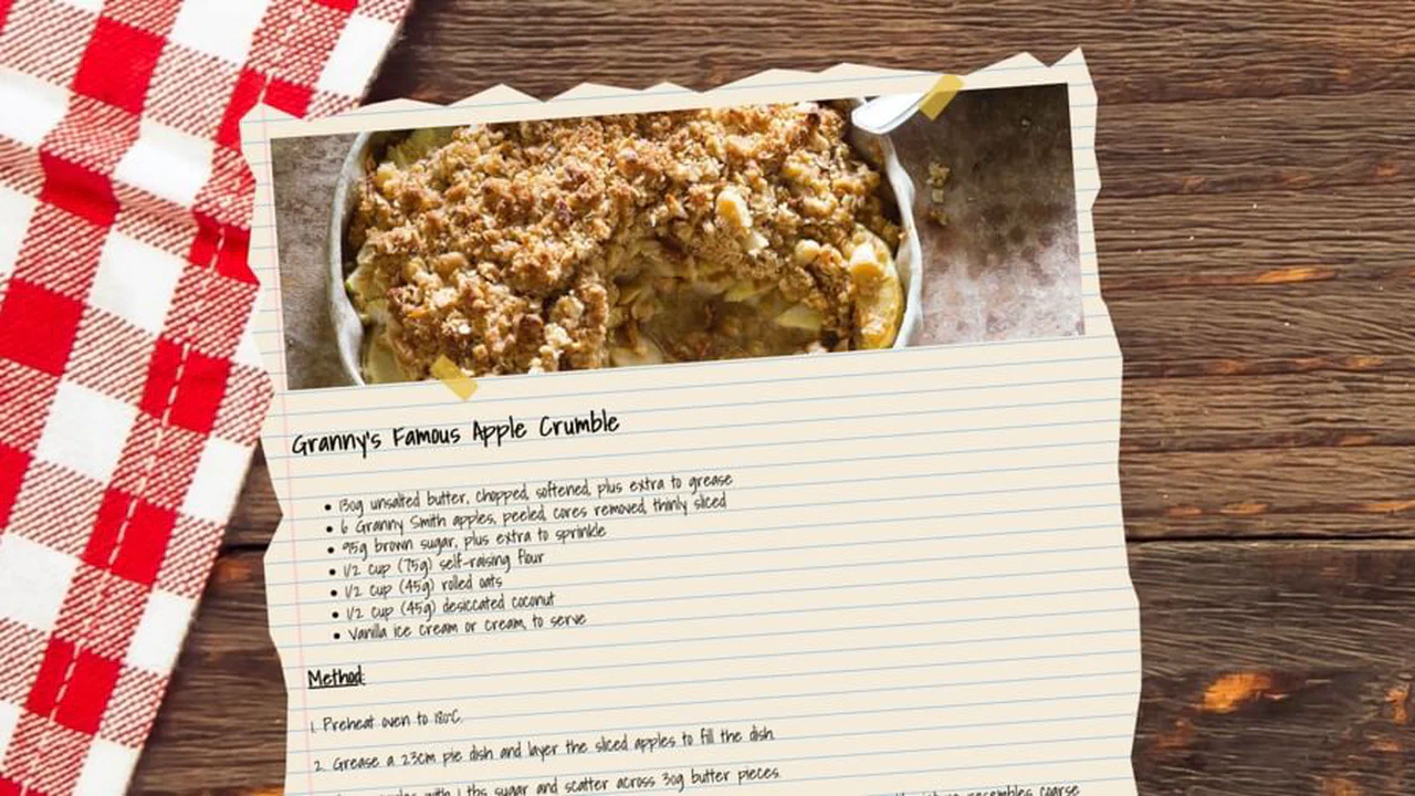
CSS Apple Crumble Recipe
Torn Paper Recipe Card simulates a handwritten recipe sheet taped onto a wooden surface. Its core feature is a massive, multi-point clip-path polygon that carves the container’s outer bounds into a jagged, torn-edge shape. Behind the text, a repeating-linear-gradient draws realistic notebook lines, while pseudo-elements model slanted yellow strips of sticky tape.
See the Pen CSS Apple Crumble Recipe.

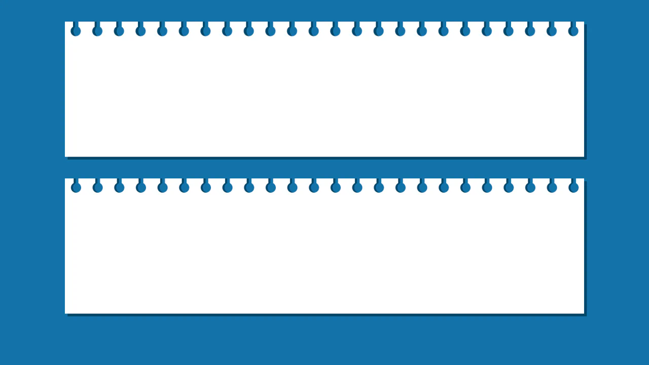
CSS Notepad Paper
Ruled Notebook Article Sheet builds a realistic document canvas shaped like notepad paper. A repeating repeating-linear-gradient is sized to a 28px unit to match a matching line-height: 28px on the body text. A double-styled margin border is set using the :after pseudo-element, while a solid :before block masks the very top row. It is a clean and lightweight typography grid layout.
See the Pen CSS Notepad Paper.

CSS Striped Paper
Stacked Paper Sheet Layout crafts a ruled paper writing canvas sitting on a messy stack of sheets. It relies on a CSS linear-gradient with relative em stops to draw repeating blue-grey lines that match text scaling. To mimic depth, two absolute pseudo-elements, rotated 2deg and -2deg respectively, sit underneath the parent container. It is a highly performant and responsive layout.
See the Pen CSS Striped Paper.
Folding Paper CSS3 Animation
3D Accordion Paper Fold replicates a tri-fold paper brochure using pure CSS. It assigns a centralized perspective: 800px to a parent container, then splits content into three sections. On hover, CSS rotateX transforms bend the sheets along adjusted transform-origin edges, while deep box-shadow overlays simulate realistic crevice lighting. It is a highly clean and tactile 3D layout.
See the Pen Folding Paper CSS3 Animation.
CSS3 Paper Effect
Ruled Calligraphy Page Layout uses CSS grid styling to build a realistic lined paper sheet. A repeating linear-gradient is sized to 1.2rem to match a matching line-height: 1.2rem on paragraph blocks, ensuring text aligns neatly on the printed lines. An absolute .marge div draws the traditional red margin line. It is a lightweight, clean demonstration of typography grid-locking.
See the Pen CSS3 Paper Effect.
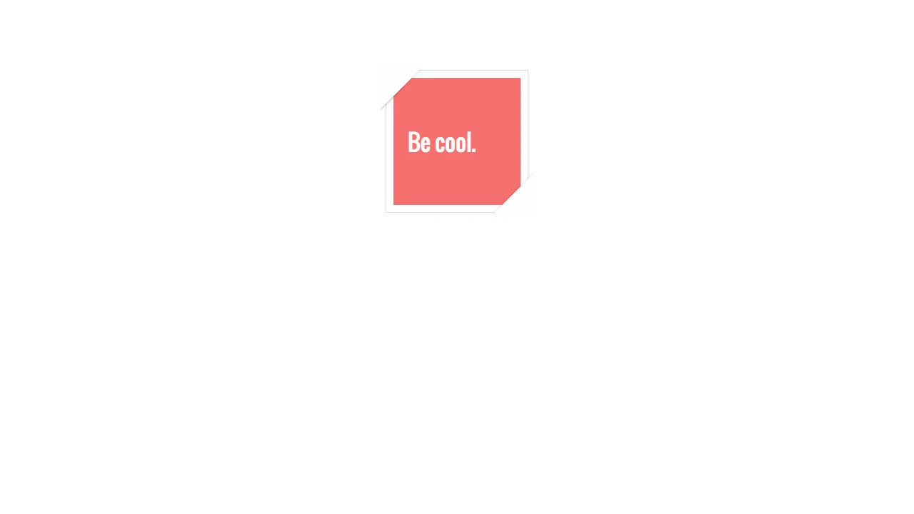
Flipped Corner Card Effect creates a minimalist, square badge with folded corners at the top-left and bottom-right. It achieves this without extra HTML elements, relying instead on ::before and ::after pseudo-elements. These blocks use massive transparent borders to render sharp triangles, which are then rotated 135deg to overlap and mask the box edges. It is a highly creative vector hack.
CSS Stacked Paper Effect
CSS Stacked Paper Effect simulates a layered, disorganized stack of parchment sheets using generated content. It positions ::before and ::after pseudo-elements behind the main .letter container, rotating them slightly with CSS transform to mimic a messy pile. On hover, the rotations transition to 0deg, aligning the stack. An inset box-shadow is used to give the papers a weathered look.
See the Pen CSS Stacked Paper Effect.
Pure CSS Paper Lift Effect
Lifted Corner Shadow Effect is a pure CSS illustration mimicking a paper sheet raised at the corners. It relies on ::before and ::after pseudo-elements positioned under the card with a z-index: -1. Skewing and rotating these elements by 5deg paired with blurred box-shadow values creates the 3D depth. On hover, transitions adjust the offsets, simulating a page being pressed flat.
See the Pen Pure CSS Paper Lift Effect.
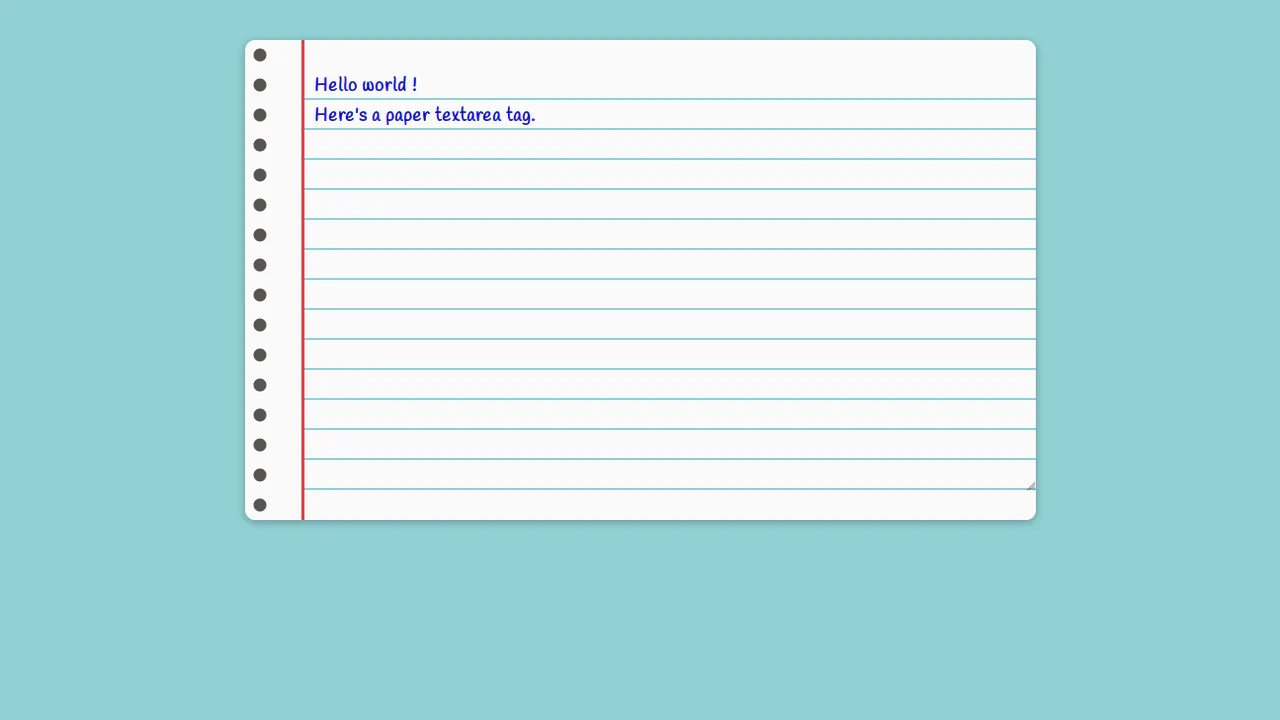
Paper Textarea
Paper Textarea Sheet crafts an editable ruled notebook page without JavaScript. It overlays a transparent <textarea> on a .paper-content container. The paper lines are generated via a CSS linear-gradient, matching the input’s line-height: 30px exactly. Binder holes are rendered using a repeating radial-gradient. It is a lightweight, purely visual typography technique.
See the Pen Paper Textarea.
CSS-Only Letter-Like Form with Inline Fields
Letter Form with Inline Fields is a pure CSS interactive form styled like ruled notebook paper. Instead of input tags, it uses inline <span> elements with contenteditable to allow typing directly on the paper lines. The ruled background is drawn using a CSS linear-gradient, while placeholders are handled via :empty:before rules pulling the data-placeholder attribute. It is highly accessible.
See the Pen CSS-Only Letter-Like Form with Inline Fields.
Lifted Paper Strips (Hover Effect)
Lifted Corner Ticket Shadows uses skew transforms and pseudo-elements to simulate curled paper edges. The .shadow:before pseudo-element sits behind the container with a rotating transform: rotate(4deg) and shadow offsets to create a 3D lifted-corner illusion, which flattens on hover. Simulated ticket holes are drawn using matching inset colors. It is a simple, lightweight layout hack.
See the Pen Lifted Paper Strips (Hover Effect).
CSS Paper Works
CSS Paper Effects and Folds showcases six distinct paper mockup techniques using pure CSS. It simulates lined sheets via repeating-linear-gradient, realistic page lifts using rotated shadow pseudoelements, and stacked papers through layered shadows. The standout feature is a 3D accordion folding effect built with nested 3D transforms. It is a highly performant, visual-only layout gallery.
See the Pen CSS Paper Works.

Paper
Editable Notepad Sheet builds a realistic, interactive writing pad without complex scripts. It applies contenteditable="true" directly to a div element, turning it into a user-editable text canvas. Ruled lines are drawn using a CSS repeating-linear-gradient, while a line-height: 32px keeps the typography aligned to each background stripe. It is highly clean and lightweight.
See the Pen Paper.