1 CSS PiP Effects: Responsive Video Overlay Snippets
CSS PiP effects replicate native Picture-in-Picture visual architectures within stylesheets, suspending fluid, floating camera views and video players above primary content layers. By coordinating absolute layout boundaries, aspect ratios, and responsive dragging frames natively, these templates present secondary media panels without introducing layout-disrupting script lag.
- Symmetrical floating bounds and responsive media ratios are structured natively using the aspect-ratio and object-fit: cover properties.
- Interactive panel dragging states and dynamic toggle expansions leverage the parent :focus-within selector to trigger GPU transitions.
- To preserve critical INP (Interaction to Next Paint) performance during high-speed dragging simulations, active offsets run on compositor layers.
Explore these responsive layout designs to master the integration of native aspect ratio metrics and highly polished, layout-stable PiP overlays into your projects.
Table of Contents:
Examples
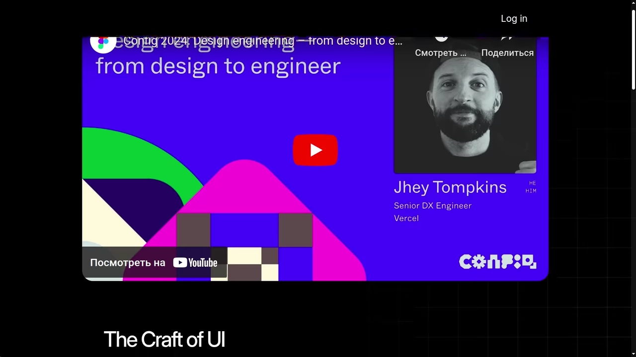
CSS @container scroll-state() Faux PiP Video
A demonstration of the current use of @container style() and scroll-state() to create context-aware UI. The key feature: the video element’s styles and animations are entirely determined not by the viewport, but by the element’s position within its parent container.
See the Pen CSS @container scroll-state() Faux PiP Video.