10+ CSS position: sticky; Examples
Context preservation is critical. This collection of CSS position: sticky; examples removes the friction of losing navigation or key data during scroll sequences. It bridges the gap between fluid content and fixed anchors, ensuring vital information remains visible without obstructing the screen. Utilizing curated snippets replaces heavy scroll-listener scripts with raw, native browser logic.
The architecture relies strictly on the position: sticky property and its containment within parent boxes. The code utilizes semantic HTML to define precise scroll thresholds and offsets. By leveraging native browser rendering, these snippets maintain high layout stability and 60fps performance without taxing the Main Thread. This approach ensures that the UI design remains reactive and transparent.
Every free demo in this updated library is fully responsive and cross-browser compatible. Users can instantly download the raw code or fork a specific layout on CodePen. These assets are strictly optimized for performance, delivering a fast, frictionless experience across all modern mobile and desktop devices where the technology serves the user directly.
Examples

Minimalist Grid Editorial Layout
This is a Minimalist Grid Editorial Layout built for digital publishing. It translates traditional Swiss print design into a responsive web format using CSS Grid. The layout utilizes asymmetric columns and deliberate negative space to establish a clear hierarchy for long-form reading.
 Chrome 88+
 Edge 88+
 Firefox 85+
 Safari 14.1+
See the Pen Minimalist Grid Editorial Layout.

Scroll-Driven Sticky Parallax Header
This is a Scroll-Driven Sticky Parallax Header. It replaces static profile headers with a deeply integrated, cinematic scrolling experience. Its function is to transform a large hero image and avatar into a compact, sticky navigation bar, using native CSS animation-timeline: scroll() to orchestrate complex parallax, scaling, and fading effects without any JavaScript. (Requires: Open Props)
Chrome 115+
Edge 115+
See the Pen Scroll-Driven Sticky Parallax Header.

Shrinking Header on Scroll without JavaScript
A smooth and performant header transformation: from tall and spacious to compact and fixed upon scrolling down, achieved entirely without JS scroll events.
See the Pen Shrinking Header on Scroll without JavaScript.

Sticky Header Calendar
A user-friendly calendar interface that functions seamlessly on both desktop and mobile devices, keeping context (time and day) constantly visible to the user, featuring both horizontal and vertical scrolling.
See the Pen Sticky Header Calendar.
Sticky Sidebar with CSS position: sticky
A pure CSS method to fix one block on the screen while its neighbor scrolls - a clear demonstration of how position: sticky works within a parent container.
See the Pen Sticky Sidebar with CSS position: sticky.
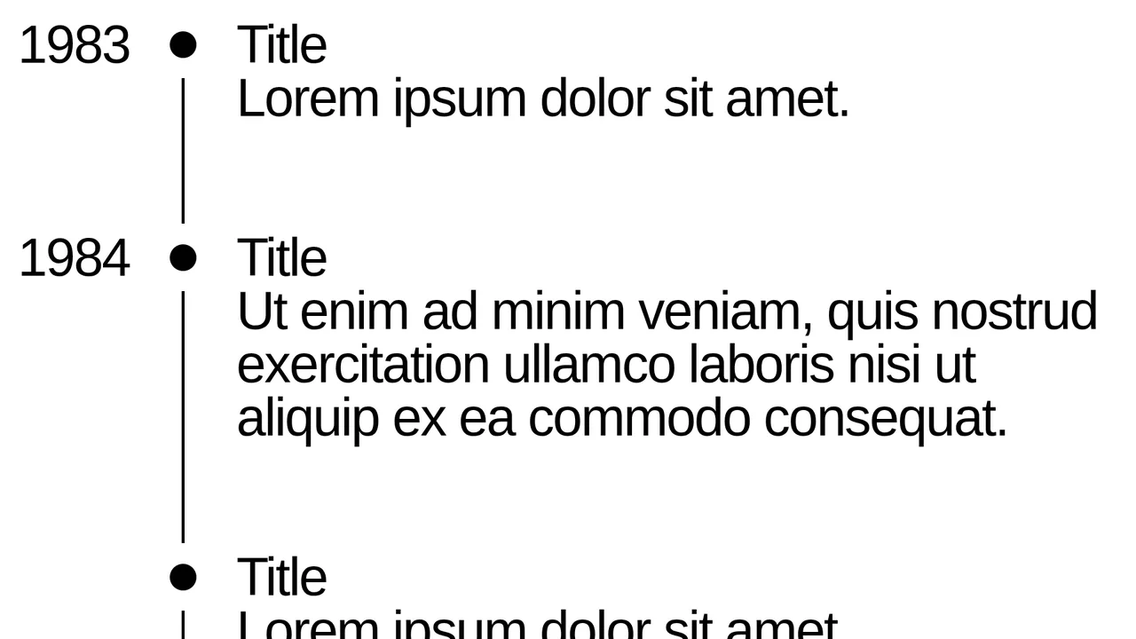
Timeline with Sticky Dates
A sleek, minimalistic timeline built with pure CSS, utilizing position: sticky to pin the year, creating a smooth and convenient scrolling experience without extra JS.
See the Pen Timeline with Sticky Dates.
Scroll progress visualization using the position: sticky property. Elements anchor to the top of the container as the user scrolls, creating a cumulative visual indicator effect. Staggered horizontal positioning via translateX provides a stepped readout without relying on JavaScript.
Alphabetical contact list interface leveraging position: sticky. Group headings (.contacts__subtitle) anchor to the top of the scrollable area, providing persistent context while navigating the list. Semantic markup using <section> and <ul> ensures accessibility and logical data structure, while minimalist CSS guarantees optimal rendering performance.
Horizontal scroll composition where title and image elements anchor relative to the viewport (position: sticky) while moving within a parent container. The use of writing-mode: vertical-lr allows for seamless integration of vertical typography into a horizontal content flow. This approach demonstrates an alternative application of the sticky property, creating a fixed-panel effect during horizontal scrolling.
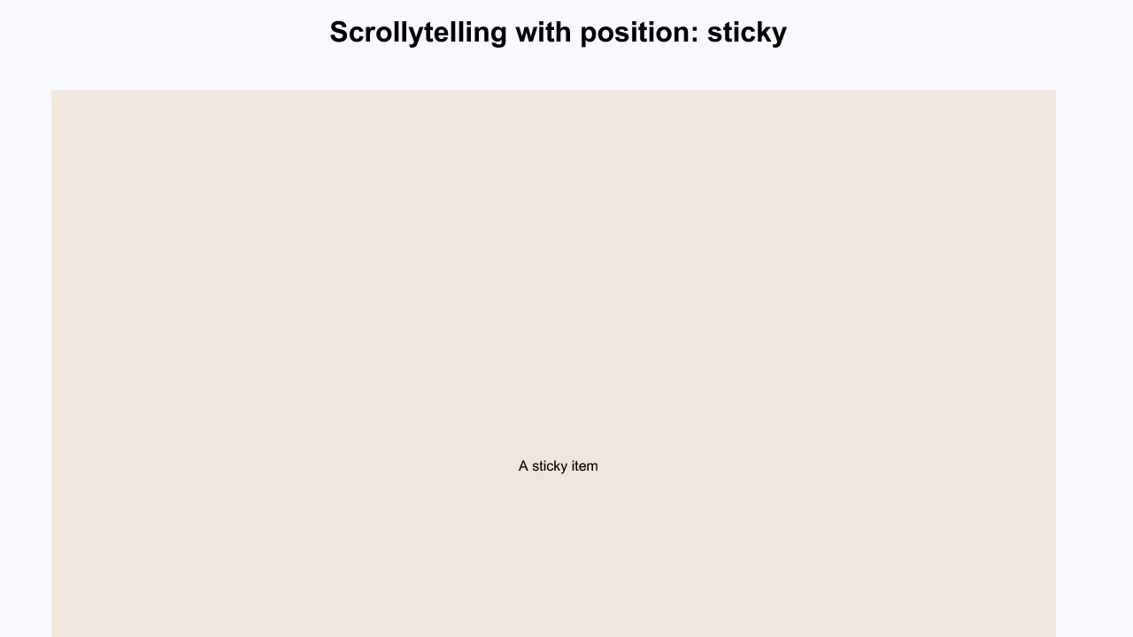
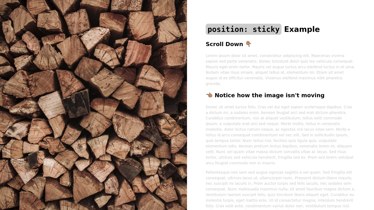
Scrollytelling implementation using pure CSS position: sticky. Visual content (figure) remains anchored in the viewport while the scrollable text block (article) traverses it. State transitions occur natively, ensuring high-performance animation without relying on JavaScript scroll listeners.
Responsive “Scrollytelling” implementation utilizing Flexbox for layout management across breakpoints and position: sticky to anchor visual elements. The setup enables seamless content transitions as text blocks scroll, transitioning to a block layout on mobile devices for improved readability. The logic relies on manipulating paragraph min-height to synchronize viewport zones with anchored elements.
Example demonstrating the position: sticky property for pinning a header within a container. The element anchors to the top of its parent area upon scrolling. This minimalist implementation provides an effective method for managing navigation or headers without JavaScript dependency.
Sticky Definition List
Sticky header implementation within a scrollable container using position: sticky. This mechanism keeps group headings (dt) anchored at the top of the viewport while the user scrolls through the corresponding list items (dd). The layout relies on CSS Grid, ensuring clean separation between markers and content without requiring complex DOM structures.
See the Pen Sticky Definition List.
