10+ CSS preserve-3d Examples
Spatial depth requires structural continuity. This updated collection of CSS preserve-3d examples removes the flat barrier of 2D planes, allowing nested elements to exist in a shared 3D space. Utilizing these curated snippets ensures that complex transformations maintain their perspective across multiple layers, bridging the gap between static content and tactile interfaces. Direct logic replaces visual flatting.
Technically, the logic relies on the transform-style: preserve-3d property to prevent the browser from flattening child elements into the plane of their parent. The code utilizes hardware acceleration to offload coordinate calculations to the GPU, ensuring a locked 60fps performance on the rendering thread. This approach maintains absolute layout stability while keeping the HTML strictly semantic and lightweight.
Every free demo in this library is fully responsive and cross-browser compatible. Users can instantly download the raw code or fork an interactive project on CodePen. These UI design assets are strictly optimized for performance, delivering a fast, transparent experience across all modern mobile and desktop devices.
Examples
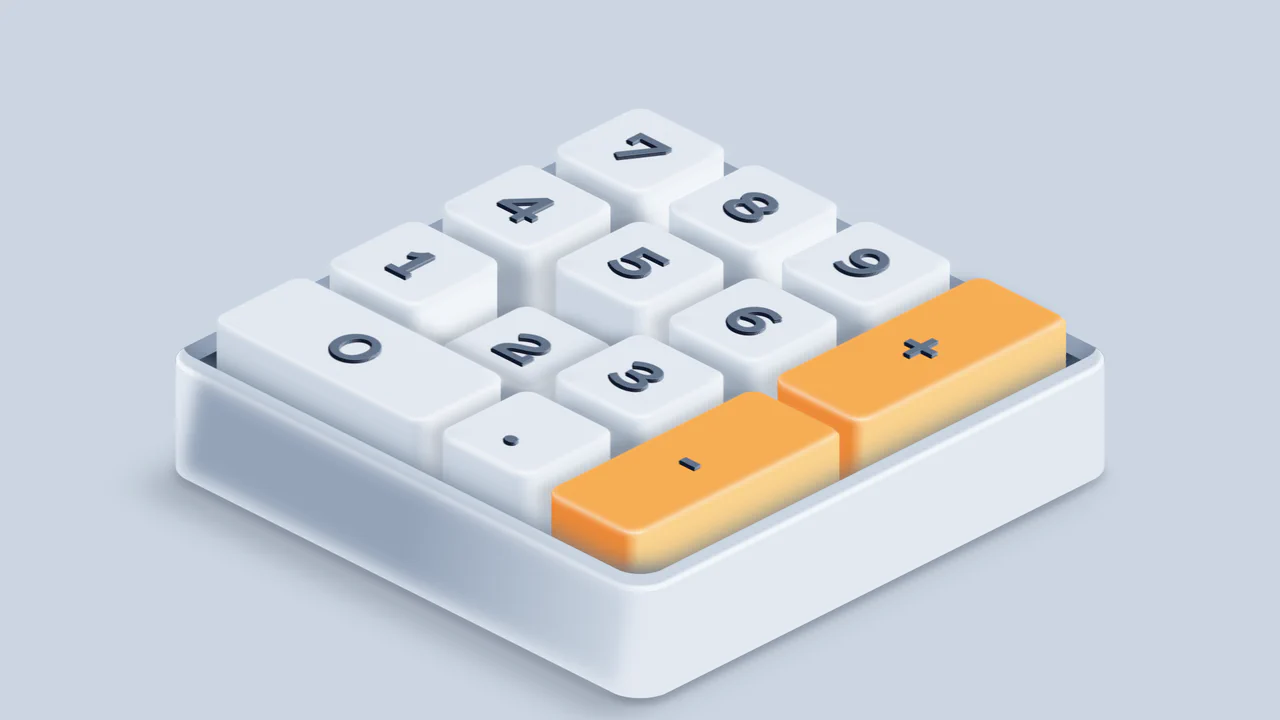
Isometric 3D Mechanical Numpad
An interactive 3D mechanical numpad built with React and SCSS. The component utilizes CSS preserve-3d and isometric rotations to render realistic, elevated keycaps with complex drop shadows and gradient highlights. Pressing physical keys on the user’s keyboard triggers synchronized visual depressions on the virtual numpad, accompanied by satisfying mechanical switch audio feedback via the HTMLAudioElement API. (Requires: react.js, react-dom.js)
 Chrome 53+
 Edge 79+
 Firefox 51+
 Safari 10+
See the Pen Isometric 3D Mechanical Numpad.
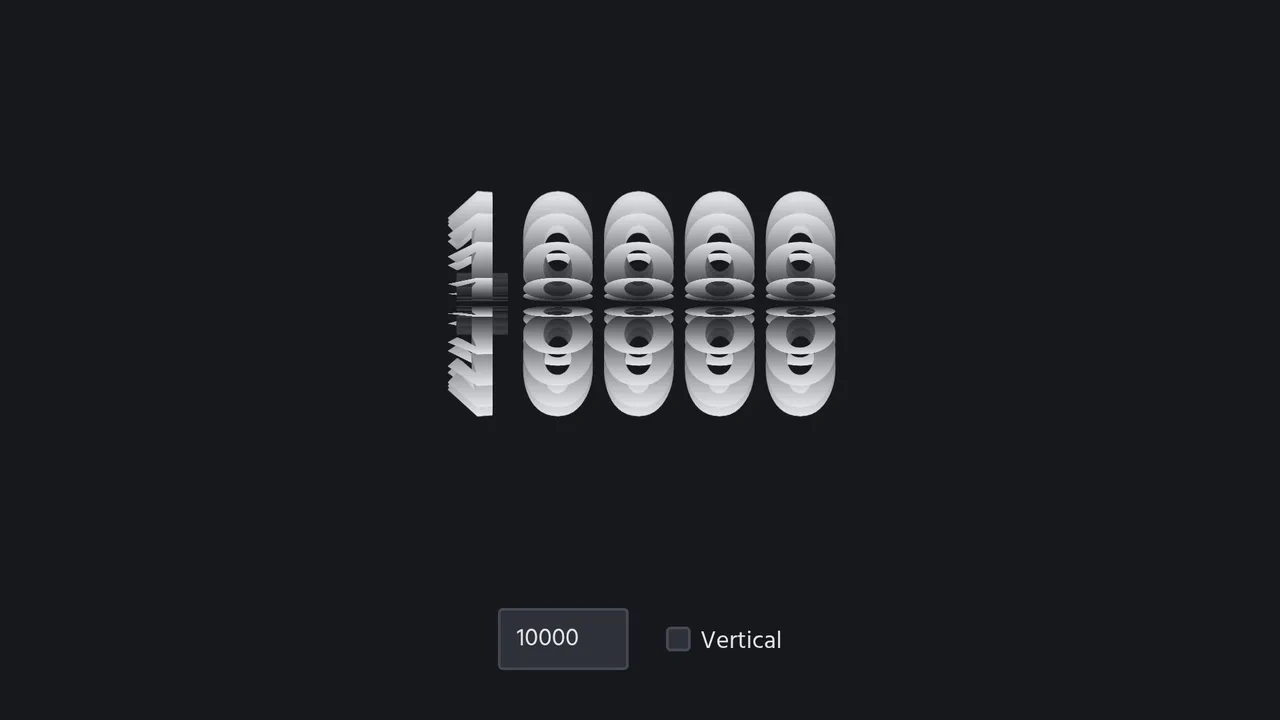
3D Spinning Typography Cylinder
An interactive 3D typography cylinder constructed using CSS preserve-3d and staggered keyframe animations. The cylinder is formed by 18 text sectors, each offset by a negative animation-delay to create a continuous spinning loop. The text features a background-clip gradient mask for a metallic sheen, while a checkbox dynamically rotates the entire assembly 90 degrees to toggle between horizontal and vertical orientations.
Chrome 36+
Edge 12+
Firefox 16+ (partial)
Safari 9+
See the Pen 3D Spinning Typography Cylinder.
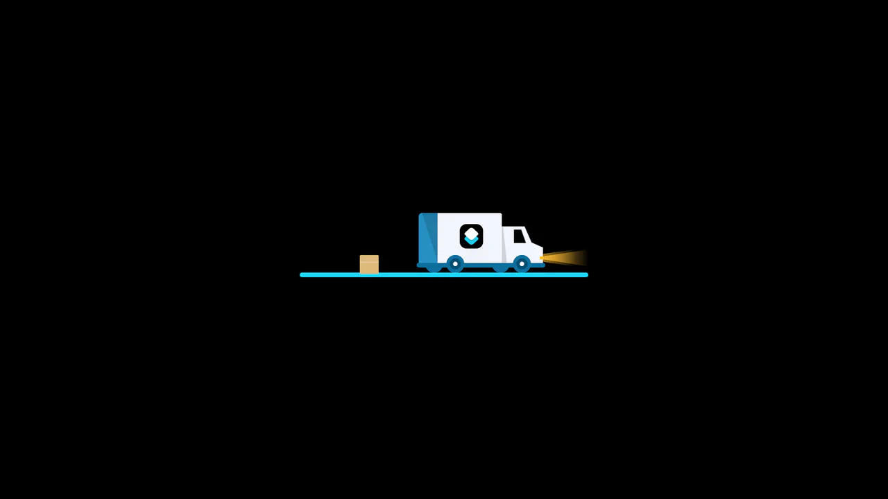
3D Truck Delivery Download Button
An advanced interactive download button featuring a complex 3D truck delivery animation. Powered by GSAP and SCSS, clicking the button triggers a 90-degree backward flip using CSS preserve-3d to convert the top edge into a flat road. A styled vector truck drives in from the left, catches a falling cargo box, departs off-screen, and flips back to reveal a success checkmark. (Requires: gsap.js)
Chrome 55+
Edge 79+
Firefox 54+
Safari 9.1+
See the Pen 3D Truck Delivery Download Button.
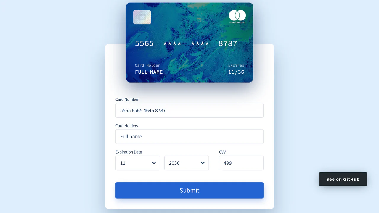
Interactive 3D Credit Card Form
An interactive credit card checkout form built with Vue.js. As users type into the input fields, the data is masked and mirrored in real-time onto a virtual 3D credit card. Focusing on different inputs triggers a dynamic highlight box that glides across the card’s surface, while entering the CVV field smoothly flips the card 180 degrees using CSS preserve-3d and backface-visibility. (Requires: vue.js)
Chrome 49+
Edge 12+
Firefox 49+
Safari 9.1+
See the Pen Interactive 3D Credit Card Form.
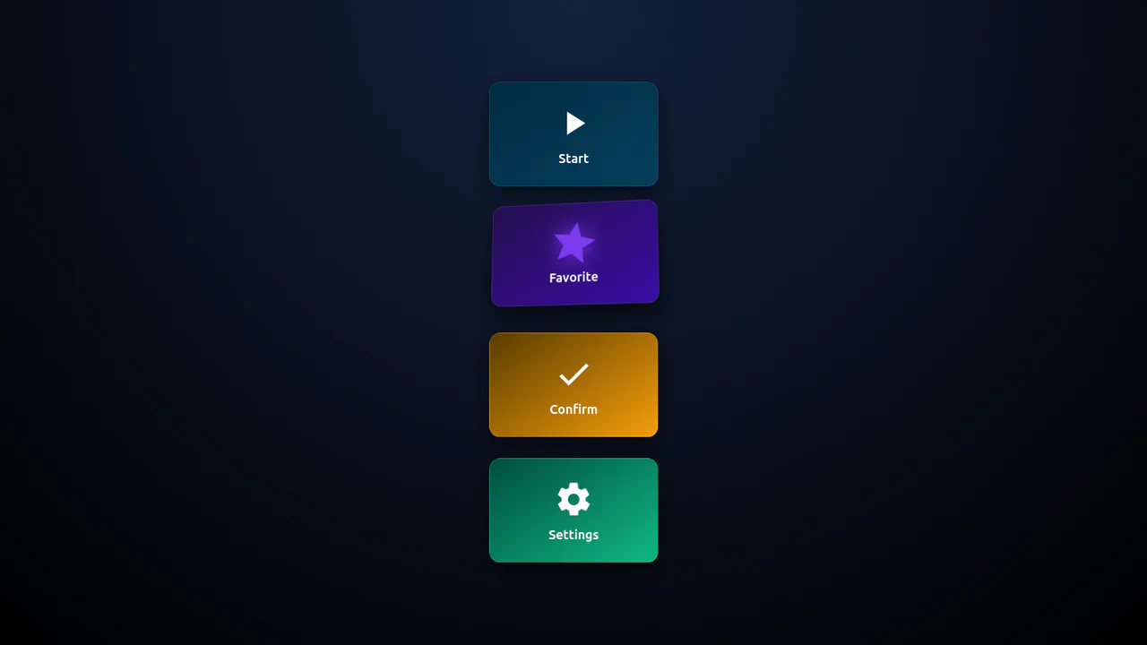
3D Isometric Neon Glow Buttons
An interactive set of 3D-perspective dashboard buttons styled with vibrant neon glowing highlights. Hovering over a card rotates its panel dynamically along the X and Y axes using native CSS preserve-3d and perspective properties, while styling the SVG icon with custom scaling and color-matched drop-shadow filters. Clicking triggers a quick, synchronized scale-pulse animation.
Chrome 57+
Edge 16+
Firefox 52+
Safari 10.1+
<main class="wrap">
  <button class="btn-3d btn-1">
    <div class="inner">
      <svg viewBox="0 0 24 24">
        <path d="M8 5v14l11-7z" />
      </svg>
      <div class="label">Start</div>
    </div>
  </button>
  <button class="btn-3d btn-2">
    <div class="inner">
      <svg viewBox="0 0 24 24">
        <path d="M12 17.27 18.18 21l-1.64-7.03L22 9.24l-7.19-.61L12 2 9.19 8.63 2 9.24l5.46 4.73L5.82 21z" />
      </svg>
      <div class="label">Favorite</div>
    </div>
  </button>
  <button class="btn-3d btn-3">
    <div class="inner">
      <svg viewBox="0 0 24 24">
        <path d="M9 16.17 4.83 12l-1.42 1.41L9 19 21 7l-1.41-1.41z" />
      </svg>
      <div class="label">Confirm</div>
    </div>
  </button>
  <button class="btn-3d btn-4">
    <div class="inner">
      <svg viewBox="0 0 24 24">
        <path d="M19.14 12.94c.04-.31.06-.63.06-.94s-.02-.63-.06-.94l2.03-1.58a.5.5 0 0 0 .12-.64l-1.92-3.32a.5.5 0 0 0-.6-.22l-2.39.96a7.025 7.025 0 0 0-1.62-.94l-.36-2.54A.5.5 0 0 0 14 2h-4a.5.5 0 0 0-.5.42l-.36 2.54c-.59.23-1.13.54-1.62.94l-2.39-.96a.5.5 0 0 0-.6.22L2.61 8.84a.5.5 0 0 0 .12.64l2.03 1.58c-.04.31-.06.63-.06.94s.02.63.06.94l-2.03 1.58a.5.5 0 0 0-.12.64l1.92 3.32c.14.24.43.34.7.22l2.39-.96c.49.4 1.03.71 1.62.94l.36 2.54a.5.5 0 0 0 .5.42h4a.5.5 0 0 0 .5-.42l.36-2.54c.59-.23 1.13-.54 1.62-.94l2.39.96c.27.11.56.02.7-.22l1.92-3.32a.5.5 0 0 0-.12-.64l-2.03-1.58zM12 15.5A3.5 3.5 0 1 1 15.5 12 3.5 3.5 0 0 1 12 15.5z" />
      </svg>
      <div class="label">Settings</div>
    </div>
  </button>
</main>
:root {
--bg: #0f1724;
--accent1: #06b6d4;
--accent2: #7c3aed;
--accent3: #f59e0b;
--accent4: #10b981;
--light: #fff;
font-family: Inter, system-ui, sans-serif;
}
body {
margin: 0;
display: flex;
align-items: center;
justify-content: center;
height: 100vh;
background: radial-gradient(circle at top, #14213d, #000);
color: var(--light);
}
.wrap {
display: grid;
grid-template-columns: repeat(auto-fit, minmax(220px, 1fr));
gap: 24px;
}
.btn-3d {
background: none;
border: none;
perspective: 1000px;
cursor: pointer;
position: relative;
}
.inner {
background: rgba(255, 255, 255, 0.05);
border: 1px solid rgba(255, 255, 255, 0.1);
border-radius: 14px;
height: 130px;
display: flex;
flex-direction: column;
align-items: center;
justify-content: center;
gap: 10px;
transform-style: preserve-3d;
transition: transform 0.4s cubic-bezier(0.18, 0.9, 0.32, 1), box-shadow 0.3s;
box-shadow: 0 10px 25px rgba(0, 0, 0, 0.5);
}
.btn-3d:hover .inner {
transform: rotateX(12deg) rotateY(-10deg) translateY(-8px);
box-shadow: 0 15px 30px rgba(0, 0, 0, 0.6);
}
.btn-3d:active .inner {
transform: translateY(2px) scale(0.97);
}
.label {
font-weight: 600;
font-size: 16px;
color: var(--light);
}
svg {
width: 50px;
height: 50px;
fill: var(--light);
transition: transform 0.6s ease, fill 0.3s ease, filter 0.4s ease;
filter: drop-shadow(0 0 0 transparent);
}

/* Accent per knop */
.btn-1 .inner {
background: linear-gradient(145deg, #022c43, #053f5e);
}
.btn-2 .inner {
background: linear-gradient(145deg, #24104f, #3a0ca3);
}
.btn-3 .inner {
background: linear-gradient(145deg, #5a3d00, #f59e0b);
}
.btn-4 .inner {
background: linear-gradient(145deg, #004d40, #10b981);
}

.btn-1:hover svg {
transform: scale(1.3) rotate(10deg);
fill: #06b6d4;
filter: drop-shadow(0 0 10px #06b6d4);
}
.btn-2:hover svg {
transform: scale(1.3) rotate(10deg);
fill: #7c3aed;
filter: drop-shadow(0 0 10px #7c3aed);
}
.btn-3:hover svg {
transform: scale(1.3) rotate(10deg);
fill: #f59e0b;
filter: drop-shadow(0 0 10px #f59e0b);
}
.btn-4:hover svg {
transform: scale(1.3) rotate(10deg);
fill: #10b981;
filter: drop-shadow(0 0 10px #10b981);
}

/* animatie bij klik */
.pulse {
animation: pulse 0.5s ease, glow 0.5s ease;
}
@keyframes pulse {
0% {
transform: scale(1);
}
50% {
transform: scale(1.25);
}
100% {
transform: scale(1);
}
}
@keyframes glow {
0% {
filter: drop-shadow(0 0 0 transparent);
}
50% {
filter: drop-shadow(0 0 14px currentColor);
}
100% {
filter: drop-shadow(0 0 0 transparent);
}
}
document.querySelectorAll(".btn-3d").forEach((btn) => {
btn.addEventListener("click", () => {
const svg = btn.querySelector("svg");
svg.classList.add("pulse");
setTimeout(() => svg.classList.remove("pulse"), 500);
});
});

Interactive 3D Floating Product Cards
This is an Interactive 3D Floating Product Card. It uses CSS spatial transforms to separate internal elements into distinct Z-axis layers upon interaction. Its function is to elevate standard e-commerce grid displays into tactile, physics-based focal points. (Requires: VanillaTilt.js)
Chrome 53+
Edge 79+
Firefox 53+
Safari 15.4+
See the Pen Interactive 3D Floating Product Cards.

Neon 3D Seven-Segment Digital Clock
This is a Neon 3D Seven-Segment Digital Clock. It procedurally generates a classic LCD/LED interface using pure CSS geometry. Its function is to provide a highly atmospheric, real-time clock that utilizes 3D space and realistic glowing floor reflections to enhance cyberpunk or dashboard aesthetics.
Chrome 60+
Edge 79+
Firefox 55+
Safari 11+
See the Pen Neon 3D Seven-Segment Digital Clock.

Tumbling 3D Cubes Animation
This is a Tumbling 3D Cubes Animation. It visualizes three interconnected, translucent cubes endlessly rolling across a grid floor in a synchronized sequence. Its function is to demonstrate complex spatial geometry and continuous kinetic motion using exclusively DOM nodes and stylesheets, replacing heavy WebGL libraries with pure CSS mathematics.
Chrome 36+
Edge 12+
Firefox 16+
Safari 9+
See the Pen Tumbling 3D Cubes Animation.
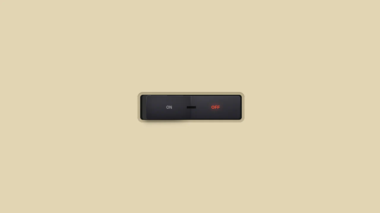
3D Toggle On/Off Switch v2
The use of gradients to create a realistic metallic effect and highlights on the button. Various types of linear-gradient and radial-gradient are applied to create a multi-layered background, and clip-path precisely clips the shapes of the pseudo-elements.
See the Pen 3D Toggle On/Off Switch v2.
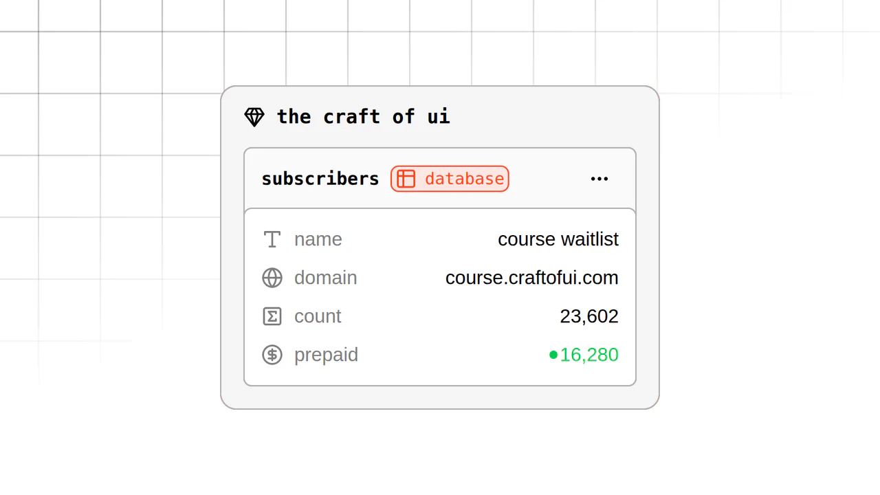
3D CSS Grid Exploding Stack
A unique layered UI experiment featuring reactive control over 3D rotations and translations via JS configuration, plus the modern View Transition API for seamless light/dark theme switching.
See the Pen 3D CSS Grid Exploding Stack.
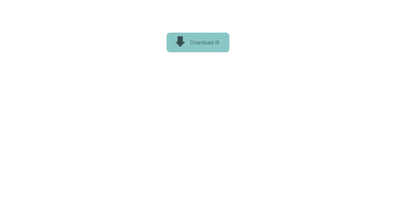
Download Button
A 3D “Download” button animation where a stylized 3D “down arrow” icon begins to orbit the button on hover. The 3D scene is created using transform-style: preserve-3d, and the rotation is handled by transform: rotateY().
See the Pen Download Button.
Particle Orb CSS
Creation of a 3D particle sphere using a single global @keyframes for container rotation and individual @keyframes, procedurally generated in a SCSS @for loop for each particle.
See the Pen Particle Orb CSS.
Quantum Project x Eedi
A 3D dot cube where each face is a separate div and the dots are nested divs. The 3D effect is achieved using transform-style: preserve-3d and perspective, with each face offset along the Z-axis by a different distance.
See the Pen Quantum Project x Eedi.
CSS 3D Text Animation
High-performance 3D text animation where each character is independently controlled using transform: rotateX/translateY. The “running wave” effect is achieved via dynamic animation delay calculated using CSS variables per character.
See the Pen CSS 3D Text Animation.