40+ CSS Progress Bars
Visualizing completion reduces user anxiety. CSS Progress Bars bridge the gap between action and result, communicating velocity and state clearly. This updated collection provides linear indicators for file uploads, scroll tracking, and task completion in modern UI design. Utilizing these curated snippets replaces static text with dynamic, tangible feedback.
These examples utilize the native HTML <progress> element and custom div structures for granular styling control. Animation states leverage hardware acceleration, targeting transform: scaleX instead of width to prevent layout thrashing. This ensures a locked 60fps frame rate on the compositor thread. Pseudo-elements (::before, ::after) generate indeterminate states and striped textures without adding extra DOM nodes.
Every free demo is fully responsive and cross-browser compatible. Users can instantly download the raw code or fork a specific loader on CodePen.
Examples
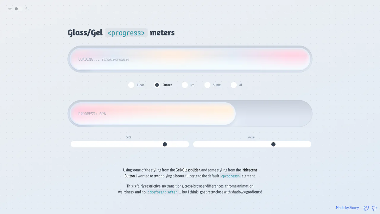
Glossy Glassmorphic Native Progress Meters
An advanced styling demonstration showing how to convert native <progress> elements into gorgeous glassmorphic ‘gel’ meters. Using native webkit and gecko pseudo-elements combined with oklch gradients, radial lighting masks, and @property Houdini variables, it builds high-performance indeterminate loading animations and responsive color themes with completely clean, semantic markup.
 Chrome 111+
 Edge 111+
 Firefox 128+
 Safari 16.4+
See the Pen Glossy Glassmorphic Native Progress Meters.

Neumorphic Loader
A tactile Neumorphic progress indicator where JavaScript drives the animation state by updating a custom property --progress. The visual logic relies on CSS conic-gradient utilizing calculated color stops to dynamically render the filling arc, while complex layered box-shadow creates a soft, extruded 3D aesthetic.
See the Pen Neumorphic Loader.

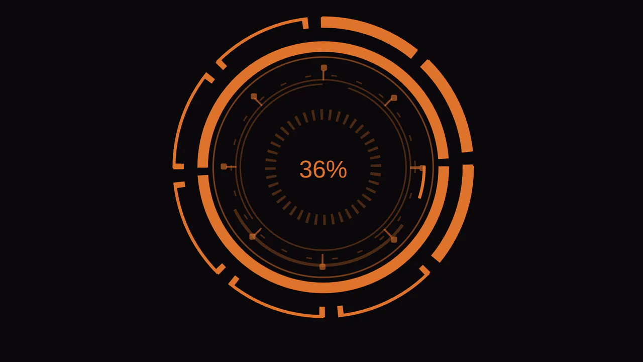
Single Element Progress
Elegant, segmented radial charts that smoothly fill upon page load, showcasing the capabilities of modern CSS without JavaScript.
See the Pen Single Element Progress.
Stylish Animated SHD Loader
A stylish animated loading indicator created using SVG masks and CSS @keyframes animations. It effectively uses setInterval in JavaScript to smoothly update the progress, showcasing an elegant and performant solution.
See the Pen Stylish Animated SHD Loader.
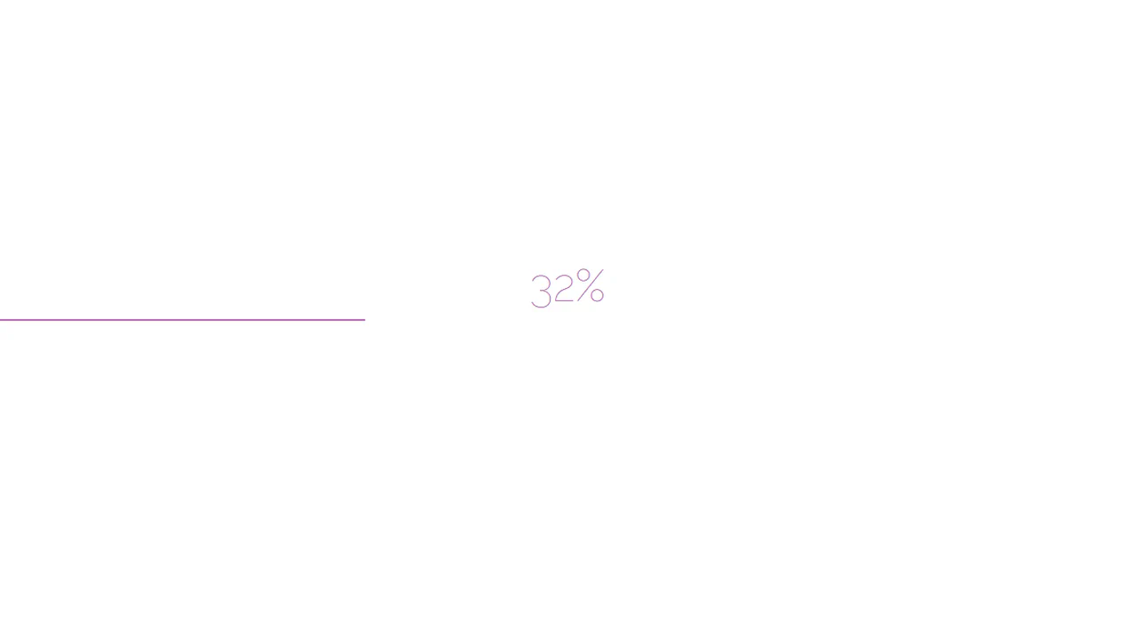
An advanced SCSS technique - the percentage counter animation up to 100% is generated using a @for loop. It demonstrates dynamic content changes and multi-step @keyframes to create a realistic loading process.
A scroll progress indicator effect created with a clever CSS trick - a massive box-shadow with a negative offset on ::-webkit-scrollbar-thumb creates the illusion of filling the traversed track as you scroll.
Pure CSS animated progress bar. On load, inner block expands from 0 to 68% via @keyframes. White shadow creates glow effect. Container with transparent background and rounded corners.
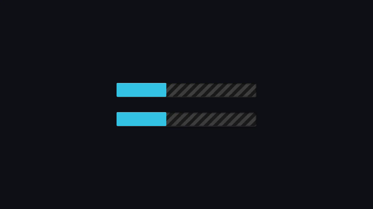
Animated striped loader with infinite motion. Repeating linear gradient at 45° creates diagonal stripes. Background shifts on X-axis, creating moving belt effect. CSS variables control width and speed.
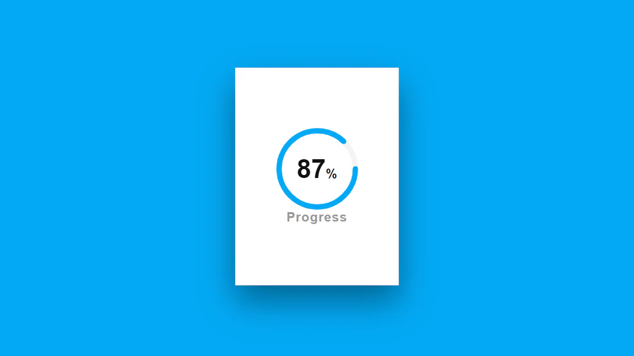
SVG circular progress indicator. Two circle layers: gray background and blue fill. Stroke length calculated via stroke-dashoffset from total circumference. 87% number centered on top.
Interactive radial progress bar in CSS. Conic gradient fills circle from start to end color. Mask cuts inner hole. Slider via JavaScript updates CSS variable --progress.

Skill card with circular progress indicator. Outer circle — gray background, inner — green fill via stroke-dashoffset. On hover, number scales up and turns white, card lifts up.
Animated progress bar with color change. :after pseudo-element expands from 0 to 100%, simultaneously changing background via keyframes. Page background pulses synchronously with loading bar.
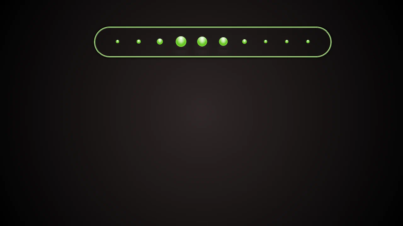
Internet speed indicator built from CSS Grid blocks. Border formed by dark cells, inner green segments appear with delay, simulating filling. Last segment blinks infinitely, symbolizing “loading”.
Progress bar built from twelve animated segments. Each appears with delay, creating sequential filling effect. Gradient and edge rounding add depth. SCSS loop generates delays for each element.


