110+ CSS Pseudo-Element Examples
Structural purity defines efficient interfaces. This updated collection of CSS pseudo-elements removes the need for empty wrapper divs, bridging the gap between content and decoration. Utilizing these snippets ensures a lightweight DOM, allowing raw logic to dictate visual enhancements without cluttering the HTML.
The logic focuses on ::before and ::after for decorative overlays and ::selection for tailored interactions. By keeping decorative layers outside the main document flow, these snippets maintain absolute layout stability. Motion-driven effects leverage hardware acceleration to ensure 60fps performance on the compositor thread. Semantic HTML remains preserved.
Every free demo is cross-browser compatible and responsive. Users can instantly download the raw code or fork a project on CodePen. These UI design assets are optimized for performance across all modern mobile and desktop devices.
Examples
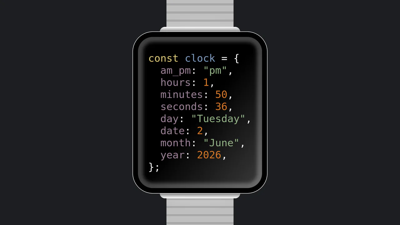
JavaScript Object Smartwatch Concept
JavaScript Object Smartwatch Concept turns a standard digital clock into a clever developer joke. The UI mimics an Apple Watch using pure CSS (box-shadow for the bezel, linear-gradient for the strap). Inside, JavaScript’s requestAnimationFrame continuously updates a formatted string, rendering the current time and date as a syntax-highlighted JS object. A fun, lightweight snippet for developer portfolios.
 Chrome 4+
 Edge 12+
 Firefox 2+
 Safari 3.1+
See the Pen JavaScript Object Smartwatch Concept.
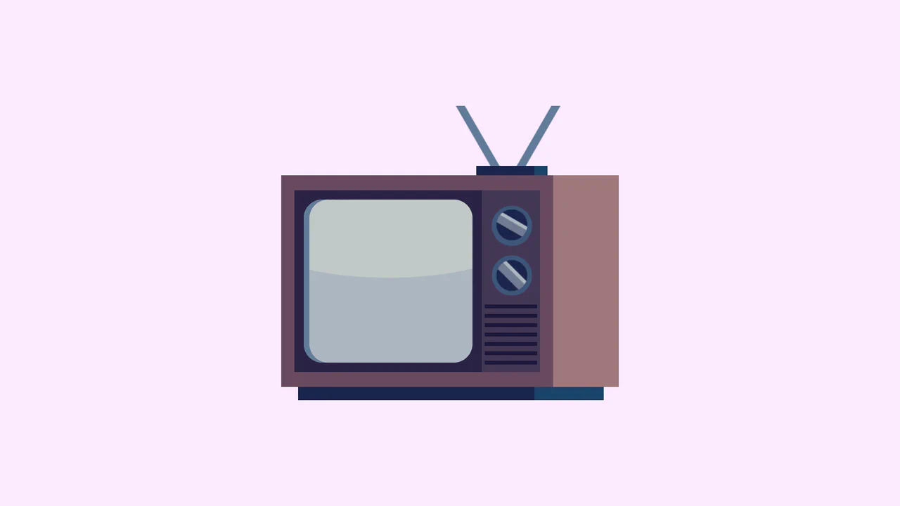
Single Div Vintage TV CSS Illustration
Single Div Vintage TV CSS Illustration is a masterclass in CSS gradient art. Using only one div and its ::before/::after pseudo-elements, it renders a retro television set. The body, screen, antenna, and speaker grill are meticulously drawn using layered linear-gradient, radial-gradient, and repeating-linear-gradient. The mask-image property is cleverly used to carve out the control knobs. A brilliant example of pushing CSS drawing to its limits.
Chrome 53+
Edge 79+
Firefox 53+
Safari 15.4+
See the Pen Single Div Vintage TV CSS Illustration.
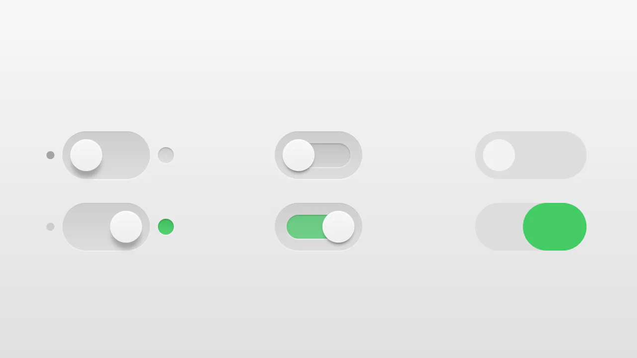
Realistic 3D CSS Toggle Switches
“Realistic 3D CSS Toggle Switches” showcase three distinct switch variations using the classic checkbox hack. Built entirely without JavaScript, they rely on CSS box-shadow and linear-gradient to create tactile, 3D inset depths. State changes are smoothly animated via transition on pseudo-elements. A lightweight, robust solution for adding polished micro-interactions to forms.
Chrome 26+
Edge 12+
Firefox 16+
Safari 6.1+
See the Pen Realistic 3D CSS Toggle Switches.
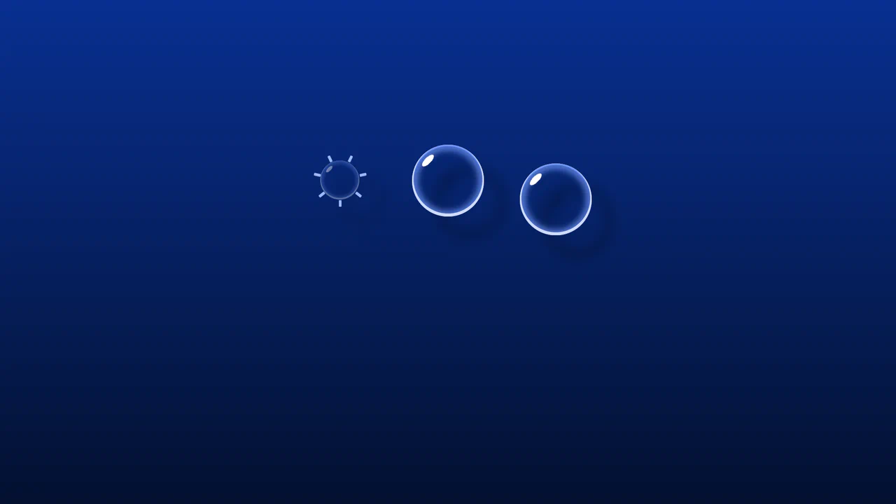
Whimsical CSS Bubble Preloader
Whimsical CSS Bubble Preloader is a pure CSS animation that simulates rising bubbles that pop and scatter tiny droplets. Using HTML layout without JavaScript, it relies entirely on staggered @keyframes delays, absolute positioning, and math-based rotations via :nth-child. Radial gradients generate realistic reflections, while drop-shadow adds depth. A smart choice for lightweight, playful interfaces, though the dense DOM structure for droplets might feel redundant for some.
Chrome 52+
Edge 15+
Firefox 49+
Safari 9.1+
See the Pen Whimsical CSS Bubble Preloader.
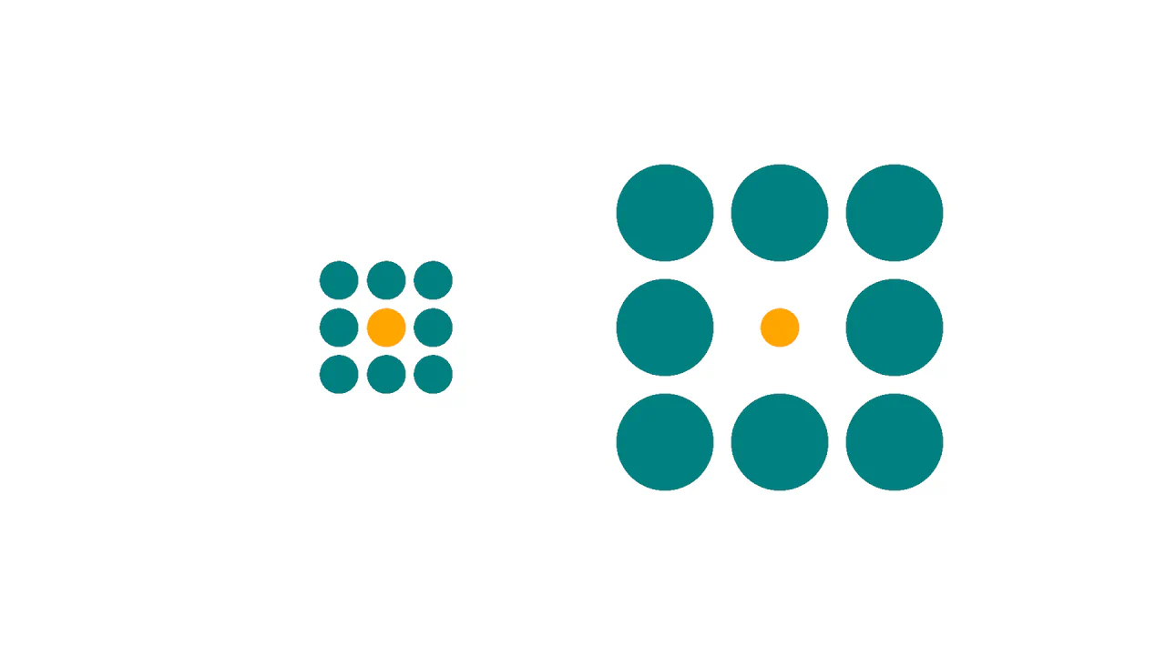
Ebbinghaus Illusion
This is a Pure CSS Ebbinghaus Optical Illusion. It uses mathematically sized radial gradients on a single element to trick the brain into perceiving two identical circles as different sizes. Its function is to provide an interactive, visual “gotcha” moment, demonstrating how relative scale affects human perception, revealed instantly via a smooth hover transition.
Chrome 112+
Edge 112+
Firefox 112+
Safari 16.5+
See the Pen Ebbinghaus Illusion.

Slingshot Elastic Stretch Toggle
The Slingshot Elastic Stretch Toggle is an experimental UI switch that utilizes exaggerated spatial movement to signal state changes. It replaces the standard sliding thumb with a “dual-handle” system that appears to shoot across the viewport using a high-velocity slingshot effect. Its function is to provide an high-energy alternative to traditional toggles, making a simple boolean selection feel like a physical, kinetic event.
Chrome 86+
Edge 86+
Firefox 85+
Safari 15.4+See the Pen Slingshot Elastic Stretch Toggle.

Iridescent 3D Neumorphic Button
This is an Iridescent 3D Neumorphic Button. It pushes CSS styling to the limit, using stacked gradients, oklch color spaces, and advanced blend modes to create a button that feels like a piece of polished, translucent hardware. Its function is to serve as a high-fidelity “Hero” element, delivering a tactile, light-responsive experience that feels alive under the cursor.
Chrome 105+
Edge 105+
Firefox 121+
Safari 15.4+
See the Pen Iridescent 3D Neumorphic Button.

Responsive Two-Column Timeline
This is a Responsive Two-Column Timeline. It transforms list-based historical data into a structured, alternating visual path. Its function is to allow users to navigate chronological content with ease, using a centralized vertical bar to guide the eye while images and text blocks oscillate between left and right columns.
Chrome 80+
Edge 80+
Firefox 75+
Safari 13+
See the Pen Responsive Two-Column Timeline.

CSS :has() Notification Toggle
This is a CSS :has() Notification Toggle. It provides a fully functional, state-aware UI switch for settings panels without a single line of JavaScript. Its function is to allow the user to toggle a binary state (notifications on/off) and have the entire UI — including icons, labels, and descriptive text — update instantly based purely on the state of a hidden checkbox.
Chrome 105+
Edge 105+
Firefox 121+
Safari 15.4+
See the Pen CSS :has() Notification Toggle.

Frameless Blurred Background Image Effect in CSS
This is a Frameless Blurred Background Image Effect. It uses an innovative CSS technique to generate a soft, atmospheric background for an image by duplicating, stretching, and blurring the image itself. The function is to create a polished, “pro” look for profile pictures or product thumbnails without requiring image editing software or complex JavaScript canvas manipulations.
Chrome 15+
Edge 12+
Firefox 15+
Safari 6+
See the Pen Frameless Blurred Background Image Effect in CSS.
Sliding Line Hamburger Menu Animation
This is a Sliding Line Hamburger Menu Animation. It reinvents the standard three-bar toggle by using internal pseudo-element sliding instead of simple opacity changes. Its function is to provide a high-end, staggered interaction that signals navigation states with mechanical precision.
Chrome 26+
Edge 12+
Firefox 16+
Safari 7+
See the Pen Sliding Line Hamburger Menu Animation.

Pure CSS Retro Arcade Machine
This is a Pure CSS Retro Arcade Machine. It constructs a highly detailed, nostalgic gaming cabinet entirely out of HTML nodes and CSS styling. Its function is to showcase the power of CSS as an illustrative medium, replacing static raster images or SVGs with resolution-independent, scalable code.
Chrome 69+
Edge 79+
Firefox 83+
Safari 12.1+
See the Pen Pure CSS Retro Arcade Machine.

CSS Scroll-Animated Accordion Vertical Timeline
This is a Scroll-Animated Bootstrap Accordion Timeline. It structures sequential data into a central vertical axis, combining visual anchor points (images) with collapsible text modules (accordions). Its function is to compress dense historical or process-oriented information into a scannable format. Nodes remain hidden until scrolled into the viewport, forcing user focus on the active temporal step. (Requires: bootstrap, font-awesome)
Chrome 115+
Edge 115+
Firefox 114+ (flag)
Safari 26+
See the Pen CSS Scroll-Animated Accordion Vertical Timeline.

Modern CSS Star Rating Component
This Modern CSS Star Rating Component represents a major shift in UI development, moving complex logic from JavaScript to pure CSS. It utilizes the powerful :has() selector to track sibling states, allowing the UI to highlight stars both before and after the interaction point. The stars themselves are created using clip-path instead of bulky SVG icons, resulting in a lightweight, scalable, and highly performant rating system.
Chrome 105+
Edge 105+
Firefox 121+
Safari 15.4+
See the Pen Modern CSS Star Rating Component.

Split Staggered Reveal Cards
This Split Staggered Reveal Card creates a dramatic, cinematic effect suitable for portfolios or featured content sections. Upon interaction, the background image recedes while two semi-transparent overlays slide in to create a high-contrast backdrop. Simultaneously, the title and description animate in with a precise staggered delay - letters for the title and words for the paragraph - powered by CSS variables. (Requires: Splitting.js)
Chrome 88+
Edge 88+
Firefox 87+
Safari 14+See the Pen Split Staggered Reveal Cards.

Stylish Highlighter Link Hover Animation
This Highlighter Link Hover Effect provides a sophisticated micro-interaction for inline text links, moving beyond the standard static underline. By default, the link is covered by a soft, semi-transparent background fill; upon hovering, this “highlighter” block collapses into a thin underline while a directional arrow slides in from the right.
Chrome 36+
Edge 12+
Firefox 16+
Safari 9+
See the Pen Stylish Highlighter Link Hover Animation.

Pure CSS ASCII File Tree
This Pure CSS ASCII File Tree brings the nostalgia of command-line directory structures to the web without typing a single pipe character manually. By cleverly utilizing CSS pseudo-elements (::before), it automatically draws the connecting lines (│, ├, └) for nested lists. It’s perfect for technical documentation, sitemaps, or retro-themed interfaces.
Chrome 4+
Edge 12+
Firefox 3.5+
Safari 3.1+
See the Pen Pure CSS ASCII File Tree.
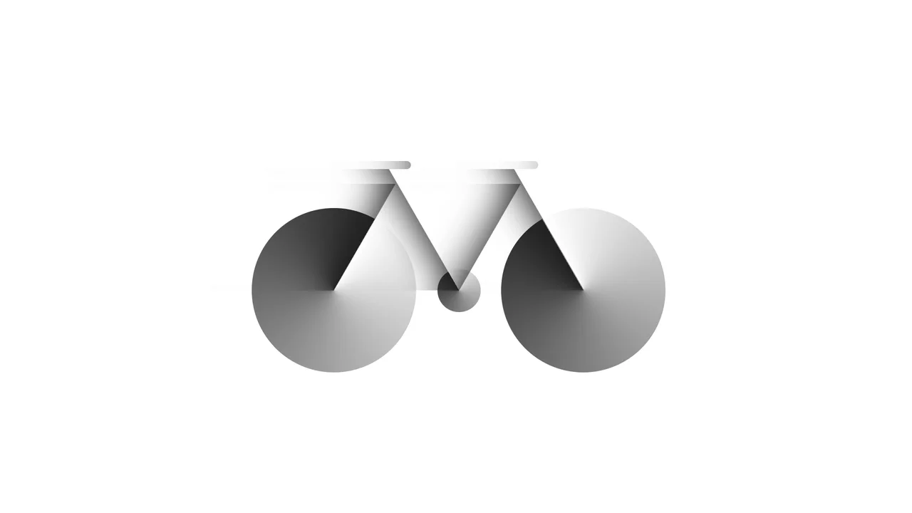
Bicycle
A pure CSS bicycle illustration constructed from geometric primitives using absolute positioning and vmin units for responsiveness. conic-gradient simulates wheel spokes, transform: skewX shapes the frame, and inset box-shadow adds depth, while pseudo-elements efficiently duplicate components like wheels.
See the Pen Bicycle.

Dipper Pines from Gravity Falls
A pure CSS character illustration of Dipper Pines, constructed from geometric primitives using absolute positioning and vmin units for responsiveness. The design leverages border-radius, transform, clip-path masking, and pseudo-elements to shape detailed features like the signature pine tree hat and hair, all styled with CSS variables and a custom web font.
See the Pen Dipper Pines from Gravity Falls.
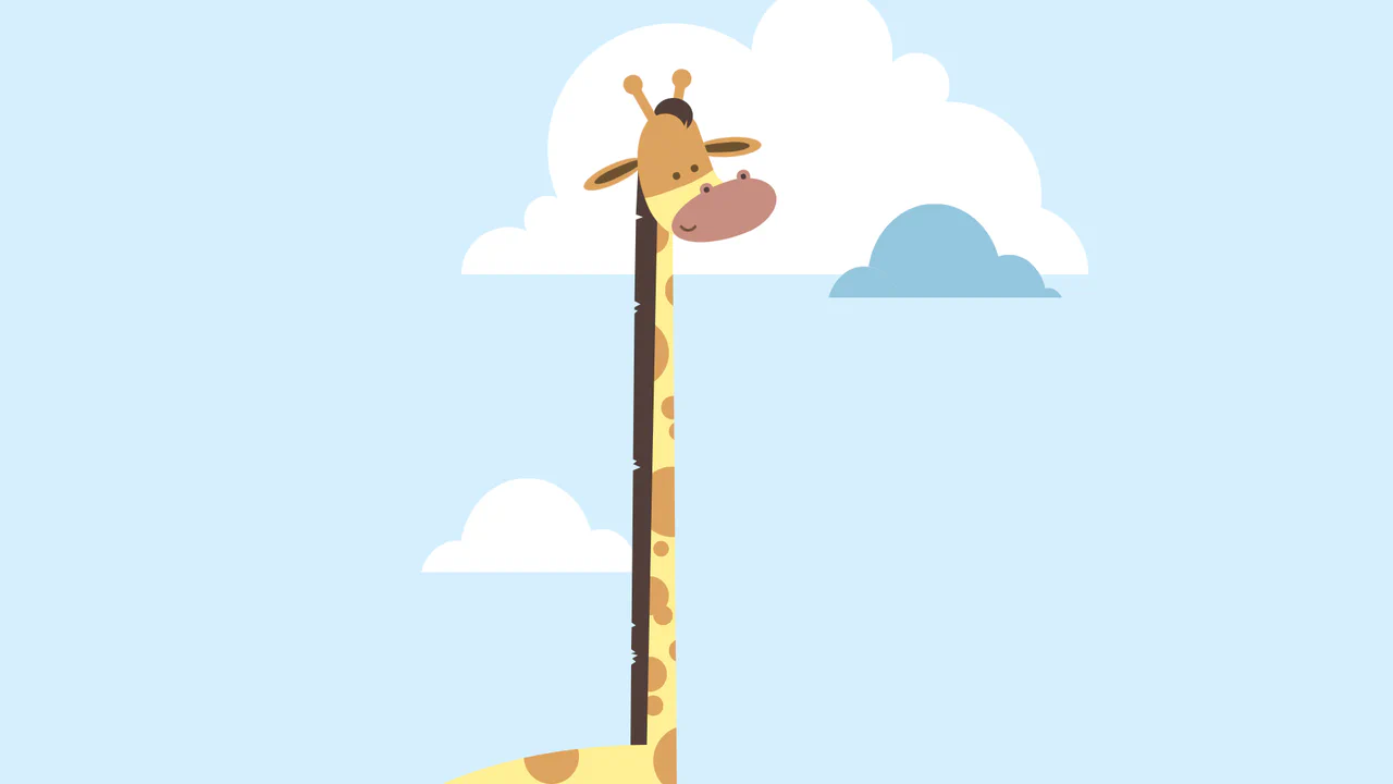
Giraffe
A pure CSS cartoon illustration of a giraffe constructed from geometric primitives using absolute positioning. It leverages box-shadow for efficient pattern repetition (spots, clouds), clip-path for complex shapes like the mane, and CSS variables for a consistent pastel color palette.
See the Pen Giraffe.

Profile CSS Drawing
A stylish, detailed vector-style portrait with depth and shadows, fully implemented using pure CSS gradients and clipping paths.
See the Pen Profile CSS Drawing.

Nested List Style
An elegant, modern list of track properties featuring custom graphic icons and smooth micro-interactions like padding shifts and color changes on hover.
See the Pen Nested List Style.

OST Tree
A pure CSS tree diagram constructed from nested lists where pseudo-elements with borders form the connecting branches.
See the Pen OST Tree.
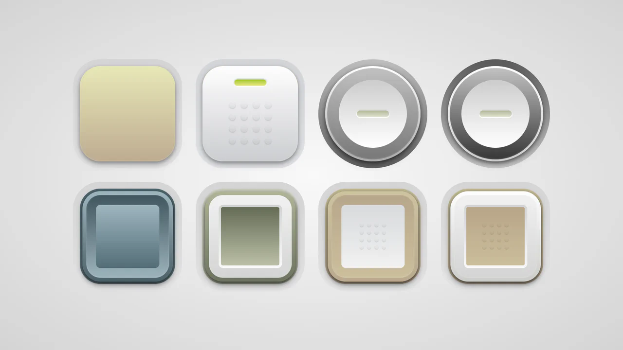
Soft Button Styling
A collection of skeuomorphic buttons rendered entirely in CSS using complex gradient layering and calc()-driven geometry variables.
See the Pen Soft Button Styling.
Up Arrow
A rectangular button smoothly shrinks into a circle, the text fades out, and an upward-pointing arrow begins to cyclically rise within it.
See the Pen Up Arrow.

Little Details
A stylized nested to-do list employing advanced CSS pseudo-elements for custom markers and hover-based reveal logic for sub-tasks. JavaScript handles basic DOM manipulation for adding/removing items, while the dark UI features gradient borders and tooltip interactions.
See the Pen Little Details.

Pure CSS Entity Visualizer
An automated text annotation interface powered by Sass loops that visualizes semantic entity types using pseudo-elements and data attributes.
See the Pen Pure CSS Entity Visualizer.

Kinetic CSS Loader
A smooth, rhythmic, and mesmerizing loader that looks complex but is implemented simply and efficiently.
See the Pen Kinetic CSS Loader.

Skull Toggle (CSS)
A playful skeleton toggle switch animated purely with CSS. The skull handle slides via @keyframes triggered by the :checked state, while a complex hand assembly - constructed from gradients and box-shadows - slides in to “push” the toggle, creating a whimsical, interactive narrative without JavaScript.
See the Pen Skull Toggle (CSS).

List Styles
An aesthetically pleasing, modern todo list featuring a vibrant gradient theme and an intuitive hierarchy creation function without complex control buttons.
See the Pen List Styles.