4 CSS Radio Hacks: Free Code Snippets & Examples
The radio hack is a CSS architecture pattern that replaces JavaScript state management with native form element behavior — hidden radio inputs control which content panel is visible through the :checked pseudo-class and sibling combinators.
- Each state option maps to a hidden
<input type="radio">with the samenameattribute, ensuring mutual exclusivity — only one radio can be checked at a time, which drives the visible panel through the:checked ~ .panelcombinator. - Content panels are stacked with
position: absoluteand toggled viaopacityandz-indexbased on which radio is:checked, keeping all panels in the DOM while showing only the active one. - Semantic HTML with
<fieldset>and<legend>ensures screen readers understand the radio group, while<label>elements withforattributes provide click target accessibility for the hidden inputs.
Browse the collection to find a radio hack pattern that fits your component needs — from tabbed interfaces with content panels to image sliders that advance through radio states.
Table of Contents:
Examples
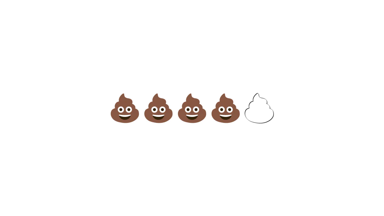
Emoji Poop Rating Component
A humorous take on the classic 5-star rating component, replacing stars with poop emojis. The layout utilizes flex-direction: row-reverse combined with the CSS general sibling combinator (~) to highlight all preceding emojis on hover or selection without JavaScript. Inactive emojis are styled using filter: contrast(0) brightness(2) to appear as blank outlines.
 Chrome 53+
 Edge 79+
 Firefox 35+
 Safari 9.1+
See the Pen Emoji Poop Rating Component.

E-Commerce Product Viewer
This is a CSS-Only E-Commerce Product Viewer. It implements a fully functional product configurator — including color variant swapping, synchronized background theme changes, and an interactive details accordion — without a single line of JavaScript. Its function is to demonstrate complex UI state management and immediate visual feedback using native CSS capabilities.
Chrome 43+
Edge 12+
Firefox 16+
Safari 9+
See the Pen E-Commerce Product Viewer.

Smart Home Lighting Multi-State Switch
A minimalist dimmer slider that increases brightness (white bar width) with each click and resets to off after reaching the maximum level.
See the Pen Smart Home Lighting Multi-State Switch.
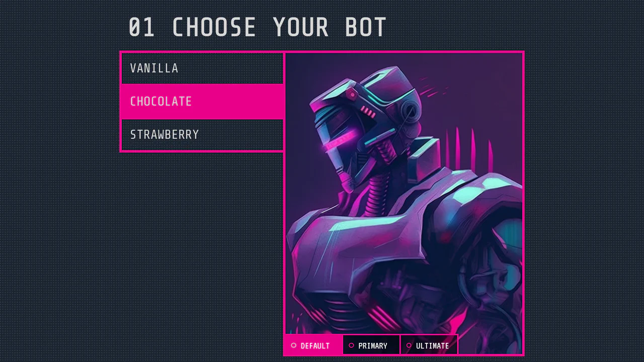
Radio Button Selector
A sci-fi character selector utilizing the CSS ‘Radio Button Hack’ for state management. While Vue.js handles data binding, the visual logic relies entirely on sibling combinators and :checked to toggle visibility and opacity, creating a seamless grid-based UI.
See the Pen Radio Button Selector.