40+ CSS Range Sliders
Granular control requires precision. Standard inputs create friction between intent and outcome. This updated collection of CSS range slider examples provides essential blocks for modern UI where function dictates the design. Using curated snippets removes the visual noise of browser defaults, making the interaction between the user and the screen transparent.
Logic relies on semantic HTML <input type="range"> and vendor-specific pseudo-elements like ::-webkit-slider-runnable-track and ::-moz-range-thumb. Transitions leverage hardware acceleration, animating properties like transform to ensure 60fps performance on the rendering thread. This approach maintains high layout stability and eliminates input latency by offloading tasks to the GPU.
Every free demo is responsive and cross-browser compatible. Users can instantly download the raw code or fork an updated project on CodePen.
Examples
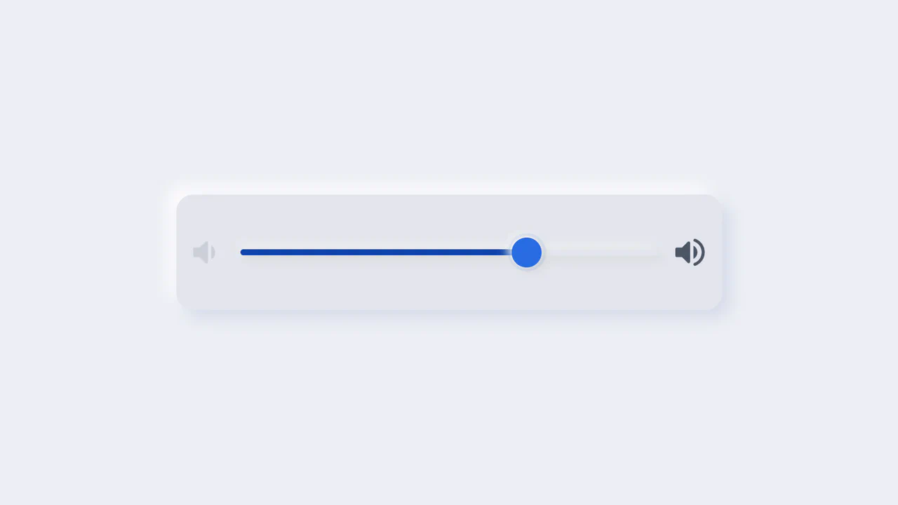
Neumorphic Volume Slider with Ripple Glow
An elegant neumorphic volume slider featuring an active thumb focus glow and directional icon highlights. Built with a single native range input and styled with modern CSS Custom Properties, it implements the Houdini @property API to transition colors smoothly across sliding states. Dragging shifts opacity focus to the corresponding volume icon based on directional vector calculations in pure CSS.
 Chrome 85+
 Edge 85+
 Firefox 128+
 Safari 16.4+
See the Pen Neumorphic Volume Slider with Ripple Glow.
Interactive CSS Tear Strip Animation
Interactive CSS Tear Strip Animation simulates the satisfying physical action of tearing open a cardboard package. It cleverly uses an invisible <input type="range"> linked to the CSS Scroll-Driven Animations API (animation-timeline: --thumb). As the user drags the slider, CSS variables dynamically update clip-path, box-shadow, and transform properties to reveal the content beneath while curling the torn strip. A JavaScript fallback ensures compatibility for browsers without native scroll-timeline support.
Chrome 115+
Edge 115+
Firefox 110+
Safari 16.4+
See the Pen Interactive CSS Tear Strip Animation.
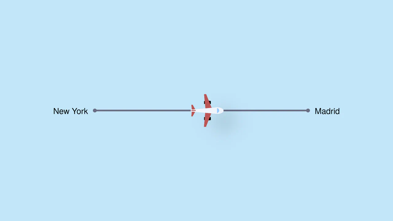
Pure CSS Trigonometric Flight Range Slider
Pure CSS Trigonometric Flight Range Slider uses CSS math functions like sin() and clamp() to dynamically scale a custom airplane thumb and cast realistic altitude shadows based on the input’s current percentage. It features a responsive container query that swaps the plane for a helicopter on narrow screens, and includes dedicated high-contrast mode styles for robust accessibility.
Chrome 111+
Edge 111+
Firefox 110+
Safari 16+
See the Pen Pure CSS Trigonometric Flight Range Slider.

Dynamic Neon Glow Range Slider
This is a Dynamic Neon Glow Range Slider. It re-imagines a standard HTML range input as a high-fidelity, skeuomorphic control with interactive lighting. Its function is to provide an immersive user experience where the slider’s track illuminates with a neon glow that intensifies, and its drop shadow physically shifts, based on the thumb’s position.
Chrome 111+
Edge 111+
Firefox 113+
Safari 16.4+See the Pen Dynamic Neon Glow Range Slider.

Scroll-Driven Glowing Slider
This is a Scroll-Driven Glowing Slider. It completely restyles a standard <input type="range"> into a high-fidelity, glowing interface component. Its primary function is to demonstrate how experimental CSS features (animation-timeline: scroll()) can link native input states directly to complex visual changes — like a dynamically resizing, blurred glowing track — without relying on heavy JavaScript event listeners. (Requires: Tweakpane, Normalize.css)
Chrome 115+
Edge 115+See the Pen Scroll-Driven Glowing Slider.

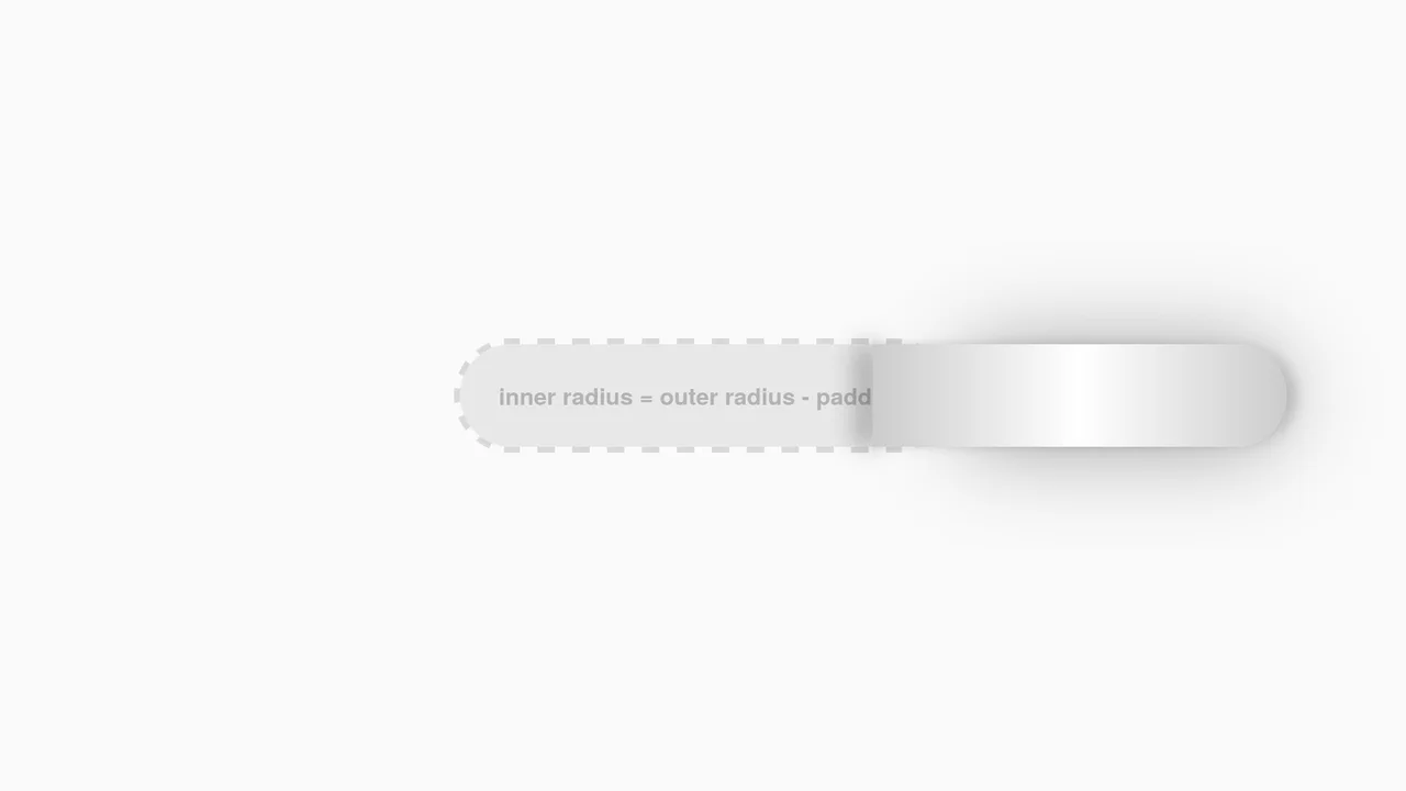
Cutout Gradient Track Range Slider
This is a Cutout Gradient Track Range Slider. It re-styles the native <input type="range"> element to create a unique visual illusion: the thumb appears to carve an invisible “gap” or “halo” into the track beneath it as it slides. Its function is to provide a highly stylized, modern form control that integrates seamlessly over complex photographic backgrounds without requiring heavy SVG masking or extra DOM nodes.
Chrome 60+
Edge 79+
Firefox 55+
Safari 11+See the Pen Cutout Gradient Track Range Slider.

Stacked Dual Handle Range Slider
This is a Stacked Dual Handle Range Slider. It re-engineers the standard <input type="range"> to support two independent handles for selecting a min/max range. Its function is to provide a high-fidelity input component for filter menus or settings panels, using a clever CSS stacking and clipping technique to color the area between the two thumbs.
Chrome 58+
Edge 79+
Firefox 78+
Safari 14+See the Pen Stacked Dual Handle Range Slider.
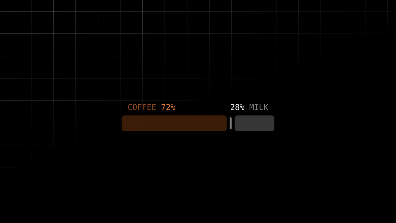
Scroll-Driven Range Slider
Inputs are usually dumb components; they report values but rarely visualize them meaningfully. This slider breaks that mold. It uses the cutting-edge Scroll-Driven Animations API to map the “thumb’s” movement directly to the visual output — without a single line of JavaScript logic for the animation. It creates a tactile, liquid connection between the user’s action and the “mixing” of coffee and milk.
Chrome 115+
Edge 115+
Firefox (polyfill)
Safari 26+ (or polyfill)See the Pen Scroll-Driven Range Slider.
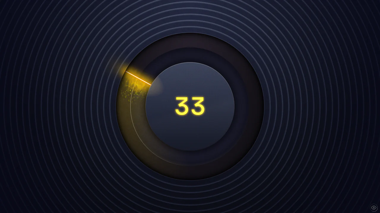
Cinematic Black Magic Volume Knob
This Cinematic Black Magic Volume Knob pushes the boundaries of modern CSS, creating a tangible, high-fidelity control element. It combines a standard range input with advanced CSS Houdini features like @property and wide-gamut P3 colors. The result is a glowing, liquid-like interface where turning the dial triggers a cascade of particles and dynamic lighting effects, perfect for premium audio applications or dashboards.
Chrome 118+
Edge 118+
Firefox 120+
Safari 17.4+ (Partial)
See the Pen Cinematic Black Magic Volume Knob.

Geometric Custom Range Sliders
These Geometric Custom Range Sliders push the boundaries of form styling by abandoning the standard “circle on a line” look. Created by CSS math wizard Ana Tudor, this set utilizes SCSS trigonometry to generate complex thumb shapes (like triangles and hollow pills) and CSS Mask Composition to carve out negative space. The result is a set of distinct, scalable inputs that rely on a single HTML <input> tag without any wrapper divs.
Chrome 84+
Edge 84+
Firefox 70+
Safari 15.4+See the Pen Geometric Custom Range Sliders.

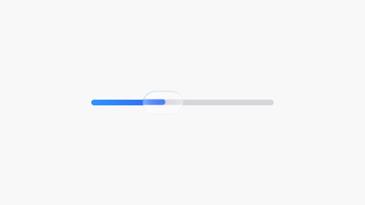
Range Slider
A highly stylized range slider utilizing box-shadow on the slider thumb to render the track, masked by a clip-path polygon on the parent container to create a unique slanted aesthetic.
See the Pen Range Slider.

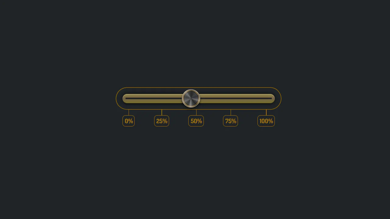
Range Slider with Value and Ruler
An unconventional use of datalist to create a custom ruler scale under the slider, where tick marks are styled using box-shadow and linear-gradient, and their visibility is controlled by CSS variables within media queries.
See the Pen Range Slider with Value and Ruler.

CSS in 2024 (Experimental Features)
Using experimental CSS features to build an advanced UI component, showcasing CSS Anchoring to attach the tooltip to the slider and Scroll-Driven Animations to drive the slider’s value and color change.
See the Pen CSS in 2024 (Experimental Features).

Custom Range Slider
Custom vertical range slider with a retro-futuristic design and a flickering display effect, achieved using a CSS transform on input[type
See the Pen Custom Range Slider.

CSS-only Sound Meter
This demo showcases an advanced CSS styling technique where the background consists of multiple layered gradients: one for the scale, a second for the indicators, and a third for the color palette. This approach creates a complex, layered design for a volume slider without any extra HTML elements.
See the Pen CSS-only Sound Meter.
Slider Button with Liquid Glass Effect
A stylish slider using SVG filters to create a realistic “liquid glass” effect. JavaScript manages precise and smooth state control, ensuring high performance and adaptability for both mouse and touch input.
See the Pen Slider Button with Liquid Glass Effect.
Custom vertical slider with animated ruler and thumb. On thumb drag, ruler highlights, marks shift and change opacity based on proximity to value. Complex masks and gradients form visual track. Pug generates marks with CSS variables. Feature detection for trigonometry and color-mix.
Centaur Slider
Slider with visual centaur transformation. As slider moves, human-to-horse ratio changes: individual body parts appear/disappear via opacity and scale toggles. Positioning via :has(input[value]). SVG sprite with named parts.
See the Pen Centaur Slider.
Kawaii slider with pink aesthetic and “droplet” effect. Track decorated with radial gradients mimicking highlights. Thumb casts series of shadows, creating multiple copy illusion. Color customizable via --base CSS variable. color-mix support.
Custom range slider with floating value indicator. On drag, diamond-shaped label appears with percentage, position and scale depend on value. Color shifts via hue-rotate. JavaScript syncs animations and updates value.
Simple custom slider with orange accent. On hover, track changes to bright orange. Thumb round with shadow. Cross-browser styling via vendor prefixes. Minimal design in centered frame.
Slider with digital value display. On drag, JavaScript updates number above. Green fill track created via box-shadow on thumb. Dark design with neon accent.