8 CSS Recipe Cards: Free Code Snippets & Examples
Recipe interfaces demand clarity under cognitive load — users scanning ingredients mid-cooking need unambiguous layouts. CSS recipe cards structure preparation data into scannable units with clear visual hierarchy between ingredients, quantities, and step-by-step directions.
- Each card uses semantic HTML with
<dl>for ingredient-quantity pairs and<ol>for ordered cooking steps, ensuring screen readers can navigate the recipe structure without custom ARIA roles. - The
counter-resetandcounter-incrementproperties on step lists provide automatic numbering that adapts to card height, eliminating the need for hardcoded step labels that break when content is reordered. - Print-friendly stylesheets hide navigation and decorative chrome while expanding truncated step descriptions, delivering a clean, ink-saving layout for kitchen use.
Browse the collection to find a recipe card format that matches your culinary content — from minimalist ingredient-focused cards to rich media cards with step-by-step photo galleries.
Table of Contents:
Examples
Recipe Card
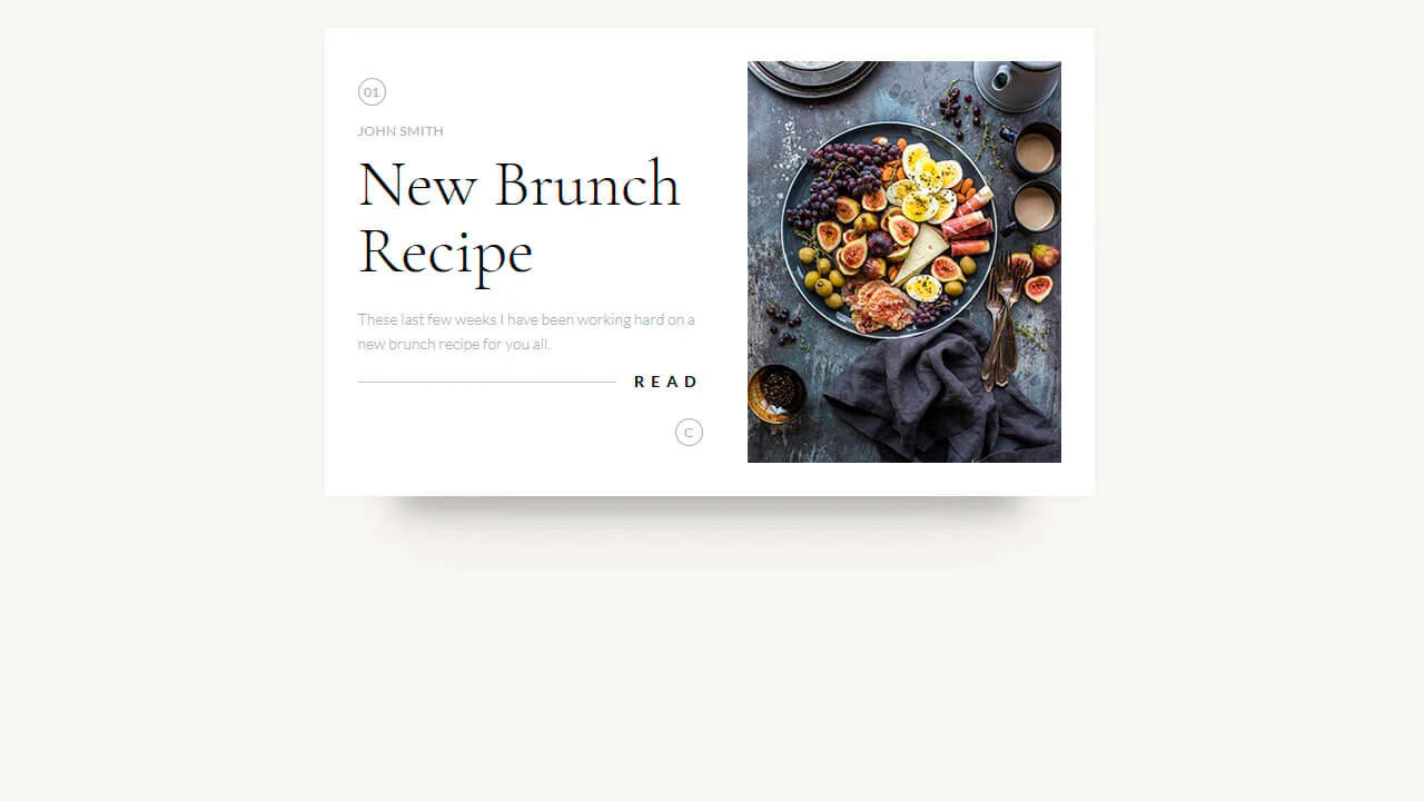
A clean and minimalist card design implemented using the box-sizing: border-box property for simplified layout; the “Read” heading is styled using a pseudo-element :after, which creates a decorative horizontal line running behind the text, demonstrating fine positioning work.
See the Pen Recipe Card.
Recipe Card
An interactive recipe detail modal technically implemented via JavaScript class toggling to trigger a complex, two-stage CSS transition - this creates a sliding panel effect; the demo uses gradients for the background, animates inner details, includes a zoom effect on the image on hover, and rotates the toggle icon using transform: rotate().
See the Pen Recipe Card.
Recipe Card
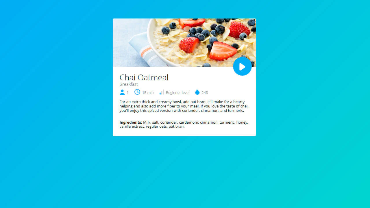
A technically interesting solution for a UI card where recipe details (time, level) are organized via inline blocks within an unstyled list, styled using pseudo-classes for precise adjustment of child element margins and styles, avoiding excessive classes.
See the Pen Recipe Card.
Cocktail Recipe Card
Recipe card with collapsible ingredients and preparation. Clicking the header toggles the “closed” class, hiding the article and adjusting the title style. Smooth CSS transitions and a gradient background complete the minimal design.
See the Pen Cocktail Recipe Card.
Recipe Card
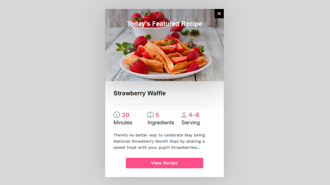
Recipe card with a fixed size, absolutely centered on the page. Features a hero image with gradient overlay, close icon, and three key details displayed with icons. Uses SCSS for structure, custom properties for colors, and a centered mixin for positioning. The footer button lifts on hover with a matching shadow.
See the Pen Recipe Card.
UI Recipe Card
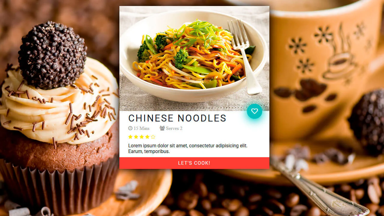
A recipe card with a clean structure and a distinct focal point. The call-to-action button and the like icon are highlighted with color to draw attention without unnecessary clutter. The use of semantics and interactivity promotes engagement while maintaining a minimalist approach to the interface.
See the Pen UI Recipe Card.
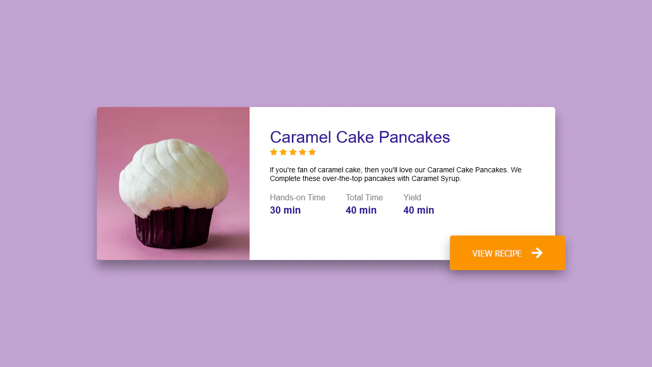
Beatiful Recipe Card Food
A recipe card with a clear layout: image and text are aligned on a grid. Key details — time and rating — are grouped for quick assessment. The button with an arrow visually emphasizes the primary action.
See the Pen Beatiful Recipe Card Food.
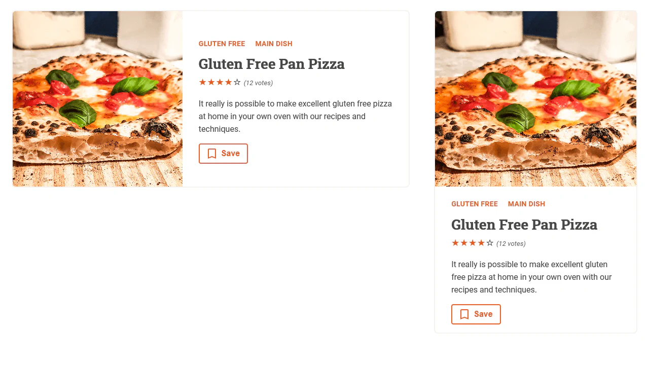
Responsive Components Without Media-Queries
This recipe card uses flexbox to build a responsive two-column layout that stacks on narrow screens. The image container scales with calc(282px + 5vw), while content areas adjust via flex-basis. CSS variables handle theming, and nested selectors keep the code modular and readable.
See the Pen Responsive Components Without Media-Queries.