30+ CSS Ribbons: Free Code Snippets & Examples
Ribbons attach context to content — they mark products as “Sale”, highlight featured articles, or indicate status without cluttering the main layout. CSS ribbons create these folded-edge labels through clip-path geometry and pseudo-element folds that sit cleanly on top of any container.
- Each ribbon uses
position: absolutewithclip-path: polygon()for the signature folded tail, creating angled edges that wrap around the corner of the parent container without overlapping text. - The fold shadow effect uses
box-shadowon a::afterpseudo-element positioned beneath the fold, creating a subtle 3D depth that separates the ribbon from the surface without triggering layout recalculations. - Semantic HTML with the ribbon text in a
<span>inside the ribbon container ensures screen readers announce the label, while the visual clip-path and pseudo-elements remain decorative.
Browse the collection to find a ribbon style that fits your labeling needs — from corner ribbons that wrap around product card edges to full-width banner strips with folded tails.
Table of Contents:
Examples
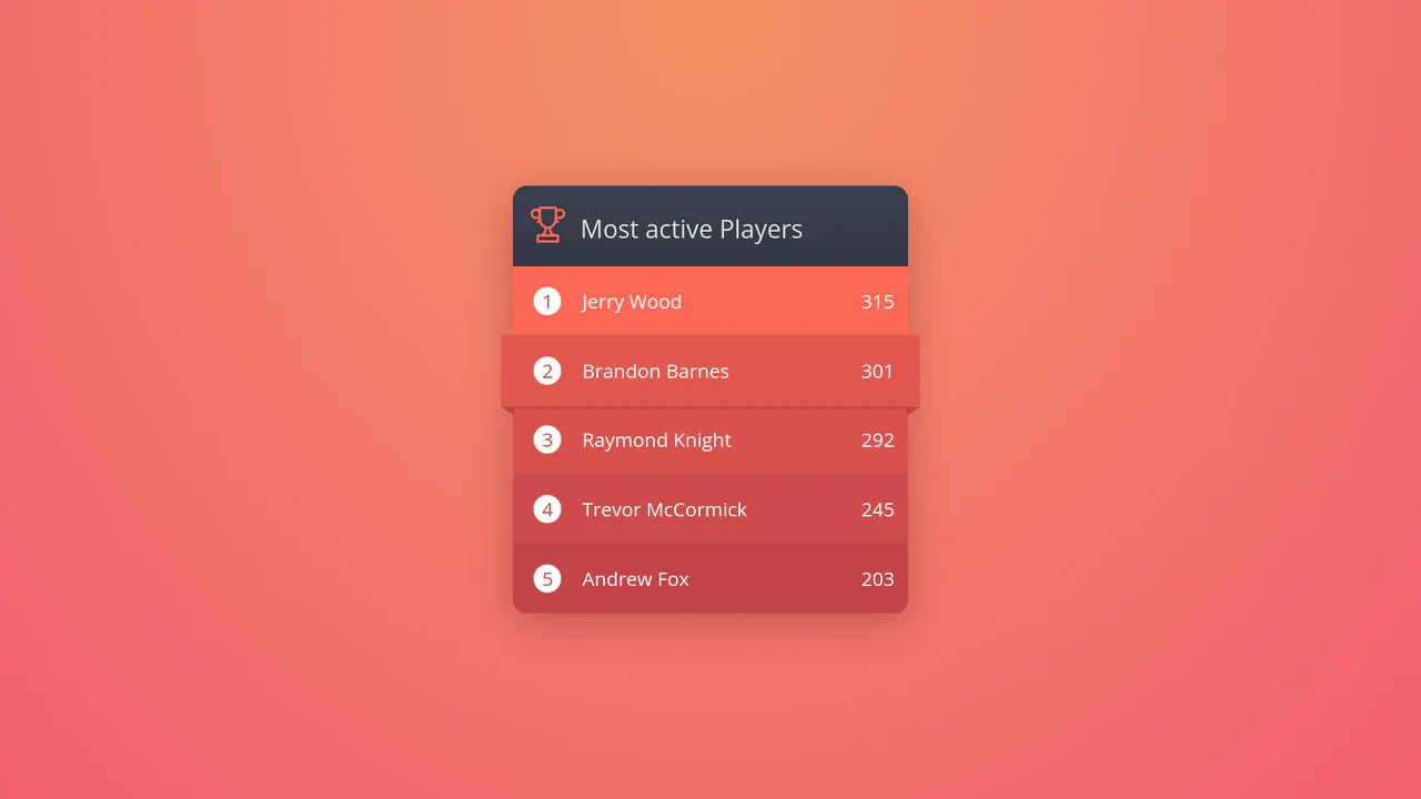
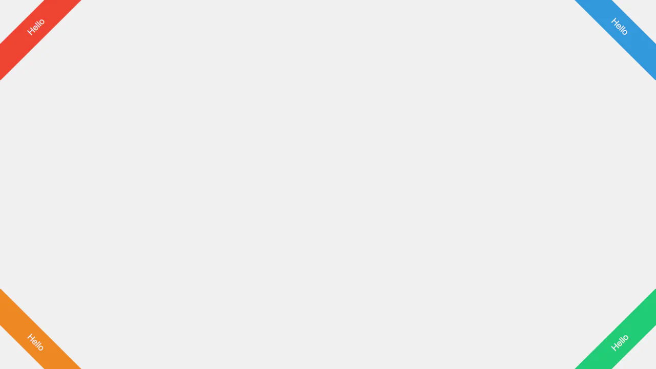
Ribbon Hover CSS Leaderboard Widget
This creative digital leaderboard displays game high scores using dynamic, nested elements. Built entirely with HTML and CSS, the layout leverages CSS counters to number list items automatically, and relies on precise hover-state translations. Hovering over a row scales the block outwards while expanding border triangles, creating a realistic 3D paper ribbon wrapping effect.
 Chrome 36+
 Edge 12+
 Firefox 16+
 Safari 9+
See the Pen Ribbon Hover CSS Leaderboard Widget.
Animated 3D Folding Ribbon
This is an Animated 3D Folding Ribbon. It decorates standard heading text with pseudo-element tails that dynamically fold backward in 3D space upon interaction. Its function is to elevate standard static title banners or badge elements into interactive, spatially-aware UI focal points.
Chrome 111+
Edge 111+
Firefox 117+
Safari 16.4+
See the Pen Animated 3D Folding Ribbon.

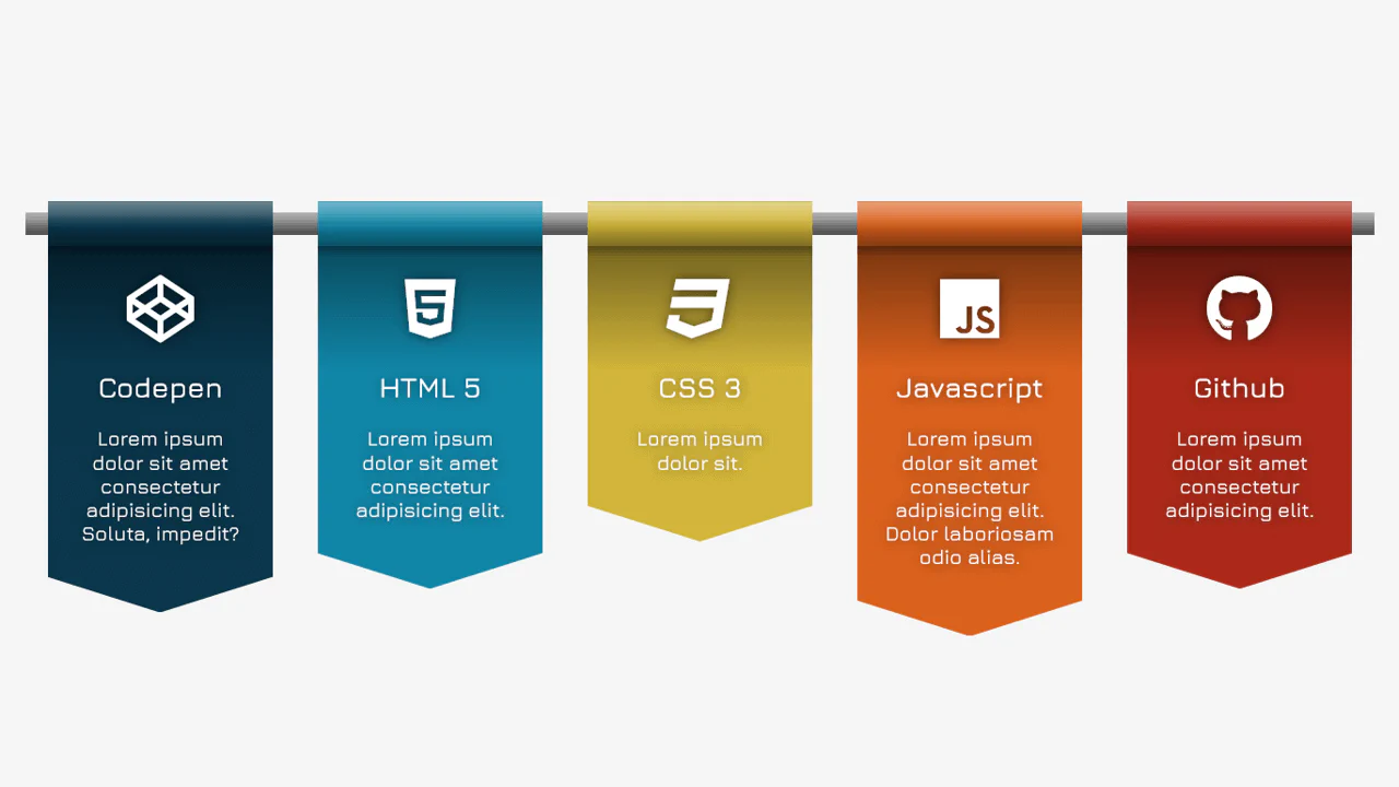
Product Plan Cards with CSS Ribbons
A pure CSS pricing component that creates a dimensional ‘ribbon’ aesthetic solely through ::after pseudo-elements and clip-path geometry. The layout leverages CSS Custom Properties for distinct color themes and calc with negative margins to extend elements beyond the parent container, creating a folded paper effect without any JavaScript dependencies.
See the Pen Product Plan Cards with CSS Ribbons.
CSS Bookmark
A state-driven animation, controlled via the “checkbox hack,” showcases the power of CSS @property (Houdini) for smoothly animating gradients and mask properties. A complex multi-layered bookmark shape is created with an SVG mask, while the entire activation effect choreography is built on synchronized @keyframes.
See the Pen CSS Bookmark.
Ribbon Spinner
This pure CSS loader simulates an interlocking paperclip loop using clip-path morphing. The two loops, drawn via pseudo-elements with thick inset box shadows, are animated synchronously. To let them pass over each other, a stepped z-index keyframe swaps depth layers at the 50% mark, creating a seamless 3D weaving path.
See the Pen Ribbon Spinner.

CSS-only Corner Ribbons for GitHub Links
Generation of corner ribbons, where both Pug and SCSS use @each loops to automatically create the markup and styles for all four corners. The element’s positioning and transform are calculated from a single SCSS variable, making the component scalable and DRY.
See the Pen CSS-only Corner Ribbons for GitHub Links.
Ribbon Design
A layered ribbon effect created by stacking two pseudo-elements, ::before and ::after. Each is slightly rotated using transform: rotate() and clipped by the parent’s overflow: hidden to create “torn” edges.
See the Pen Ribbon Design.
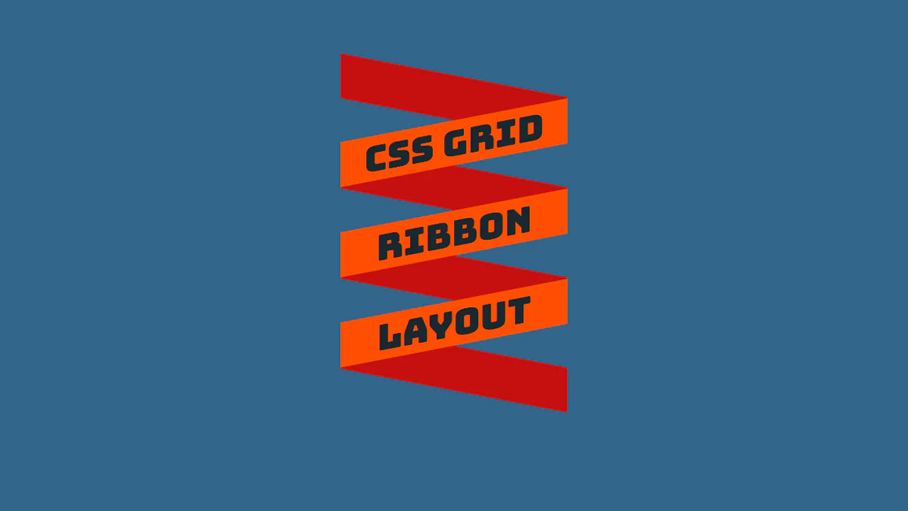
CSS Grid Ribbon Layout
Ribbon-style heading with slanted stripes via skewY. CSS Grid positions rows, odd/even rows get different background and opposite skew. Overlap effect via z-index.
See the Pen CSS Grid Ribbon Layout.
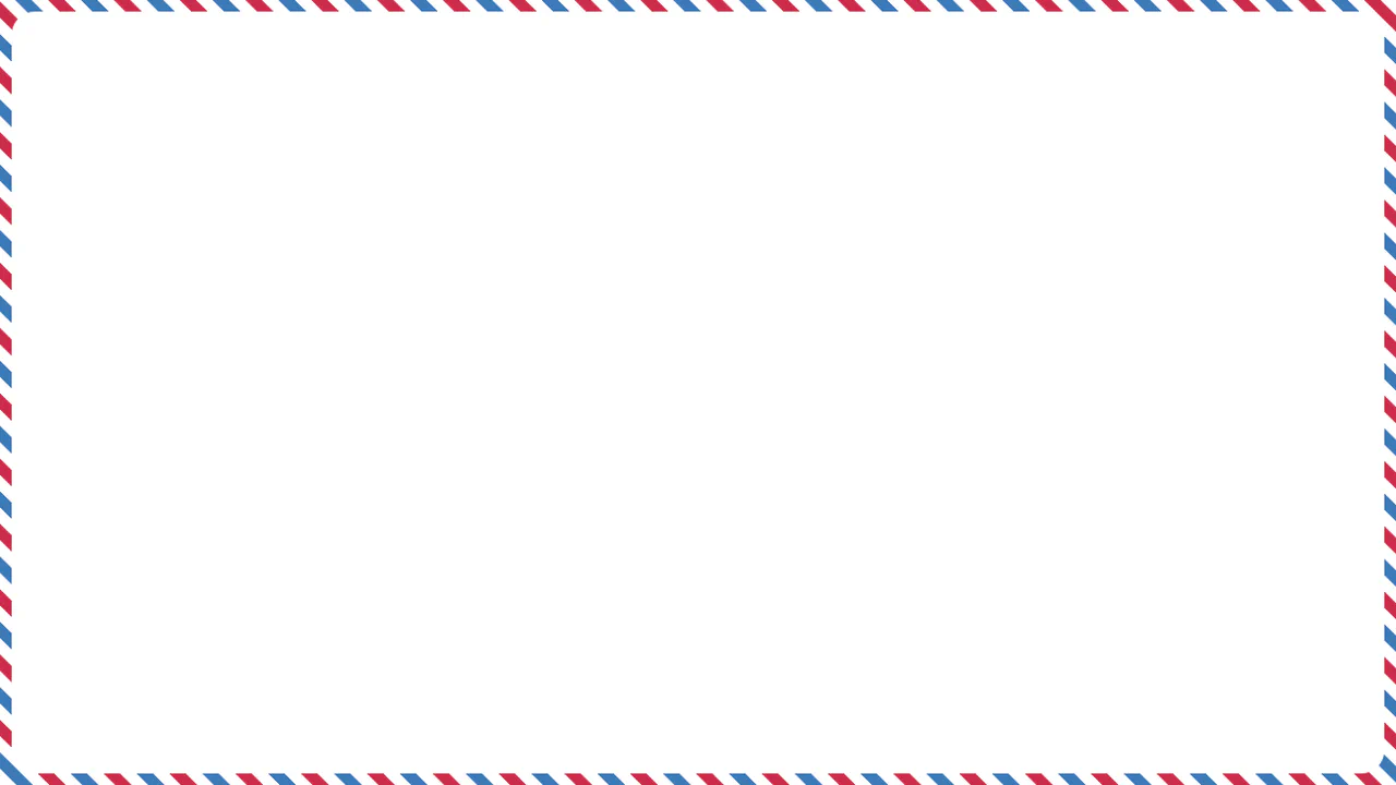
Mail Ribbon
Diagonal striped frame via repeating-linear-gradient. ::after pseudo-element creates colored pattern, ::before forms white inner area with rounded corners, leaving only frame visible.
See the Pen Mail Ribbon.
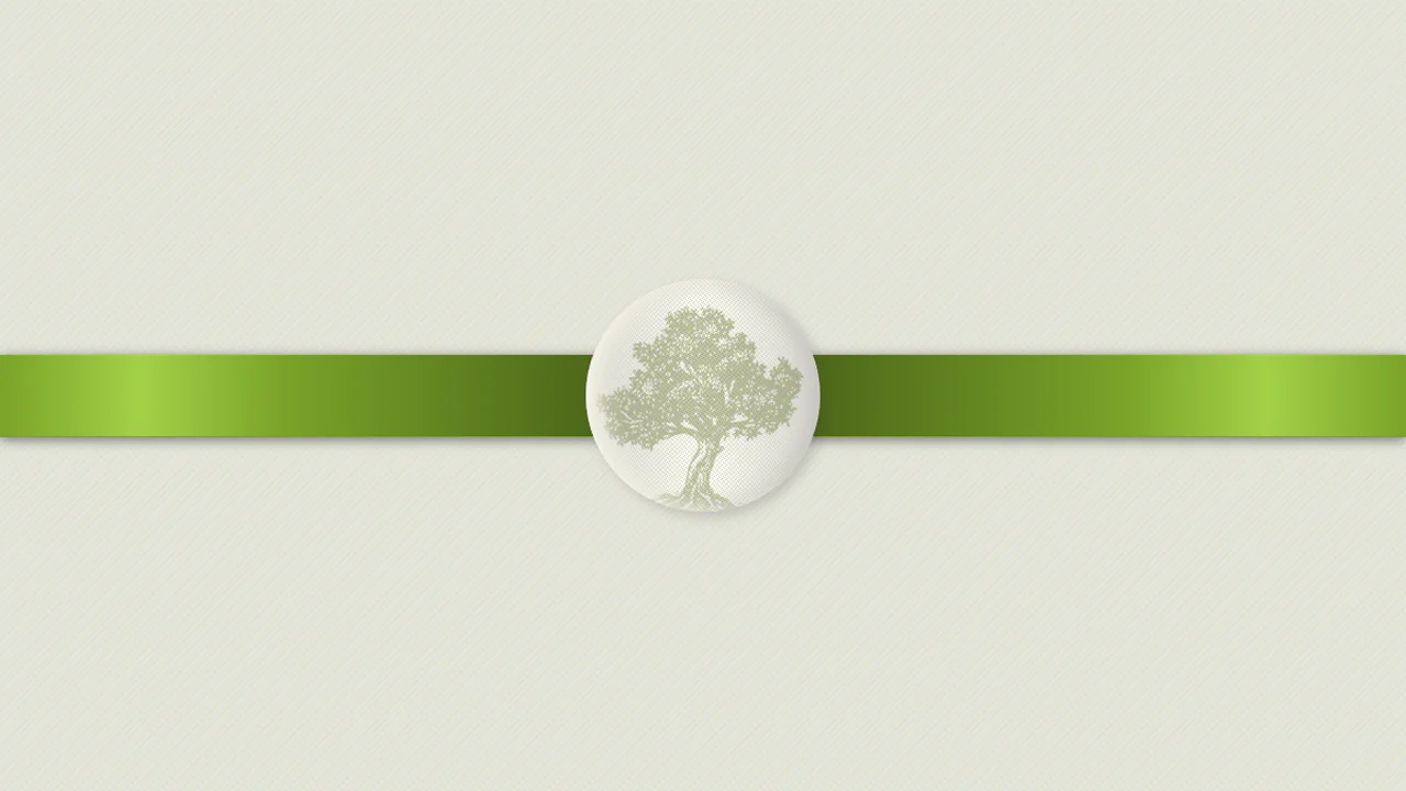
Olive Ribbon
Award ribbon simulation with badge. Ribbon gradient creates 3D folds via alternating dark and light stripes. Badge with canvas texture and inner shadows mimics metal pin.
See the Pen Olive Ribbon.
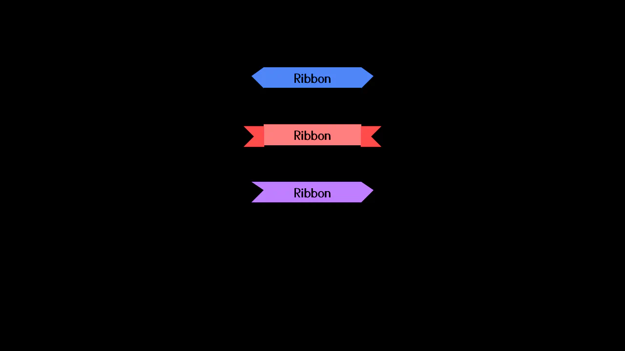
CSS clip-path Ribbons
Ribbon collection created via clip-path. Each shape (straight, slant-up/down, cutout) defined by polygon. On click, ribbon type changes randomly. Gradient and shadows add depth.
See the Pen CSS clip-path Ribbons.
Ribbon Menu
Sliding menu with diamond-shaped item arrangement. On “Menu” click, main panel drops down, links slide in with angled rotations. SCSS variables control colors and sizes. JavaScript toggles active class.
See the Pen Ribbon Menu.
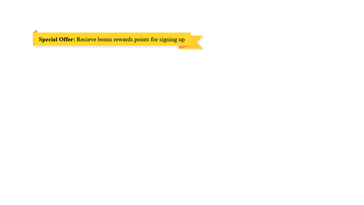
Sale Label
Four animated promo blocks. First — marquee text, second — moving border with percentages, third — vertical text scroll, fourth — rotating SVG text on circle path. SCSS loop sets delays for border animation.
See the Pen Sale Label.

Decorative Ribbon Heading
Heading with ribbon ends via pseudo-elements. clip-path forms slanted edge, gradient adds folded corner. Left and right elements mirrored (scaleX(-1)). Ribbon positioned behind (z-index: -1).
See the Pen Decorative Ribbon Heading.
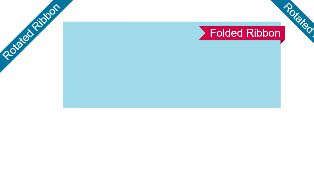
Folded and Rotated Ribbon
Two ribbon types: rotated and folded-corner. First uses clip-path: inset and huge shadow to create infinite strip. Second uses clip-path with variables for fold (--f) and radius (--r). Shadow simulates fold.
See the Pen Folded and Rotated Ribbon.
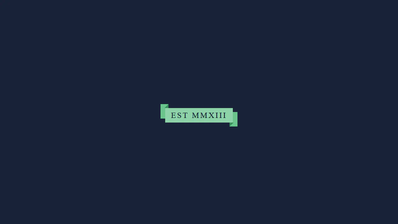
Ribbons
Ribbon headings created via pseudo-element borders. Each variant uses different border-width and border-color combinations to form tails. Ribbon colors set via SCSS variables.
See the Pen Ribbons.
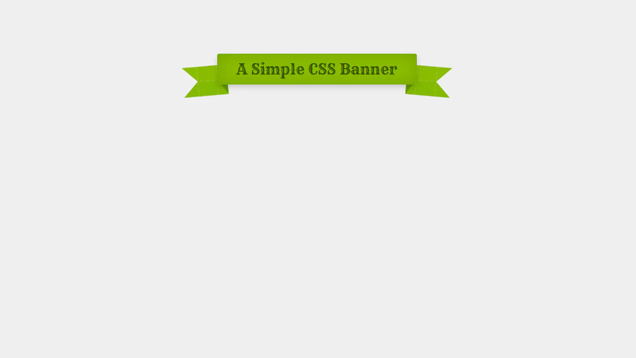
Simple CSS Banner
This single-node CSS header replicates a vintage Western-style ribbon banner. By configuring absolute pseudo-elements with complex, multi-colored border thicknesses, the stylesheet draws tucked fold shadows and transparent-cut fishtails simultaneously. Minor rotations (rotate(5deg)) and inset box-shadows add realistic paper depth.
See the Pen Simple CSS Banner.
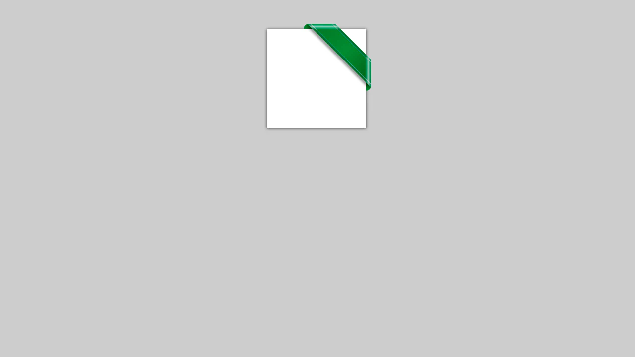
Corner Ribbon
This pure CSS corner badge creates a glossy, embossed ribbon overhanging a white card. The 45-degree rotated green bar is clipped inside an overflow: hidden container. Curved pseudo-elements form tucked folds on the edges, while intersecting translucent white linear-gradients simulate shiny diagonal glass glares.
See the Pen Corner Ribbon.
CSS Ribbon
This pure CSS ribbon layout creates an overlapping, three-dimensional loop wrapping around the text block. By combining offset pseudo-elements on h1 and span layers, the design sets up a multi-level stack. Diagonal borders draw tiny triangle wedge shadows that visually join the overlapping planes into a continuous 3D fold.
See the Pen CSS Ribbon.
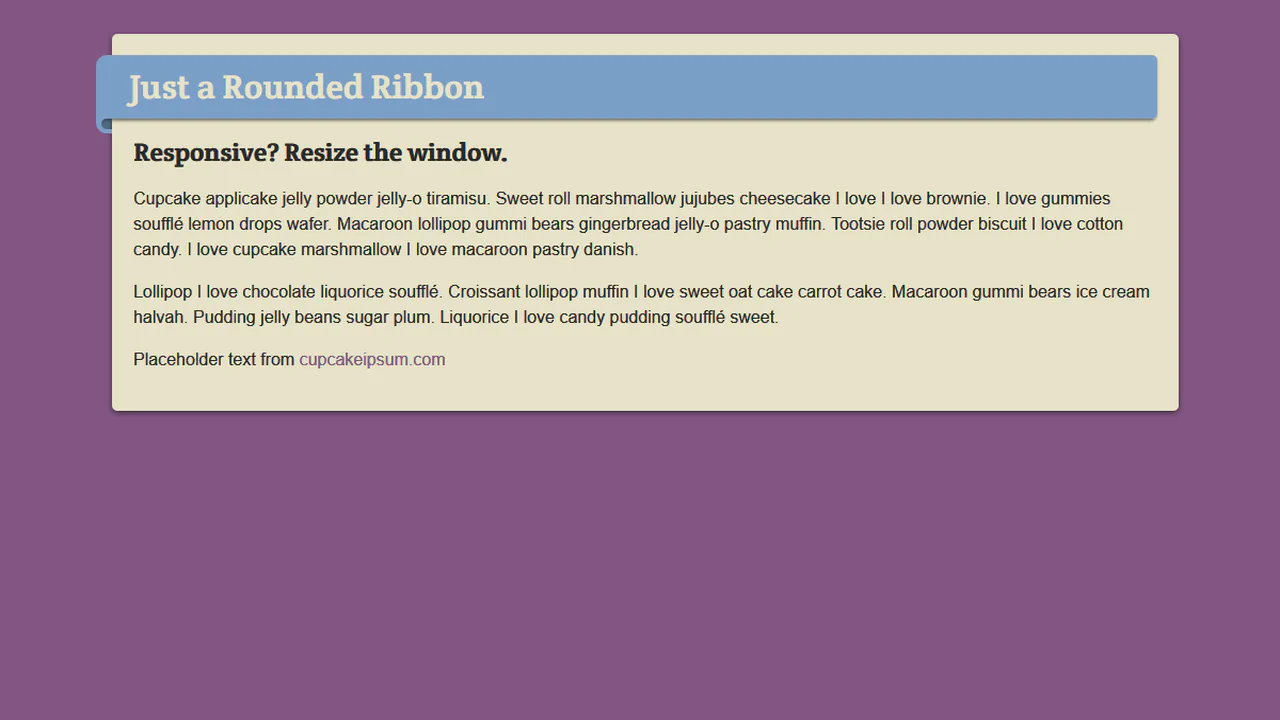
Responsive Rounded Ribbon
This responsive, fluid ribbon layout is built entirely on font-relative em units. By tying dimensional coordinates and borders to relative text scales, the 3D folded tag shapes, margins, and offsets scale proportionally when resizing or downscaling body typography. Rounded pseudo-elements form tucked corner fold shadows.
See the Pen Responsive Rounded Ribbon.
Animated Ribbon
This interactive ribbon banner unfolds sequentially using cascading CSS animations. Driven by precise scale transformations and staggered keyframe offsets, the main body expands horizontally, the dark corner shadows slide down, and the tucked-back fishtails pivot outward. A lightweight jQuery click handler clones the element to replay the loop.
See the Pen Animated Ribbon.
CSS Ribbon
This interactive, editable ribbon badge utilizes CSS 3D transforms to create volumetric depth. Configured with preserve-3d, the card is rotated and skewed on multiple planes. The background fishtail folds (::before and ::after) are pushed backward along the Z-axis (translateZ(-1em)) and shaped using border thickness colors.
See the Pen CSS Ribbon.
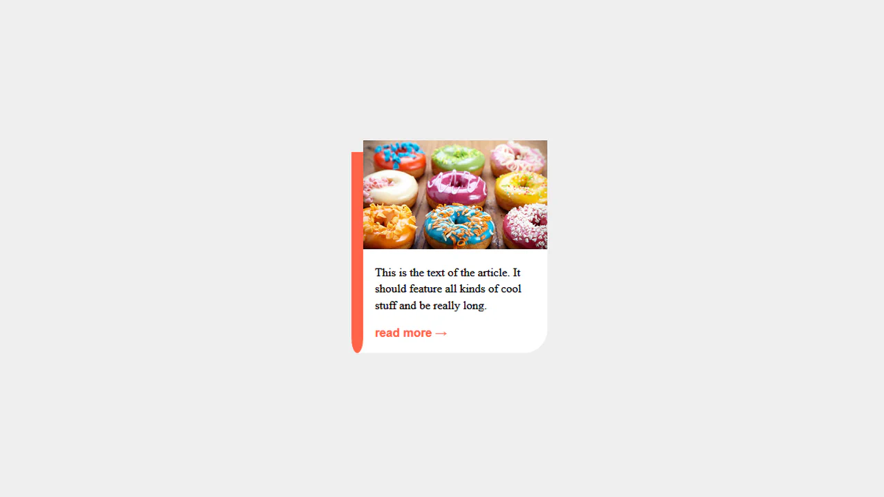
Ribbon Article
This pure CSS card layout simulates a book-marker or hanging ribbon tag along its left boundary. Using absolute pseudo-elements, the red bookmark is offset and shaped using asymmetric border-radius curves on its bottom corners, while an overlapping white pseudo-element acts as a mask to clip the hanging folds cleanly.
See the Pen Ribbon Article.
Corner Ribbons
These lightweight corner ribbons use pure CSS for seamless page-corner branding. By pairing negative offsets (left: -50px) with 45-degree rotation transforms (rotate(45deg) or rotate(-45deg)), the banner cards overlap viewport edges. Using position: fixed locks them in place during scrolling, requiring no scripts.
See the Pen Corner Ribbons.
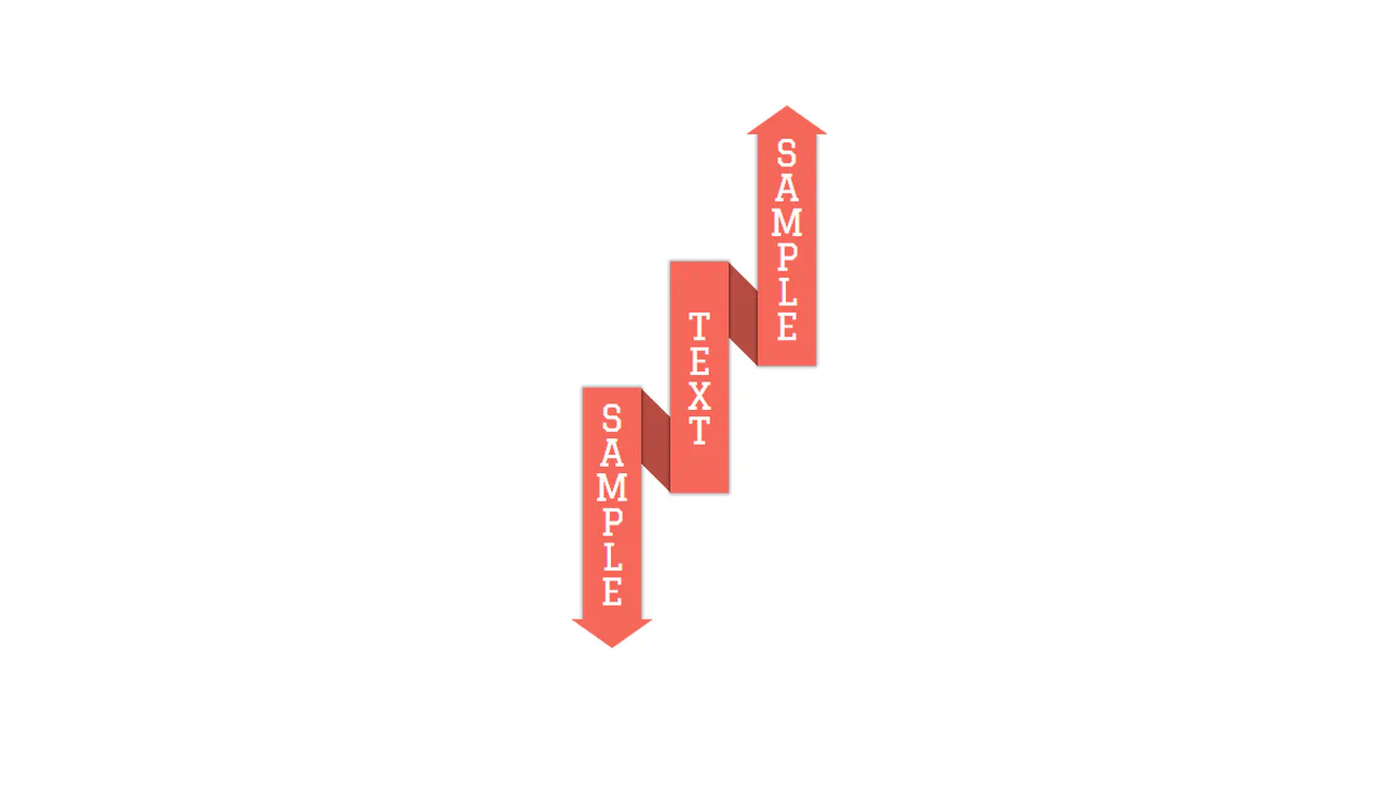
Pure CSS3 Ribbon
This pure CSS vertical ribbon layout arranges three staggered pillars to form an overlapping paper fold. The top and bottom triangle arrows are constructed using border thickness tricks, while darker background blocks sit tucked behind with skewY(45deg) transformations to bridge the columns and complete the 3D ribbon illusion.
See the Pen Pure CSS3 Ribbon.
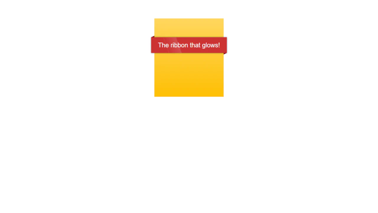
The Glow Ribbon
This folded 3D ribbon banner features an animated metallic sheen running across its face. Shaped using overlapping elements and CSS border triangle shadows, the red ribbon achieves tactile depth. A slanted, semi-transparent white .glow panel uses skew transforms and infinite keyframe translations to simulate rolling light reflections.
See the Pen The Glow Ribbon.
UL Banner Cards
This circular ordered list cycles color accents using :nth-child(6n+x) rules. Each square card is converted into a circle using aspect-ratio: 1 and border-radius: 50%. The :before pseudo-element renders an oversized, clipped counter digit, while :after applies a realistic drop-shadow ring using filter and blur().
See the Pen UL Banner Cards.
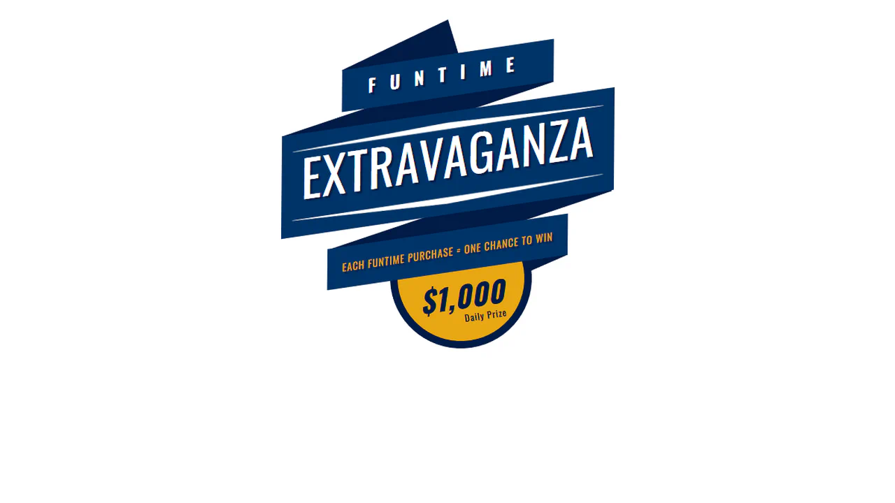
Animated Ribbon
This animated carnival-style ribbon badge combines skewed transforms and delayed CSS transitions. A simple jQuery class append triggers a staggered chain of animations: the rotated blue panels slide out in width, hidden absolute shadow folds rotate into place, and text elements fade in from opposite directions.
See the Pen Animated Ribbon.
CSS Ribbon
This pure CSS folded ribbon bar achieves a tactile, 3D banner look without any JavaScript. By stacking multiple pseudo-elements (::before and ::after), the stylesheet renders dark diagonal triangle folds, tucked-back fishtail edges, and an offset light gray drop shadow layer using customized border-width parameters.
See the Pen CSS Ribbon.
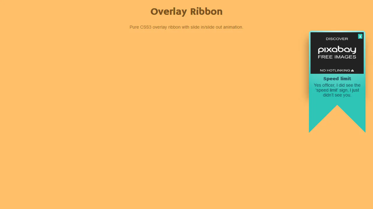
Overlay Ribbon
This hanging ribbon banner notification uses CSS border triangles to shape its distinct fishtail bottom. Driven by jQuery on close click, the component slides vertically off-screen by appending a .slideout class, while standard entry keyframes automatically drop the ribbon into place on page load.
See the Pen Overlay Ribbon.