10+ CSS Ripple Effects: Free Code Snippets & Examples
CSS ripple effects translate physical kinetic impulses into digital feedback, creating expanding circular waves that emerge directly from a user’s point of interaction. By mapping these responsive ripple highlights across buttons, cards, and navigation links, this visual pattern naturally confirms successful inputs with fluid tactile feedback.
- Micro-interaction waves are orchestrated natively using absolute-positioned pseudo-elements triggered by the :active state, expanding from zero to full dimensions.
- Smooth wave propagation relies on transform: scale() and opacity transitions, executing calculations directly on the GPU without triggering expensive layout reflows.
- To preserve critical INP (Interaction to Next Paint) performance, modern ripple overlays leverage compositor-only animations to bypass main-thread script execution.
Master these expanding wave mechanics to build highly responsive, tactile components that react organically to touch and mouse interactions.
Table of Contents:
Examples
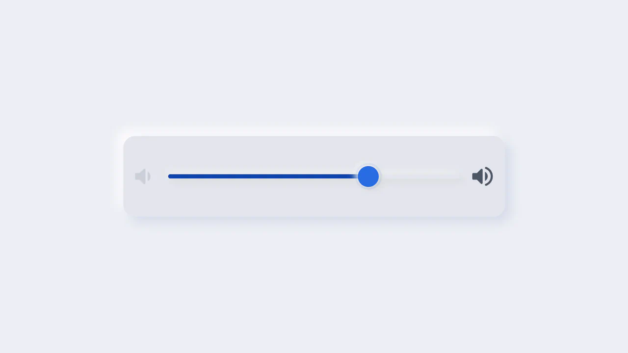
Neumorphic Volume Slider with Ripple Glow
An elegant neumorphic volume slider featuring an active thumb focus glow and directional icon highlights. Built with a single native range input and styled with modern CSS Custom Properties, it implements the Houdini @property API to transition colors smoothly across sliding states. Dragging shifts opacity focus to the corresponding volume icon based on directional vector calculations in pure CSS.
 Chrome 85+
 Edge 85+
 Firefox 128+
 Safari 16.4+
See the Pen Neumorphic Volume Slider with Ripple Glow.

Animated Fruity Product Showcase
This is an Animated Fruity Product Showcase. It acts as a high-impact hero section for a product landing page. Its function is to create a sense of dynamic energy through synchronized GSAP animations, where product imagery “falls” into view, titles update with staggered transitions, and ripple-wave effects surround the navigation buttons. (Requires: GSAP)
Chrome 60+
Edge 79+
Firefox 55+
Safari 11+
See the Pen Animated Fruity Product Showcase.

Neumorphism Waves Animation
Pure CSS ripple animation with neumorphic styling. Checkbox-triggered wave sequence using scale transforms and opacity transitions.
See the Pen Neumorphism Waves Animation.
Arrow Animations (CSS-Only Icon)
This highly reusable CSS-only icon features complex bidirectional animation and a ripple effect, achieved by leveraging CSS Custom Properties for state and using a minimal JavaScript cloning trick to instantly restart the animation on click.
See the Pen Arrow Animations (CSS-Only Icon).
Dark Ripple Pre-Loader (No-JS)
Dive into a dynamic ripple loader crafted using modern CSS capabilities, such as backdrop-filter for a stylish blur effect. The demo showcases how to leverage CSS Custom Properties for easy customization of the background and gradients without altering the core animation logic.
See the Pen Dark Ripple Pre-Loader (No-JS).
Water Drop
A pure CSS water drop animation featuring realistic ripples, utilizing a key technical feature: 3D transformation rotateX(75deg) on pseudo-elements to simulate the perspective of expanding concentric circles.
See the Pen Water Drop.
Logo with Ripple Effect
An advanced ripple effect adapted to irregular geometric shapes using the CSS clip-path property. The technical implementation relies on minimal JavaScript to accurately determine click coordinates and dynamically position the wave using inline styles.
See the Pen Logo with Ripple Effect.
CSS Ripple Effect
A hypnotic SVG ripple animation leveraging SCSS loops and CSS keyframes for a high-performance visual effect. This snippet demonstrates advanced frontend techniques, including dynamic SVG radius calculation and CSS-only animation state management, ensuring optimal performance without JavaScript overhead.
See the Pen CSS Ripple Effect.
CSS Ripple Effect
A lightweight pure CSS ripple animation created using multi-layered box-shadow properties and pseudo-elements. This snippet showcases an efficient technique for generating concentric wave effects with zero JavaScript, ensuring optimal frontend performance and seamless integration into modern web designs.
See the Pen CSS Ripple Effect.
CSS Ripple/Wave Checkbox and Radio Button
A modern set of custom checkboxes and radio buttons featuring a dynamic “click-wave” CSS animation. This snippet leverages appearance: none and pseudo-elements to create interactive, high-performance UI components that enhance the visual feedback of web forms and improve overall user experience.
See the Pen CSS Ripple/Wave Checkbox and Radio Button.
Hover Ripple
CSS Ripple Button Transition creates a clean, circular button with a fluid hover animation. It uses ::before and ::after pseudo-elements positioned behind the main button. On hover, CSS transitions scale these elements up to scale(4) while introducing a subtle blur(2px) and fading the borders. A 100ms delay on the second element produces a staggered, dual-ring ripple effect without JavaScript.
See the Pen Hover Ripple.
Pure CSS Card Ripple Effect
Interactive Ripple Toggle Card is a pure CSS interface control that changes card states without JavaScript. It utilizes the checkbox hack (:checked + .box) to toggle styles. When active, a hidden circular .ripple element undergoes a massive scale(35) transition, flooding the parent card’s background. Simultaneously, the custom switch slider shifts horizontally and the text color flips.
See the Pen Pure CSS Card Ripple Effect.
Toggle Button with Ripple
Day/Night Ripple Toggle Button builds a tactile, high-contrast switch with fluid animations. Clicking triggers a JS class toggle that coordinates overlapping circular .ripple elements. While the active toggle knobs remain stationary, the corresponding background ripple scales up (scale(4.8)), flooding the button capsule. Delayed transitions and z-index swaps reset the inactive state seamlessly.
See the Pen Toggle Button with Ripple.
Ripple Animation Button
Request Loader Ripple Animation implements a continuous, pulsing radar effect using pure CSS. It styles the ::before and ::after pseudo-elements as circular borders placed behind the main emoji badge. Driven by an infinite @keyframes animation, these rings expand via scale3d while fading to transparent. A 0.5s delay on one layer creates the staggered, dual-pulsing wave.
See the Pen Ripple Animation Button.
Toggle Button with Ripple Effect
CSS Blend-Mode Ripple Switch implements a pure CSS color-inversion animation using the checkbox hack. On click, a hidden checkbox triggers a transition that scales up a circular pseudo-element over the label. Utilizing mix-blend-mode: difference against a black-and-white radial-gradient, it dynamically flips the text and background colors under the expanding ring.
See the Pen Toggle Button with Ripple Effect.