20+ CSS shape-outside Examples
Standard web layouts are rectangular. The CSS shape-outside examples in this updated collection remove this rigid constraint, allowing text to flow organically around complex media. This creates a direct, magazine-style connection between typography and image, eliminating the visual friction of boxy containers. Utilizing these curated snippets ensures a high-end UI design where content dictates the form.
The architecture relies strictly on the shape-outside property, which requires the element to be floated. The code leverages functions like circle() and polygon() for procedural geometry, or url() for precise alpha mask detection on transparent images. This calculation is handled natively by the browser’s layout engine, maintaining high layout stability without the performance cost of JavaScript-based polyfills. The HTML remains strictly semantic.
Every free demo is fully responsive and cross-browser compatible. Users can instantly download the raw code or fork a specific layout on CodePen. These assets are strictly optimized for accessibility, as the text’s linear reading order is preserved in the DOM, delivering a fast, frictionless experience across all modern devices.
Examples
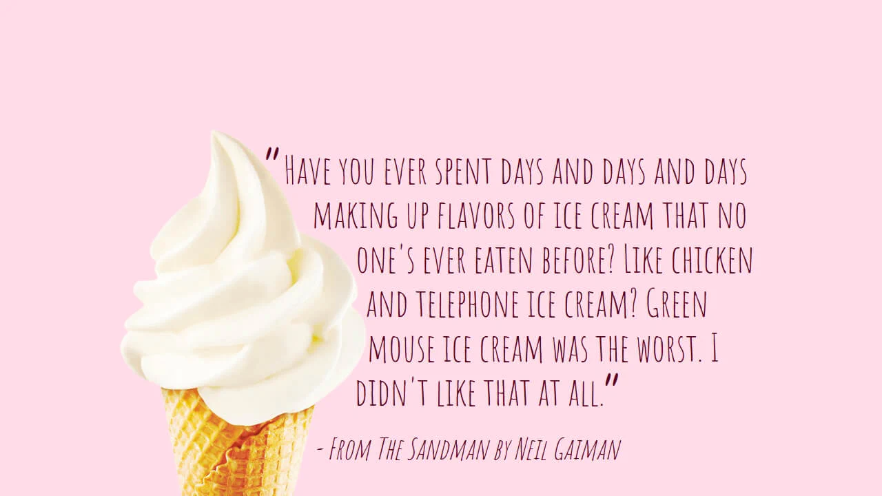
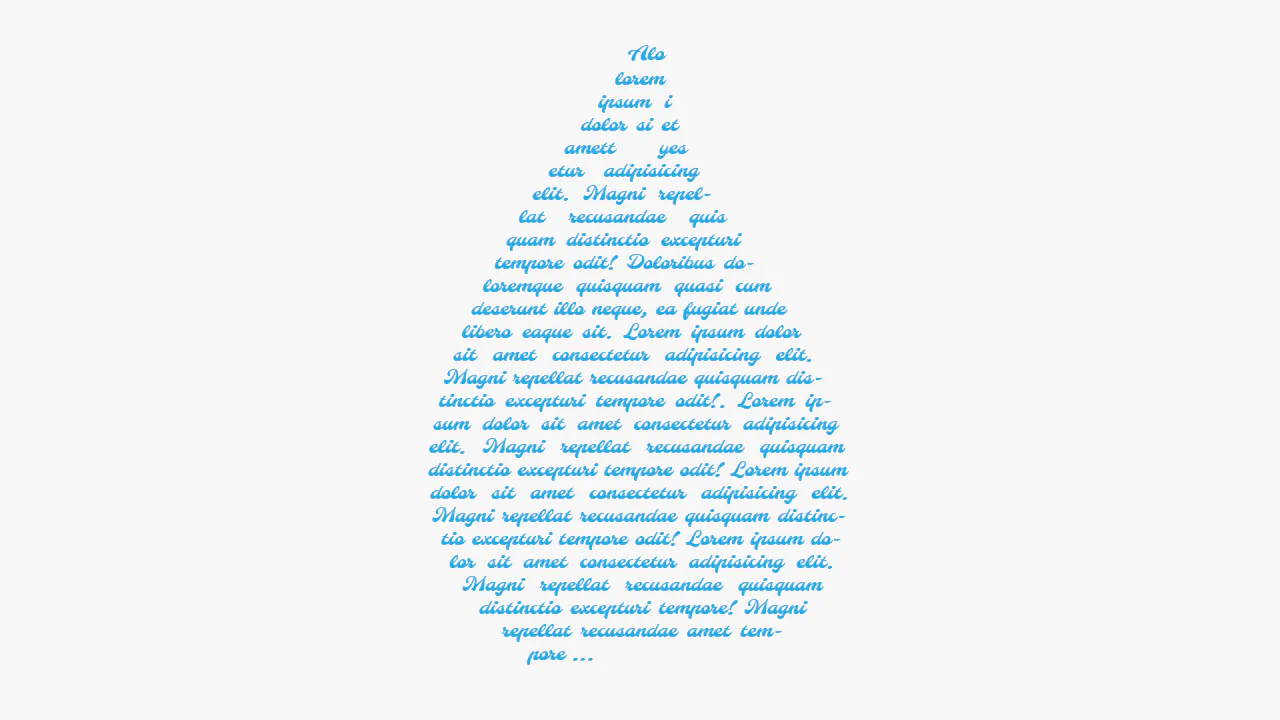
1980's Pop Magazine Pullquote
This demo showcases advanced CSS features like clip-path and shape-outside for creating non-rectangular layouts, while leveraging modern CSS units like clamp() and dvh for a fully responsive design across devices.
See the Pen 1980's Pop Magazine Pullquote.

Interactive text-wrapping visualization leveraging shape-outside with dynamic parameter adjustments via CSS variables. The component uses radial-gradient to define the shape, which is then mapped to the wrapping area, while the CSS :has() selector facilitates a debug mode to visualize the contour boundaries. This technique provides typographic flexibility and interactivity, allowing users to manipulate the layout without altering the underlying DOM structure.
Classic layout implementation leveraging shape-outside. The circle(50%) property forces the text flow to follow the contour of the circular image, ensuring an elegant wrap. This technique achieves “magazine-style” layouts with non-rectangular content boundaries without requiring complex grids or overlapping block elements.
Interactive demonstration of dynamic text wrapping using shape-outside. A JavaScript script recalculates SVG polygon coordinates in real-time as the user drags control points, updating the .text element’s shape-outside property. This allows users to reshape the text container on the fly, transforming the layout into an interactive design tool.
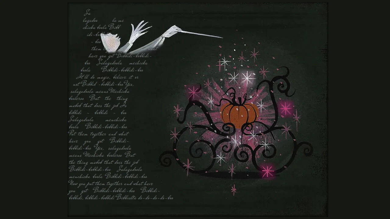
Typographic layout featuring “magazine-style” wrap around complex shapes, implemented via shape-outside: polygon(). The use of mix-blend-mode: multiply in conjunction with overlaid background gradients and imagery produces a print-like aesthetic, integrating the content seamlessly into the background texture. The polygon coordinate array precisely mirrors the illustration’s contour, ensuring a natural text flow around the subject.
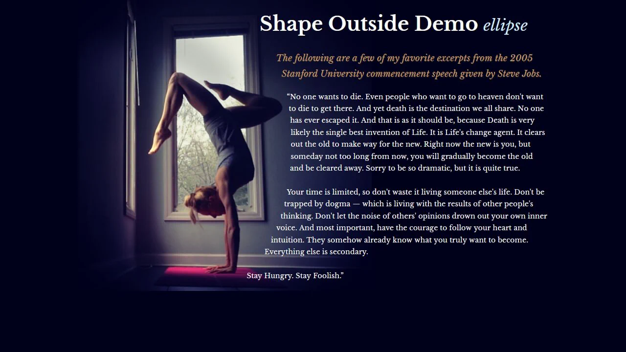
A layout utilizing shape-outside: ellipse() to facilitate organic text wrapping around the yogi figure. The elliptical contour allows for a more precise adaptation of text flow to the object’s anatomy compared to standard rectangular models. The use of the @supports feature ensures robust typographic presentation even in environments lacking support for the CSS Shapes module.

Magazine-style layout utilizing shape-outside: polygon() for contour wrapping. Two hidden floating blocks flanking the text define virtual boundaries, forcing the text flow to follow a central path. The decorative p:before element creates an overlaid header effect, while shape-outside allows for precise manipulation of text flow around non-rectangular zones.
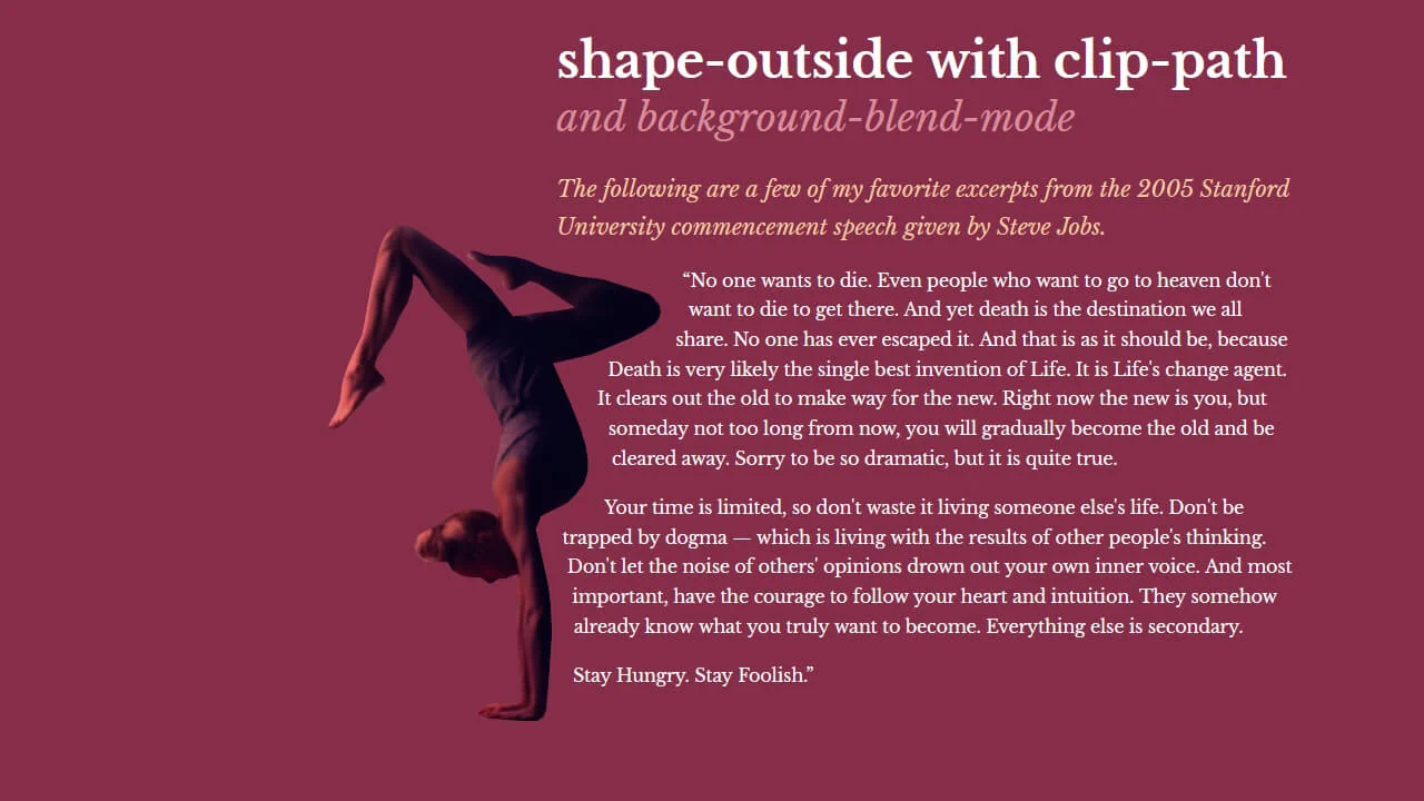
Advanced text-wrapping composition integrating shape-outside and clip-path via a shared, complex coordinate polygon. The combination of background-blend-mode: multiply and color filters enables stylistic treatment of imagery within clipped contours, achieving a painterly aesthetic. The implementation employs @supports queries to ensure graceful degradation for browsers with limited CSS Shapes support.
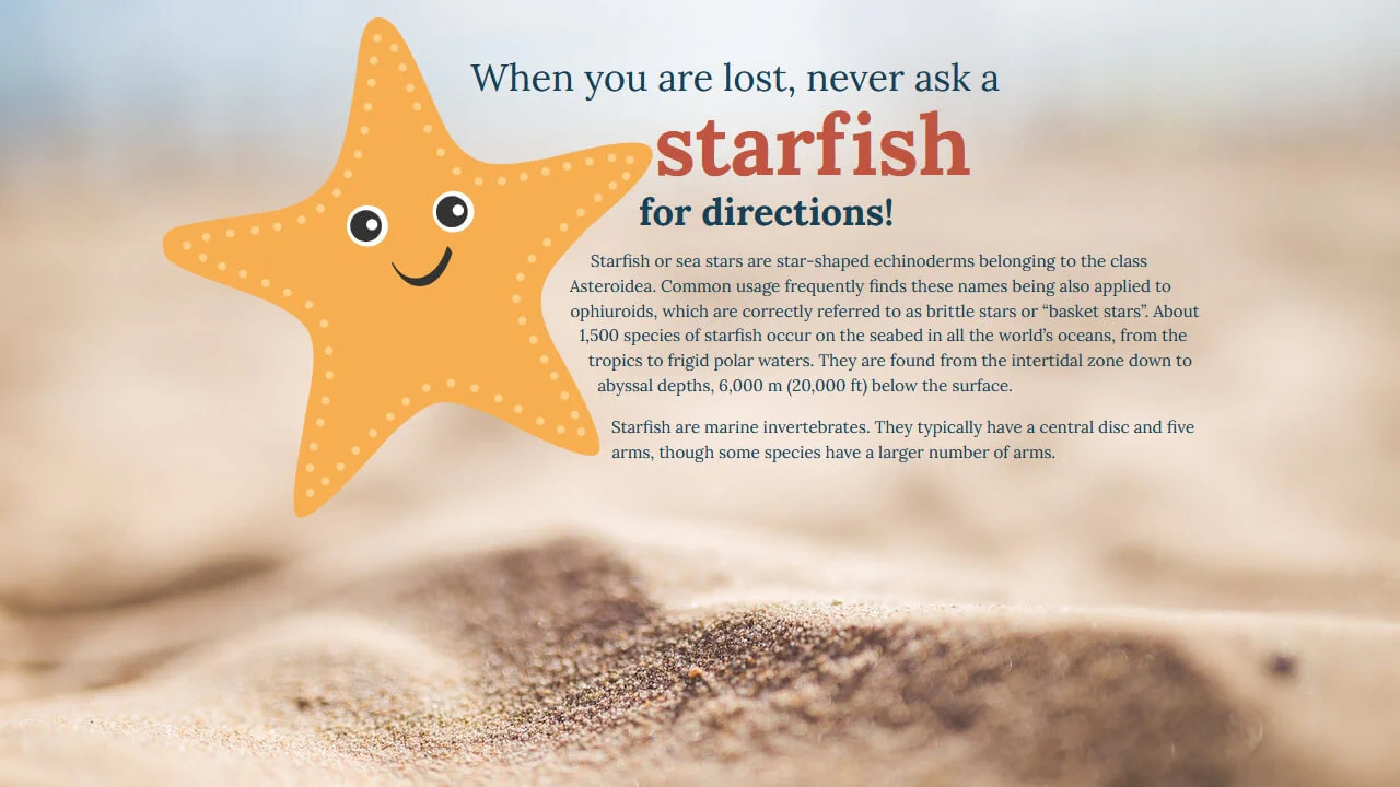
Interactive typographic composition utilizing shape-outside: polygon() to create a complex text-wrap around an SVG graphic. The starfish illustration, rendered via vector paths, serves as a visual anchor, while the text content organically wraps around its contours. The document structure relies on CSS Grid to segment graphical and textual blocks, ensuring responsive behavior and visual clarity.

Layout utilizing shape-outside: polygon() to create a diamond-shaped text container. The text flow is segmented by two invisible floating blocks (.left, .right), whose clip-path and shape-outside properties synchronously constrain the content area, creating a dynamic tapering effect toward the center. Additional visual depth is achieved through layering via clip-path: circle() and custom polygonal shapes for shadow simulation.
A demonstration of the shape-outside property. It enables text wrapping around complex geometric shapes and polygons defined via polygon().
Complex layout utilizing clip-path and shape-outside to create non-standard geometric forms and text wrapping. High density of CSS manipulations results in intricate visual structures, requiring rigorous responsiveness control.
Utilizing two invisible floating blocks with shape-outside to form a complex text corridor. This method creates a “curve-wrapping” effect, rarely seen in standard web layouts.