4 CSS shape() Examples
Organic geometry dictates visual hierarchy. The CSS shape() examples in this updated collection remove the rigid barrier of rectangular boxes, allowing content to flow naturally. Modern UI design requires fluid, non-linear forms. Utilizing these curated snippets replaces heavy SVG files with pure code, bridging the gap between raw data and the screen instantly. No friction.
The architecture relies strictly on the native shape() function within clip-path or shape-outside properties. Defining precise coordinate commands directly in the stylesheet leverages hardware acceleration to maintain 60fps performance during transitions. The HTML structure remains strictly semantic, ensuring absolute layout stability and preventing costly browser repaints during user interactions.
Every free demo is fully responsive and cross-browser compatible. Users can instantly download the raw code or fork a specific layout on CodePen. These assets are strictly optimized for accessibility, delivering a fast, frictionless experience across all modern mobile and desktop devices.
Examples
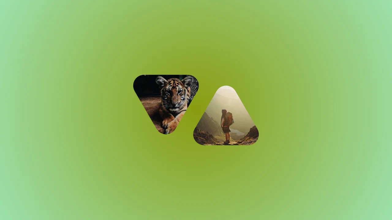
Morphing Rounded Triangle Image Mask
This is a Morphing Rounded Triangle Image Mask. It relies on advanced CSS mathematics and masking to clip raster graphics into smooth, interlocking geometric shapes. Its function is to replace standard grid layouts with organic, tessellating image tiles that physically react to user interaction.
 Chrome 111+
 Edge 111+
 Firefox 117+
 Safari 16.4+
See the Pen Morphing Rounded Triangle Image Mask.
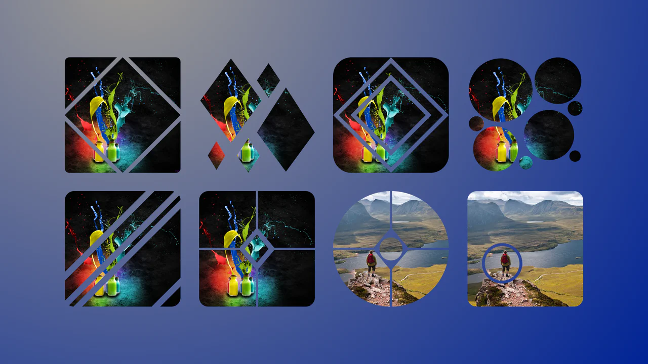
Complex Geometric Image Masks
This is a collection of Complex Geometric Image Masks. It shapes standard rectangular images into precise, multi-part vector forms using a single HTML node. Its function is to break rigid grid layouts and introduce structural visual interest without requiring external SVG assets.
Chrome 88+
Edge 88+
Firefox 71+
Safari 13.1+
See the Pen Complex Geometric Image Masks.
Pure CSS Waves
Experimental visualization utilizing CSS Custom Properties (@property), the CSS Shapes module (shape()), and relative color syntax (hsl(from ...)). Fluid deformation of wave-like layers is achieved by animating clip-path with arc and line primitives. Background and graphic color states are synchronized via a shared --color variable, which transitions dynamically throughout the animation sequence.
See the Pen Pure CSS Waves.

Custom property --k animates between 0 and 1, driving a clip‑path defined by a non‑standard shape() function — likely a placeholder or experimental syntax. The path appears to morph the image edges, creating a wave‑like distortion.