10+ CSS Shimmer Effects: Free Examples & Code Snippets
Shimmer effects have become a cornerstone of modern UI design, particularly for creating polished skeleton screens and high-end interactive elements. Instead of static loading spinners, these “ghost” animations provide a more organic sense of progress by mimicking content structure. Using this updated collection allows developers to implement these sophisticated loading states efficiently, improving perceived performance without the need for complex JavaScript logic.
Technically, these snippets rely on animated linear-gradient backgrounds. By manipulating the background-position or background-size properties through hardware acceleration, these effects ensure a fluid 60fps experience on the compositor thread. This approach maintains high layout stability and prevents expensive reflows. The HTML markup is kept minimal, often using pseudo-elements to apply the shimmering mask over existing container boxes.
Every free demo in this library is fully responsive and cross-browser compatible. You can easily download the source code or fork a specific project on CodePen to customize the animation speed, angle, and color palette. These resources are optimized for ease of integration, ensuring your application remains performant and visually consistent across all modern devices.
Table of Contents:
Examples

Holographic 3D Interactive Card
This Holographic 3D Interactive Card is a premium UI component inspired by rare physical trading cards. It features a sophisticated depth effect where the logo floats independently from the iridescent background, reacting dynamically to mouse movements or touch input. The use of modern CSS APIs ensures high-performance rendering of complex gradients and masks, creating a truly immersive “collectible” feel for digital assets.
 Chrome 85+
 Edge 85+
 Safari 16.4+
 Firefox 128+
See the Pen Holographic 3D Interactive Card.
Grainy Gradient Text with CSS Houdini
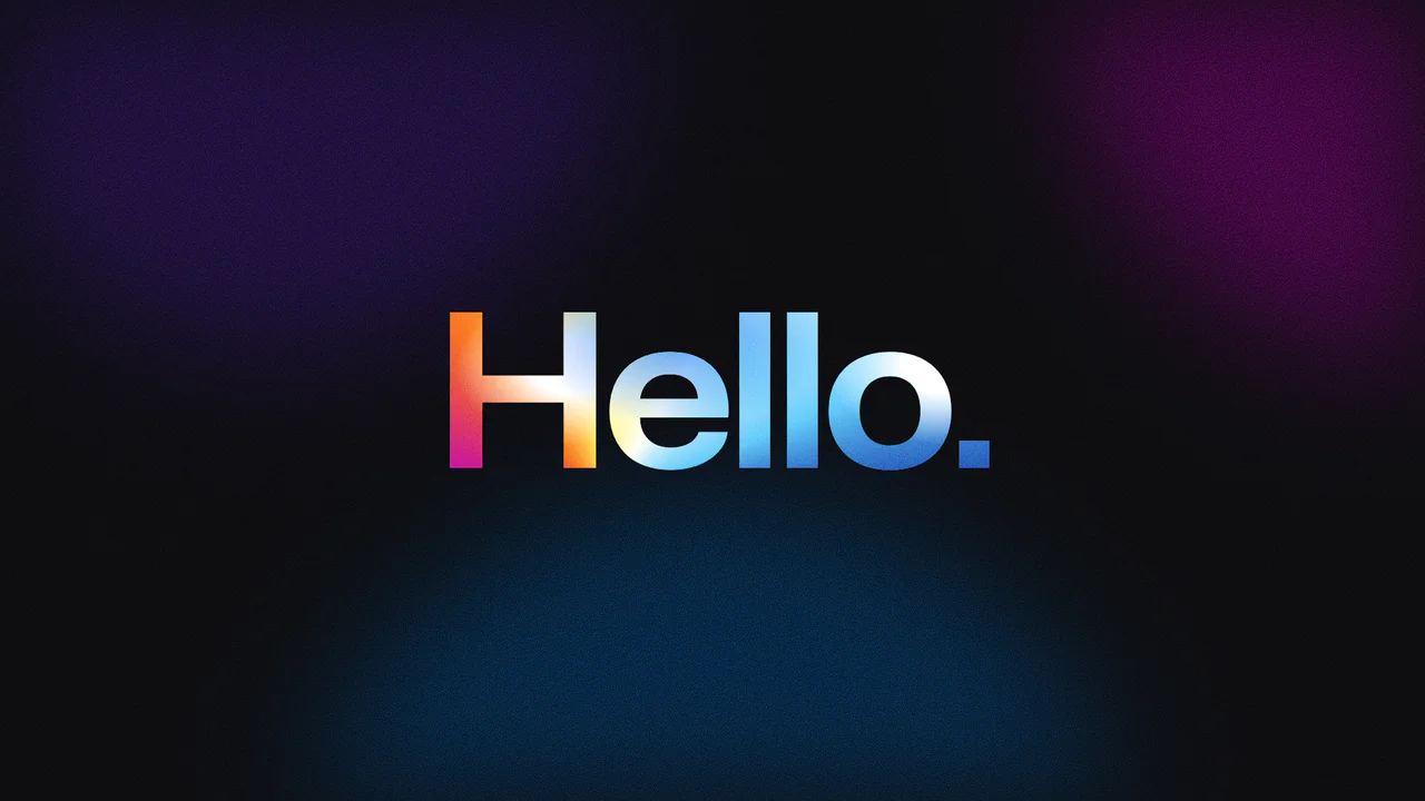
A holographic typography effect achieved through CSS Houdini properties to animate complex gradient coordinates. The text features a grainy texture generated by SVG noise filters and blended with conic and radial gradients using background-blend-mode: color-burn, creating a shimmering, fluid color movement clipped directly to the character shapes.
See the Pen Grainy Gradient Text with CSS Houdini.
Text Shimmer Lines Effect
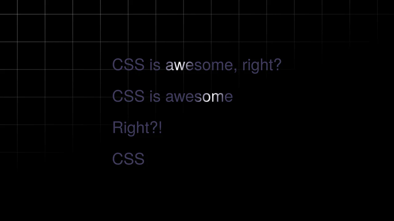
A text shimmer effect, where all parameters - from gradient angle to animation speed - are configured in real-time via Tweakpane. The smooth theme change is implemented using the latest View Transitions API, and the effect itself is built on background-clip: text and CSS variables.
See the Pen Text Shimmer Lines Effect.
Shimmer 3D Dodecahedron
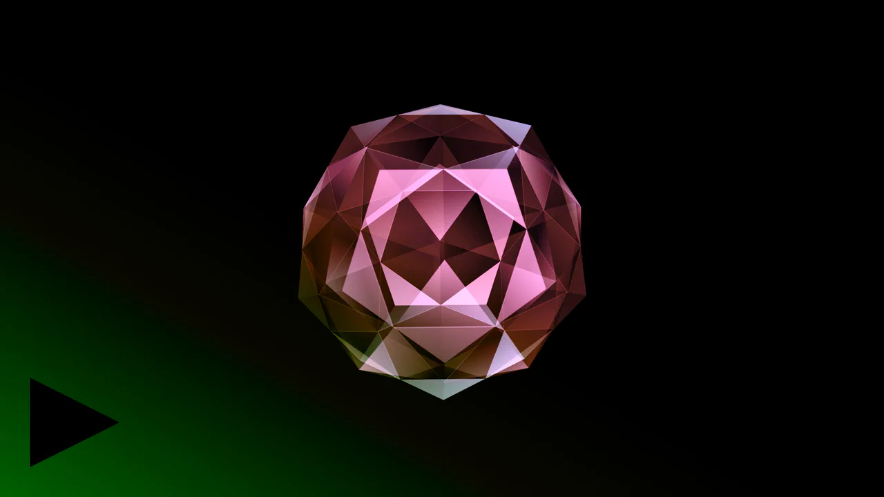
This demo illustrates how intricate 3D models can be built and animated in the browser using only CSS. Key features include using sin() and cos() functions for geometric calculations, and controlling animation and color effects (hue-rotate) through CSS variables and @keyframes.
See the Pen Shimmer 3D Dodecahedron.
CSS Shimmer Loading Effect
A classic skeleton loader pattern implemented via pure CSS. The shimmer effect utilizes a wide linear-gradient and animates background-position to simulate a passing wave of light indicating active data fetching.
See the Pen CSS Shimmer Loading Effect.
Virtual Credit Card UI
A demonstration of “living” cards with two looped @keyframes animations - one for smooth background panning, and another for creating a shimmering gradient highlight.
See the Pen Virtual Credit Card UI.
Pure CSS Skeleton Loading Animation With Shimmer
A professional skeleton loading animation built with pure CSS to enhance the perceived performance of your web applications. This snippet uses animated linear gradients and pseudo-elements to create a smooth shimmer effect, providing a lightweight way to handle content loading states in modern UI/UX design.
See the Pen Pure CSS Skeleton Loading Animation With Shimmer.
Shimmer Button
A vibrant gradient button featuring an infinite CSS shimmer animation and an interactive light-streak effect driven by SVG filters. This snippet combines smooth transitions with hardware-accelerated transforms, delivering a high-performance and visually striking UI component for modern web projects.
See the Pen Shimmer Button.
CSS Shimmer Button
An advanced CSS shimmer button utilizing conic-gradient and modern properties like :has() and container queries for dynamic light effects. This snippet features multiple animation styles (Flip, Lazy, In-and-Out), providing a premium feel for UI components while ensuring high-performance rendering.
See the Pen CSS Shimmer Button.
Button Shimmer
A high-end shimmer button featuring a pearlescent effect, built with pure CSS using the @property API for smooth gradient angle transitions. This snippet showcases advanced conic-gradient techniques and hardware-accelerated animations, providing a premium interactive experience for modern UI/UX projects.
See the Pen Button Shimmer.
Gold Border Shimmer
A creative CSS border shimmer animation built with linear gradients and keyframe transitions. This snippet produces a dynamic golden glow behind a central container, providing a high-performance solution for highlighting cards and buttons in modern UI designs.
See the Pen Gold Border Shimmer.
Shimmering Neon Text
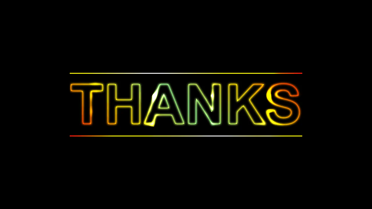
A striking pure CSS neon text effect that utilizes advanced mix-blend-mode properties and animated radial gradients. This snippet showcases a dynamic “spotlight” interaction and multi-layered glowing aesthetics, providing high frontend performance and visual depth for modern web designs.
See the Pen Shimmering Neon Text.