3 CSS Shine Effects: High-Quality Free Templates
CSS shine effects cast dynamic light sweeps and glossy reflections across interface components, mimicking physical metallic sheen and glass surfaces to elevate hover states. By passing a brilliant, angled flash across cards and buttons natively, this micro-interaction visually enhances element tactile feedback without the weight of heavy image slices.
- Glint reflections are constructed using a skewed linear-gradient absolute-positioned pseudo-element stacked above target text containers.
- Dynamic light-sweeping motion is triggered on hover, animating transform: translateX() values to sweep the glint cleanly across the component area.
- To guarantee a responsive INP (Interaction to Next Paint) metric, the glossy overlay isolates repaints by running strictly on the compositor.
Master these reflective styling techniques to seamlessly integrate premium, hardware-accelerated glossy accents and polished hover indicators into your design.
Table of Contents:
Examples

Shiny Buttons on Hover with Tailwind CSS
A polished button component featuring a sleek “shine” hover effect created entirely with Tailwind CSS.
See the Pen Shiny Buttons on Hover with Tailwind CSS.
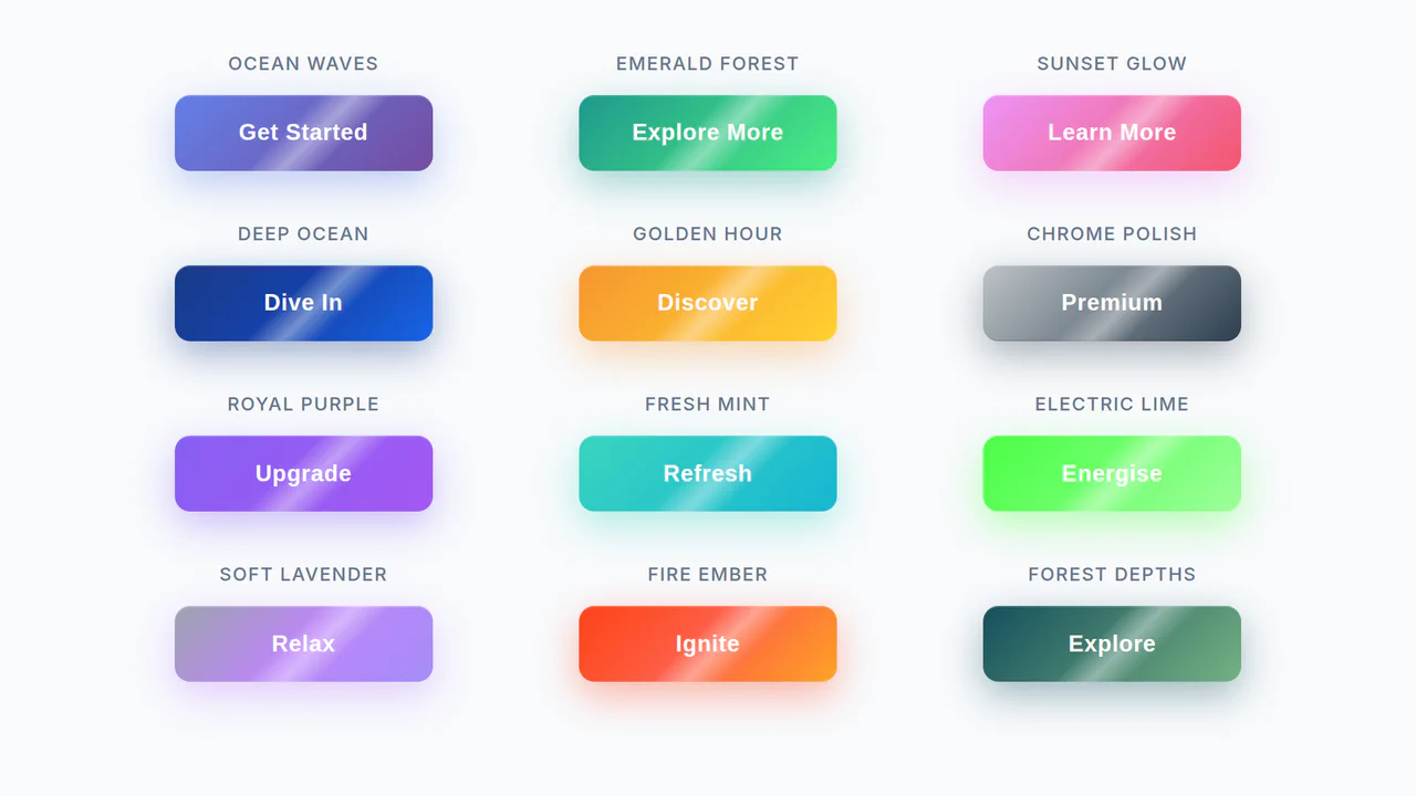
Shine Gradient Buttons
An example of modern UI/UX design implemented with pure CSS. The demo shows how to use linear-gradient, box-shadow, and transform to create buttons with gradient fills and a 3D-like effect, while the @keyframes animation adds a dynamic shine, making the interactive element more engaging.
See the Pen Shine Gradient Buttons.

Eye-Catching Bootstrap 5 Button
A vibrant CTA button featuring a neon linear gradient and a continuous ‘shine’ animation implemented via a moving radial gradient on the ::before pseudo-element. On hover, it scales up and intensifies its colored drop-shadow for enhanced interactivity.
See the Pen Eye-Catching Bootstrap 5 Button.