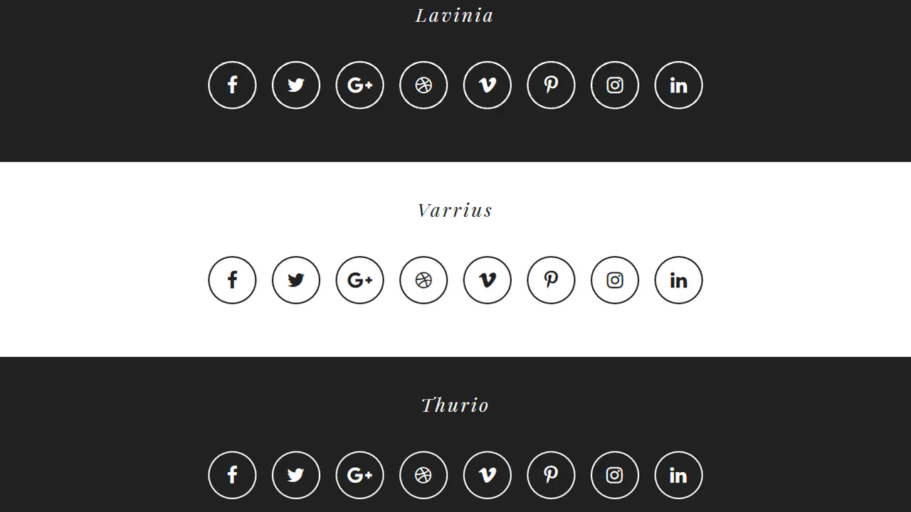
30+ CSS Social Media Icons
The Pure CSS Social Media Icon Examples collection demonstrates how brand symbol systems function through CSS geometry. Social platform logos built from borders and shapes eliminate image dependencies — enabling instant brand color updates and responsive scaling without asset management.
Social icons use border and clip-path techniques to reconstruct platform logos: Facebook’s rounded square, Twitter’s bird silhouette, LinkedIn’s geometric letterform. Pseudo-elements layer multiple shapes for complex symbols like Instagram’s camera outline; transform: rotate() and skew() create angled strokes matching brand aesthetics. CSS Custom Properties store brand colors, enabling theme switching across entire icon sets without modifying HTML. Animation adds hover effects — color fills, scale bounces, and rotation spins; animation-delay staggers multi-element sequences. Conic-gradient and linear-gradient produce gradient overlays matching platform branding.
Responsive design scales social icons fluidly via em units and calc(), maintaining proportions from 16px to 128px+ sizes. Accessibility is native: semantic HTML ensures screen readers announce platform and action. Focus states remain visible for keyboard navigation. The collection includes free CodePen demos, downloadable code, and updated examples. Each snippet prioritizes Core Web Vitals — zero layout shift through fixed dimensions, hardware-accelerated transforms via will-change: transform, minimal repaints using contain: paint.
Every example works in modern browsers (Chrome, Firefox, Safari, Edge). Download, customize, deploy.
Examples
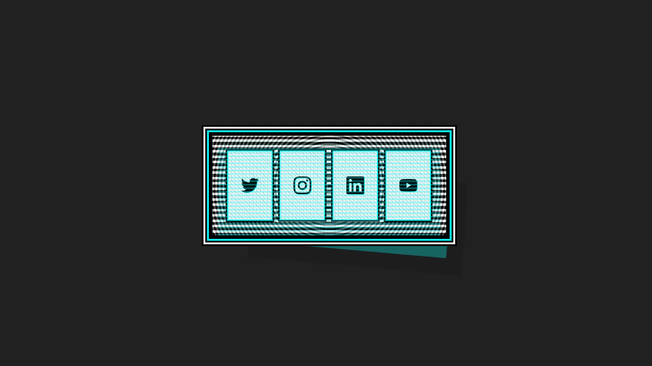
This Cyberpunk-inspired card features a complex box-shadow offset and text-shadow for the core CRT aesthetic, paired with a dynamic :hover state that uses transform to instantly swap the terminal view for a social icon grid.
Hover Effects
A dynamic hover effect in pure CSS, where the :has() pseudo-class triggers simultaneous animations: a slide-out tooltip and a smooth icon fill. The tooltip’s content is sourced from a data-tooltip attribute via attr(), and the fill color is flexibly configured with a --bg CSS Custom Property.
See the Pen Hover Effects.
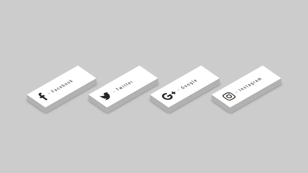
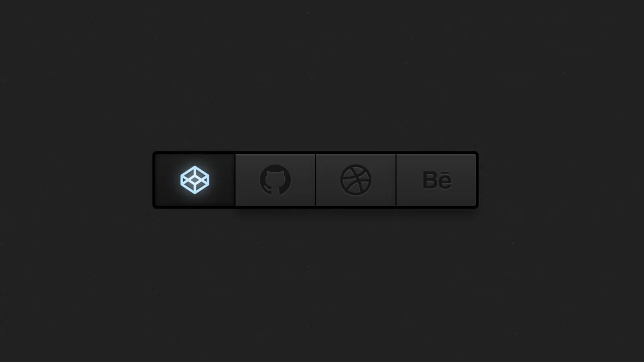
3D - CSS Social Tiles
A set of isometric social media buttons created purely with CSS transforms.
See the Pen 3D - CSS Social Tiles.
A set of social media icons with a CSS‑only hover effect — the gradient circle shrinks while the icon scales up and gains a gradient text fill. The effect relies on -webkit prefixes for the gradient text, so cross‑browser support is limited.
Social icons use pseudo‑elements and image‑based borders that rotate on hover — the “border-social.png” fades out while the hover version spins in. The effect is purely visual, with no JavaScript;
SCSS mixins handle hover effects, centering, and transforms. The main interaction rotates the button on hover, revealing a hidden link behind it — an animated reveal using cubic-bezier. Footer social icons scale and change color on hover; the heart beats with a keyframe animation.
Four spans inside each link draw a border — on hover, the top and bottom lines retract while the left and right lines extend. Color and transforms are handled via CSS transitions; the effect is simple and self‑contained, with no JavaScript.
Each icon is built from five <span> elements stacked with different transforms. On hover, they shift in a staggered sequence, creating a 3D pop‑out effect. Pseudo‑elements on the <li> add the bottom and left faces, completing the illusion of a solid block.
Three glass‑morphism buttons with distinct color themes — hover lifts them and intensifies the shadow. The markup uses PNG images inside, adding extra requests; the original gradient text is commented out.
A row of social media icons with a hover‑triggered jello animation and a pulsing focus ring drawn with a pseudo‑element. The layout is static and relies on external icon fonts.
A hover‑triggered button that slides out an overlay to reveal staggered social links. SCSS loops generate transition delays for each link, creating a cascading effect. The design is simple and functional, relying on transform and absolute positioning.
SCSS loop generates staggered delays for social links hidden behind a button. Hover slides out the overlay and reveals them with a bouncy transition.
Three social buttons use 3D transforms to flip on hover. Front and back faces are absolutely positioned with translateZ; hover triggers a Y‑rotation, swapping them. Each button has a distinct color; the .border pseudo‑element adds depth via nested transforms.

